David Palumbo
As I enter the home stretch on my upcoming two-man show (Skin and Tonic, May 4th at Reh’s Contemporary in NYC), I’ve been giving more and more thought to the role size plays in how we respond to images. To say that the scale of an original affects how we experience it is about the most “water is wet” observation one might make about painting, but I’m thinking more specifically about what works at what sizes, why, and how does this relates to commercial work, gallery work, and digital sharing. Bigger is generally more impressive, but so much of my work is very small and I feel the small works have their own kind of magic.
I was reading an old film-era photography book recently and there was a chapter on shooting Polaroids. Since Polaroids have a fixed reproduction size, they pose unique challenges versus a traditional photo which can be printed much larger. If your image is going to be rigidly set at a few inches tall, you need to compose with this in mind and the recommendation was to look for clear, bold shapes and patterns. This reminded me of one of the key guidelines many card game art directors advise their artists to follow: to prioritize shape and contrast in making sure that an image reads clearly. In card art, this often extends to story telling as well. In other words, the small image works best when it is graphic and the message is concise.
Of course, bold graphic images can work well at any scale. The whole concept of working out compositions through thumbnails is rooted in the premise that if it works as a postage stamp, it will work at any size. I wonder though if some images actually do work best when small. As an example, using extremely shallow depth of field (1) in photography has become fairly popular in recent years, to the point of widely used (overused?) smartphone filters that simulate the effect by just throwing heavy blur on the edges of an image to achieve that look. On a smartphone screen, having your subject pop out in clear sharp detail only to fade into dreamy hazy blur can be very striking. Bokeh filters (and also vignetting filters, which darkens the edges of the image) are designed almost exclusively with smartphone views in mind and they help to clarify focus and simplify what may be a busy image that you hold in the palm of your hand. Blown up large however, these effects may detract from an image. Even worse, images with that fake iPhone bokeh added will look bizarre and obviously doctored. Relating this to painting, I feel a parallel can be drawn to rendering focal areas tighter and peripheral areas with more abstraction. I personally think contrast of render is essential in any painting to give it life, but it certainly seems to work best when we can appreciate that contrast. Our field of vision must cover enough space to see the transition (as oppose to having to turn your head to see it), otherwise it feels disjointed or unfinished.
It is an important point to make a distinction between the size of the piece and how the viewer experiences it too. A billboard is massive but, since you can only ever see it from a distance, it may as well be the size of a magazine in terms of our subjective experience. Most images we see day to day are in a comfortably perceived size range that doesn’t require us to turn our heads to see the edges. Even if we might focus around inside the picture looking at different details, we can peripherally see the whole thing at a glance.
In planning for scale, the size of a
room can affect the way we perceive a piece too. A 30×40 inch painting hanging in a loft style gallery would look positively modest. In a small
bedroom, however, a 30×40 might command the space. Knowing how big a piece might feel in its intended display or how close the viewer will be should impact how you approach a composition.
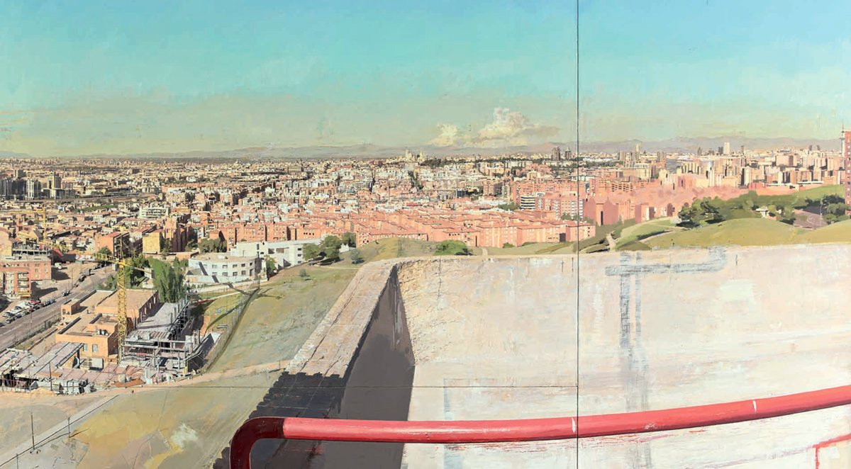
In cases of larger work, truly heroic scale, we interact with the image in a very different way than a normal picture. I used to puzzle over the strange perspective in the above example by Antonio Lopez Garcia. His work typically shows tremendous precision, so things like the curved pipe and that far left perspective that’s maybe just a bit funky (feels like it’s smushing/distorting) always seemed like odd stylistic choices to me. You can find other similar pieces with almost fisheye effects on the periphery. It wasn’t until I saw his work in person that I understood these painting are huge and the distortion is designed to look absolutely correct when the massive painting is towering before you. As you turn your head from one area to another, your relative position to the piece straightens out the curves. The distortion is “correcting” for the fact that the edges of the picture are significantly further away than the center from the viewer’s eye.
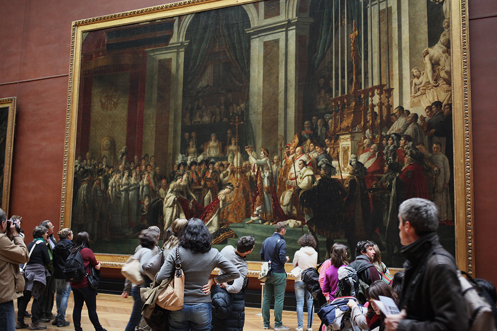
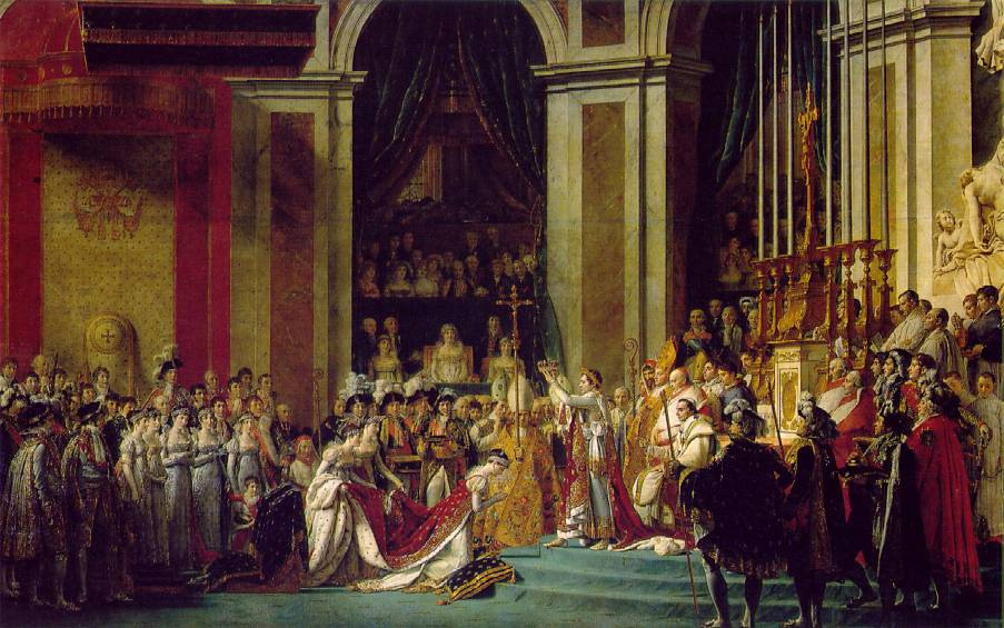
Another way that we interact with mural sized works in close quarters is to see scenes within the scene. If we can get close enough that we need to physically move about to see the whole image, we can digest it in pieces. The interesting effect in these mini-scenes is, unlike typical images, they have no frame but rather drift into the next portion of the picture and so are closer to how we see the world. If we try to look at works like The Coronation of Napoleon by David in reproduction, however, we lose this effect because the whole image shrinks to fit in our field of view. We are simply unable to even see a tremendous amount of the painting because it must be reduced so greatly. And sure, this painting works in reproduction, but only to the same extent that you can also hear a recording of an orchestra through a tiny speaker and appreciate the composition in its broadest strokes. This painting was never intended to be viewed hand held and, I would argue, it can’t be. Not properly. Just look at the size of it in the article header up top! And if graphic punch works well in miniature, I feel subtleties need to be seen large to be fully appreciated.
I feel it’s also worth pointing out that the lower half of the image has far more close up detail and areas of interest. While the top half does create a nice balance in negative space to the busier bottom, the top half is also much too tall for anyone to get close to. That area is designed and painted with the knowledge that it would ONLY be seen from a distance.
This brings me back to preparing images for my show. In so much of my work, I’m accustomed to planning for small reproductions. Card images, covers, online sharing… In illustration there is rarely a reason for me to go beyond 18×24. For an in-person audience, however, scale becomes a critical component. A word many use when talking about large works is “presence.” No painting reproduced on a phone screen can possibly have the presence of a life sized original. Even if you have a giant 4k display, you’d need a corresponding 4k+ image file to fill it (which living artists are not too inclined to give away). This leads to a peculiar frustration in a social media run world. We’ve become so accustomed to being able to share our work globally, instantly, and endlessly but, if you work large, sharing online is only a simulation of the experience that you’re trying to create. When people say “a photo doesn’t do it justice” while looking at original works, they tend to point out color and tonal subtleties. But in my experience, intended scale is one thing that truly needs to be seen in person to be understood and appreciated.
And for as much as the large images excite me, I really do enjoy small. I find the challenges of it rewarding and like being able to share them widely without the pieces losing presence. But creating for a limited in-person audience also makes me more aware of how going larger can make certain images really land. Those joining in at home might not get the full experience but, unlike my commercial work, the primary intended audience is not a virtual one. In the end, each piece should be designed appropriately for its intended purpose and considered carefully so that the scale delivers the maximum effect.
(1) A shallow depth of field is seen in a photograph when the subject is in sharp focus but the foreground and/or background is out of focus. Extreme examples might show a subject’s eyes clearly focused while their nose and ears are heavily blurred. The out of focus blur is also called “bokeh”


Recent Comments