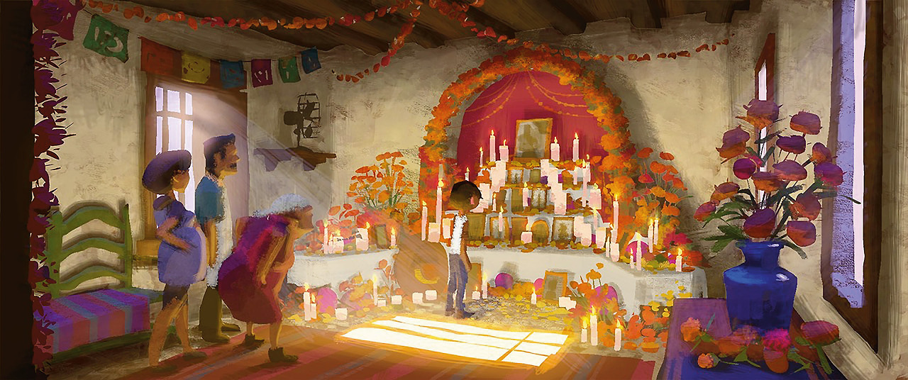
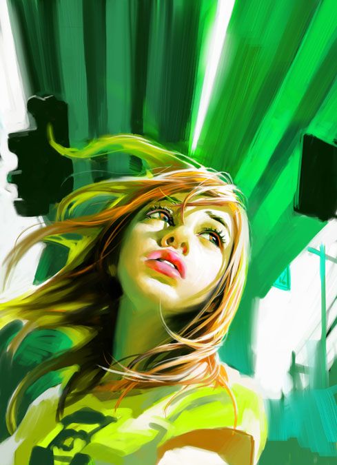
beautiful concept art by Shelly Wan
I am a little stressed right now getting trying to scramble to get things done before Comicon next week. Trying to prep our site with new content, getting samples done for a book, and illustrating a new round of panels for the graphic novel that won’t be ready by next week – breath, relax – so, I thought I would share with those of you who are not attending Comicon 2018 one of the two lecture/demonstrations I will be doing. The other lecture I did not post here is on expressing action in your poses for illustration and sequential story telling. Maybe that will be another post on one of those scheduled dates that I am running thin on time. Here is the lecture as I have outlined it, with the pictorial examples I will be using:
Comics, illustration, card art, concept art, illustrate story and evoke mood, set the stage, invite us away to fantastical spaces, and stoke the consumer to buy. This type of work is staged much like a theater performance, a stage play, a film. Once the illustrator understands this is the concept of building a picture by planning from the setting, staging, and motivation of the performance, the illustration will take on an entirely new meaning. Until then, the artist is in “school mode”, eyes open but looking too closely at technical information, Gumroad videos, and Youtube for assistance.
Color is a crazy issue every artist wrestles with their entire career. Whether it is learning to control a palette, switch colors to create a different mood, pigment mixing issues, pure vs. mixed, chromatic vs. tonal, switching clients and colors, adding colors to the palette, and so on. Color never stops playing artistic adversary, always messing with our head, and our finishes.

Visual mood is partially designed by light. The color palette used is a result of what lights you choose and how you choose to use them. If you paint with natural light, you would heighten it in the way that a Pixar film enhances lighting, staying true to where it comes from, but chromatically saturating it more than we can see in nature or pushing the cooler hues against the warmer ones and saturating the shadows with more color to balance the shot.
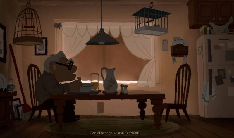
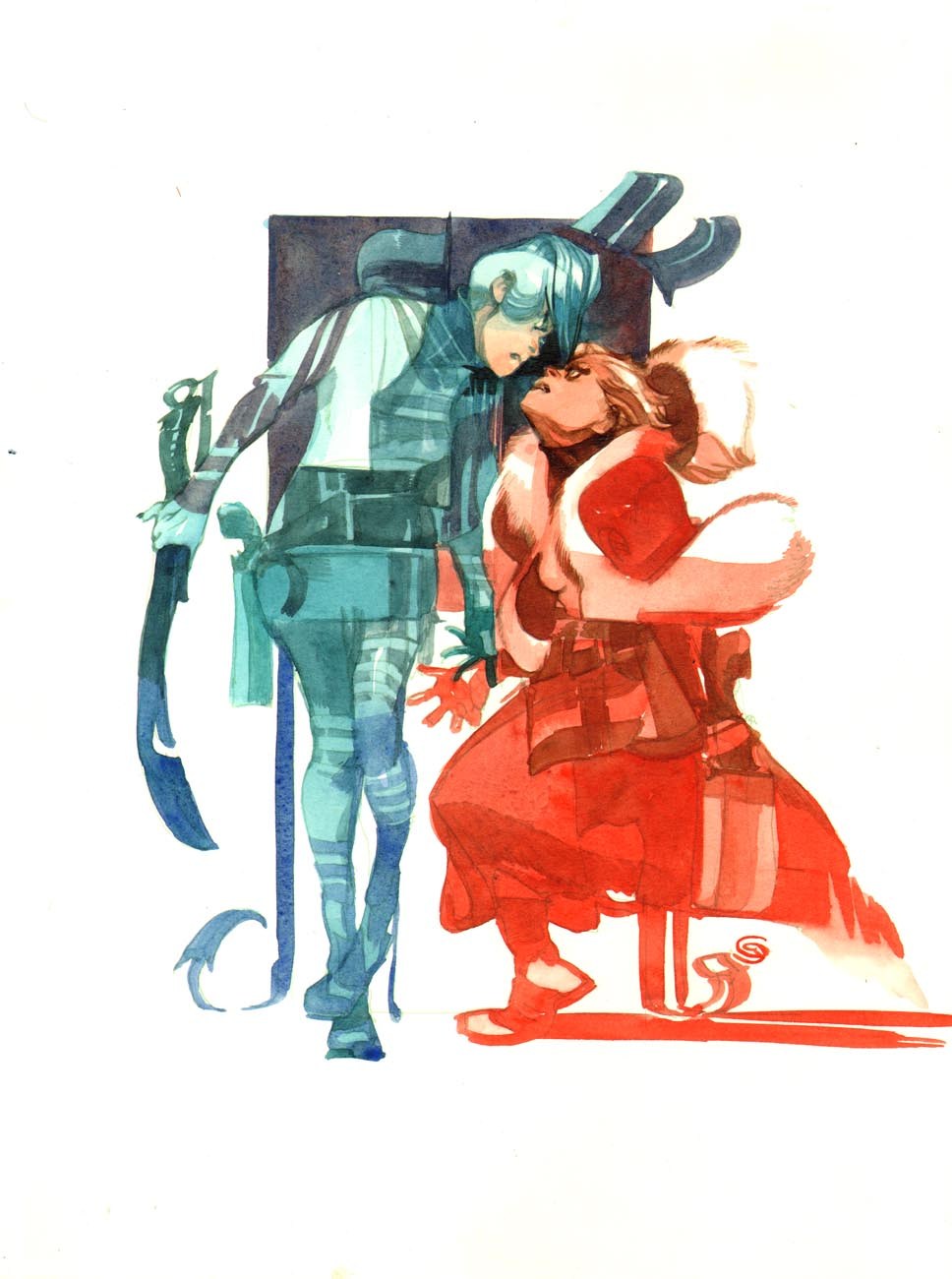
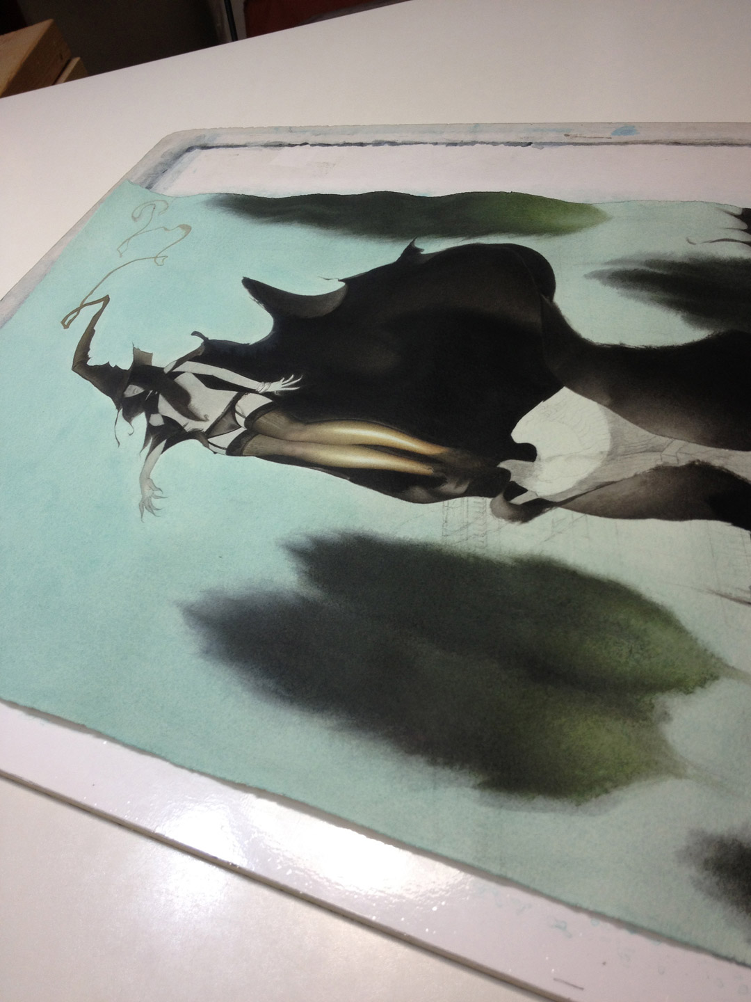
art by Daniel Arriaga
If the mood you are choosing is pushed by a color recipe, the result of a limited gamut of color chosen from the color wheel, or derived from using the complementary, split complementary, triadic, tetradic, quadratic, formulation system, or what I liken to cooking and using various “recipes” (color relationship + colors of the limited palette + mixing the colors towards the appropriate chroma scale), your painting will look/feel in a similar way to extremely colorful stage lighting or colored club lighting. The lower chromatic range tends to fall towards tonal looking palettes, moody, and driven more by the value of the colors than the colors themselves. The higher chroma range leans towards the cartoon palette, saturated, using less black in the graying system to keep all the colors saturated regardless of their value on the value scale.

the square one is quadratic
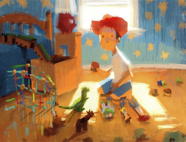
Here are several examples of natural lighting pushed:


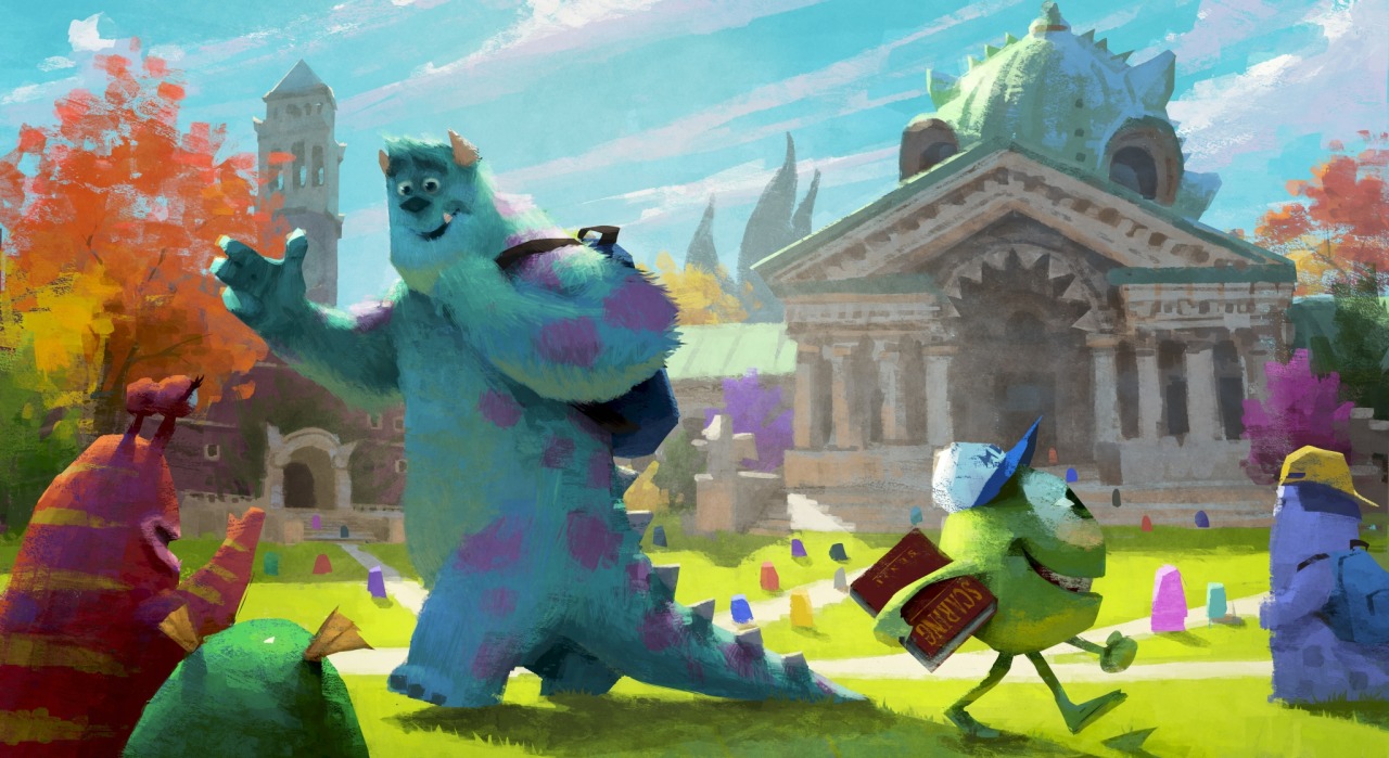
concept art by Robert Kondo and Dice Tsetsumi
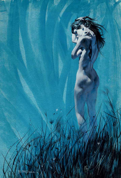
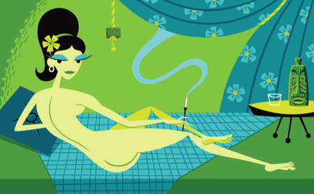
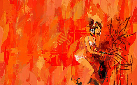
Here are many examples of color recipes:
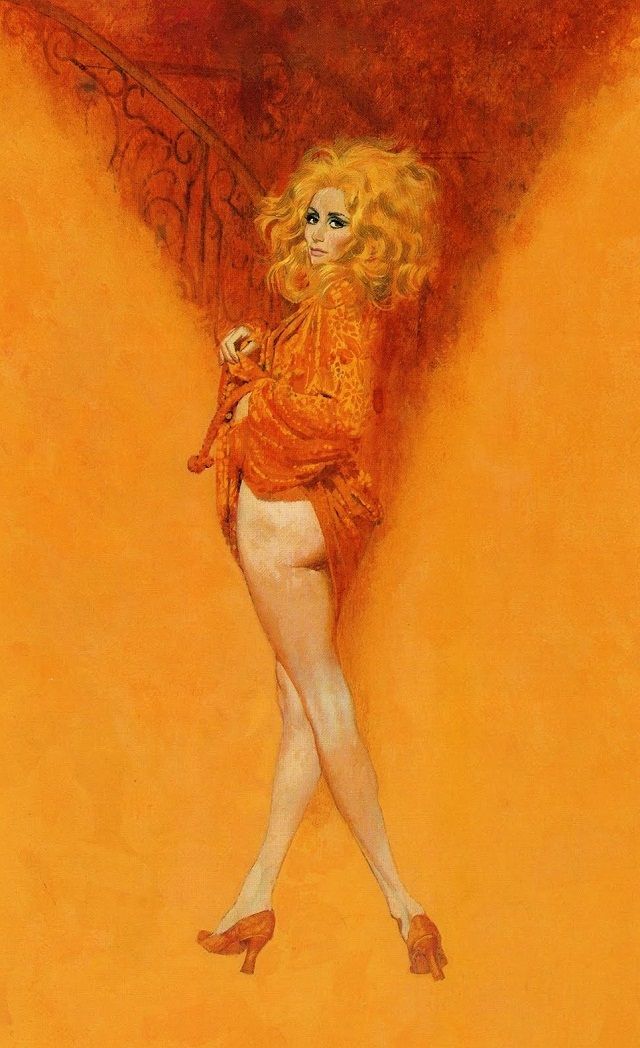
Art by Robert McGinnis
Art by Shag

Art by Greg Tocchini
Art by Kevin Dart
Art by Benjamin

More Great Art By Kevin Dart
There is also the design of your image and how you relate colors to each other. The outlines also called self lines of the work could be the color contrast to the spot colors in the work, like the works below by Greg Tocchini who is known for his page inks being all various colors.
Art by Greg Tocchini

Art by Tim Sale
The piece could be completely designed using various patterns that fill each shape space.

Art by Jon Klassen
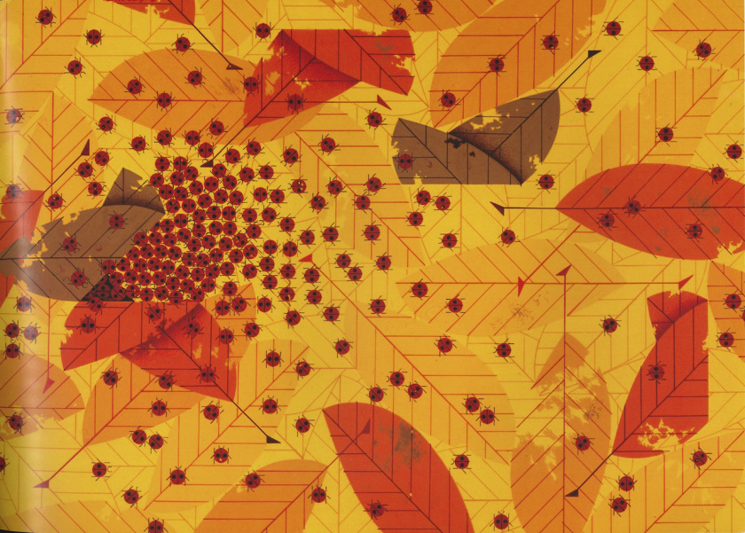
Art by Charley Harper
The painting could be completely shape driven with little to no indication of shadow except to produce a suggested overlap in shapes for dimensional front to back purpose.
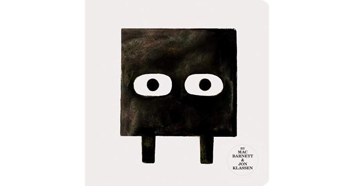
Art by Jon Klassen

Art by Jon Klassen
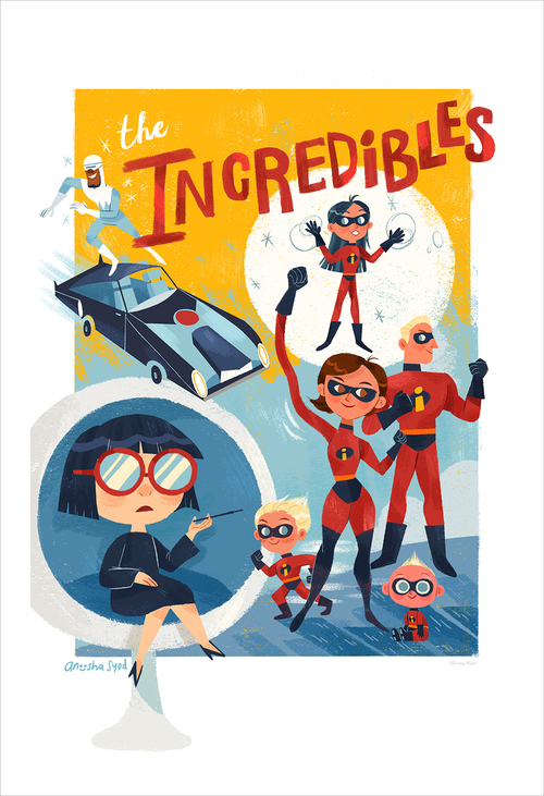
Art by Anoosha Syed
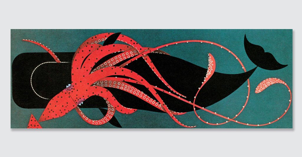
Art by Charley Harper

Art by Jen Corace
Know Your Technical Motivation
If a painter does not know what the technical goal is they are attempting to assemble, the picture can fall apart in pieces of success between the two types of construction. Knowing the technical differences between form and shape design will help the artist stay on point and successfully build their images that convey feeling because they knew what they were doing and why they were doing it.
The above examples are not pictures that indicate light/shadow by the traditional sense. These images are designed using pattern, shape contrast, and contrasting temperatures of color on the color wheel, or one of many other devices from our graphic design elements and principles. They are “shape driven” vs. form driven where light and shadow are principle. This is not to say that cut out shapes can’t feel dimensional, all art is attempting to feel like it has depth to it, but these dialects (styles) use different modes to achieve that dimension and depth.
For those of you using the word shape to mean form, in the arts we use these two words in contrast to each other. As an example, in drawing class we refer to shape as the flat symbolic representation of something, the silhouette, the cut out, appearing flat vs. volumetric, or gradient driven by transitioning light across the surfaces.
Form, when done well can look sexy. Form is a lot of hard work and requires longer deadline time to effectively pull off. But form can kill a painting that when first designed probably had strong, graphic shapes but by scaling up the image and having more space to fill, gradation can sometimes take over as we think we need to turn form with value all over the place, and usually by turning the light too far across the surfaces using too many value transitions, that most of the perceived volume of an object blends in with other surrounding values and gradations leaving a faint impression of a much larger form for us to see at first glance. We often think these paintings are out of proportion, or oddly painted, and over time as paint darkens, more of that form gets lost and the original boundaries fade away from existence.
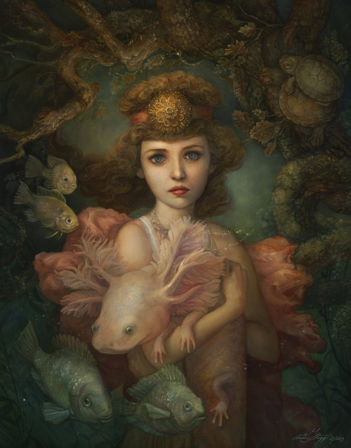
Annie Stegg Gerard Makes it look easy with her complex layered paintings. This image is “seen” here, but these paintings need to be “viewed” in person to feel them. They are not painted just to be seen with all the layers of depth they exude.
Reducing the value range, form is stated with abrupt changes in planes, a bit more hardened than what is seen in nature but with good reason; visual power is in strong shapes and extreme contrasts. Transition does not cater to this. Many fine artists also reduce their forms to planes and shy away from over turning the forms with value for the same reason of strong shapes command attention. This is also where temperature opposites assist with the visual contrast. Color contrast has just as much jump to the eye as value contrast when done smart and effectively.
Here are some examples of what I mean:
While there is a little gradation, the edges of the shadows were kept firm to push the heat under the midday sun.

Art by Arthur de Pins

Art by Pascal Campion
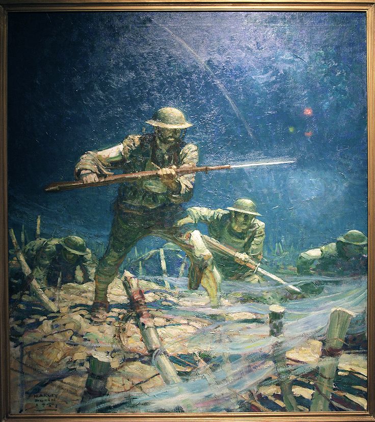
Harvey Dunn portrays the grit of war with these bold, strong, firm edged brush strokes.
The Tool Box
To paint light effectively here is a series of tools and why they are used that you should familiarize yourself with, practice the meaning and understanding of them, and continue to develop a broad range of tonal and saturated color schemes expanding your capabilities to cover a variety of moods and emotions in your image making.
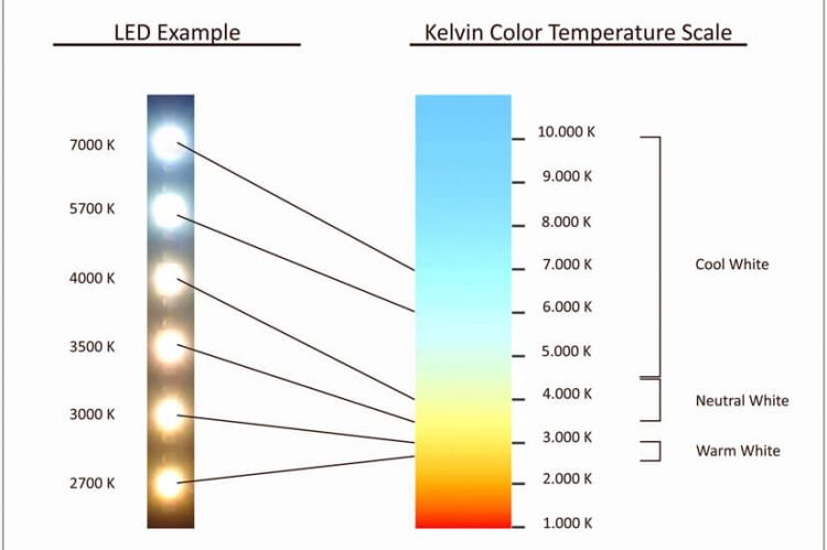
Measuring Light – True Light – The temperature of light is measured using Kelvin. We buy our lightbulbs by their temperature, stores like Home Depot have kiosks that features their entire range of CFL bulb temperatures for you to choose from for your living/work/play spaces. Most pedestrian eyes do not register with this concept of temperature in the light, which is many times the reason why when we pick a color to paint a room with it looks different when we get home and paint it on to the walls. The lights in the store and the house did not match, and the color looked so good at the store.
Here is a Kelvin chart. Paint a copy of the color gradient and learn what pigments in your palette achieve the hues. This brightness in value and quality of color will be the influencer of all your hues facing towards it. Then the fun begins reducing and balancing that hue with the indirect light hues while mixing it all into the appropriate local value. If you ever wondered why your paintings lack “real world lighting” sensibilities, this is likely a big reason.
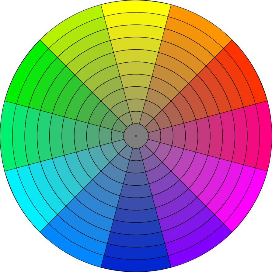
Color Wheel 1 and Color Wheel 2 – Why not add another wheel to make it more difficult!?! The first wheel is the “You Ride My Bus, Cousin Gus” YRMBCG, or “Yurmby” wheel designed by Tobey Sanford, written in greater detail by James Gurney on his blog, here. The colors are Yellow, Red, Magenta, Blue, Cyan, and Green respectively. This wheel compensates for all the hues in the print and digital color spectrum, the colors represented in pure hue form makes this wheel exceptional for Choosing the dimensions of color you intend to work with Tint, Shade, and Tone Values removed.
The second wheel is the Chroma wheel, a slice of the Munsell system, broken down and designed by Sebastian Capella back in the 1960’s. This wheel represents painting color from the tonal ranges, low chroma, to the extremely colorful high chroma ring and through the “usual tones” ring in the middle. This wheel organizes brilliance by value, a way to control the cleanest colors a painter wants to try and achieve in their work.
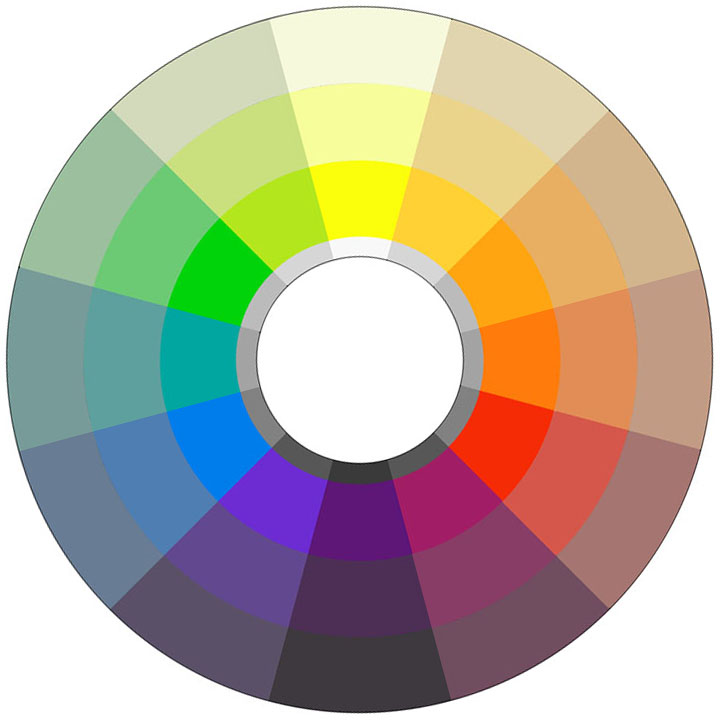
Aside from organizing tonalism from colorism color concepts, this ring is fantastic for keying mood in its chromatic changes, and the broader gradient of changes that are not charted here, the 9 values between black and white that we use as artists.
Between these two rings, all the color recipes and moods a traditional painter needs can be conjured up for any subject, any painting. Digital artists have their millions of colors organized differently, but I wish these two dials were somehow the rings we choose from as our color picker and appropriately labeled so that the color wheels were not just tools but “teaching tools” as well. I might have to look into this as some form of app – or someone closer to the programming chops to connect with me and concoct…hmm ?
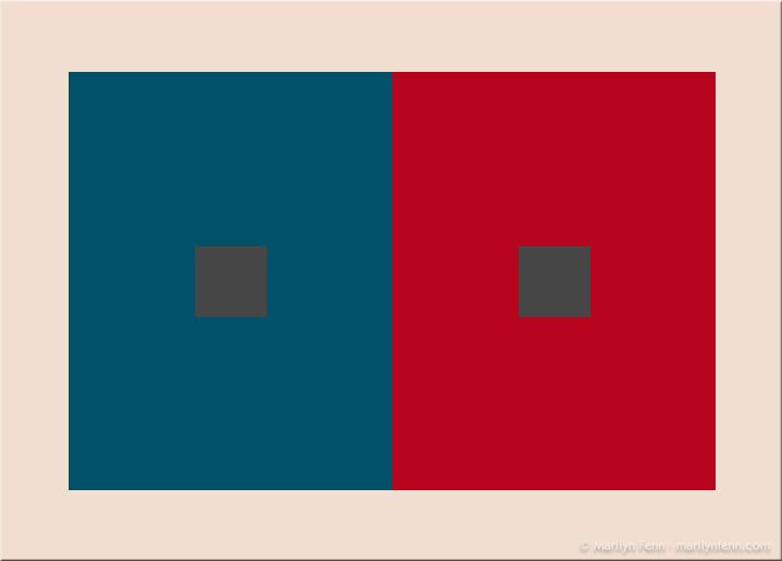
Major and Minor Key structures – This chart expresses the various types of contrast relationships painters use to convey story, mood, light and shadow in its own form of graphic abstraction. The shapes represent the two different structural keys used to measure a picture moving or still, the major representing the overall graphic impression the image produces at a glance, and the second is the range of value between the lightest and darkest values of the forms in the picture at the range of value suggested. This is what you would call the minor read of the picture, or how light passes across each sub form to produce volume to the viewers eye.
Here are some examples of different keys in use by Monet:
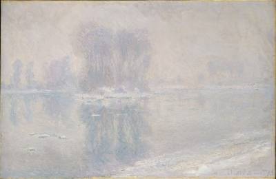 High Key
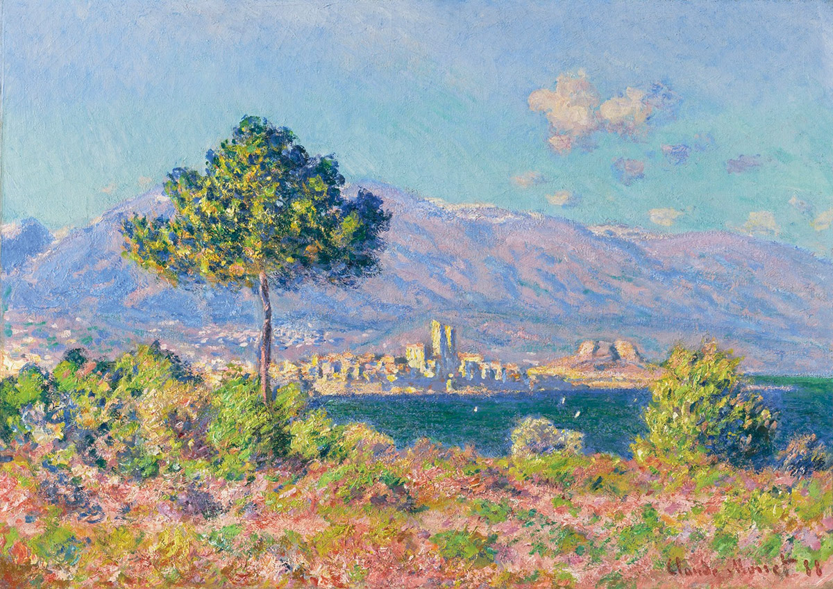
Middle Key

Low Key
This key structure helps one understand just how much light the objects in the shot are receiving as well as how much to roll the forms vs. keep them graphic because of the limits of value chosen for the painting. This is just a simplified chart, limited to 9 structural keys. Push yourself to find more and expand on this range.

Notes from a class long ago
Warm Vs. Cool – As much as it is said or written, not enough is written on why this is so effective. To sum it up, value = color color = value. They are one and the same. When the value structure gets difficult to separate spaces, or give distinction to the light side of something from the dark side or the background, color comes in to save the day. Color has two more variables that help achieve separation of spaces or light and shadow, and that is temperature contrast and chroma contrast, or simultaneous contrast.
Temperature contrast is warm vs. cool, or the warm colors on the wheel, any with yellow in them, vs. the colors on the color wheel with blue in them. This jump in temperature is just as strong and just as powerful as any value contrast. This is how Rembrandt contrasted his figure’s silhouettes on the dark side of his Chiaroscuro approach without losing their form in the shadows.
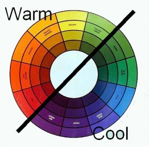
Simultaneous contrast or contrasting dull against chromatic is used a lot in animation so the experience doesn’t melt your eyes with too much saturated color spread across the screen. It pairs a strong chromatic accent with grayer colors in the scene, the saturated color triggers the grays to appear more saturated than they really are and more recognizable in hue. This is an intelligent approach to color schemes, more so than the dreaded complementary color schemes overdone in the 80’s and overused until the early 2000’s as one of the few solutions for exciting color palettes.
If it weren’t for the bit rot, this exercise would be more effective. But the same gray appears as the color opposite for both colors regardless of the fact that it is the same value and temperature of gray in both examples.
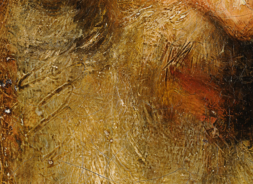
One extra note, for you painting in oils, you can also use the texture of the paint to cast small forms within the recording of the brush strokes using real light as an added element to create, darken, or break up shadows painted on the surface. Just as brilliant are the painters who use black paint similarly but to catch light, like Steven Assael with some of his life-sized figure paintings which I do not have any good examples of.
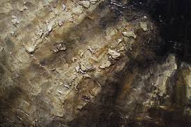
combination of sgraffito and raised paint to create surface depth 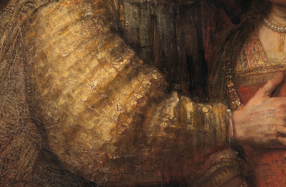
The Demonstrations
Aw, did I have to keep that in here? Due to scrambling to get ready for Comicon, I do not have the time I’d like to produce an extra set of demonstrations. But, as this label suggests, I will be doing the demonstrations, but at SDCC this next week, and if you are attending please come by our booth to check out the times that both Vanessa and I will be lecture/demonstrating. I have two, one on Friday and the other on Sunday, Vanessa has hers on Thursday Night and we hope to see you there if you will be attending the show.
And after the convention has cooled off, I append the demos to this thread if you don’t see them first on social media. I look forward to the show, and I look forward to more time again and lengthier demonstrations for these posts. Take care and happy arting.


That’s a very helpful post, Ron! Thanks alot for the information. Have a nice Comiccon!
This is yet another post I’ll keep coming back to to read multiple times… thank you for the information and hope to see you at the Comic-Con. 🙂
A very, very help full post:)
I know it is a big thing to hope for, but it would be great to see the same picture done with different color schemes.
For me it is such a big struggle to reconise the schemes, and choose the appropriate one before I start a picture…
Thanks again!
Thank you Ron, really appreciated your thorough analysis on the subject.
I stumbled across your post doing some research for a theatre lighting design. Brilliant! We never talk about major/minor tonal keys in my field. I mean, we talk about value and tonal contrast, but I’ve never had anyone break it down into a diagram like you have done. Thank you for this enlightening post!
HII, I have a question.
When we work with base color in digital painting (before work on lights), Do we have to adapt them to minor and major keys? for example, if i want a minor key image, those base colors have to be more light midtones than if I were working on a major key image?
Thank you so much!!