I have a tendency to use rimlight on everything. I like the effect it creates and I seem to miss it when its not there. I have caught myself in a conversation smiling to myself with a strangely smuck smile, if I notice the person I am talking to is having a rimlight on the face from a window close by, or a second lamp. “Are you listening? whats so funny?” I hear my wife say and i snap back to the conversation. “Nothing, Honey. What were you saying again?”
Like I said; I love rimlight. Actually I wrote an article 4 years ago about the same thing. But today I think I can show better the pitfalls there is. The things that can go wrong is often when you forget what you are doing: Its when you forget that you are painting light and just think about rimlight as an effect.
Here is what it is:
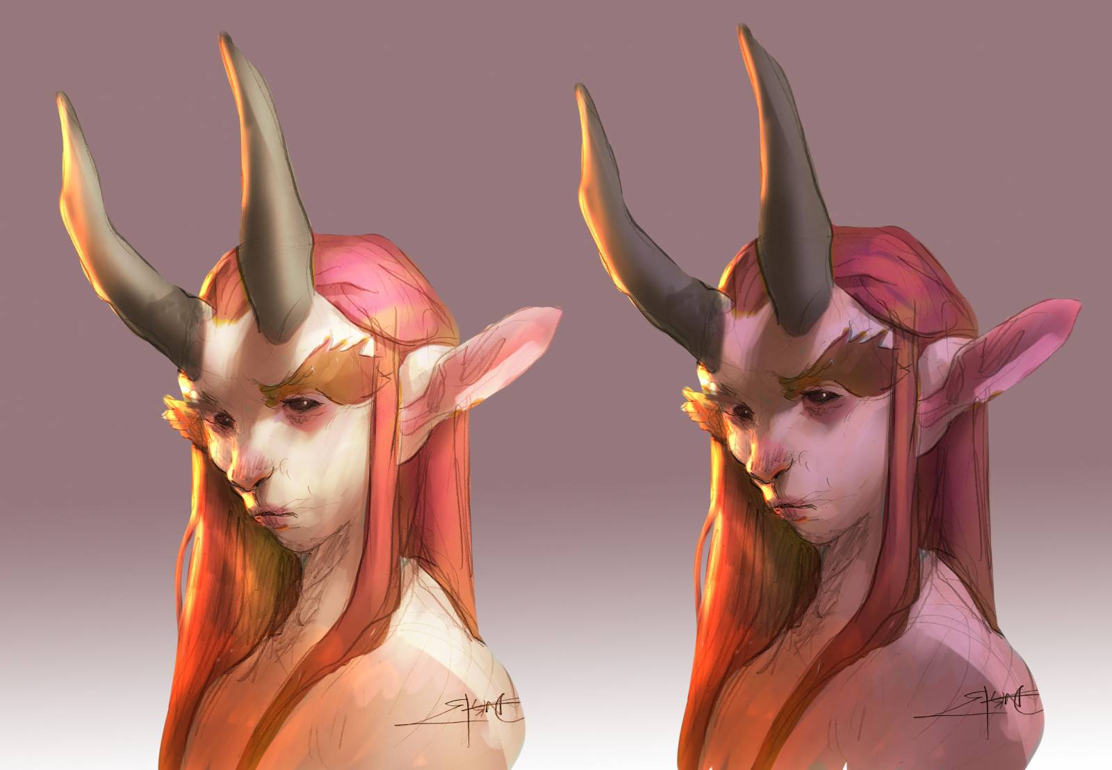
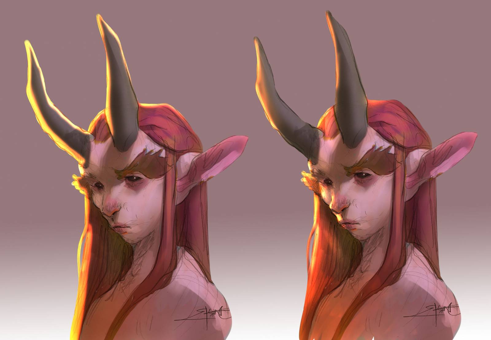
Rimlight happens when you have 2 light sources on an object. One is primary and the second one – the one that creates the rimlight – is behind the object slightly to a side creating an edge of light. The rimlight light source seems stronger because it is seen in contrast to a darker transition into the softer light source. Well; that sounds like a lot of highbrow nonsense, so I created a figure to exemplify what i am talking about. Just remember that we are talking about 2 light sources and in order to get the maximum effect of the 2 I try to keep some aspects in check: Value, Temperature, Transition, Shape and Intensity.
Value:
If the main light source is equal in value the rimlight effect doent do much justice. It ruins the effect of light and creates an image that seems to busy. The rimlight is not having enough contrast to work with to look light light and it becomes just a diversion for the eye. This is perhaps my most common mistake, and often I will fix it by glazing in a fine layer of color in the main light area to kill some of the contrast and the light value there.
Value
Temperature:
If you use a warm rimlight and a warm main light source it simply looks flat. it looks flat because they are similar. There is no opposites. I will always differentiate the 2 sources in temperature to get the maximum effect: That is if I have a figure being in a warm environment i will add a bluish rimlight from the sky and if I have a colder environment, like a night scene or indoor area I will add a warm rimlight from an off-camera torch or fire. Sometimes I will include the light source if possible.
temperature
Transition:
Okay; this is by far the most common mistake to make. There is an area between the main and the secondary light source where none of the sources hit directly. That area is going to be darker than any of the two. “Well yeah Jesper, but not always. If you point to flashlights at a ball you can make the 2 cones overlap and there will not be any darker transition between the 2”. That´s right, but we are not trying to proof our theory wrong here. We are trying to get the best effect out. So, remember to add that dark transition between the 2 light sources or it will look like a dude with yellow paint on the side of the face rather than light.
transition
Shape:
If you forget that you are painting a three dimensional figure, it is easy to overdue the rimlight effect. if you never take into consideration that the shape you are trying to add light to, is a ball shape or a cylinder shape the light around the edge becomes just a big fat line of color. Light needs to shape, well; around the shape. It creeps into the facial structures especially around cheeks and noses. On noses it becomes hard and the lines are thin, but on cheeks the light softness around the ball shape and the rimlight bleeds out into the transition color.
Shape
Intensity:
this last issue is mostly something i try to think of in order to direct the eye or the focal point of a painting. If the rimlight is equally intense all over the figure it becomes a bit too effect full and takes over the focus. I tend to maximize the contrast and the contrast around the facial areas and then softness it out the further away I get from the important part: You can argue that this is not how real light behaves and you might be right. But it could behave like this in real life and I am the director of light here and I decide how it falls. use rimlight to your advantage and that means to make it look right but also get the most out of the effect as possible.
intensity
What I like about the rimlight effect is that when it is used right, it creates a very convincing three dimensional object. it adds interest and credibility when an object in a painting behaves like an object in real life. We must follow the rules of light from the real world but in fantasy it can be the best possible version of real life, all the time.
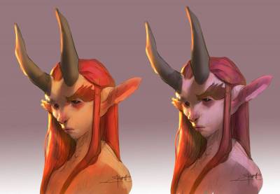
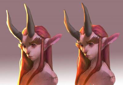
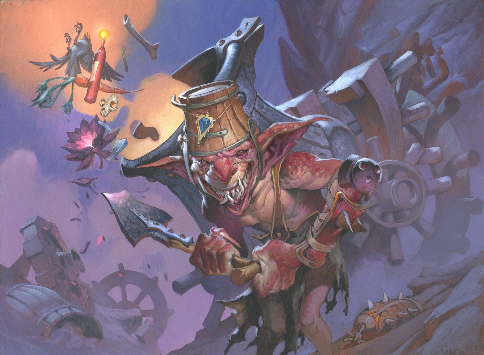
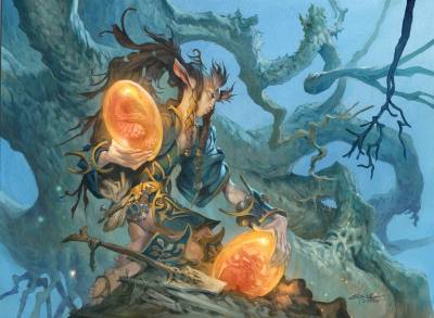
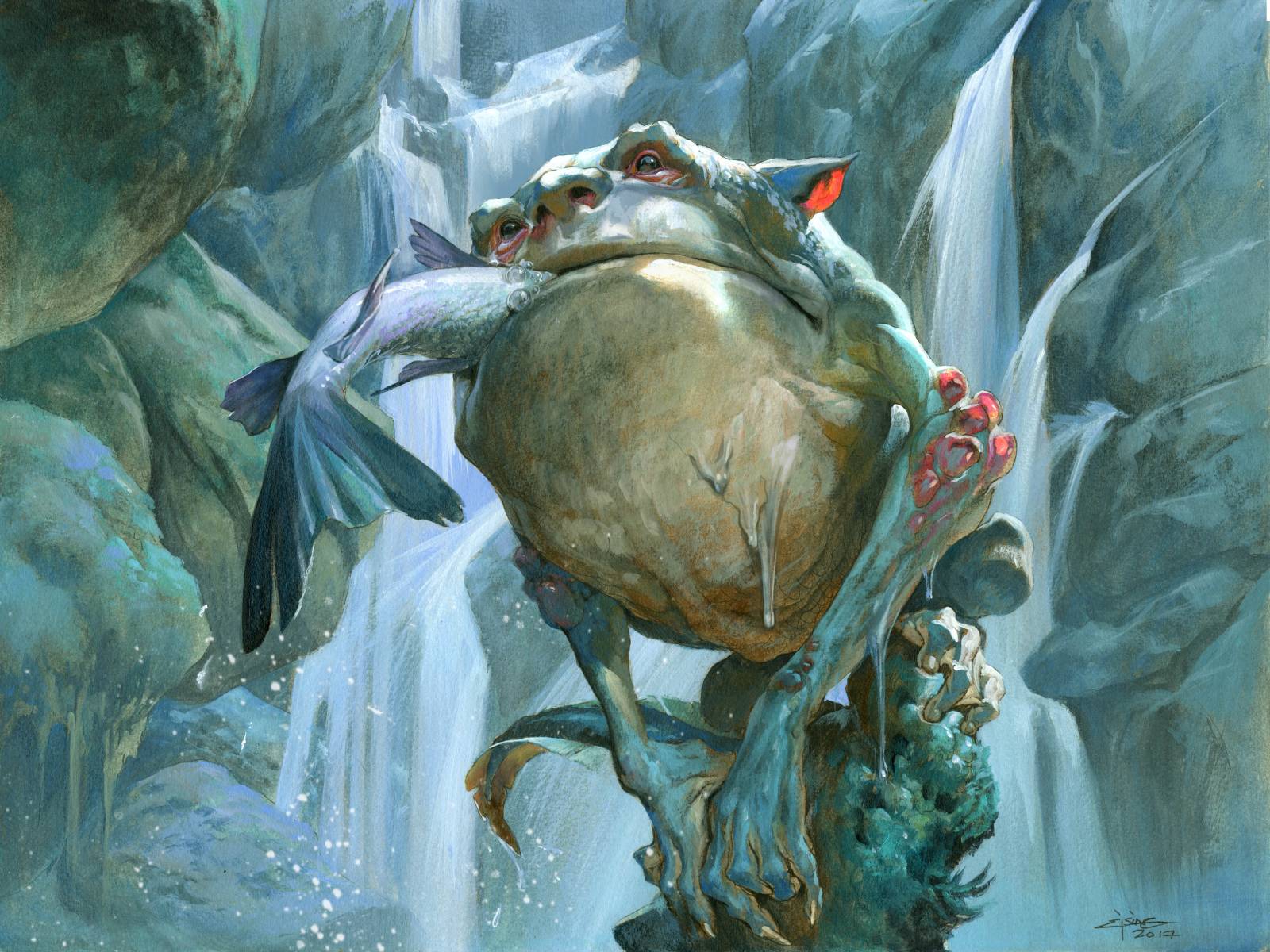
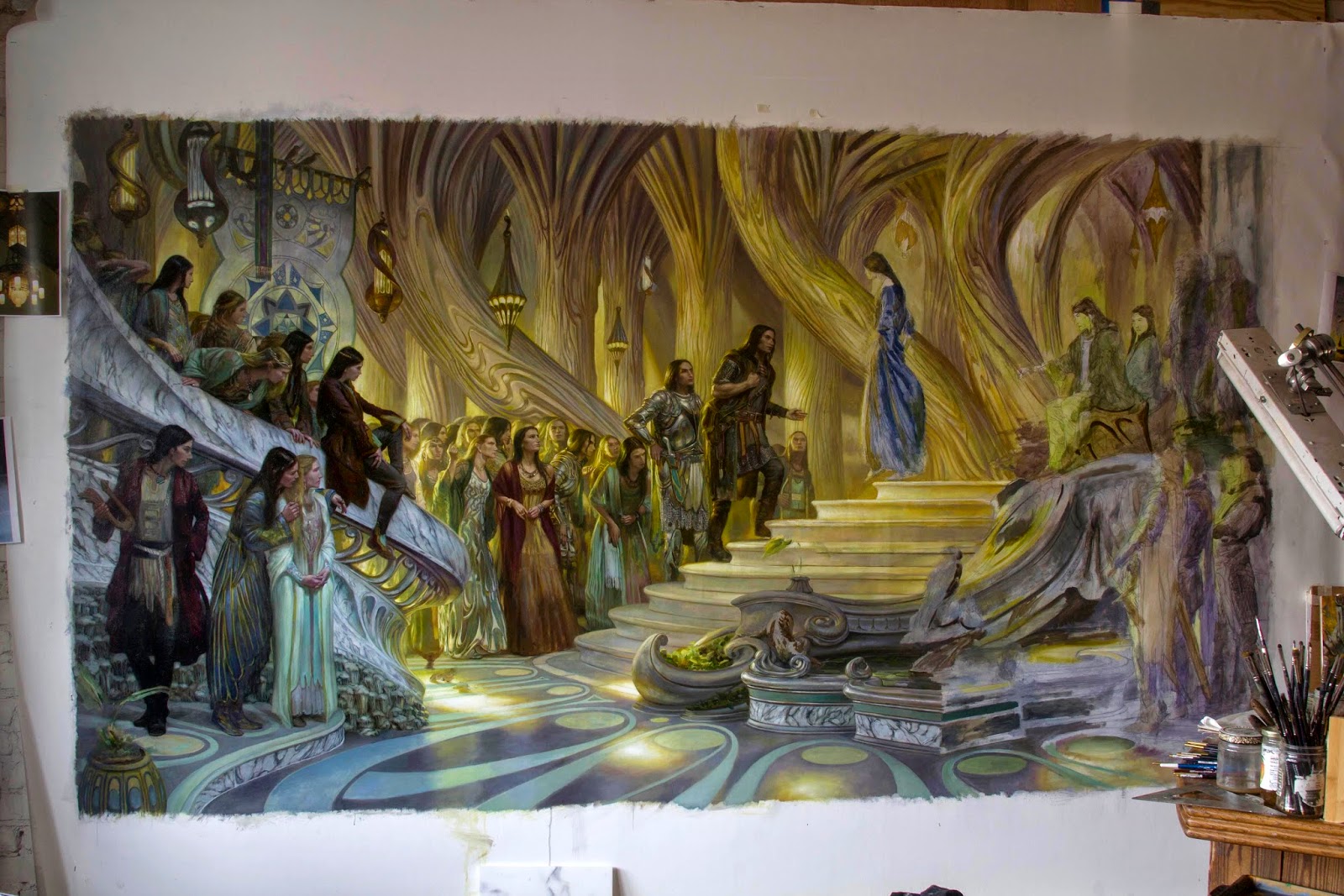
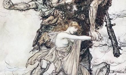
here is a bunch of examples where I feel the rimlight effect worked wonders for me.


Thank you, amazing notes!
So helpful – thanks! Gonna bookmark this! (I do that too – stare at people with amazing lighting, and resist the urge to pull out my camera.)
Wonderful, thanks Jesper.
Very helpful! Thank you Jesper!
Great notes! I have a bad tendency to overdo rim lights and use a stark white. Need to start working in more complementary colors and temperature shifts.