12 Years ago, I was commissioned by Tor books to create the cover from Brandon Sanderson’s novel ‘Warbreaker’. At the time, no one quite knew just what a phenomenon Brandon Sanderson, and his entire Cosmere, would become.
Over the course of the past decade, Brandon’s literary universe, the Cosmere, expanded and I began to fall in love with it more and more. When I created the original Warbreaker painting, I was only familiar with a small part of this universe. But as time went on, I could begin to see the larger picture, and how themes of this particular book echoed throughout his others. It gave me a new appreciation for the novel, and a deeper understanding of how it worked within the larger scheme of things. I treated the original job like any other, and did what I thought was a good job at the time. (If you’d like to see some of that process, the entire painting process was captured as part of an Instructional Video)
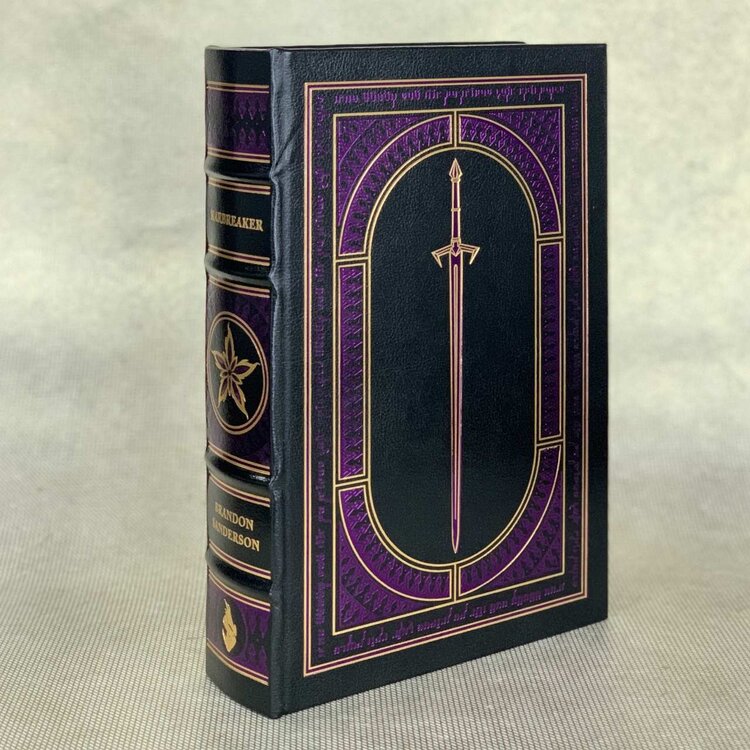
THE ORIGINAL WARBREAKER COVER, ©2007
But like all paintings, with time, one starts to see where things could have improved. I secretly wished I could have another go at the cover, but that’s not usually an option for an illustrator. Once a book hits the shelves, that’s it. It’s out in the world for all to see, imperfections and all, and there is no changing it. Unless, that is, they decide to re-release the book in celebration of it’s anniversary with all new art!
Isaac Stewart is the Art Director for Dragonsteel Entertainment, and is in charge of designing all of the leatherbound editions of Sanderson’s work (He is also the mastermind behind all of the glyphs you see in Brandon’s novels). He told me they were getting ready to release a special edition of Warbreaker, and asked if I would again produce some art for it. Since it is an embossed leather cover, there is no traditional cover art to speak of, but they offered me the endpapers of the book, the first and last art someone will see when they read the book. I of course jumped at the opportunity to revisit one of my favorite novels, and dove head first into this remarkably fun (albeit daunting) project!
Working on the Leatherbound edition posed a lot of great opportunities not usually afforded to an Illustrator working on a new title, such as the ability to listen to an audiobook version of the novel. Which is exactly what I did. I started this project by reacquainting myself with the book. It had been a long while since I read it, and if I was going to do the caliber of job I wanted to do, I wanted to get it right. So I put on some headphones, cued up my audiobook, and just listened.
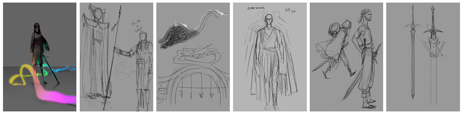
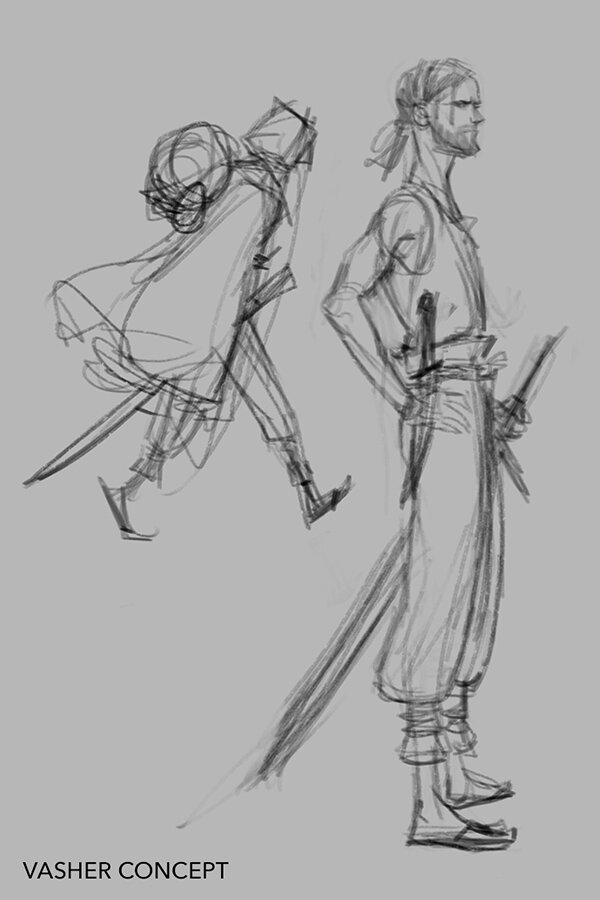
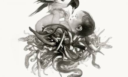
For 25 hours, I just sat there and drew. I listened to whole book, and jotted down visual notes as I went, making specific note of character costumes, appearances, and environmental details that I may have missed the first time. I used this time to sketch without any real purpose, and allowed myself to just explore. I didn’t start sketching endpaper compositions right away. Instead I just drew whatever interesting moment was happening in the story at the moment, allowing the book to lead me on a visual journey. The sketches that I did during this time served as concept art of sorts, letting me build a visual language that I would later implement into my final work. What does biochromatic breath look like? How would it move? How long is Vasher’s hair? What does Nightblood really look like? All of these things could be handled in so many different ways, and I wanted to try them all until I found the one that actually felt like what I had in MY head.
Character Likeness is a very aloof thing. You think you have an idea of what they look like in your head, until you actually try to draw it, and then nothing seems quite the way you picture it. It’s a little like a dream, where you know a person by the way they FEEL, and not just the way they look. Or sometimes, there may be a person that is simultaneously more than one person, an amalgam of personalities. Putting a face to a literary character is a little like trying to capture that same feeling. Nothing is ever quite adequate.

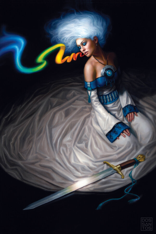
VIVENNA AND HER SHAWL © DAN DOS SANTOS
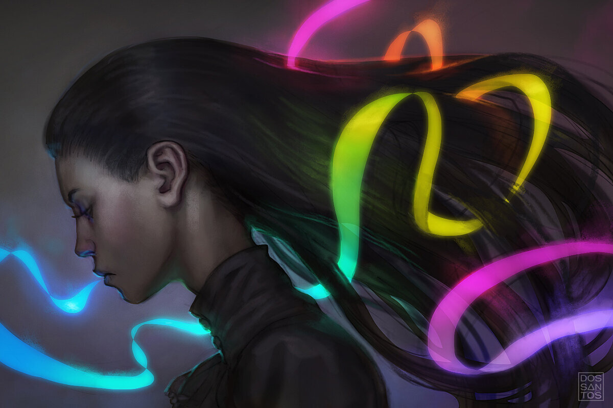
Most of the concept sketches were extremely loose, but some of them got the better of me. They were either too good to stop working on, or there was a quiet moment in the story that allowed me to keep working on one image. Ultimately, a few of my concepts turned into completely finished works of art produced simply for my own satisfaction.

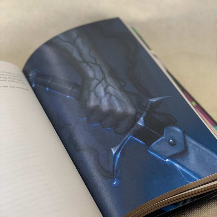
NIGHTBLOOD © DAN DOS SANTOS
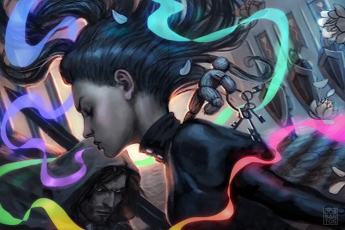
Once my re-read was complete, I began concepting the actual endpaper designs. Each endpaper is what we call a ‘double page spread’, a single image extended over two pages. This poses some unique opportunities, as well as challenges. I need to be aware of where the page splits, making sure it doesn’t land in a critical visual area such as a face, and I also need to consider how the two endpapers work as a pair. Essentially, I’m trying to balance four images in one. I also needed to be careful about spoilers. Unlike interior art, the reader would be seeing this image before they begin reading, so I can’t go spoiling some major narrative moment.
Like most jobs, I did dozens and dozens of ‘thumbnails’, small conceptual sketches, before deciding on which ones I would actually go ahead and refine into fully realized sketches. It’s a challenge to whittle down 50 ideas into just a hand full of the best. But once I had a selection of options I felt were good representations of the book, I submitted them to the Art Director.
It’s hard for one image to truly encapsulate all the aspects of a multi-faceted novel. So I try to offer a variety of options when sketching. Some sketches capture the book’s sense of magic, others the narrative, and some the drama.

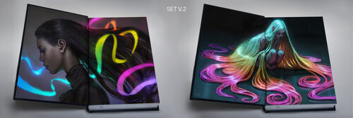
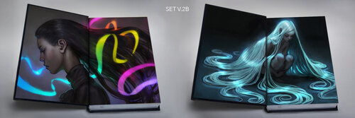
Because the endpapers needed to be considered as a pair, I went ahead and put together mock-ups of what these paintings might actually look like in a finished book. This would better help the client envision the final work, and help him decided which two images looked best together, as there are multiple combinations available.

This is the phase where things get hard, and tough decisions need to be made. I tend to pour my heart into my concepts, and I don’t submit a sketch unless there is something I really love about it. But the sad fact is, typically only one sketch (in this case two) will make the cut, and all the other ideas will get trashed, usually to never see the light of day. It’s like giving birth to triplets, only to have to decide which ONE you want to keep. It’s always difficult to see a sketch with lots of potential remain unfulfilled.
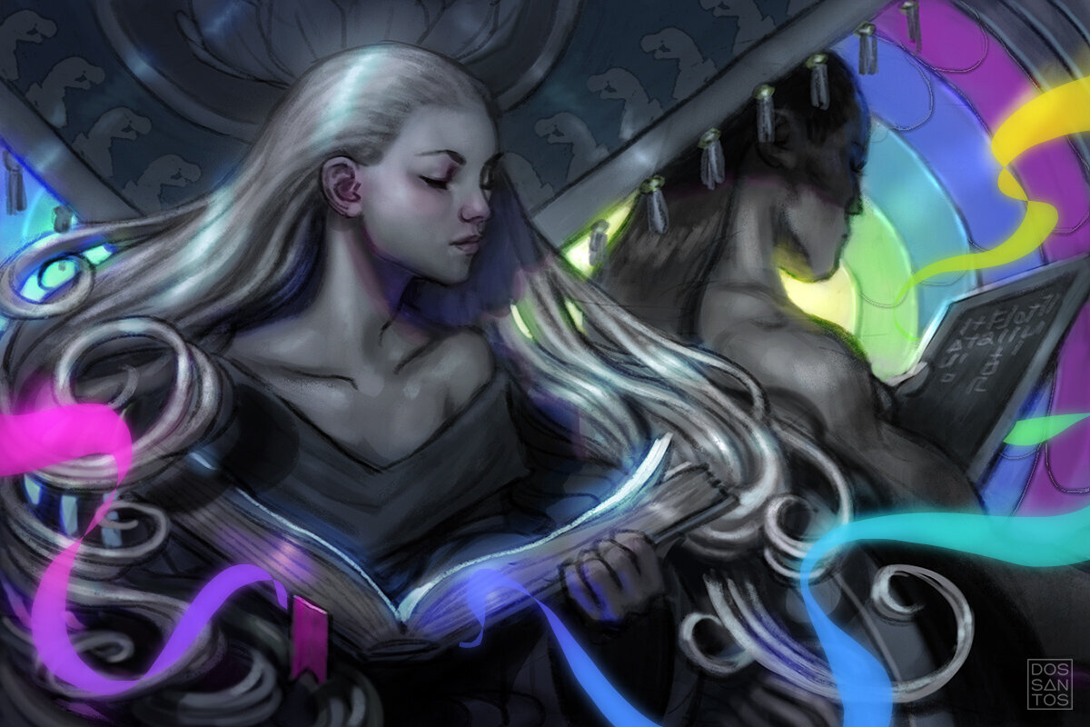
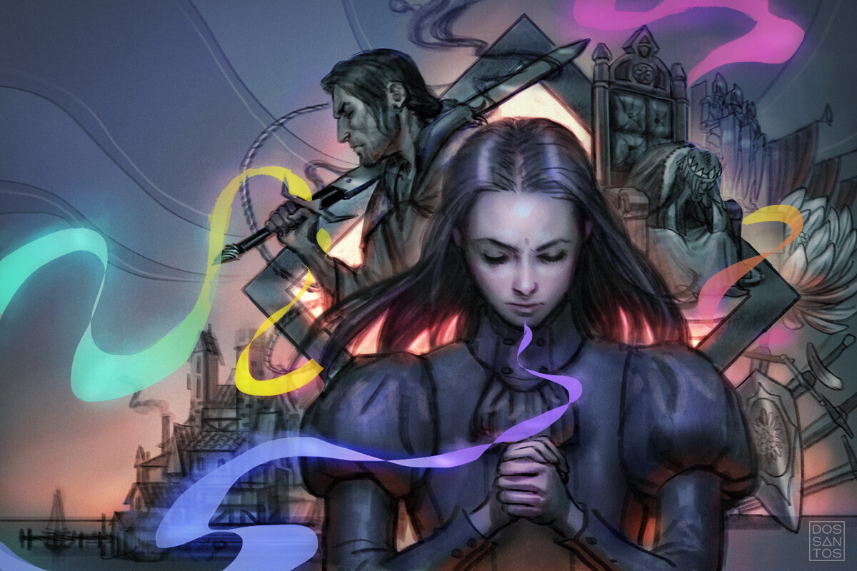
The Art Director, Isaac, showed the sketches to Brandon, and together they decided which pieces would make the cut. They opted not for their favorite image, but for the pieces which they felt would make the best endpapers, which are not always the same thing. Just because an image speaks to you, or is really striking, doesn’t always mean it’s the most appropriate solution for the task at hand. Brandon and Isaac opted for the two sketches you see here…

Once I get sketch approval, the job starts moving VERY quickly. There are a lot less decisions to be made, since I’ve already worked so many of the problems out before this. My main goal at this phase is to acquire reference so I can improve my drawing, and begin executing the final art.
When I painted the original cover 12 years prior, I used a good friend of mine as the model. Her mixed race appearance is quite similar to how I envisioned Sanderson’s characters (who are not typical Caucasians). So when I got the job to do the endpapers, I thought it would really appropriate, and really fun, to use the same model again. Fortunately for me, my model is blessed with some amazing genetics, and didn’t appear to have aged a day over the past decade, whereas I aged about 20 years somehow!
I contacted her and sent her my concept sketches. She had since moved away, so photographing her wasn’t an option. Instead, she graciously photographed herself, trying her best to match my sketch and the lighting that I needed.
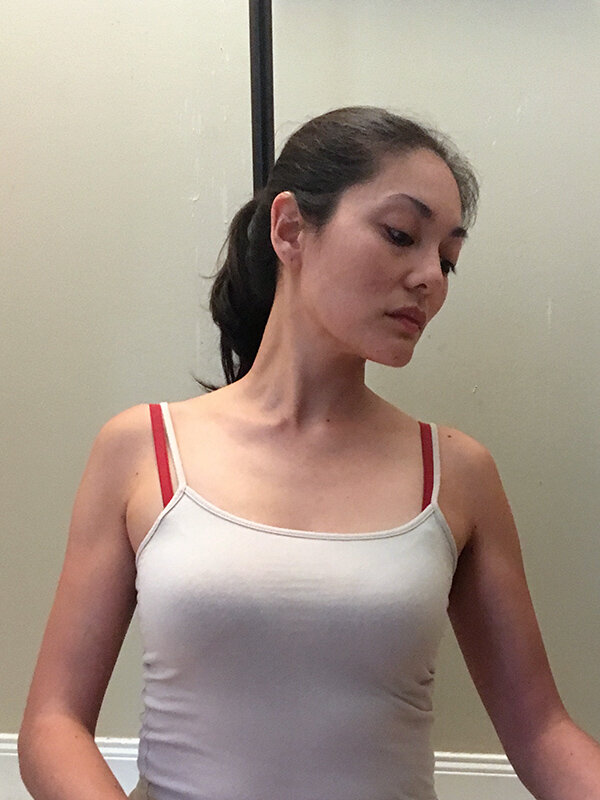
With some good reference in hand, I began to redraw my image onto my illustration board, and begin the long process of painting the image in oils.
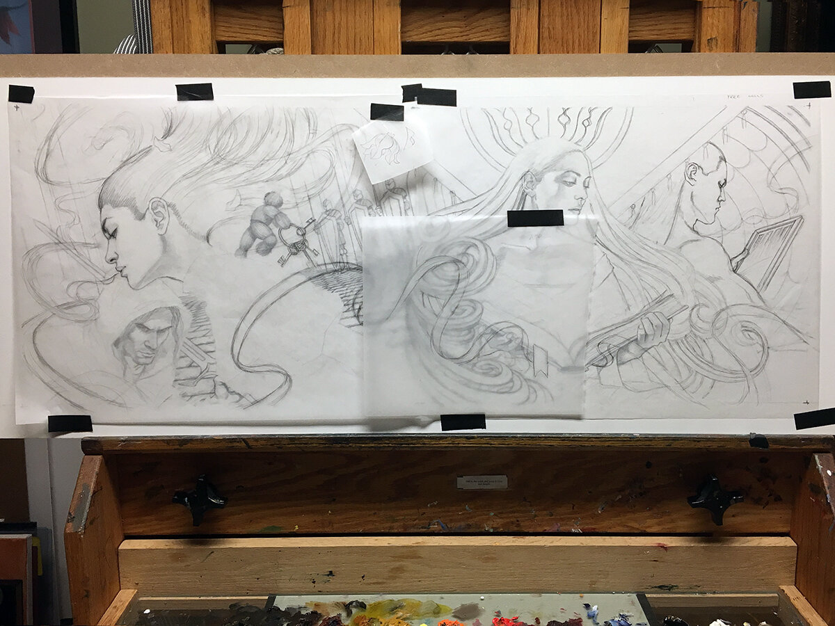
THE UNDERDRAWING, WHERE I OFTEN MAKE USE OF TRACING PAPER TO HELP PLACE AND REVISE CERTAIN ELEMENTS.
The execution of the painting itself was fairly typical in most ways, but uniquely challenging in others. Because I’m a glutton for punishment, I decided it would be really cool if these two endpapers actually linked together to form a single large, grand image. This was fine in the sketch phase, but once I began painting it, I started to realize how many challenges that actually poses. Most notable was the color palette. Color is a very fickle thing. A color can appear completely different depending on its surroundings. It’s what artists call ‘color relativity’. For instance, a simple shade of red can appear brown, or hot pink, depending on what you surround it with. Locking on to the precise color you actually need takes several tries sometimes, as it’s appearance will change as you begin to lay in more colors around it. Normally this isn’t too much of an issue, it’s just part of the painting process. Typically, I only have to worry about the color relativity across a single image, but since this image was essentially four paintings in one, I found myself having to balance the color relativity across four images, an exponentially more difficult task! I would paint a certain shade of blue, convinced of it’s correctness, only to reach the other end of the painting, paint a different color, and realize the original blue was way off by comparison! This happened OVER and OVER. It actually took a stupid amount of passes before I got the entire image looking like a cohesive whole.
THE DREADED UGLY PHASE!
In addition to relativity issues, I also had a difficult time getting the kind of glow I wanted from the biochromatic breath. Achieving glowing colors is remarkable easy in digital mediums, but are much more challenging in real pigment. Certain pigments just don’t get THAT bright. I found myself having to tweak a lot of colors for print, and even used a few fluorescent colors in the original painting to get the glow I wanted, despite knowing that they wouldn’t be reproducible in CMYK.
Aside from the color challenges, the rest of image went pretty smoothly. I pushed the deadline down to the wire (I’m sure to the horror of my AD), so that I could give it the time it deserved. Once completed, I photographed the image for a high-resolution file, and sent it off to my client!
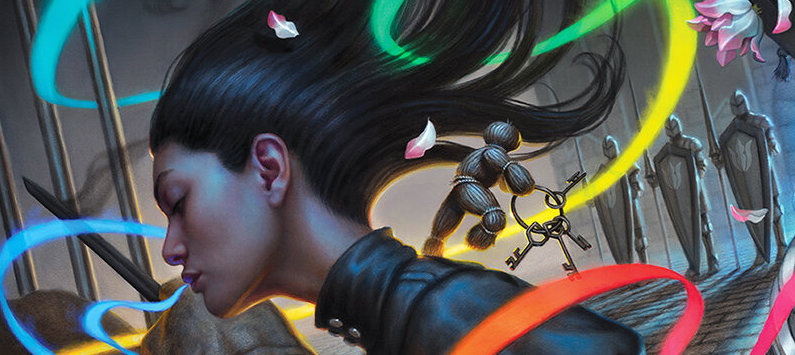
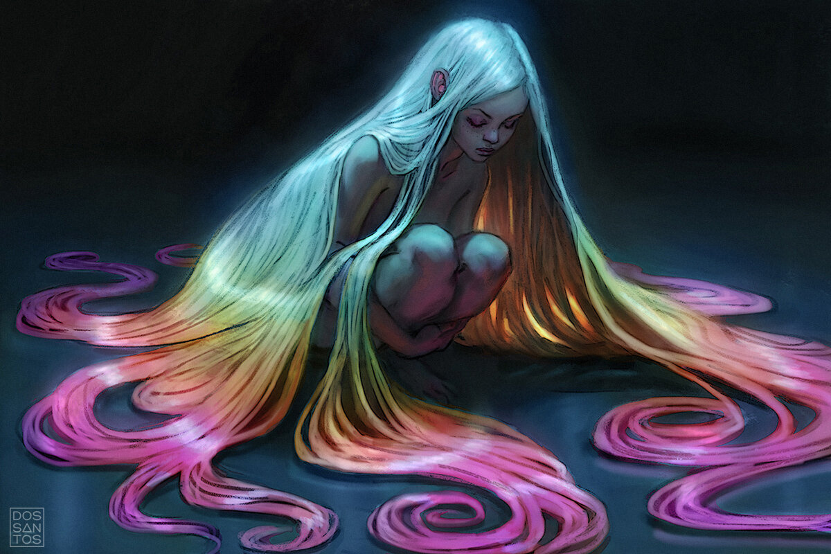
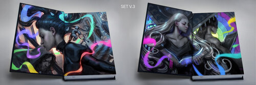
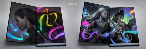
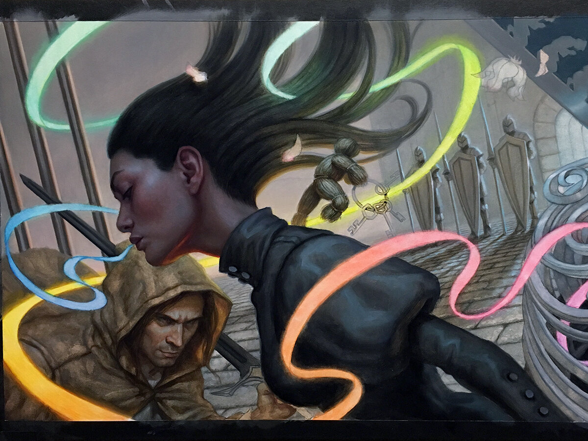
Here you can see the final art as it appears in the book…
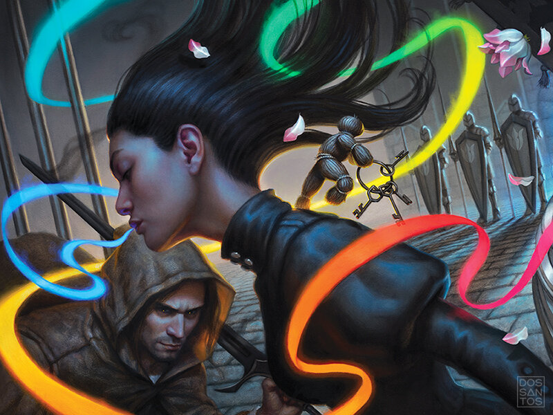
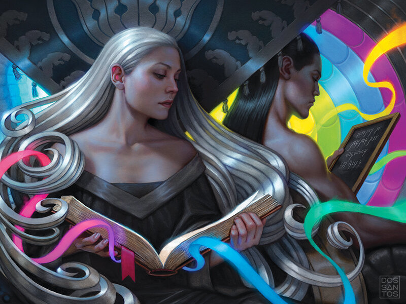
And here is how the completed endpapers look when pieced together as a single diptych…
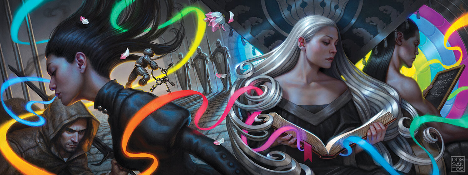
THE COMPLETED ENDPAPERS FOR THE WARBREAKER ANNIVERSARY EDITION © DAN DOS SANTOS
For those of you interested in acquiring a cool connectable print of the new Warbreaker endpaper art, I have a very limited number of them available right HERE.
The Art Director also asked if some of my other sketches were available to use as additional interior art. This was a pleasant surprise. They had already served their purpose as far as I was concerned, but it’s always nice to give an unused sketch a second chance at life!
The final product, the Leatherbound edition (available HERE), is a true work of art. With embossed leather, a metallic spot treatment, and even iridescent paper stock, the book is just stunning. It is full of art from a variety of artists, including Howard Lyon, Micah Epstein, Miranda Meeks, and many others, and is truly the rendition that this wonderful novel deserves!

Thank you for joining me for this behind the scenes look at the creation of the Warbreaker Leatherbound Endpapers. I hope you enjoyed it!
For those of you who are interested in doing artwork like this yourself, I have two unique educational opportunities coming up, both with Isaac Stewart, the Art Director on this project.
The first is a 14-week online mentorship program, where Isaac Stewart will be a guest speaker. This program is custom tailored to help aspiring artists reach professional skill levels. Isaac will visit the class with a mock cover assignment, and students will produce a book cover worthy image with the same expectations and process as a professional. Classes start very soon though, so don’t delay! It’s a life-changing experience, and the perfect gift for the aspiring artist in your life. For more info click HERE
The other educational opportunity is the ‘Fantastic Arts Conference’ in Utah this March. Think of it like a Ted Talks for artists. At this conference, both Isaac and I will be presenting, along with a slew of other incredible artists, including Brandon Sanderson! At this conference I will discuss my thought process behind creating a cover image, and then, with a prompt from Brandon himself, I will create a client-worthy cover sketch (similar to what you saw above) on the fly, as a live demonstration. For more info click HERE.


What a great post Dan. Your struggle about how to bring a character to life on paper that you have in your head is so well described! Also glad you got to re-use some of those sketches!
Insane, Dan! You’re such a superstar, thanks for sharing the journey <3
Guess who just decided to eat instant ramen for the next five months, and sign up for a thing…
Great Article Dan. I just finished reading Warbreaker for the first time (I only knew of these characters from the Stormlight novels before) great book, and now I need to watch your warbreaker dvd again to finally understand the magic “breath” you were really emphasizing in the piece. :3