Thanks for all the kind responses to Friday’s crits! Several people mentioned that it is difficult for readers to make comments regarding a particular image because there are no names attached. I did this because even though someone has entered the Art Order competition, it does not necessarily imply that they volunteered to have their work publicly criticized. Thus, I felt it best to keep the crits anonymous. If you would like to make a comment about a particular piece, simply post a link to said image in your reply. There are so many awesome submissions pouring into Art Order every hour. I really wish we had the time to mention them all. Rest assured, whether or not we got to discuss your piece, we are looking at everyone’s. Now onto Round 2! **************************************************************************************************************************
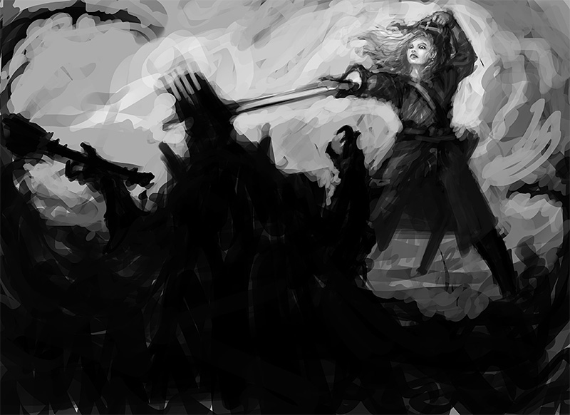
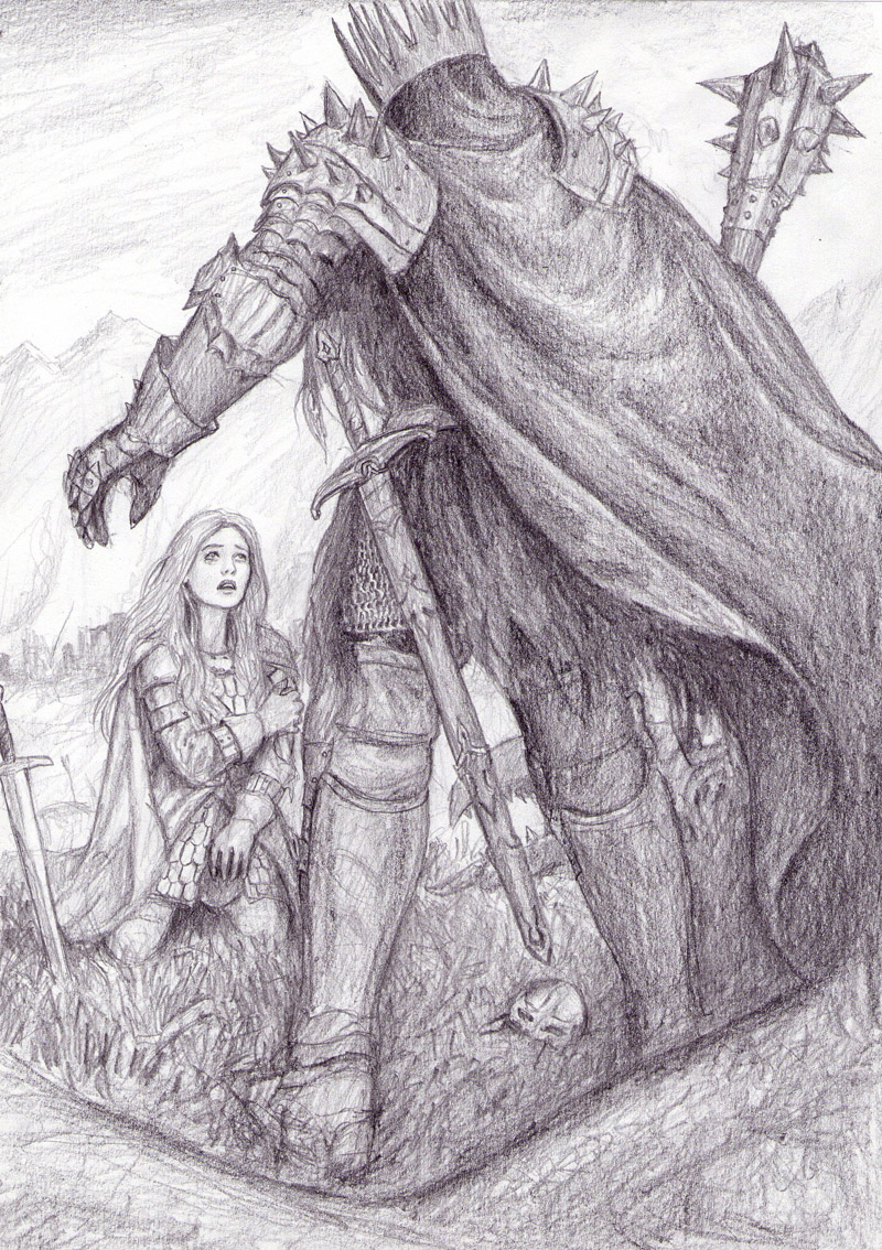
 AF: Very nice stylization, reminiscent in a way of Disney’s Sleeping Beauty. Eowyn’s pose seems too forced and stiff when compared with the fluidity of the Witch King (and that’s some long arm!). Try repositioning her legs and other arm to give her figure more natural balance.
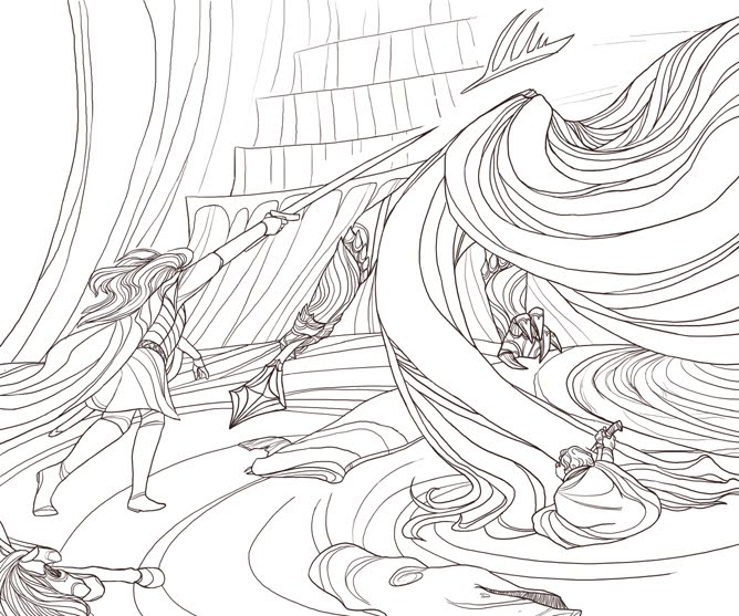
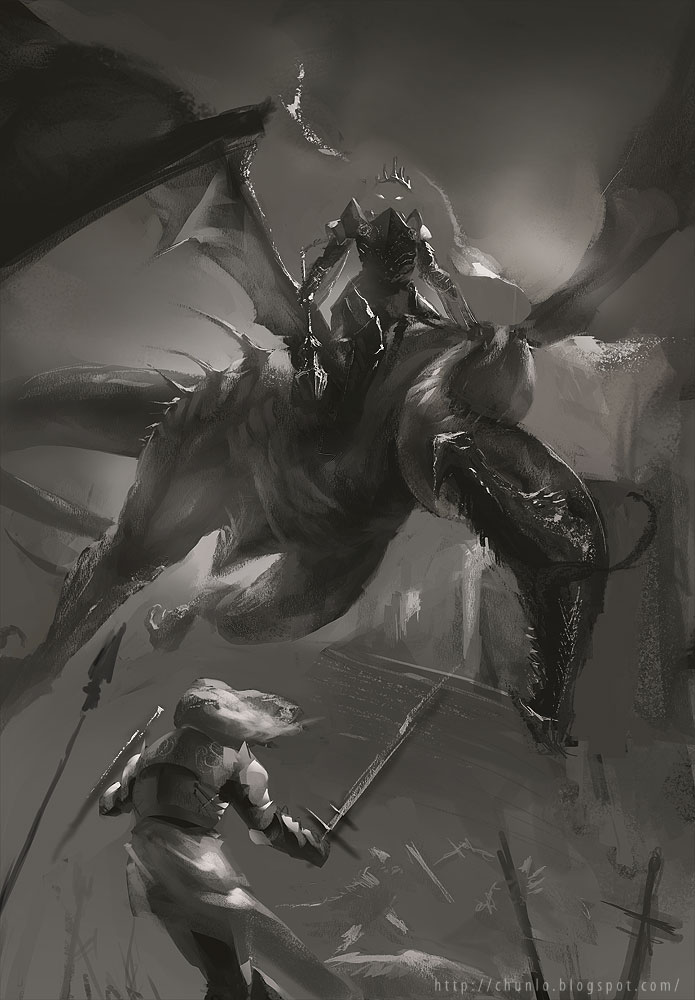
DDS: Like Arnie, I really enjoy the stylization of this piece. But the character’s poses could be better, The Nazgul is really just standing there with the mace hanging at his side. You need to twist their torso more and add a sense of weight to their poses. I also think the horse in the bottom left seems like an afterthought. Either show more of it, or get rid of it completely. **************************************************************************************************************************
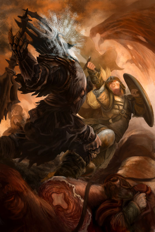
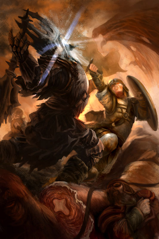
 AF: A strong, well designed interpretive illo. I could easily see the finish as a book cover or movie poster. My only suggestion would to raise the Fell Beast a bit so that the Witch King’s crown is not competing with its mouth for clarity.
DDS: This is a really beautiful image. But be careful of symmetry. Even though you may have the same thing going on on both sides of an image, the sides should not looked cloned. For the most part you’ve handled it perfectly, but the mirroring of the smoke looks lazy and takes away from it’s ‘organic’ quality. **************************************************************************************************************************
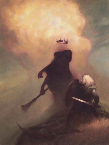
 AF: Yes, proportionally this is all wrong…but it works as a symbolic interpretation of the scene. Eowyn is tiny, forlorn, and hopeless as the Nazgûl approaches. You feel for her, you’re drawn into the scene. The color seems to be coming along nicely, too, so…good job.
DDS: Gorgeous! My only suggestion would be to tilt the Nazgul’s crown forward a little. The ellipse it creates will make it look like he is looking at her. I would also move Eowyn’s sword into the foreground and showcase it a bit more. It’s not doing much for you at the moment, and you can make better use of it’s angle. **************************************************************************************************************************
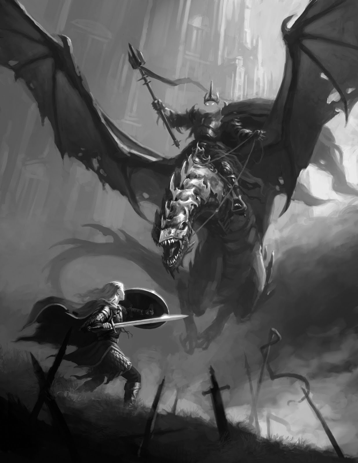
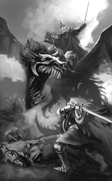
 AF: Powerful piece. The beast’s head is getting a little lost with its position in relationship to the neck; I’d suggest lowering the head a bit to give it better definition. Also, the sword (or scabbard) in Eowyn’s left hand looks a little awkward. I’d suggest lowering the arm and perhaps giving her a shield.
DDS: Close the Fell Beast’s mouth a bit. What you gain in drama from the open mouth, you lose in composition. The silhouette of his head is much more important. I think you can also make Eowyn bigger.
**************************************************************************************************************************
 AF: This is a lovely piece, but the looming Nazgûl seems too dark and lacks definition while the detailed foreground seems too light and draws the viewer’s eye away from the action. (The horse’s teeth and mane are what you look at first.) I’d suggest reversing the values, making the foreground darker (probably not this much!—I was in a hurry!) while lightening the top a bit, more or less putting Eowyn into the center spotlight. The only other nit is that her shattered shield is a little visually confusing. I’d suggest refining or eliminating it entirely. (Paint-over below)
 |
| Paint-over by Arnie Fenner |
**************************************************************************************************************************
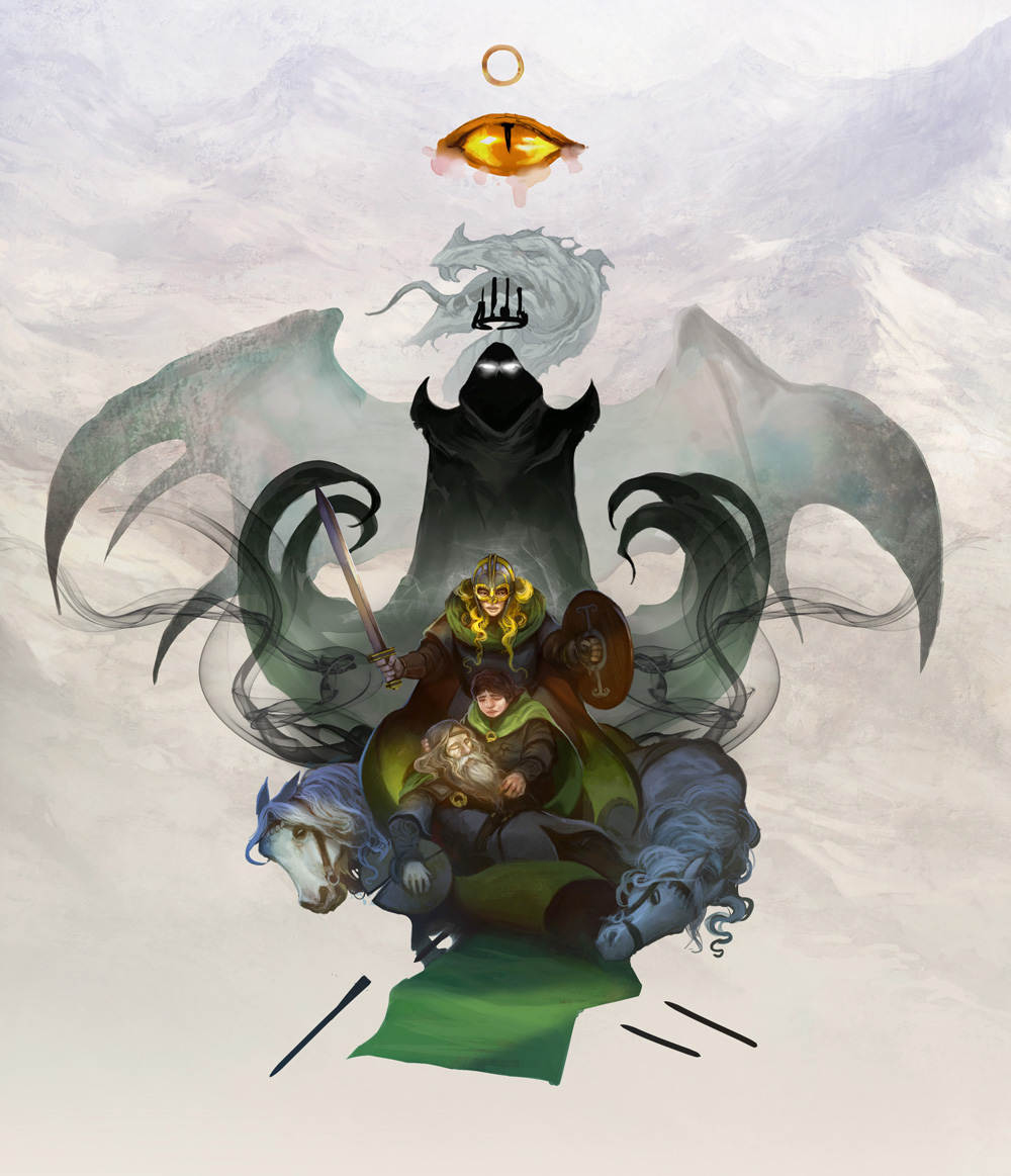
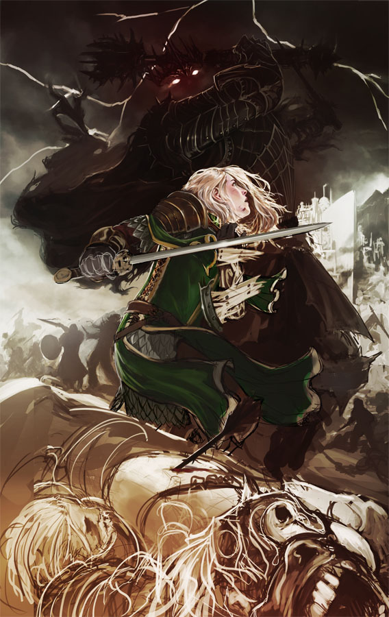
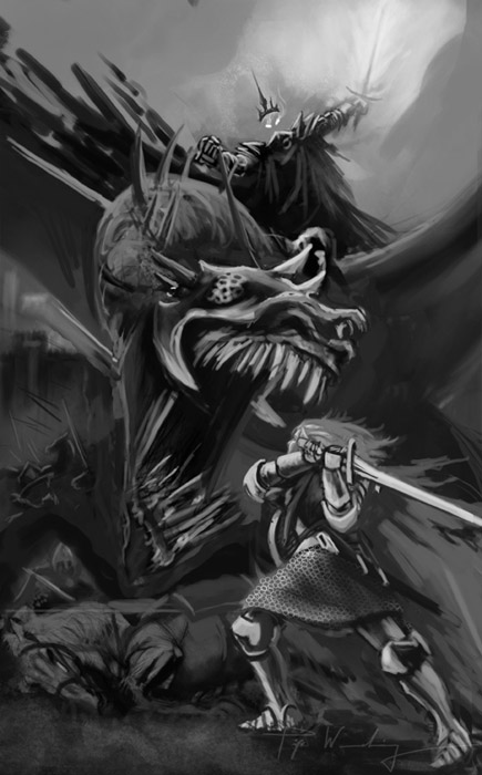
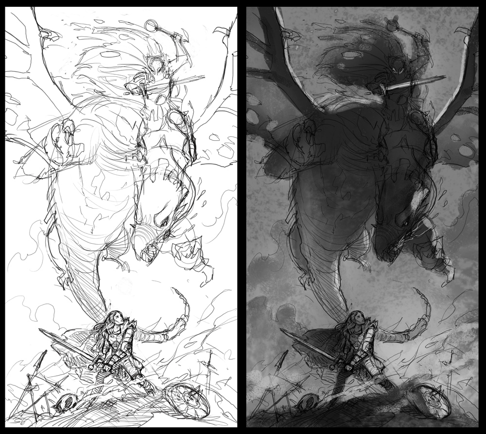
 JE: This one just is fantastic! I really am impressed with the drawing skills and compositional skills it shows. But it could almost be any old fantasy painting. Without the dead horse and Theoden dead trapped underneath it is a bit too generic. I would add the king and some more twisted bodies and horse legs sticking up of the mud instead of the swords. Two small things: the grip on the sword looks weak. The cross guard could be turned so it follows the underarm. It gives more powerful grip: grab a sword and hold tight and feel how awquard the weight is if you hold it wrong. The other thing is the Fell Beast’s legs, they are a tad too similar. I would stretch his left one a bit and raise the other one up for for-shorting. Just to ad a little more interest or spring to the pose. AF: Beautifully done. My only suggestion would be to increase Eowyn’s size to help make the viewer an active participant in the action, not a passive observer from a distance. (Paint-over below)
  |
| Paint-over by Arnie Fenner |
**************************************************************************************************************************
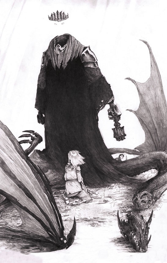
JG: This is a great piece and I really look forward to seeing it finished. First off, I am fairly sure the artist intends to add eyes, but in the off chance that they don’t, I will mention that it really needs it. We can get a sense that the Nazgul is looking at Eowyn by the orientation of the crown, but I think that because of the hands position, which gestures down to the left, it really needs the glowing eyes to show that he is definitely looking down on her. I really like the choice to sort of leave a hint of a shadow where the head should be. The shadowy silhouette is a great approach for the Nazgul, and David has handled the edges here really well. I wouldn’t mind seeing just a hint of glittering metal in places to kind of give the form just a little more definition. Also it wouldn’t hurt to add just a little more atmospheric distance between the foremost hand and the hand holding the mace. Overall though, I really like this treatment with the ghostly edges. As for Eowyn, I like her pose, but would like to see her legs just a little longer. I realize she may be hunched over a bit, but because of the lighting it kind of reads as though she has small legs. Part of it may be that her right foot is under the wing of the felbeast and her left foot is in taller grass. I think this could be played with a little and it would feel a little more natural and fit a little better with the really excellent treatment of her upper body and the sword and shield. In the comments the artist mentioned that something needed to go in the bottom left and I agree. As to what, I tend to say something that isn’t distracting but that adds to the narrative. I would lean towards something that shows the aftermath and carnage of the battle. A dead horse’s body, a fallen soldier or arrows and broken banners. Whatever it is though I would want to make sure it stayed dark and vague and didn’t pull us out of the great lighting focal point that is on Eowyn. Overall though, killer work and I really look forward to seeing the final. **************************************************************************************************************************
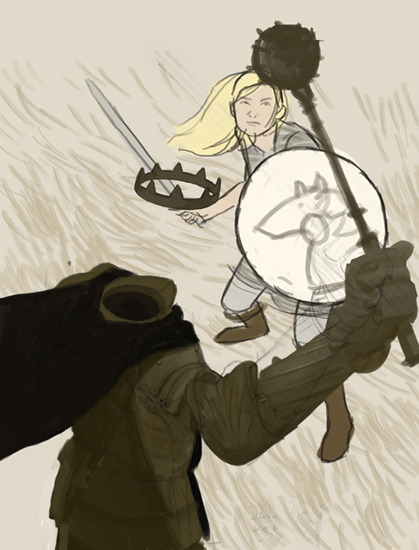
EF: This sketch has potential. It looks as if Eowyn is staring at the ball at the end of the mace. Because her face and the ball are so close together this interaction between the two keeps our attention cycling in that small area. Maybe having Eowyn looking at where the Nazgul’s face would be will expand the viewers attention between the figures a little more. Also, stand on a chair and have a friend swing a bat one handed to note how the body may twist and shift weight etc. This nazgul is feeling pretty stiff.
DDS: Increase the size of the Nazgul’s body, and arch his back more. His pose needs a LOT action to it. Remember, swinging a mace (or a bat, or even a punch) starts in your FEET. It moves up to your hips, through your back, then shoulder, then elbow. The motion uses your WHOLE BODY. Show us that. Make the impact of the impending blow a real threat. Aside from that, I think you need to better ‘connect’ the Nazgul’s crown to the body in some way. Be it proximity, or a black haze, or maybe a cast shadow. There is a lot of empty space there at the moment, and it’s killing the composition for me. **************************************************************************************************************************
 |
| Paint-over by Justin Gerard |
**************************************************************************************************************************
JE: I really love the angle of this picture. The focus on Eowyn is great. The color rough just doesn´t help the reading of the picture. What works so great in the grey tone version is the flatness of the surface she is standing on. Keeping it light is going to be the key to success. Keep all black out of the middle and background and max out on the contrast in the Witch-kings hand to pull it forward. One thing I would do to pump up the drama is to make a drop shadow on Eowyn. One that covers half bottom of the shield. That way we know the Nazgul and Witch-king is closer and the connection between them is heightened. The mace is a bit boring. Look up some historical ceremonial weapons for inspiration. That mace is surposed to be the baddest mace in all of Middle-earth. **************************************************************************************************************************
JE: I love the way the composition all circles in toward the action of the sword thrust. The posing are really dynamic and the color theme is great. But I thing the whole image is somewhat to squashed. It would benefit from opening up and adding a bit of space. Maybe loose the wing? The only thing I really thing is wrong is Eowyns sword arm. She is behind the Which-king yet the hand and arm is not thrusting forward. The grip feels wrong and not forceful enough. I would stand in front of a mirror point a sword or a broomstick to study the foreshortening and angle of the hand in a forward thrust.
DDS: There is some amazing stuff going on here. But as is, the focal point is the Nazgul’s back. This is due to the hard edges and high contrast. You need to add that same level of focus/contrast to the area BETWEEN the two figures. Move Eowyn’s cape and hair as necessary so that you can add that bright sky between them and emphasize their silhouettes. (Paint-over below)
 |
| Paint-over by Dan dos Santos |
**************************************************************************************************************************
JE: The acting of her face is genius. The facial expression is to me the most difficult thing to capture, but this one is just right. Lets just say that the stray from the story is not important. She takes of the helm, revealing she is a woman and then fights the witch king, not the other way around. But the drama of this illustration is just great. The wing tip that bends in toward the focus is good. If you should continue on this sketch I would think a lot about the posing of the Witch king. Right now I cannot tell if he is lying half on his back or his knees?
DDS: Eowyn is fantastic but the Nazgul needs a lot more work. I’m sure you’re still working on it, but try not to make him -all- black. Add some fill-light to his back so we have some details to look at. It will also break up that large mass of black so that the blacks in Eowyn take on a bit more importance. **************************************************************************************************************************
JE: I like the desperate gesture to Eowyn the way the which king towers above her and frames her with the arm is good. Eowyns head is a little too big for her body and there is some perspective mistakes in the mace but as a composition ad the telling of drama this one is great. The cropping should be zoomed out to not cut the crown.
DDS: The poor cropping of this image is defeating an otherwise -stellar- drawing. I don’t know if you plan to draw or paint this, but you really should add more bleed to the top. **************************************************************************************************************************
JE: This sketch is the closest to the one I would have drawn myself. The dynamic of the beast and the simpleness of the compositional elements is just up my alley. The way the beasts lower body and tail bleeds into grey is a nice trick, that I might have used before. Only thing that stand out o me is the pose of Eowyn. I know how badly you wanted to show her from the front, and I do know how difficult it is to stage the figures right so that we do not look in the back of the head of either the monster or the hero. But since you do have her frontal, how about crouching her as if she was grieving over her father and only right his second turns her head towards the attacker. Right now she is waiting almost like if she was bored or doesn’t bother about turning around. It would be more dramatic if she was in the middle of the turning.
DDS: I would bring Eowyn and the Fell Beast closer together. I would also bend her left knee a LOT more… like she was really about to take a giant swing.


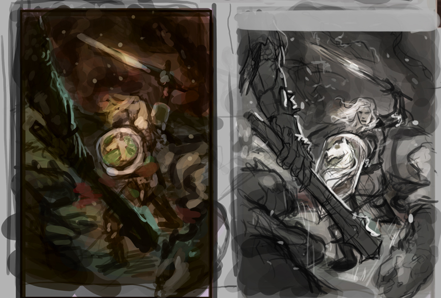
Wow, I'm really digging this challenge and the feedback is great. I'm definitely gonna enter something myself. One question, the one image (link below), with the clouds and Eowyn turned to the side is gorgeous but I wonder if you guys have any thoughts about the tone of the piece? I wonder if that sort of dreamy feeling it has works against the conflict depicted. Either way, beautiful work.
http://2.bp.blogspot.com/-QHEvCOZq8Jc/Tb4vKHTp4PI/AAAAAAAAAfc/4NfPEhixBtY/s1600/davidbrasgalla_evn_wip_04.jpg
Wow – thanks, guys (mine's fourth from last, with paintover by DDS)! I've already pretty much finished it, though, due to time constraints (I've got only a few days before I'm away til past the end of the deadline). Most of the changes suggested are already in (lost some of the hair, Eowyn has no helmet now and is the focus, the sword arm is tighter, the wing at the back is faded out, the space between them is brighter, the Witch-King has more detail to hold attention, his face's 'explosion' radiates more, and I've tried to open up the space a bit). Also, it's actually now the middle panel of a triptych with close-ups of Merry and the Witch-King on the wing panels.
I'll revisit it and tighten it up a little more based on your suggestions.
I really appreciate the time you've taken over my work!
Thank you for the crits gentlemen, Dan and Jasper! Very much appreciated and duly noted! :o) I did indeed wish to show Eowyn from the front, as I feel one of the major elements is the need to identify with her, and although much of that can be done with posture and narrative, seeing her expression is an aspect I wanted to emphasise. Will tighten up the posture and the composition… Cheers!
Thanks fellers! I wasn't expecting to get picked out for crit!
Fantastic help and inspiration. Thank you.
Thank you for the critique, Eric and Justin. It's quite helpful to me at this point, when I've stared at the image so long that I begin to doubt my judgment. Justin, I'd actually hoped to avoid painting in the eyes on the Witch King, as I thought he'd make a more unsettling ghost without eyes, but I see what you mean. *I* know he's looking at her, but it needs to be understandable to the viewer.
It would also speak to what Eric said about character interaction. The passage in the book describes Éowyn being unable to meet his gaze, and using her shield to block it out. I was trying to capture that idea in their postures, but perhaps it really does need the eyes to sell it. Adding them in could hopefully address both crits.
Thanks again for your time and attention!
Thanks a million for the critiques Arnie and Dan. I appreciate the kind words about my piece, and your insights on making it better. Thanks again to everyone at Muddy Colors for going above and beyond. Cheers!
Thanks a lot for the crits guys! I'll be sure to fix up the silhouette of my fell beast 🙂
Thanks for the crits. I'm actually going with my earlier idea and doing the witch king attacking on the fell beast, but I may give the second version a tweak if we're allowed multiple entries and if time permits.