-By Dan dos Santos
Over the last 7 years or so, Penguin books has commissioned me to paint the coves for most of Patricia Briggs‘ books. I am really fortunate, as Patty is a very popular author, and they pretty much all become NY Times Bestsellers.
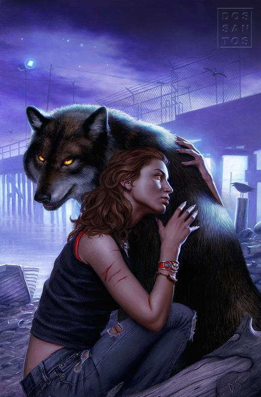 |
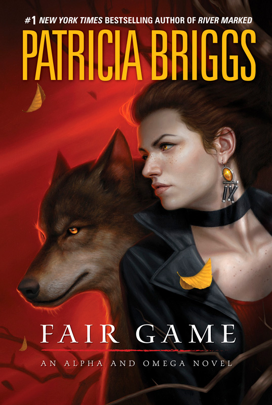
| Book #2 in the Alpha & Omega series. |
I am also really fortunate to have a phenomenal Art Director on the project, who has managed to keep the series really fun for me. Being a NY Times Bestselling book is a big deal for a Publisher, and that means that a LOT of people want to have their say in what the cover should look like. Luckily, the reverse has actually been the case here. Every time one of Patty’s covers sells better than the last, the AD responds by giving me even more freedom. To date, they have yet to request a single revision of me (knock on wood).
This cover is for the third installment of Patty’s ‘Alpha & Omega’ series, a spin-off of the hugely popular ‘Mercy Thompson’ series. This piece also marks the first hardcover printing in this series. For the publisher, that means greater printing costs… for me, it means more cover space to work with!
Because this was to be the first hardcover, and a new beginning of sorts, the AD wanted to revamp the series’ image a bit. As we discussed in a previous post, visual continuity in a series is really important. My first solution, as it often is, was a montage. I looove montages. Unfortunately, my clients rarely feel the same. Montages were very popular in the 70’s, and as a result, it tends to make a book look very dated. In this case, I was going for more of a movie poster vibe, and the AD picked up on it. She expressed a real interest in it, and I thought that I had finally convinced someone to let me paint a montage, something I have yet to do professionally.
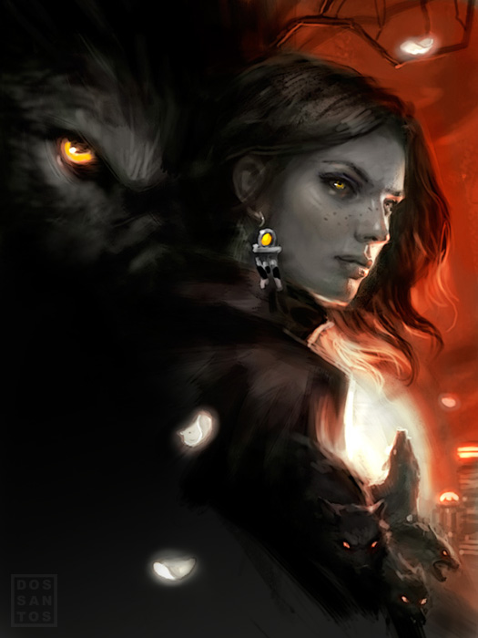 |
| Sketch #1 |
I also did two other sketches. The second being a really safe bet, sort of a common composition for an Urban Fantasy cover, and typical of what the series already looked like. The third was a bit more graphic, and looked like a lot more fun to paint.
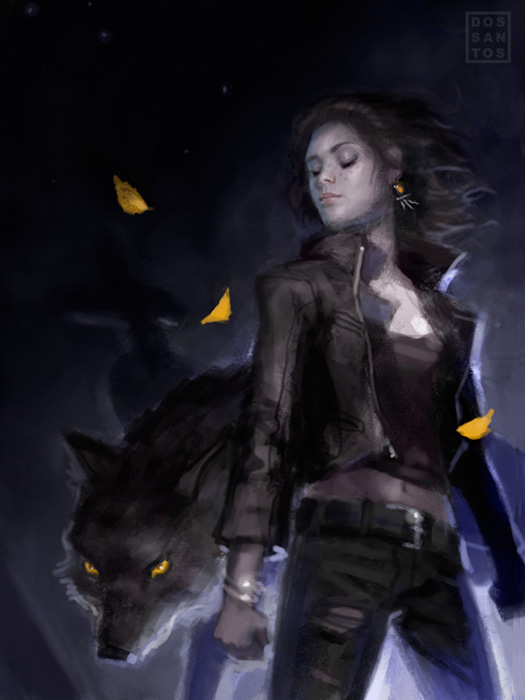 |
| Sketch #2 |
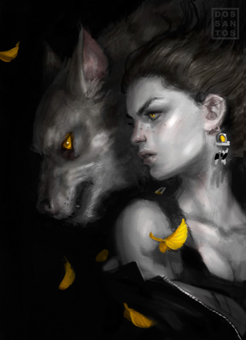 |
| Sketch #3 |
Ultimately, the AD decided she wanted the third sketch (dashing my dreams of a series of montages), but wanted me to use the colors of the first sketch. This was actually a bit harder than it may seem. A black background makes treating things graphically very easy. Elements can just ’emerge’ from the black and have very little impact on one another. But as soon as you have to paint a background, spacial relationships and proportions now play a much greater role, and all of sudden that cool composition starts to look really weird. The piece required a lot of compositional revisions to get the combo to work, but I think I finally achieved what she was looking for.
 |
| Oils on illustration board, 14×20 inches. |
Lastly, here is the final cover with it’s type treatment. The book, which is already available for pre-order on Amazon, won’t actually be available until February of 2012. In fact, I’m not certain the manuscript has even been completed yet. So when someone asks why it is that that the covers don’t always match the content within… now you know. Illustrators have to sometimes paint the covers a year in advance, long before a manuscript is even available.
And for those of you that follow Muddy Colors closely, this is the first of two red paintings that I had mentioned previously.
God damn, Dan! This piece looks fantastic. I love the sketches, any of them would've been killer. I'm now curious to see what other compositional solutions you came up with before settling on the one that is now the final piece. Were there other variations of the final sketch that you wanted to do more or are you happy with what you finished with? I think the tree branches are an awesome way to go about breaking it up. Nicely done, sir. 😉
Yet one more beautiful cover, Dan. Question: As a rule, do you usually warm and darken the hairline?
Great post. As always, thank you for sharing your process.
Awesome work as always Dan! I'm really diggin' the red in this one and it was a smart choice to echo it in the shirt. Cool work! 🙂
-J
I actually found you after I discovered the Mercy Thompson series. Wonderful books. I was halfway through the third book when I decided to track down the artist. I simply LOVE the cover art for each and every book. Believe me, I've read them all. It's so exciting to see the next cover for the Alpha and Omega novels.
I can't wait! Your work is beautiful. Great job!
awesome Dan! Wife loves all your work too. She went on a rampage about the overseas paperbacks for the Moon Called series. People are going out of their way to get the books with your covers on them.
loved the second sketch for that one. These covers are great, I own most of those books.
And on a side note, I hate when they switch a series to hardcover! I don't want to buy them in hardcover and I hate the waiting.
I guess I'm going to be the lone dissenter here.
That cover would not attract my attention, or cause me to pick up the book and look at it. It reminds me of what I consider a typical SF book cover – a portrait of the main cover. I also find the outline/highlight around the wolf very distracting. And to me the wolf looks more like a german shepherd dog.
Too bad you couldn't do the montage, looks like you put a lot of thought into making it cool and contemporary. But at least the red background final looks gorgeous.
That sketch #1 is so awesome! It is a montage without being cheesy, and has great mood. I like the final painting as well, but it lacks the impact of that first sketch. I know it wasnt your choice, but I think what you did with final is pretty sweet, although I'm curious why you changed the expression on the wolfs face. Anyway Dan, I think your really talented and I enjoy looking at your stuff.
I really *HEART* this cover. The deep red background is so rich and vibrant, and I am such a fangirl of your artwork! Fantastic job! 😀
@ Eric: Yeah, I went through a ton of iterations before I settled on that one. But none were good enough to share here.
@ Kim: I don't know about warming and darkening, but I do increase it's saturation at times, and make the edge MUCH softer than one might think.
@ Steven: The wolf is actually her boyfriend (he's a werewolf), and I felt he didn't look smart enough when I made him mean. I also thought a more gentle expression helped push the concept that there is a strong romance element.
Very cool, reading your thoughts and seeing your ideas take shape. I have to agree I like the montage best (maybe they'll let you on the NEXT book!), and the wolf is a little “off” for me in the final one, but something that really struck me were the freckles … love them!
I've read all of those books, and this is the first time I have seen your work outside of the author's webpage. I think you have done great with the Mercy Thompson series and you exceeded my expectations for the Alpha and Omega books. For all that you make the books' covers before the content is finalized, you always capture the characters well.