I first translated Jim Lee’s art in 2003. It was a Batman statue based on a promotional poster he designed for his 12 volume Hush book series. For the statue, he redesigned Batman’s right arm/hand to make the pose more dynamic. This was still in the early days of cold cast statue production and so the cape needed to be modified to accommodate reproduction limitations. The follow-up was the 2004 Superman statue. In 2007 I sculpted nine action figures based on the Hush book series.
Earlier this year I had the opportunity to work with Jim Lee and Shawn Knapp on the Superman/Wonder Woman “Kiss” statue based on art from the New 52. I thought the Kiss statue would be my last commercial piece but then the opportunity to translate one of the most iconic images in comic art arose and I couldn’t pass it up.
Translating any 2D art into 3D is always a challenge. Jim Lee’s art is so well known, so identifiable and so idiosyncratic to the artist, there’s no part of the piece that can deviate from his vision and still be a Jim Lee statue. Having done a few Jim Lee pieces before gave me an advantage but not having worked with his imagery for a half dozen years meant I had to invest some serious time in study. I dug out all my old Hush reference and reviewed his notes from those initial pieces.
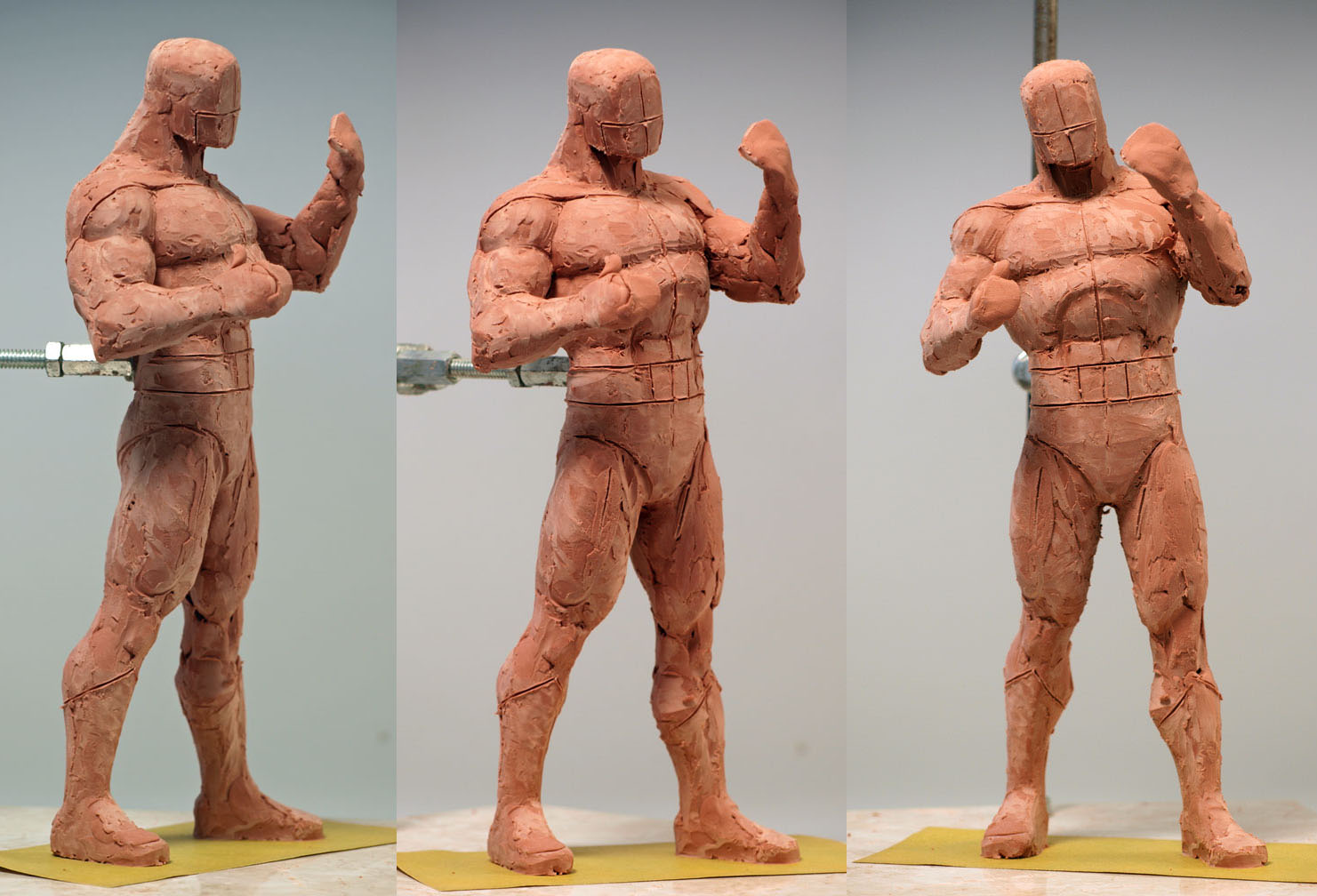
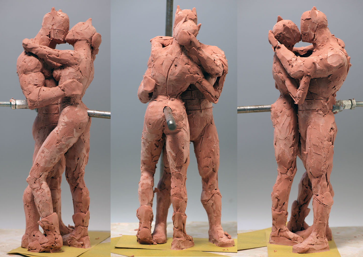

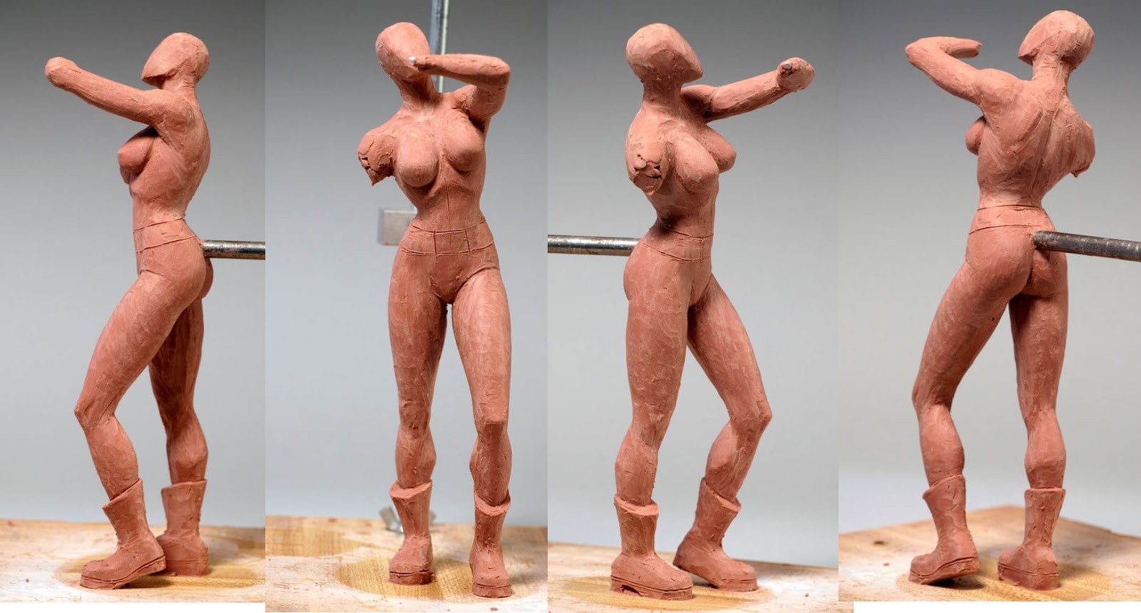
I needed a foundation on which to build the piece. Batman was that foundation. After I’d roughed him out in clay, I roughed out Catwoman working on developing their body positions and interaction. There was some concern about their leg positions in that his leg was posed between hers. But there was really no other way it could work, given the art.
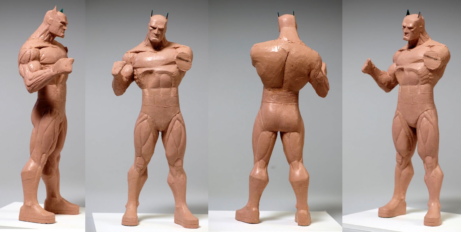
With rough clays approved, I refined the clay for Batman, making sure to keep tight to Jim’s stylistic choices. In particular the way he treats Batman’s calves and upper body. With the refined clay approved, I made a set of waste molds, poured waxes and began finish work. (Image Batcat4)
This was going to be a long and complicated piece and I needed to make sure I was going in the right direction at each step along the way. I had to keep reworks down to as few as possible. A change in one element would mean a domino of changes to other parts of the statue. So, getting approval of sculptural interpretations in parts meant I could move more quickly and with more confidence. An approval of the first pass of finish on his left leg mean I had them both. An okay on the rough of his head meant I work that to finish when I was ready.


When I had most of his body first-pass-finish in wax, I concentrated on refining the clay for Catwoman.
Waste mold to wax for Catwoman and I could start fitting them together with more precision.
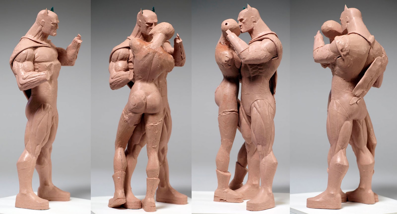
The cape. What the hell was I going to do about the cape? Logically, its one piece that looks like its going to two different directions. I cast up a couple or resins from the clay waste molds and started playing in clay. I think it was the second or third pass that the fold-over started to make sense. I studied Jim’s cape treatments throughout the books and found markers that would let me invent believable cape resolves for what was not available from the art.

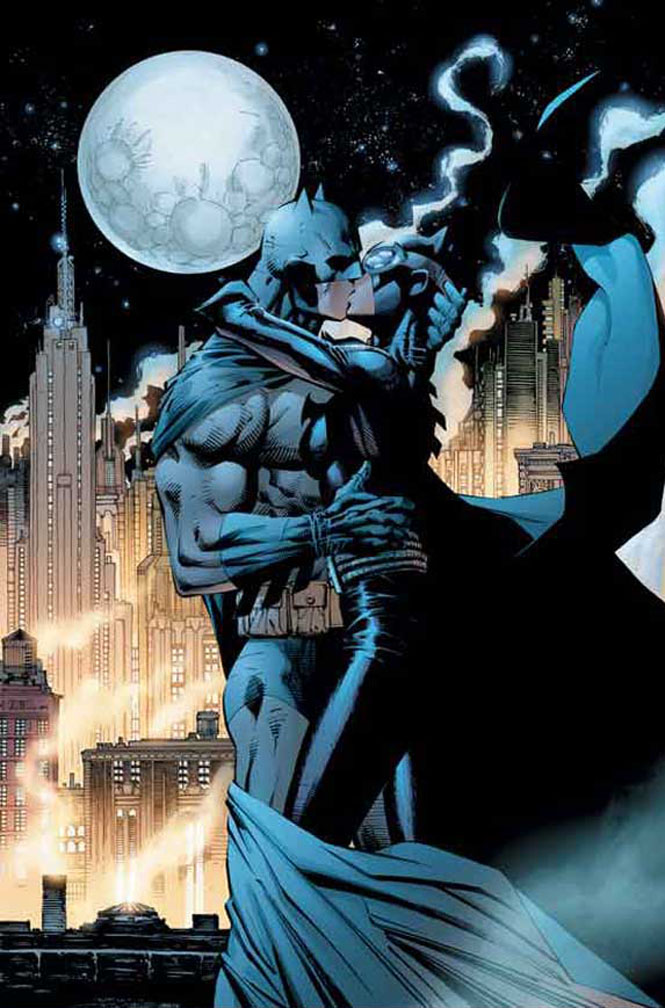
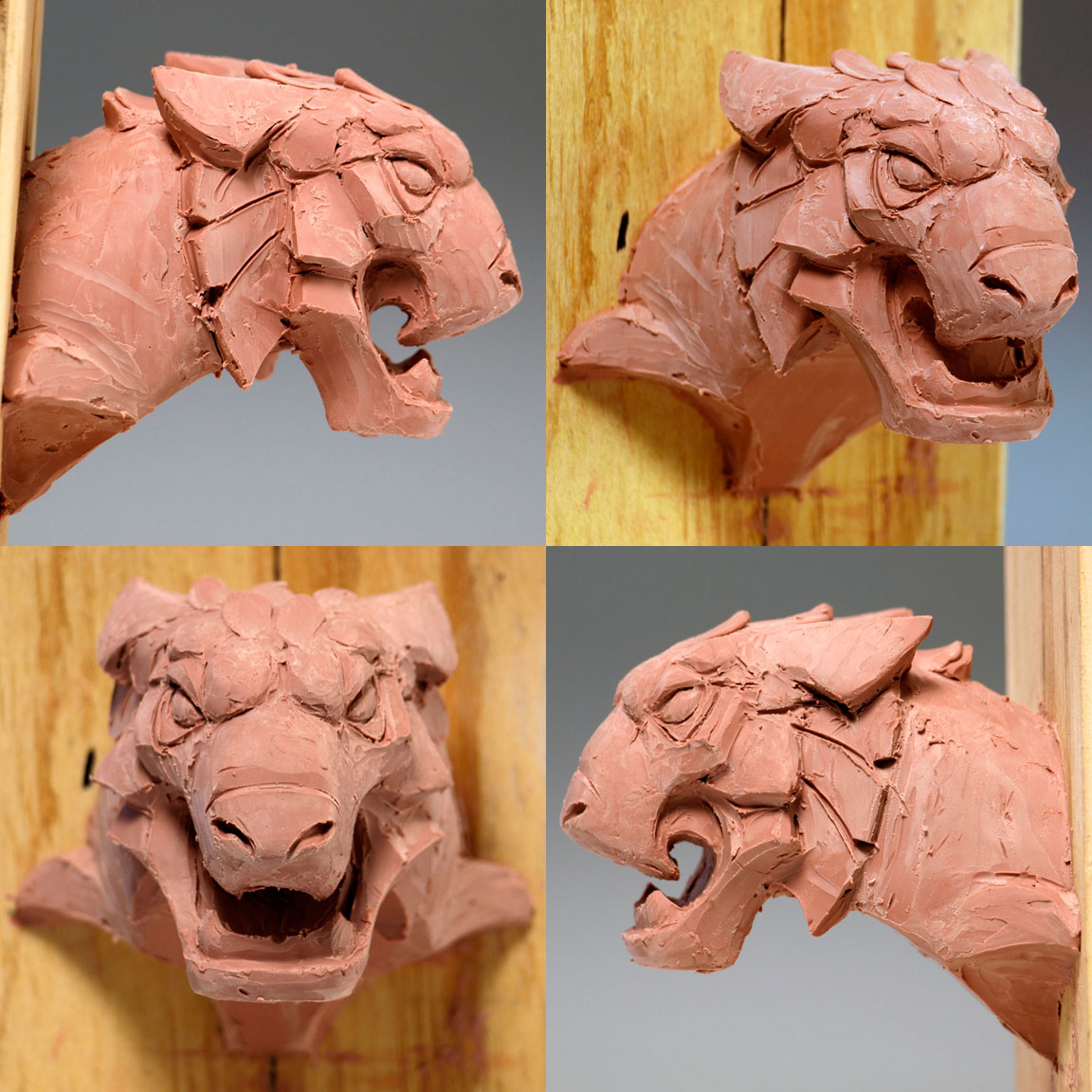
In the book, they meet on a roof top. There’s a gargoyle. There’s a good deal of drift from the front view to the side view and I didn’t think it would translate as an architectural design element. So, I refined the shapes to represent the head of a big cat. A neo-gothic inspired lion. And I thought having a cat played well. The base needed to feel like a section of a much bigger unit without being physically large. This to me felt like a working compromise. I’d intended to include smoke units which would help supply context.

Can't wait to see the finished piece! Looks amazing so far.
Thanks for posting,looking forward to part 2!