-By Greg Manchess
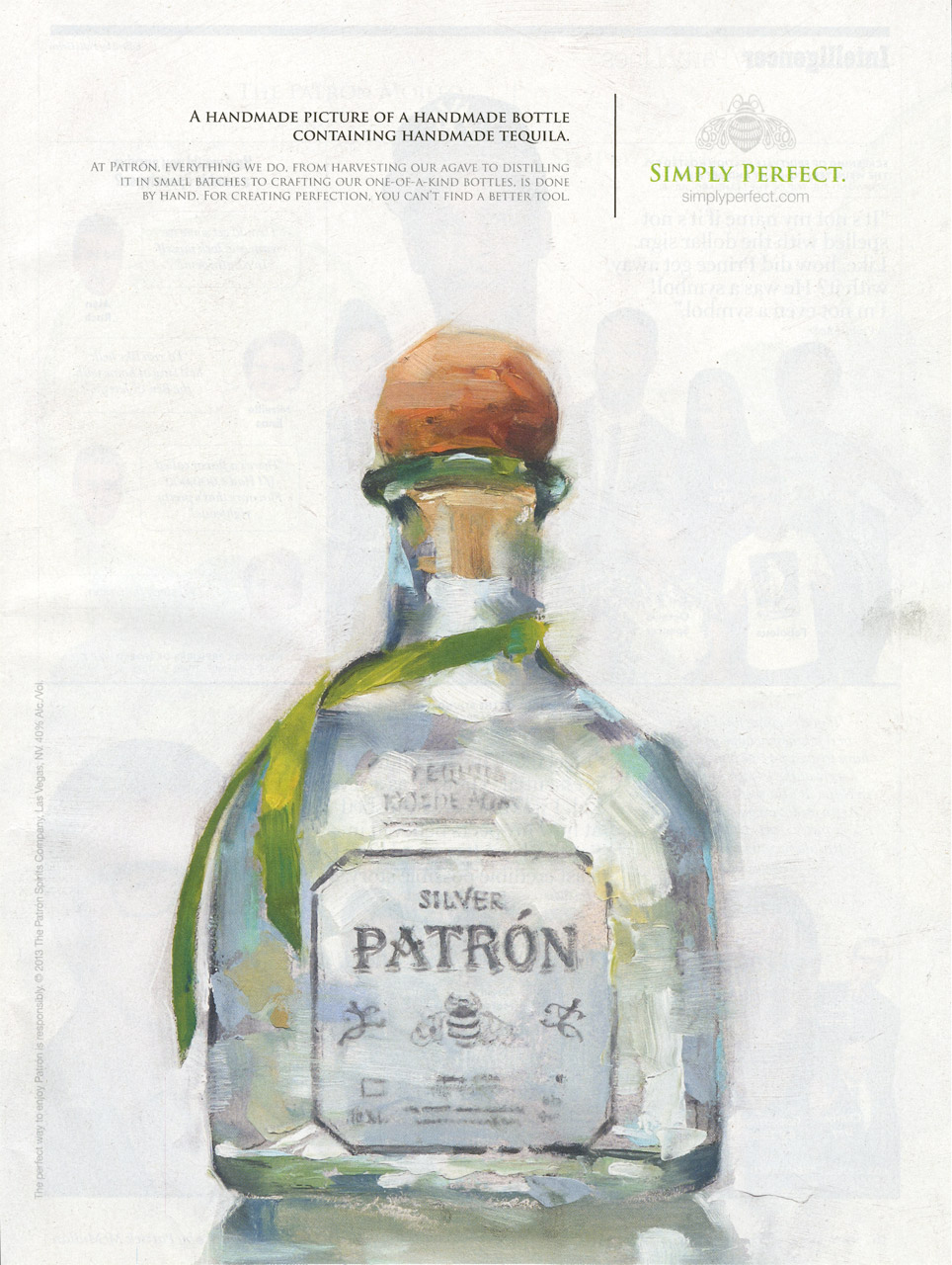
This ad campaign for Patron is running in the current editions of The New Yorker and GQ Magazine, amongst others. I painted the bottle.
It was a simple job and fun, but the best part was how much the agency and the client loved the feeling of the loose strokes. In fact, they liked it so much, they asked me to paint a duplicate on-camera for an upcoming TV commercial.
As soon as they produce it and allow me to run a post, I’ll fill in all you Muddies about the process. It was a one-time, get-it-right affair. But the whole team, from crew to film director to art director, made the event exciting and allowed me to feel right at home, even though I painted under nuclear lighting, and at an angle to the surface.
I’d do it again in a heartbeat.

Most excellent work, Greg. Congratulations to you and to those creative ad people.
As soon as I saw this ad I immediately knew it had to be your work. It is fantastic and I can't wait to see the video.
That's a fine looking bottle.
good lord! that's gonna be awesome! Congrats!
Congrats Greg!
Can I have your autograph? They chose the right person to pull off the paint it live thing for sure. The bottle up there ain't bad either.
I love your work, it's magical.
I immediately thought it is your painting when I saw it in a magazine a few weeks ago. It was such a lovely work, and feels totally different from the usual ads seen in a glossy magazine. Love it.
Sweet! What an opportunity and your painting is terrific. Way to go!
When I first saw this I assumed they's Photoshopped in the logotype and messed around with it a bit. But they didn't, did they? You just painted that sonuvabitch.
When I grow up, I want to be a painter just like you. I'm 51, so I've got plenty of time.
How did you do the logo and type?
This is one of the few times advertising worked on me. I know what I'm doing with my afternoon…
Wow! Only Greg Manchess can make a bottle a work of art. Can't wait for the video!
That's gorgeous, Greg! And, it's always nice to see companies going for this kind of work in their advertising nowadays. Goes without saying that it really stands out.
This is stunning! And wouldn't it be great if it started a new trend in advertising art?
I knew I liked that when I saw it in GQ! I even tried to see if they listed the artist on the page. I should have known it was yours. It was great to watch you work at IMC, so I'm sure the commercial will turn out great. And doon't worry, I will also be painting boldly on my 20,000 leagues piece as I finish it up! Great stuff.
“…do it again in a heartbeat. ” You exhibitionist, you. 😀
Adam…..I just painted that sucker, yes! Y'know, I learned a long time ago that loose stuff looks good when a little something is controlled within the picture. The type was the opportunity here. Besides, they asked for that! It was a bit of a pain as I wanted it loose, but tighter than the rest. You should've seen the mess I made of the type on camera…..
Cassy….I projected the type onto the painting after I had some pigment on there and had painted for a while. That way, I wouldn't worry too much about obliterating my sketch underneath. Then I painted the type with a smaller brush, with the idea that I also needed the type to be a tad loose, too.
Thanks for all the kudos, guys! You all recognize what you're looking at and I enjoy the comments as they help me “see” my own work. ALL of us need that…..
Greg
luscious!
ABSOLUTELY AMAZING. I tried finding you on Twitter! Your work is excellent and wanted to give you a shout out 🙂