by Greg Ruth
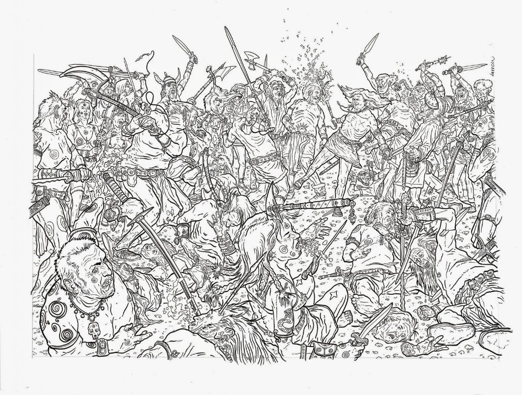 |
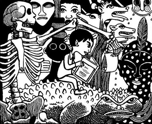
| CONAN by GEOFF DARROW |
This post is on one of those subjects that can only barely be touched upon in something like this. It’s a struggle that we find in nearly every art form and we could delve forever into all the many examples that support the arguments for both sides, but I won’t torture you with that I promise. Just a quick ramble like a stone skipping over murky water. The argument for simplicity and efficiency vs. complexity and flourish rages on and I still see the merits of both, but not always. In comics, where this rubber assuredly hits the road, we can find the merits of both. So I’m going to try and more or less briefly discuss some of these examples in my favorite medium. We’ll attack some of the other areas in a later post.
I think no matter what kind of comics we make, we can all agree that efficiency is a common ideal. This doesn’t necessarily mean simplicity of character or has within it a point for more cartoony iconic comics, and the road to getting slimmed down to only what you need to show to tell the story are very different. Ultimately it’s subjective, but if you’re going to choose sides, know what you’re choosing, and choose towards your strengths, not against them.
In comics there is a practical aspect of simplicity that is essential to moving the story along. Coming up in the NYC arts scene in the 90’s there was, and perhaps remains, a staunch attitude against non cartoonish art based upon the idea that simple art tells a better story graphically. It’s closer to language, as the written word is also a string of symbols, so the brain processes the imagery more quickly. Some argue it points to the obvious artiface of the comic leaving the reader to look beyond that screen to a deeper purpose in the story. Sometimes it’s just how people can draw. This is an ongoing idea I find a lot in whatever the hell we’re calling alternative comics this week. This is clearly not my school of thought, and I found I never quite fit with the kind of work I was surrounded by coming up in NYC in the 1990’s. Principally because of the notion unique to comics of a maintained level of movement through the story without breaking out from that flow. the best argument for simplicity is that simple things are easier to absorb, digest, and move on from than more complex ones. A good example below of David Mazzuchelli’s absolutely perfect GN, Paul Auster’s CITY OF GLASS:
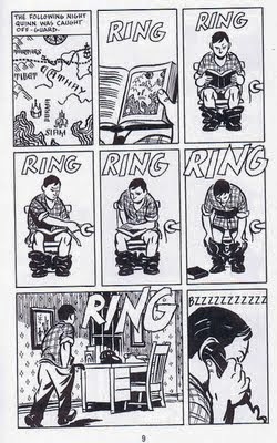 |
| CITY OF GLASS by Paul Auster and David Mazuchelli |
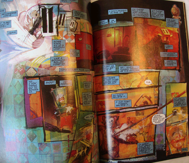
Versus Bill Sienkiewicz’s seminally insane and incomprehensible masterpiece, STRAY TOASTERS. This is an example of art over story, which in this particular case makes for better art than comics. I love this book, but it becomes more about comprehending the architecture of how it’s constructed which by its own definition gets in the way of the story it’s telling:
 |
| STRAY TOASTERS by Bill Sienkiewicz |
CITY OF GLASS is an entirely different animal, and its story a totally different narrative beast comparatively- STRAY TOASTERS is about madness and childhood whereas Mazzuchelli’s is a calmer more intellectual delving into language and the literate psyche. Overall my rule is there are no rules that can’t be broken, but I think the best approach, however inspiring STRAY TOASTERS may be to the artist side of the equation, defaulting whenever possible to less flashy approach is a better way to strike it overall. In terms of overall storytelling, and the efficiency of the art, this is one of the absolute achievements in american comics. It’s great stuff and there’s a lot to learn from it.
This dovetails nicely into my originating issue with the “There is no God but God, and his name is Charles Schultz” school of thought. PEANUTS is brilliant, let me first stay this. Brilliant beyond measure. But its a strip, and even books of deep human introversion like Chris Ware’s JIMMY CORRIGAN, (a clear child of Schultz, especially in how its main character is drawn), it carries with it a fault inherent to its simplicity. The simpler the character design, or the way a book is drawn the more immediate it can tell its story, but it comes at the cost of the depth and complexity. You can apply this to my all time favorite strip, Ernie Bushmiller’s forever perfect NANCY cartoons too. (Sorry Nancy!)
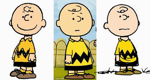 |
| Charles Schultz’s PEANUTS |
My point is, like so much that goes behind the theory of the Uncanny Valley, the more iconic your characters are the more direct they can convey their emotions, but also this requires, more often than not, simplifying the emotions and limiting the range of variance and complexity. Again, there are some that totally do this well, but often times this rule does hold true. David B’s EPILEPTIC proves this by making up for any lost ground in the character’s demeanor by letting the surrealistic environment carry the emotional complexity. It’s a tricky needle to thread- it can be done, but often isn’t done well.
 |
| David B’s EPILEPTIC |
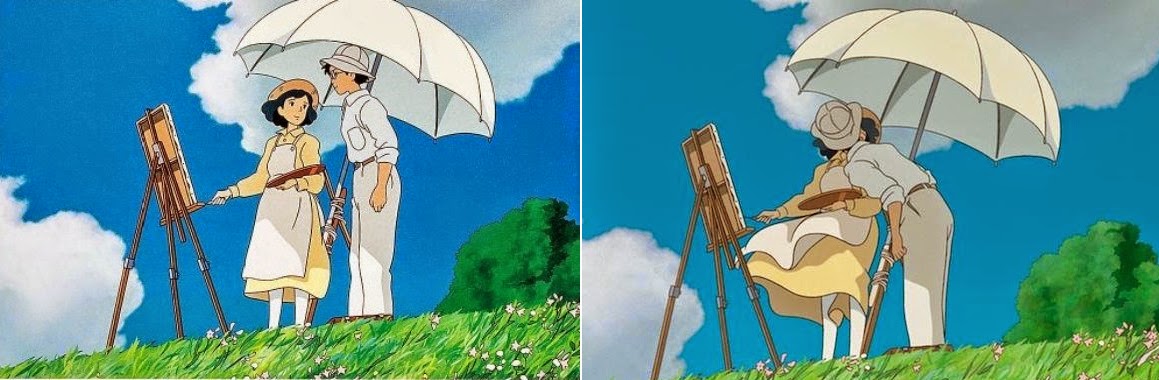
Now for the other side of things. I myself draw in a particularly naturalistic way- my comics are more impressionistically real. It is what I do, and it’s not just out of a default reality and acceptance that I can’t do the other thing (which I can’t… not like Bushmiller or the rest of those folk. It is singularly amazing and incomprehensible to me), but that I sincerely believe there’s more that comes out of more complex treatments for the reader to hold on to. More complex humanistic looking characters can deliver more complex human emotional states. We as readers I think, identify with a character we can see that reminds us of ourselves than with one who is more a symbol of a human we may know. We are allowed by their being closer to a less symbolic version of a human, to love them more, or hate them. We respond in a different way to those kinds of pictures and that was a lot of the driving force behind how I chose to tackle THE LOST BOY:
 |
| THE LOST BOY by Greg Ruth |
|
 |
| THE LOST BOY by Greg Ruth |
|
But there’s also a practical cause to think more along these lines derived from the context of the whole story. Doing this book in a Schultz way would have never worked because part of what this is about is bringing cartoonish, fantastical elements into play in a realistic. It’s weirder that way because the context or realism forces a difference the more simple approach would disguise. The presence of walking stuffed animals amongst people is more immediate as it is weird. Which was the point of course.
 |
| THE LOST BOY by Greg Ruth |
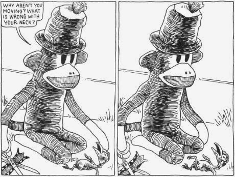
Tony Millionaire’s incredible SOCK MONKEY threads the needle between both sides better than anyone. One of my favorite, and likely the darkest of all the Sock Monkey comics, is when our namesake accidentally kills a baby bird with a chinese finger torture toy, then in an act of anguish tries to commit facial seppuku as penance. But tragically, it doesn’t work because he’s a toy. He even wishes that he could be alive only so he could the nothingness of death. When his failed attempt to end himself with a pair of scissors, he is picked up by his loving owner and stitched back together, crooked right down the middle of his face, but still loved by the little girl who tells him so. His blank stare gives us one of the most existential stares in comics history and it is a beautiful/terrible thing to behold. Like I said… DARK. There’s so much that’s real and sophisticated in the whole narrative concept, but he’s a real sock monkey doll who just killed a real bird, and you feel it more because that’s exactly what it looks like. The stakes are therefore real and the impact emotionally is made more complex and powerful because of this recognizable reality. But it’s all still obviously drawn, and as a result safer and less practically hard. In many ways from where I stand this book and Millionaire’s work marks the highest ideal of fusing the simple with the complex in comics. Plus I appreciate his craft in the same way I also do Bill Waterson.
 |
| SOCK MONKEY by Tony Millionaire |
The far extreme of this effort is the photo-comic, something I find wholly unworkable no matter who is doing it. The main reason for this is that there is almost no way to ever overcome the artiface of the panels and the staged pictures. The clumsy fact of the photograph makes any kind of imported emotion or identification from the reader impossible in a normal way, and leaves us feeling unintentionally creeped out, or constantly dissecting the who and how of how the photo was taken rather than ever believing the image on the page is an identifiable emotionally important character. They just simply don’t work in a way not even opposite to the simplified approach of Schultz, and to date I have never seen this disproven no matter who does it. They become to much about the individual panel than the story they intend to tell. We are arrested by photos in a way different from how we see drawings. They are like stage-play murders… never wholly convincing. The hyper realness prevents the reader from ever going beyond the photo except to ponder its creation, and as such totally arresting. Which is not good in comics.
Arresting not slowing. Most artists who make comics will argue for the need to maintain a decent clip of pace. Not me- I like a variance and the interplay of simple and complex act as speed controls for the reader that you’d be a fool not to exploit vigorously. Comics lack a common movement and presence of time the way film does, but you can slow the read- whichever speed the readers reads.
One of the true masters of blending both is animator and comics genius, Hayao Miazaki. Myazaki mixes both intricate and simple so perfectly it’s hard to even imagine any other way to pull it off. Mostly it’s his simplistically crafted characters, especially their faces, against really detailed and complex settings as we see below in this clip from HOWL’S MOVING CASTE, (a personal favorite of mine):
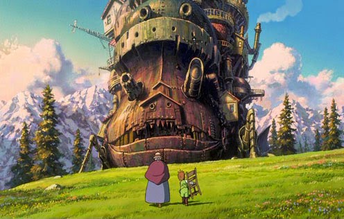 |
| HOWL’S MOVING CASLTE by Hayao Miyazaki |
But it’s more than that. He manages to achieve a naturalistic manner to his more iconified characters in a way that is truly unique outside of some of the old Disney masterpieces like BAMBI or 101 DALMATIONS. Sometimes simple characters can be expressed complexly by their actions without having to rely upon their facial expressions. Mo Willems can achieve in six or seven pencil strokes a ridiculous amount of character and personality, despite the movements, or lack thereof. Like I said: no rules.
 |
| THE WIND RISES by Hayao Miyazaki |
In the end, much what fuels both sides of this back and forth fall to us, the viewer and our predator’s eyes inherent to our species. It is a theory I espouse overmuch, but basically the notion roots itself in how we perceive things as evolved predator mammals. our bi-focusing eyes are hunter’s eyes. We are as a result constantly looking for things out of place, we are watchful for being fooled. Magic works entirely on tricking the flaws of this kind of perception, and comics narratives when they’re at their best, are like magic.
There are of course numerous examples to disprove both sides of this, Raina Telgemeier’s really luminous SMILE and Eddie Campbell’s work on FROM HELL are just two, but the overall truth remains. They key is to clearly acknowledge and become familiar with your own proclivities and push towards those strengths with all due force. If you’re inclined towards more cartoony approach, then utilize place and context to better express richer more human expression. If you are inclined towards more naturalistic comics work like I am, know it carries with it an increased duty to making the characters not just seem realistic looking, but real feeling. If they come off wooden, it can seem weird and off-putting. The burden is higher on this latter category, but I would argue if done successfully, the pay off is beyond any other way. But it requires a deep understanding of anatomy and facial realities to bring it off well. Practice practice practice. But folks from either side can gain a great deal by taking more time to regard the other. They each have a lot to teach.

I really enjoy this essay as a continuance of some of the issues raised my McCloud concerning symbolic and naturalistic approaches to character rendering. While I can see his point, and it's an interesting theory, I always felt it was only the beginning of a much more complex conversation. Thanks Greg, for starting to address the rest of the conversation around simple vs. complex. So much to think about. And thank you for contributing to this amazing field of comics not only as an artist but as a thinker/writer who conveys complex ideas using simple, clear, and effective language.
Greg, I really appreciate the thoughtful approach to this post. Love the examples, and your work especially.
Thank you for the post, Greg. Great examples and wonderful ideas!
This is something I think about a lot. I lean toward simplicity in my own work. Not sequential art or graphic novels–I'm mainly an oil painter, but I think what you're driving at is universal. I think one of the jobs of the Artist is to direct the eye of the viewer toward whatever the artist considers the meat of the matter. Here's something I just read today in the recent Andrew Wyeth Spoken Self-Portrait book that rings my bell–
“Great simplicity is complex, and there's a difference between simplicity and vacancy. It's the hardest thing–enrich that sunlight so it actually speaks more than what is on the wall. It's rounded, has depth behind it–breadth. A lot of things are painted at. There's nothing much to hold onto.”
I think one of the things he's saying is that there's more to an image, if it's done right, than meets the eye. Somehow leaving space for the viewer to think about what's going on in an image that might somehow suggest thoughts beyond what's in the image itself. Not sure how else to say it.
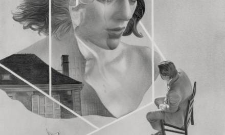
I look at that drawing by Geof Darrow and it's like being on LSD back in the day. There's no real point of focus–everything holds the same weight and value to the eye. I just get confused and lost in the minutiae. Nothing against Darrow–he's amazing in his willingness to take things to such a degree. I just tend to get lost in everything that's presented, while being totally blown away by the ability it must take to go there.
Many years ago I read Remembrance of Things Past, by Marcel Proust. He spent 2500 pages reflecting on a cookie, essentially. I spent a whole winter reading that book and it pushed me toward simplicity, cuz after awhile you just get lost in the minutiae, once again.
I guess I want to be led part way into a situation, but I want room for my own thoughts in reaction to what I've been presented with. Like Wyeth said, I want some fleeting glimpse of something that keeps me wondering just what went through my mind when I was confronted with that image(s.)
Don't tell me what it means–I want to decide that for myself. If it's done a certain way, there's communication there. That would seem to be the point, to me.
Thanks for the post, really great!
Thanks everyone- glad the post is hitting the right parts of the mind grapes. Thing is though, I think it's a subject almost infinitely vast and potentially one of the lodestones of art making, whatever your medium. Coming to understand all the complexity in understanding figure drawing, the hidden musculature, the facial recognition… And then in a way, making sure you forget it is one of the most profoundly difficult parts of this. I always bring Chris Ware up as an example- the guy can draw as classically great as anyone, but his comics are misleadingly simple, despite their insanely baroque structures and narrative architecture. This fools a lot of young artists who look at his work and think “oh man, he's just drawing circle heade boys and cartoony objects! I can do that!”. The fallacy of this is that this simplicity comes as an end result of years of training and craft. It's a destination confused as a starting point. There's so much more I didn't touch upon here that I did I think this will be a theme running through more than a few future posts. Apologies in advance.