by Greg Ruth with Jordan Brown
No one likes to have to make do-overs. You know it’s true. Your editor or AD don’t much go for them either, but they happen all the time. Most of the time it’s valid, as certain nuts are really hard to crack. Other times… well it’s preventable for a thousand reasons. The below example is happily the former.
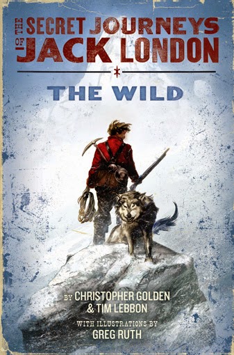
This is the long and winding road to find the perfect wendigo for THE SECRET JOURNEYS OF JACK LONDON: THE WILD, (Written by Christopher Golden and Tim Lebbon) for Harper Collins! Jordan was my editor on OUR ENDURING SPIRIT, so we came into this particular briar patch with a strong working and friendly relationship in place. This is an ideal situation. Needing to make a fix means there’s something wrong, and rarely is there enough patience and time offered to be able to find the right way out without having to A. settle for the good instead of the perfect, or B. Fire the artist. Happily none were required in this case.
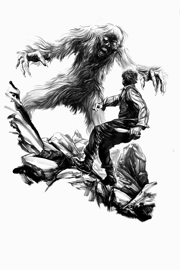
J: This was Greg’s first take on the Wendigo close-up. Even in this first stab at the creature, I knew that we would have a spectacular image by the end of the process. This didn’t exactly mesh with my interpretation of what we might want the Wendigo to ultimately look like, but Greg is a master at creating terrifying, stylized monsters, and there was no doubt in my mind that we would want to work with what Greg had here toward a final monster that all of us loved. My initial email response noted that I loved the mouth and eyes, but that the creature overall was perhaps a bit too yeti-ish – that it looked really great, but that the compositional elements of the beast didn’t quite get across the feeling of horror we were going for. In this first email response, I said what I think would become our guiding principle to meld Greg’s fantastic vision with what Christopher Golden and Tim Lebbon were doing in the text:
G: The best way I can put it is also unfortunately the most vague: I want to look at this beast and know that despite how perverted it has been, how much of a beast it has become, it was a human once (and, therefore, something into which Jack could turn). The reader needs to smell this thing by looking at it. I want it to make you feel wrong inside and also feel like what it is to stand in front of something like this.
J: Here’s the reason why I love Greg: he knows that peeling off or adding layers is often a better way to revise than simply redrawing something, and he never runs out of ideas. Greg’s response to me (and I so very much love that Greg explains his thinking, it’s so helpful, from an editor’s standpoint, because it’s always my aim to figure out what the illustrator’s vision is and to work with that – Greg always gives me a great summary of his vision with every sketch):
G: Yeah. That’s a trick crazy editors taught me. Assume the need to cut and patch and make sure you can do it on a dime. I always weep for who make actual oil paintings when faced with changes. I really do. Anywhow… These two wendigos are indeed a might bit different, both in pose and look—the former here below is a bit more trimmed that the previous version, but essentially the same fellow. Both are scaled up a sight bit more than the last take. The second is more like a flying monkey gone mad, with darker fur and more animalian features… see which one you like to pursue forward as I suspect neither does the deed entirely.
J: In 2a you can see how he went about taking his first creation and making him more human. This still wasn’t quite right for me, but Greg’s changes helped me to focus my thoughts a bit, and I expressed this to him in an email response:
G: What I feel like we might want here is a sense of desperation to the beast’s hunger. Right now, his hunger for Jack’s flesh and life has a ferociousness to it, but I’d love to get the sense that this is a beast who hunts not just for a love of carnage, but also as an attempt to assuage a desperate, endless starvation – not simply a hunger, a starvation.
J: I wouldn’t have been able to say this without seeing what Greg had already done, what was working well and what we still needed from the image. 2b I include just to illustrate how full of ideas Greg is. This one wasn’t quite right, but is an insanely awesome drawing in its own right. Made me hope that Chris and Tim might find a way to take Jack to the dark impasse of the African continent at some point. Greg never leaves a stone unturned.
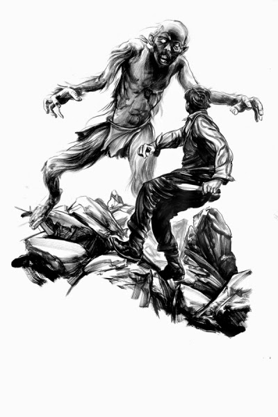
J: Here, Greg starts over a bit, giving us a beast onto which we can add layers until we’re satisfied. You can see how he’s focused in on the hunger and made a beast who is an embodiment of it. According to Greg:
G: I’ve gone a bit far and wide from our previous more monkey style version as you see….emaciated, desperate and hauntingly post-human monster that he now is. Let me know if we’re a sight bit closer to the mark… I suspect this fellow needs more of the hair.
J: Here, Greg’s nailed the spirit of this spirit – this is something that is terrifying not only because of what it might do to you, but because it presents you with an image of what you might become. This is the key element of the terror present in all good zombies, and Greg has outdone them all in this image. Now, it’s all detail work, taking this human beast and adapting him to the north. This is where I become a douchebag editor and try to order my monster a la carte. Luckily Greg doesn’t start hating me for it (or maybe he does?)… My response:
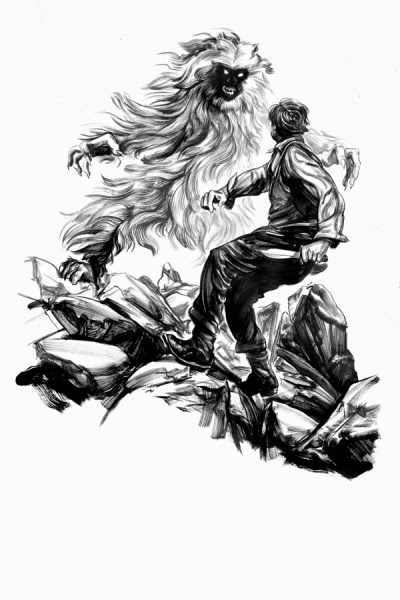
G: This has something necessary that the others didn’t. But I think you’re right, I think we need to add the hair back a bit – is there a way to get the hair and the strength of the last incarnation and combine that with the desperation of this one? I know I’m being a jerk editor now, trying to make physical changes happen by repeating vague nonsense. Maybe this will help: I actually love the Wendigo in the camp attack scene (note: there’s a more silhouetted version of the monster depicted from afar in an earlier chapter illustration) pretty much just the way he is, and would be delighted if we could retrofit this to match that.
J: An awesome thing happened with this revision: I called Greg after emailing him about the last image to talk this over a bit, and we discussed the wendigo for a while, and then got off onto Battlestar Galactica and French silent panchromatic films of the 1920s and whatever else we were talking about that day, and then after like twenty minutes he said “done.” And I said “huh?” And he said “I finished the new sketch. I’ll send it off right now.” He had been sketching the whole time we were chatting, finished a whole new design. See why I love this guy? Anyway, you can see Greg applying a layer of hair on this one, and we’re much closer. My response was long, so I’ll paraphrase: I asked that we have a bit more firm stance, make the beast slightly larger, and let the mouth own the face a bit more.

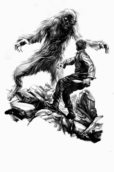
J: Greg, as usual, solves all the problems in ways much more cunning than I had expected. The mouth is fantastic, and I love that he accomplishes the firm stance by simply hiding the feet. An inspired move. And he has the most astute and enlightening comment on the size issue, which I have to share with you here, because it’s brilliant:
G: It’s a funny thing, scale. Counter-intuitively, something on the scale of King Kong doesn’t have the same level of terror as say, a Mighty Joe Young. There’s this horrid middle ground between about seven or eight feet and about ten or so feet that to me is the real sweet spot for the bad feelings when comes to the beasties. Personally I love this weird middle ground—I think there’s a lot of great tension in any creature that occupies this arena—but let me know if we’re hitting the right spot on this here one.
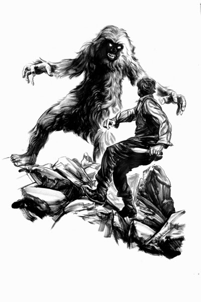
J:Anyway, the beast is perfect. Which means, of course, I ask him to tweak it one last time, because I’m a jerk like that. I asked for a slightly more powerful stance, and a bit more of the claws.
And here it is, the final, in all its glory. My favorite of the bunch. Flawless.
G: I don’t know about flawless, but I agree. It turned out to be exactly what we both were looking for but didn’t know we wanted until we saw it. The thing I think works best is the scale. There’s something far more scary about something that is Mighty-Joe-Young-big versus something the size of say, Godzilla. In my book anything that can work its way through your front door with great difficulty and still pull it off is far more than something smaller or the size of a skyscraper. There’s just something more intimate and immediate about it. It can sit next to you even if only barely. So making certain we got this horrible fellow at the right scale was what it was all about for me at first. That best final is as you see it below:
J: If there’s anything to take from this, it is the sheer inventiveness of Greg Ruth, and his ability to read my mind when I am throwing at him the most vague feedback possible. He came up with a monster that is entirely his own, my favorite rendering of the Wendigo that I’ve ever seen, and the perfect rendering for this story. It’s a funny thing, illustrating monsters – they often have to physically embody the themes and narrative of the text in an even more acute and representative manner than illustrations of the heroes. The heroes are meant to represent the reader, and are often made to look somewhat universal for this reason. But it’s the monsters that represent the struggle, in the narrative and often in the hero him/herself, and for this reason, they are often the most difficult to design. But also the most fun, if this is any indication.
G:I have to say working through this with Jordan was tough but never unpleasant. I think the friendly relationship we have, and the same with Tim and Chris made the whole process something really extraordinary. We got to go back and do a second volume in the series together, THE SEA WOLVES. And I may post about that later. Though I have to say by that time, we pretty much had our thing down so there was little trouble going forward. Sort of. But what the hell… a little trouble can be a good thing.

Thanks for this post. It was great seeing how you kept a positive attitude through a ton of changes and ended up with a better piece because of it.
There was definitely a good bit of off color teeth gnashing and comical weeping on the phone, but all in good fun. I mean at the end of the day, it can be frustrating but not ditch-digging level of frustrating. I think it was the feeling of being lost that was the worst. That around the middle i just had no idea who to pull out of this. Ultimately you just have to work through it. Glad we did, but glad too we didn't have to do it more than this one time.
Greg, do you totally redraw each time, or save the good parts, rescan the changes and say paste the new windego behind the old rocks and hero? I find your drawings engrossing, and feel that you could probably redraw everything with superb craftsmanship, but time and deadlines might mitigate against that…
You've got it exactly right. And deadlines aside, since i just hit it from scratch there's no way to ever recapture the accidental successes of the first drawing, so i tend to drop and paste to fix what isn't. It's a baby with the bathwater kind of thing, and also that i am not patient enough to redraft the same image over and over again. It loses life for me when that happens, and the sense of drudgery comes through the art then.
Great post Greg! I love seeing the evolution you guys went through….the end result is well worth the effort. Reminds me in some ways of those mummified prehistoric men they discover frozen in the ice….but this time with claws, and he's hungry. Perfect!