I was approached by Irene Gallo to do a piece for Tor.com’s WHERE THE TRAINS TURN by Pasi Ilmari Jaaskelainen, and as typical to my previous efforts, (and despite my swearings to be cured of this method) I ended up doing two. Overall I have always railed against this double work as a poor and time consuming way forward. “Why not just thumbnail it first, you dolt?” is the usual refrain when it comes to confessing this as a recurring event. And I thought for a while that it was true. That my impatience to get right to the piece itself was causing this. But as it turns out, this is not the case. So, I have decided to hug this as a legitimate part of the process, and celebrate its necessity rather than try and undo it. So, in full confession mode, here’s the deal as representative of deals to come and deals long past, and why it’s maybe not such a bad thing.
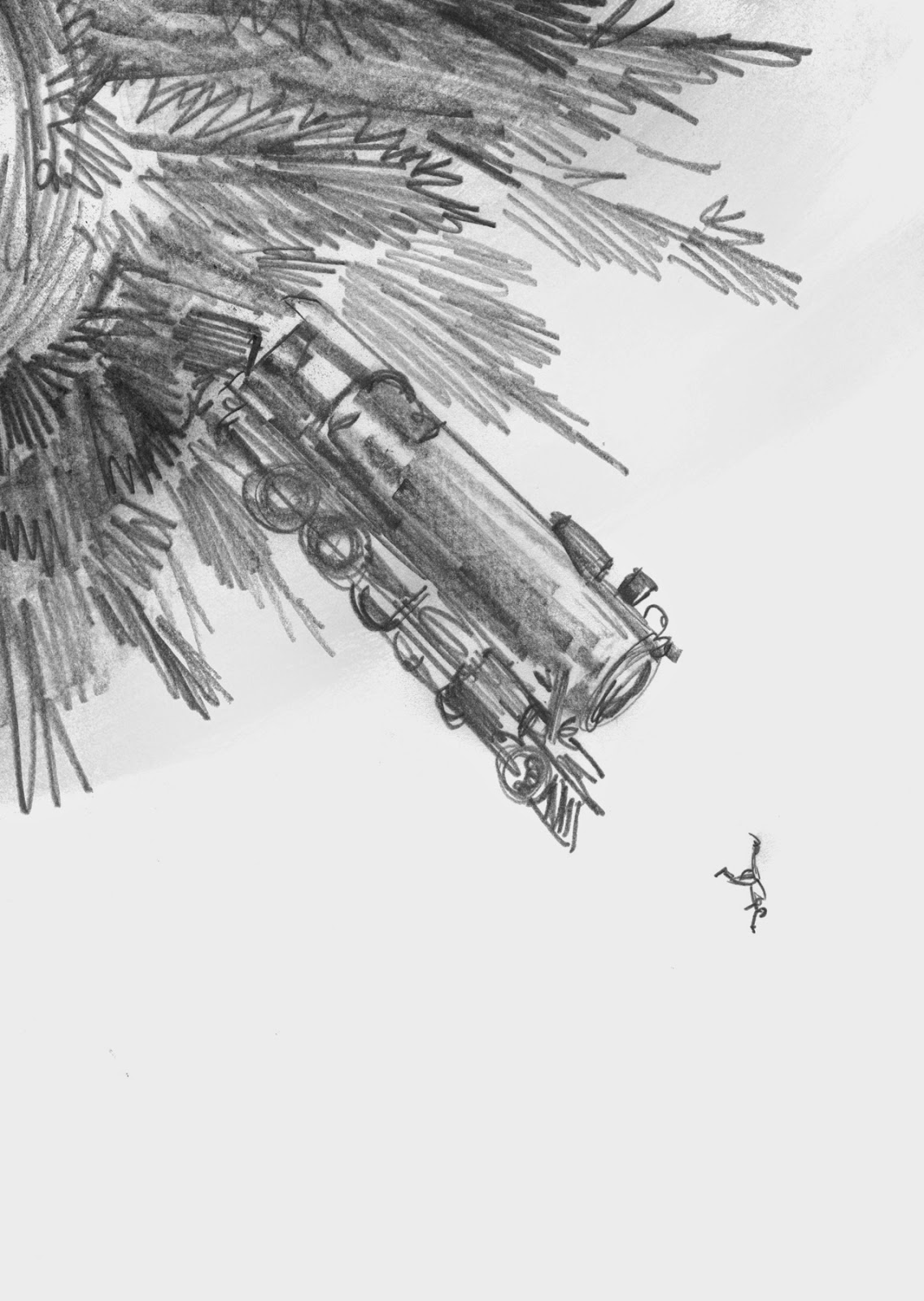 |
| TRAINS thumbnail |
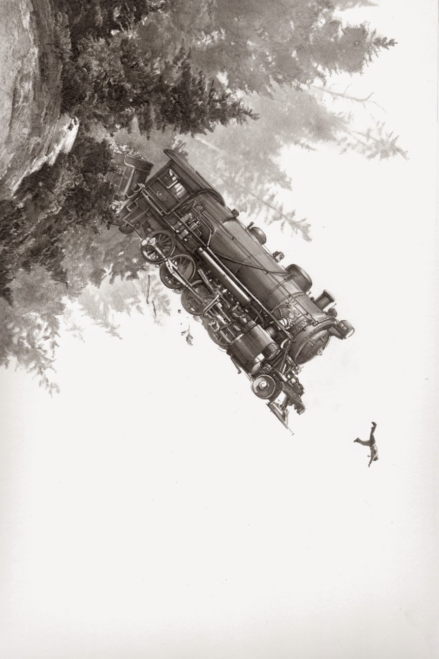 |
| TRAINS first attempt final drawing |
 |
| Final orignal graphite drawing |
So confident was I in this new approach I jumped full bore into it. Now for the record, these types of graphite drawings are extremely tedious and slower to execute than my usual ink and brush style. And jeez louise… what a self wounding fool I was to surround this floor of the scene with pebble dash. It literally took me as long to draw all those little rocks, and shade them correctly, as it took to draft the entire rest of the piece. But, I was confident this would work, and never for a moment thought otherwise. The train that was the spooky forest, the moon for its headlight, the boy frightened and hiding on the track, the centralized composition… it had all the singular earmarks of a good and proper cover image. I wanted to make sure that while I intended to add a bit of color to the final piece, I was committed to make the original drawing as fully rendered as possible, if not entirely. This meant making my brain doing a few pretzel twists to provide the illusory sense of space int he woods and keep to the identifiable form of the train itself, and getting the lightening and chiaroscuro right meant really taking it slow. One of the side benefits was finding that in order to exact the right level of darkness where needed, I had to dig my Blackwing Palomino deep into the thick of the paper, causing small grooves and textures to form. Which of course was a total delight, and I think brings a pressure-printed quality to the original piece as a result. Making the graphite or ink do things it’s not supposed to do is my latest endeavor, and this struck that bell perfectly.
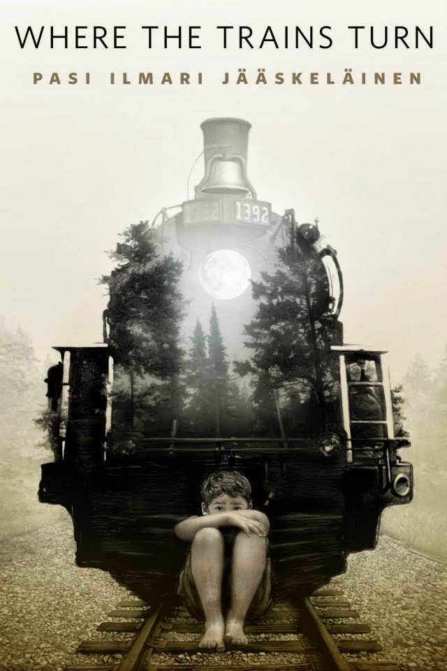 |
| FINAL cover with title treatment |
And so it ended up being even more than I had hoped. This moment is something I find rarely occurs with a single image piece like this, and is usually reserved for my comics work. With comics there’s a built in tipping point when all the images are put together and connected with the words or narrative. I never really know what or how the page may work until I see it working, or not. When it does though it’s a sheer delight, as if someone else had done it for me and I get to see it for the first time. Single image work like this just lacks the mechanical complexity to bring this moment out regularly, but when it does, it’s pure magic. The sense of space, the setting of the train and woods and most especially making sure to get the boy’s fretful expression correct was the axis upon which this whole thing spun, and it came off nicely. To me the moment I can look at an appreciate a piece of work as if I were an outsider is a rarely achieved goal. But when it happens, I can see the thing objectively and without ego.
And here’s the thing I discovered at the end: I couldn’t have made this piece, without having also fully executed the former go at it. The certainty and wisdom gained from doing it wrong the first time is entirely what informed this final far more successful piece. Recognizing that sometimes, and in my case apparently all the time, the need to get lost in order to find the way home is the most important take away from all of this. That all failures contain a solution within them is a lesson well learned from this. Also trusting the gut of experience doesn’t hurt either. I can now look back on the original effort and dissect why it wasn’t working, but at the time I couldn’t at all. It simply just felt wrong, and trusting that was the smartest thing I could have done. And I now have two drawings where I would normally have one. At the end of the day, the struggle to get there fades and your just left with what you did or didn’t do. Way I see it I got a bonus piece out of this, and a reconciling with my nature I couldn’t have otherwise achieved. I’m better at what I do and can do for the next job as a result, and by working the previously erroneous method as a vital part of the whole process means I’ll know hoe to make time for that in the future. We as a species have a total inability to learn from our successes. Our mistakes thought, are an orchestra of learning. Whether it’s a holdover of our survival instincts going back to our monkey times, I can’t say. Somethings are best left as mysteries, even though they are as tangible and valid as any lesson learned.



Amazing!
Great story, information… The fear of failure stifles… a pathway to success is often littered with failure… Not sure about the hold over from the monkeys… but since we can't predict the future, we have the free will to try something new, until we find ourselves in that future…
Greg,
You don't know me, we've never met. I am a huge admirer of your work. Have been since Freaks of the Heartland. Your work constantly surprises and amazes. But I have to say, I couldn't disagree with you more regarding your recent Muddy Colors post on the cover for Where Trains Turn. While I appreciate the level of craft in the second cover, I find the composition to be entirely predictable, whereas the first one I feel is anything but. I understand your position as to why you feel it more adequately addresses the needs of the story, the character development, etc. Yes, the single, centrally located, almost totem pole like placement of the imagery does very succinctly combine the main themes from the book. While the combining of the forest imagery with the front of the train and the boy on the tracks makes for a powerful image, it does look like a double exposed picture with a little photoshop thrown in. I just feel it looks a little too familiar. What I loved about your first attempt is that is didn't elicit any of these feelings in me. The composition was completely surprising, a little disorienting even, in a good and unexpected way. I guess I don't expect a cover to have to encapsulate the main themes of the story in broad overarching strokes, in order to be successful. A little bit of mystery, which I think you very successfully achieved with the first cover, can be just as effective if not more so. I guess part of this diatribe comes from what I see as a propensity within our field to solve most our compositional challenges by placing the imagery dead center on the page. Lord know's I've defaulted to this as much as anyone. I just think it's a bit of a missed opportunity, especially when you had something so fresh and unique, right in your hands and then felt it wasn't an adequate solution for the job at hand. Please don't take this the wrong way, As I stated earlier, I very much respect your talent and ability. I'm hoping, based on your writing being as developed and thoughtful as your art, that you'll take this as I've intended, a respectful and considered observation on your latest incredible work.
For what it's worth — Kelly
I understood the process with brush and ink thing Greg but with graphite? Do you lash yourself every night too? One of the things I truly admire about you, your dedication to a project. Thanks for the post.
I don't know about cover design to speak to that, but Kelly's comments certainly struck a chord in every way. I too totally love the first illustration; it is great to see that much freshness–on a book cover or anywhere else–for that matter.
Wow, I love both images but the final really hits me in a much more emotional way than the first. Evoking memories of wandering down the tracks in my misspent youth.. Amazing! I can feel those pebbles and smell the trees. Thanks for sharing!
Well Kelly, this happens a lot to me, especially with these Tor covers. I did a piece for a story about Dragons last year and to this day the initial image is by every measure my favorite and preferred. I think there's little arguing it as compared to the second choice which we went with. And boy do I love the first attack of this with all the gusto you're showing it and more. But both suffer the same problem, and its a catastrophic one when it comes to book cover needs: they don't reflect the story they're covering. Once that button gets pushed you'd have to put The Raft of the Medusa in the wastebasket. Book covers can't be about compositional dynamics. Those can help make a cover in service of the work, but it's not enough to make it the focus. And that's the best thing about that piece. It also doesn't reflect the narrative being told, and having the boy so far away that he's a near-stick figure, means it gets robbed of his emotional state- and lacking that very essential symbiosis with the reader is just the second catastrophic failure.
Thing is doing a book cover means you have a boss- the story you're covering. Now you may have a better idea than the boss for an image, and that happens a lot to be honest. You could very well have a better image than what the boss wants, but the boss is the boss and you have to do what the boss wants, or you really shouldn't have the job. Otherwise you're making it about you, rather than the boos you're there to serve. Now there are sneaks and tricks to make this boss coincide with your take, and I have had the rare moment where the story gets changed to accommodate the image, but that is as rare as summer snow. Using the first image would have been me stepping in front of the story- or my boss on this one. That's a fine thing to do in art, but this isn't that. This had to be about the boy, and this notion of trains chasing him down. Knowing the composition and the standardized Tor title treatments, this is the one that hits the reader's heart right. The other hits their frontal lobe more- which again is fine, but I prefer selling through the heart rather than the brain, especially for this one. That's where it's seat of power is.
Personally I like centralized simple compositions more and more these days. But it had been a while up until these latest two covers that I got to play with that again. Prior to that I had done a few diagonal compositions exactly like this one- particularly the one for SOMETHING GOING AROUND. And I guess I like to remember the context of the other illos I've done in this series, and want to avoid pushing the same button too often or regularly. Honestly the composition bored me because of that. Not for anything having to do with the image itself… it's just too much a repeat of work I had been doing elsewhere in the studio that week. But I'm glad you all love it as it is- I do too. I think it makes great art, even if not a good cover image. I could see it as an album cover or for something else entirely though. But this was the wrong shirt for this guy.
And that smell of the engine oil soaked into the rocks and rusted steel, Brian. The sound of the track jumping as a train comes… they are super intimidating giant things of beauty.
Amen Greg! And it's all there in your piece. Great work!
The fact that this is graphite just blows my mind! How big is the original to get the rocks like that!?!
Amazing!
Greg, did you color the final image yourself? I personally love the sort of faded out, antique color I see in this and some of your other images.
Greg, your posts are always a delight to read, as they bear the hallmarks of long hours of consideration and careful thought. That must be the benefit of rendering thousands of tiny rocks – plenty of time to think!
In thinking over the images, I have to agree with Kelly in that the first one is my favorite; totally surprising and with slightly terrifying. However you are definitely right in that it doesn't convey the story at all – there is no indication that the figure is a boy, and he seems not so much menaced by the train as thrown off the globe alongside it. The final communicates the story much more clearly.
I also love those deep horizontal grooves in the darkest area of the train. They make me think of really heavy iron.
Looks great! The top one!
You're so right! Very interesting!
You can buy cheapest ESO Gold at http://www.esosale.com/