I have been exploring various arrangements of a simple flesh palette lately. It is remarkable how many different colors you can get with just a few colors.
The basic palette is:
White
Yellow
Red
Black
I have posted about it before with some of my other sketches. It is sometimes referred to as the Zorn palette. It gets interesting and fun to try putting in different pigments into those 4 color slots.
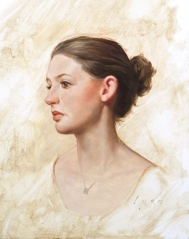
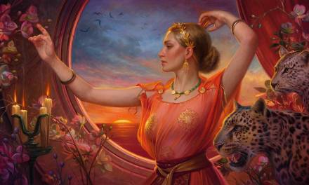
In the image above I used a palette of:
Flake White
Cad Red Light
Cad Yellow Medium
Van Dyke Brown (Gamblin)
The Gamblin brand is unique to other brands I have used as it is much less brown in town, almost a neutral warm grey. It is a great pigment for neutralizing the reds and yellows and the warmth compliments the skin, but you can still get a sense of blue and green.
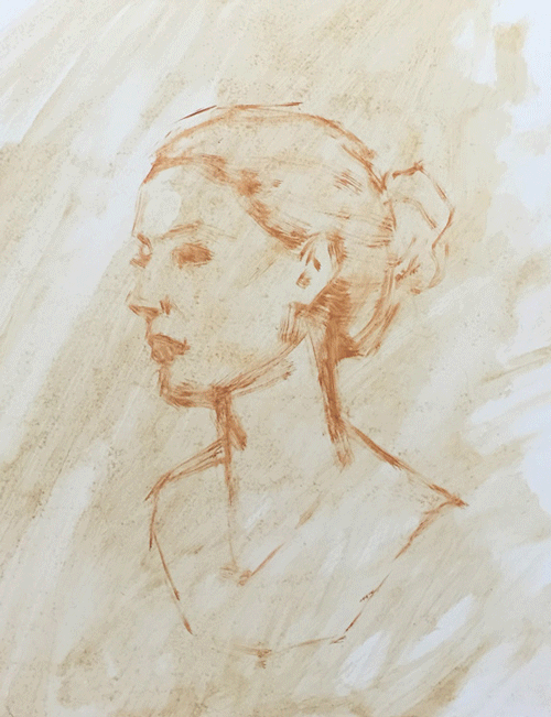
Here is a progression of the sketch as a gif. Give it a moment to load:
It is was painted quite thin and done over a few hours. I used a medium of 5 parts turpentine, 1 part damar varnish and 1 part stand oil.
Here is another sketch, taken a little further over about 5 hours.
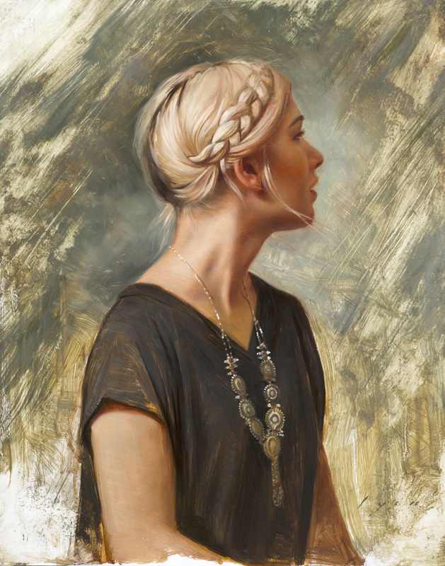
The palette for this painting was:
Flake White
Vermillion
Yellow Ochre
Charcoal Black
Here is a GIF progression of this painting:
The vermillion in this palette is warmer than the cad red light in the first palette and the yellow ochre is a little easier to bring into the range of flesh tones than the cad yellow. Charcoal black gives a much bluer grey than Van Dyke brown too, which means you can get stronger greens from this palette. Both the Van Dyke brown and charcoal pigments are a bit transparent which is a plus in the shadows.
I have tried about a dozen different arrangements of this palette using raw umber, lead tin yellow and bristol yellow for the yellow slot. Terra rosa, Alizarin Crimson, Pyrol Red and English Red have all worked well in the red slot. Ivory black will give you stronger blues and greens and mars black offers similar tones as charcoal black.
Just swapping out one color makes a big difference and doing so has helped me understand color temperature and harmony better. Mixing the same color, but with different sets of red and yellow has been a valuable exercise, making me mix similar target colors from a different palette.
I haven’t been particularly scientific with the whole thing. I should really paint the same subject with different palettes, or make a range of color charts… but it is much more fun to keep doing new sketches and throwing different palettes together.
If you have had similar experiments or do so in the future please let me know what you learn. Until then, thanks for giving this a read.
Howard Lyon


Beautiful work. Love, love seeing the progressions. Thanks for doing these!
Also on another note, I just found out one of my favorite artists , Glen Orbik passed away on May 11th. 51 years old is too damn young.
Thank you Sam! I too am sad about Glen. Such a great artist and much too soon.
The way you sculpted the lights/darks on the hair, braid, and neck of the second lady is just entrancing. Gorgeous work.
Thank you Gabe!
Thank you Howard. I love seeing your progression through these paintings.
It is so interesting to see how the vermillion changes the skin tones- beautiful. I work with a this palette all the time- especially for the figure. My current variation is all Michael Harding paints:
Scarlet Lake, Yellow Ochre Deep, French Yellow Ochre, Ivory Black and White. I find that with two yellows I can push the greens, browns and highlights pretty far. I also use both a titanium white and zinc white depending on how cool or transparent I want to go. I've also had fun with a more standard M. Graham- Cad Red Light, Ivory Black, Alkyd White, Yellow Ochre with Gamblin's Golden Ochre combination.
Great post Howard !