Prerequisites for this course:
Type 101 for Illustrators: Basic Type Tips
Type 201 for Illustrators: Artist Logos
Alright folks. I’ve given you some universal tips for dealing with typography in Type 101, and given you a lot of good artist logos to look at in Type 201. Remember, when in doubt, Less is More, and Keep it Simple.
Now we’re going to build on those lessons, and talk about applying your artist identity—whether it is a simple type treatment or a full logo—to watermark your images.
Part I: Watermark vs. Signature
So, a watermark is not what you think it is. Historically it had nothing to do with preventing theft. In fact, it was advertising. A watermark was used by paper mills to show where a piece of paper was manufactured. It’s called a WATER mark because the paper was still wet when the mark was impressed on it. There were many different kinds, which you can check out here.
The watermark was invisible until you held the paper up to a light. As you can see they were often quite large – but they didn’t interfere with the use of the paper unless you were looking for the mark.
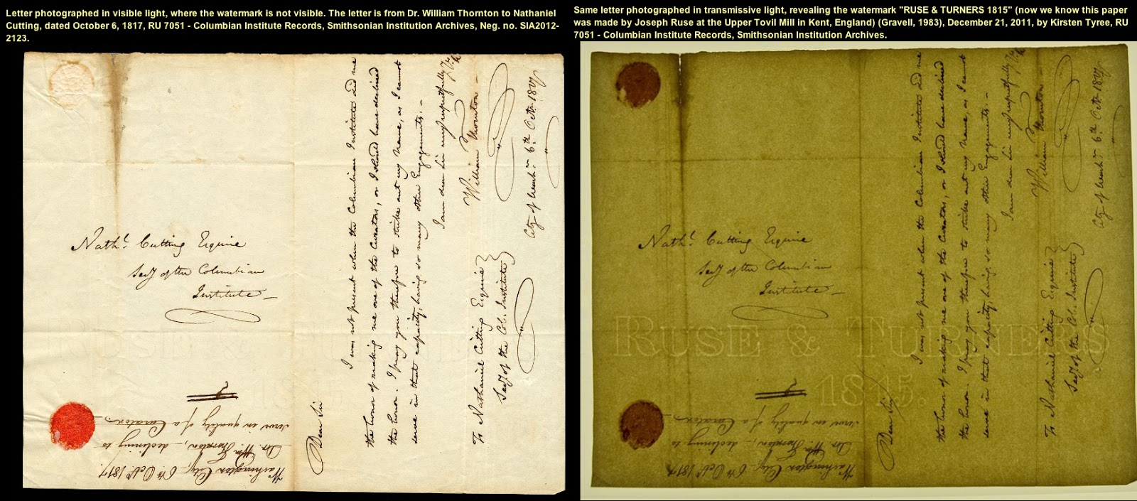 |
| Watermark examples from the Smithsonian Institute |
In the digital age, the term “watermark” came to mean a pattern put over an image so that it couldn’t be stolen and reused online. Stock image sites are especially fond of this method of protecting their photos.

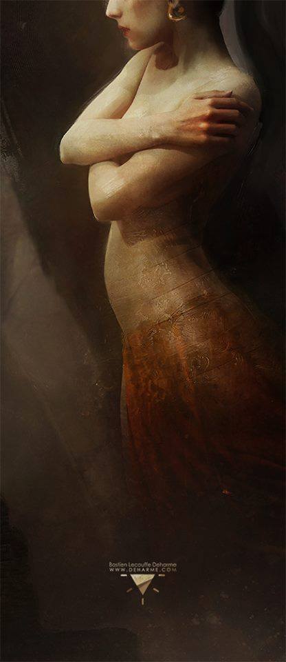
Unfortunately, for artists, this is problematic. Your portfolio images are going to look like crap if you have a giant watermark over them, and it also hampers Art Directors from being able to use your portfolio pieces to pitch you to their approvers to give you a commission. Very often I need to mock up a cover idea using a piece from an artist’s portfolio to sell the concept to Editorial. It’s really hard and obnoxious to work with an image with a watermark like the one above. So an artist’s watermark is better when it’s a lot more like a signature.
 |
| Dan Dos Santos doesn’t need his website in his watermark because if you type “dos santos art” into google his site comes up first |
In fact, often an artist’s watermark is at least partially their signature. However, I don’t like using the term “signature” instead of “watermark” because I think an artist’s signature should be reserved for use as you’d use it in signing a physical painting. And often times a signature alone is not legible enough.
In many cases an artist has a common name and their website is the more important piece of information to show than their name. Artists, you should google yourself and see if just typing in [your name] or [your name + art] takes you to your website. If not, you should be watermarking with your website. (And come on people, it’s 2016, you don’t need to type “www” anymore. Waste of space! Just the .com or .net or .ninja is plenty.)
Part II: Why Watermark?
Look, if someone is going to rip off your art, they’re going to do it. They’re going to crop off your watermark or they’re going to retouch it off. Simple retouching doesn’t require skill—it doesn’t even require photoshop anymore! They have phone apps that do it for free. Same advice here applies when we talk about turning on/off the right-click-download feature on your website: People who want to steal are going to, so the only person you’re stopping is art directors. You don’t want that.
However you DO want people to be able to find your work once it gets separated from your site or your social media. And it will. Pinterest is good for retaining links back to original sites some of the time, but tumblr doesn’t even try. And Facebook and Twitter break chains every time someone uploads something manually. Instagram has almost no link-backs at all. You want to know, for sure, that people can trace your art back to you, or else you’re missing out of clients, fans, & commissions.

Art Directors email images around frequently to each other that we found online or in our own archives that got separated from their artist info. And it can be super frustrating to be trying to chase an image down online, to no avail.
Also, in a world where people repost art without remembering to credit, keeping the credit info ON the image makes crediting automatic. Again, yes, there are people who are trying to rip you off. But MOST people are not—there’re either just lazy, or not aware of how important crediting artists is.
Before we begin, let me thank all the artists that volunteered their art and watermarks to scrutiny and critique. Brave souls, give them all some applause.
Part III: Rules of Watermarking
1—Keep to Corners
As a default put your watermark in the lower right hand corner, that way the viewer’s eye, which naturally moves left to right, top to bottom, will hit the watermark last and it will interfere with the viewing process the least. Only if the image is very busy in the lower right should you move to the lower left. Only move it to the top corners if the bottom really cannot work for some reason.
 |
| As tempting as it may be, don’t integrate the watermark into the art. It’ll either get lost at one end of the spectrum or get in the way of the art, at the other end. |
 |
| I think this large watermark makes the image really hard to put in a portfolio website, and it throws off the balance of the work…don’t you want an Art Director to see your work at its best? |
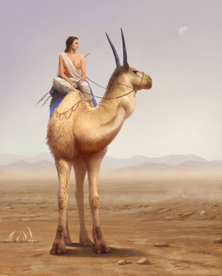
2—As Small as is Still Legible
Make your watermark as small as possible…so long as it can still be read. And read by middle-aged people who may be wearing glasses…because most ADs end up wearing glasses from sheer eyestrain if no actual vision problems. This also goes for the color of your type—don’t make it so pale you can’t read it.
 |
| A bit too teeny. I know we don’t want to detract from the art, but it has to be legible or there’s no sense watermarking at all. |
 |
| Also too small. Maybe it would be more legible if it was solid white, but ghosted out and too small isn’t legible enough. |
 |
| Great font, great use of all caps sans-serif, but it’s really close to the background color, i’d pop it just a weeee bit more. |
3—Simplest Fonts, preferably Sans-Serif
A watermark is not the time to impress with your design choices. A watermark is supposed to be noticeable, but minimally impactful to your art. Sans-Serif is often the best choice for a few reasons. First, sans-serif fonts are often legible at smaller sizes than serif fonts. Second, sans-serif fonts more often come in condensed versions, so you can make them take up even less space yet retain legibility. And finally, a nice plain sans-serif has less personality than a plain serif does. And you don’t want your watermark to add emotion, especially not one that’s pulling you in the opposite direction of your art. However, if you feel like your art needs the feel of a serif, pick a simple one, with very little variation in line weights between pieces of the letters. Look at the O. Is it a consistent line weight or does it go thick and thin? If it goes thick and thin it’s going to need to be bigger to remain legible.
Good Sans-Serif fonts: Trade Gothic Condensed, Gotham Condensed, Knockout, Futura, Gotham
Good Serif fonts: Mrs. Eaves, Bembo, Filosofia, even Times New Roman
And default to all caps first. If you really think upper and lower case feels better, then you can go there, but start with all caps. Easier to read, more authoritative.
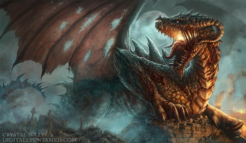 |
| Crystal used a serif here, but it’s a very consistent one that works with her piece, and is easy to ready even ghosted out a bit. |
 |
| It’s really hard to read that font small. And the logo is cool, but here my eye keeps trying to read it as part of the image, like a bullethole, or a target, or a larger firefly glow. |
4—Least Amount of Info
If your website is your name then you don’t need your name AND your website written out. Just use the website. And like I said above, you don’t need the “www” for people to know it’s a website. If you want to do a © then go for it, but having that on your image or not really don’t deter anyone on it’s own. If they’re not deterred by your watermark on the image, then they’re not going to respect it just because it has a “©” sign. Artists automatically own the copyright to their images unless they are derivative of another copyright (like IP work)—putting “©” on your piece doesn’t legally protect it any more than it already is.
 |
| You don’t need to repeat “allen douglas studio” twice. Just once, as “Allen Douglas Studio.com” will do the trick much more simply |
5—Minimal Logos
Now is not the time to impress people with your logo. It will be distracting. It will be distracting if it’s a bad logo, and it’ll be doubly distracting if it’s a good logo—good logos draw the eye to them. But you don’t want to draw the eye, you want the eyes to stay on your artwork as long as possible. Really you should probably go for just text. If you want to use the font that matches your logo, then do that, but leave off the logo. A logo doesn’t help anyone find you if they find your image and are trying to track down the creator.
 |
| As proud of your logo as you may be, it’s not helping people find your website. Just use your name. I would stack the name and the copyright info under it in the lower right hand corner. It’s way too distracting at the top. |
 |
| The name and website is fine, but that logo is definitely working against, not with, his piece, it could be a lot smaller, or perhaps it’s not really needed at all. |
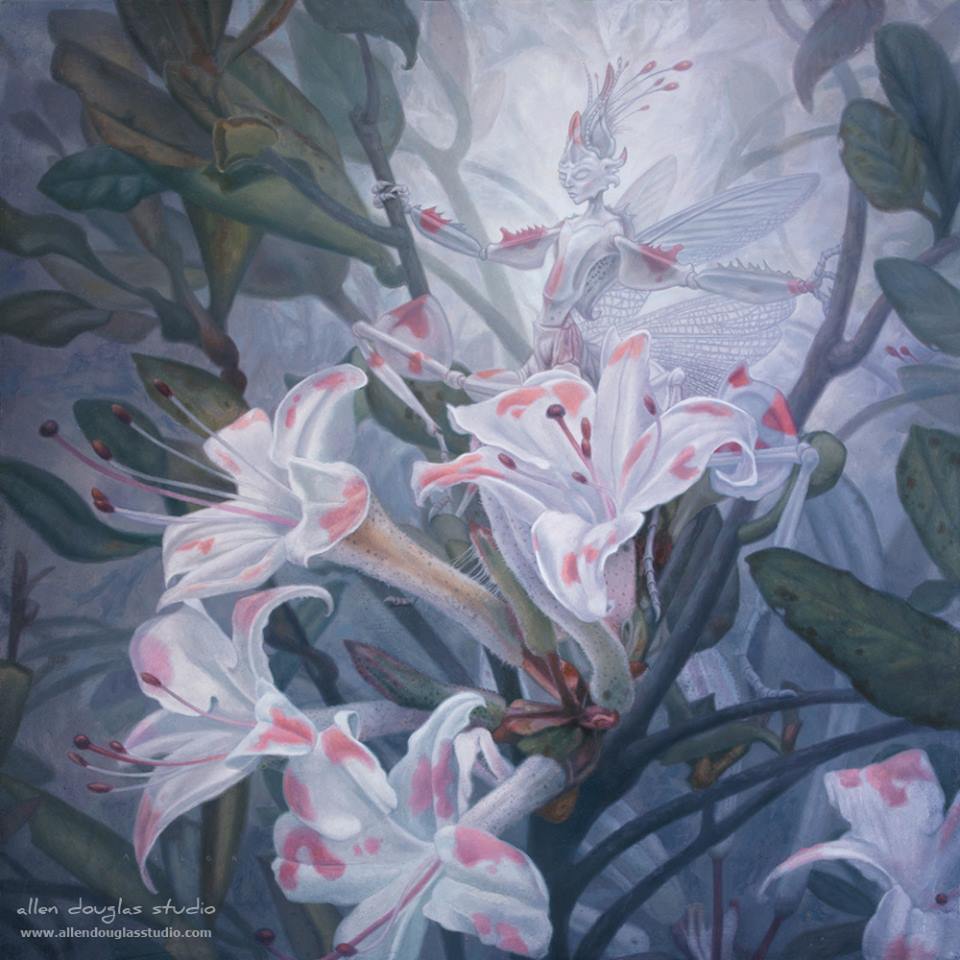
 |
| Exception to the logo rule, this motif works pretty well – but only because it’s working as PART of the image, not just a logo plunked on top like a sticker. The type is still a bit too small though, I’d make it a little bit bigger. |
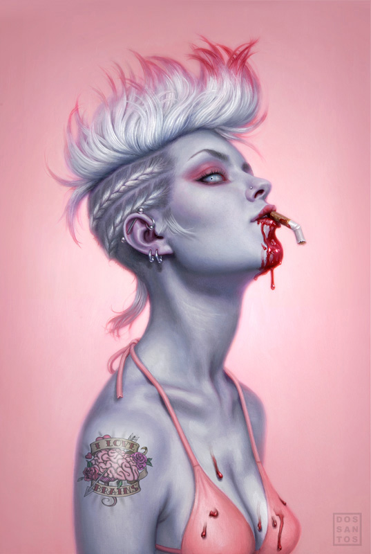
Part IV: More Good Examples


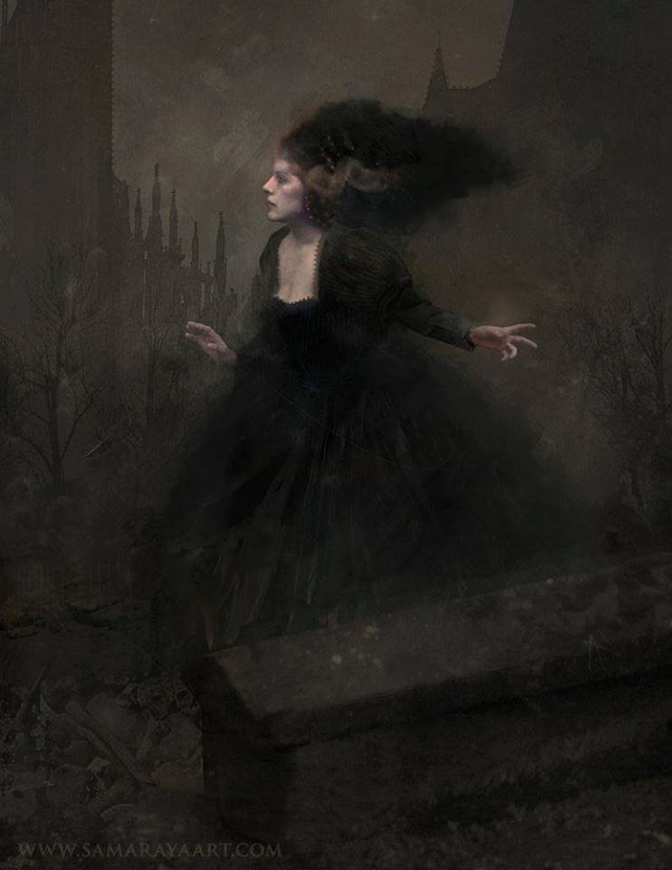

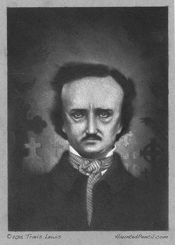

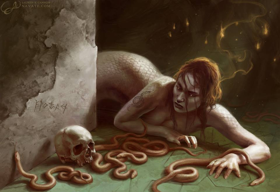
Again, thank you everyone for submitting! Especially the ones that got critiqued <3


![[Anti] Social Media](https://www.muddycolors.com/wp-content/uploads/2017/12/eeeff-1931_frankenstein_img28.jpg)
Thanks so much Lauren! This post is excellent and very, very helpful. I love your type series!
Excellent advice Lauren. This is exactly the approach I have been taking for many years for my online photos and art, good to have your validation on the matter. Great choice of artwork for your examples by the way, I'm sure all the artists chosen appreciate the “advertising”. 🙂
Somewhat related… more information about the image can be added by metadata. In photoshop it is accessed under “file info”. I doubt many people look at that, but it does not hurt to add it. Also, do you have any thoughts about the size of images online? My philosophy has been to err on the smaller size to help prevent theft of the image for any commercial purpose. Good enough to see, but too small to make a quality print. Of course it is desirable to show as much detail as possible, but one has to be practical regarding the wild, lawless internet. I usually upload images no larger than 800 pixels on the largest side. Is that too small from your perspective?
I also add info on the metadata, not sure how many people pay attention to that. Still I like having it.
Great article, Lauren! Thank you so much for using my image. I love the amount of info this site pumps out regularly, and your type series has been awesome.
Thanks for including my Spirit Owl in your critique! I've learned a lot from this post.
It's absolutely worth entering it in the photoshop metadata BUT most people do not know, or do not have the capability to check that.
<3
Thanks for being a good sport!
Great post! I've never really come across an article about the do's and don't of watermarking before. This is some really helpful advice and great examples!
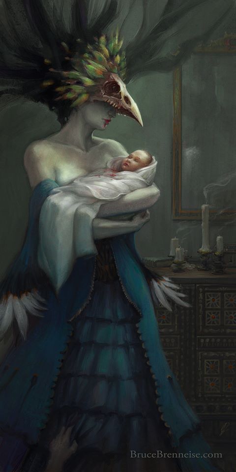
Excellent and very useful post (as always), Lauren! Thanks so much for including 'The Feeding' among the additional examples; that made my week! 😀
Timely and useful. Last night I watermarked/signed all my drawing-a-day sketches before placing them on my website. Your reasoning in favor or their inclusion is convincing. Thanks for posting.
Much obliged for the crit, Lauren! I'll definitely have to pare down that logo. Probably time for a re-brand, anyway.
Great article, Lauren! this beautiful art,
you must have logo