“It’s like Bernie Fuchs and Bill Sienkiewicz had a a baby!” is the first thing I thought when I first discovered the massive ppol of art over the last sixty odd years of Brian Sanders’ long career. There’s a defined fluidity here I will always chase and never catch and his ability to craft the real without ever undermining the abstract is unparalleled. Like Fuchs, Sanders has an incredible gift for maximizing the narrative of the images he draws with his composition ninja skills- We could all of us working in this field learn a lot from his ability to design a page. If you are new to Sanders as I still am, here’s a few favorite pics below to see what I mean. Aside from doing a stint of illos for Kubrick and 2001 A Space Odyssey and more recently, work for Mad Men, much of his stuff can be found sprinkled throughout women’s grocery store magazines throughout the sixties and seventies. But barring a time machine to a Nixon-era Kroger, the interwebs are fairly resplendent with some of his work. Happily there is a show going up at the Lever Gallery May 12-July 31in London. If you are in the motherland, please stop by and take a look- I’d kill to see these in person myself. (Well, maim without permanent effect, maybe. I mean let’s be civilized about it).

ARTIST SPOTLIGHT: Brian Sanders
Friday, June 16th, 2017
-By Greg Ruth
You can see more at his website right HERE


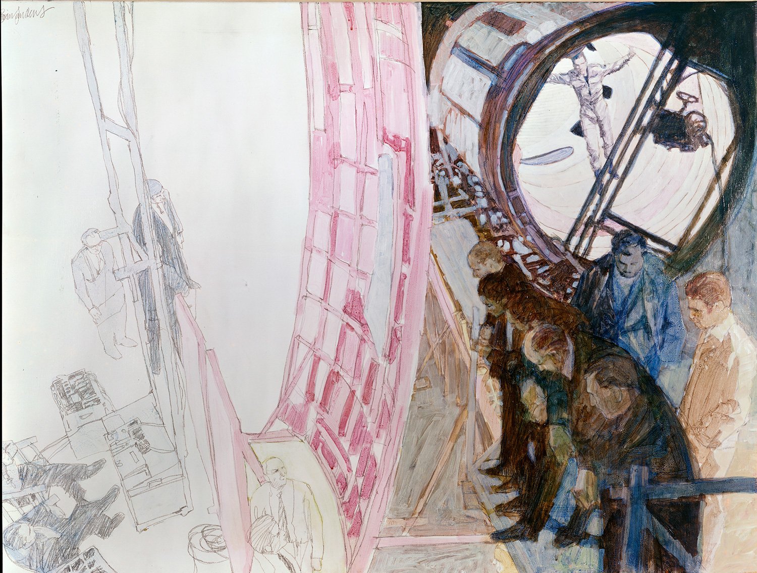

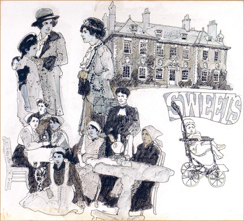
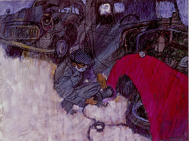



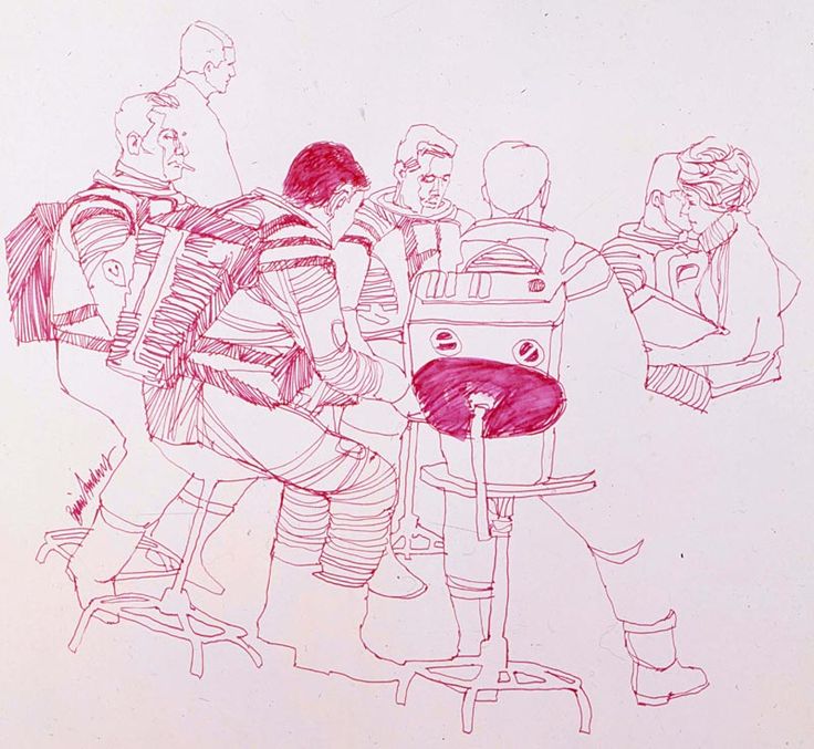





I can't believe we didn't know him better. Thanks for the find.
Is this just innate or taught? Bill Sienkiewicz, Robert McGinns, Neal Adams seem to have a similar sense of aesthetics…..or maybe it's just a reinforced study of Homer, Pyle and Wyeth?
Bill Sienkiewicz was a protege of Neal Adams at continuity comics, so it's not like there's no relation…Robert McGinnis, spelling.
I'm not one of those people that can purge themselves in one paragraph, so you'll have to bare with me, but David Downton is also a (Fashion) illustrator that reminds me of this style as well. Seems to be a technique only taught in Ateliers, not necessarily in public or corporate art schools:
https://www.youtube.com/watch?v=kFkWMzK0UB0
https://www.youtube.com/watch?v=Jv9tA_mMm74
However, it does seem more contour heavy as opposed to construction heavy.
I understand he's around 90 or more. That first piece you show was commissioned to recall the feel of his 60s work—for the series Madmen, just a couple years ago. After that Madmen had Milton Glaser do one too…
Thank you Greg for your kind comments – Sandy is my name to all friends – Brian is my given name.
Mark, I was 80 last week, but still really only 18.
PS I didn't do the one below the Mad Men poster.
Sorry I got that wrong, I was hasty in trying to add some “facts.” Are you ever in Hawaii? I met someone here a couple years back who was allowed to sketch on the set of 2001, I think as a student. He advised me to get more abstract.
The Today's Inspiration Group on Facebook has a few of your works also, too few. But you might enjoy the range of work there if you haven't come across it. What's new on the drawing board?
That would be Jan Parker. He wasn't a student, we shared the same agent. I worked on different occasions to Jan and have not seen what he did. My advice to anyone living in Hawaii is draw what you see, I would.
Leif Peng blogged me fairly comprehensibly on Todays Inspiration. If you go to:
artofbriansandersblogspot.co.uk you will see the edited selection he kindly left permanently on line. Im currently working on the third book of an illustrated autobiography, it's about my time as a Royal Marine.
Sorry! I failed to see the link you had already made to the blogspot Mark