You can find the original article on CreativeBloq
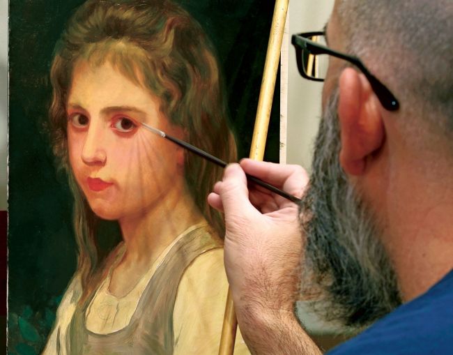
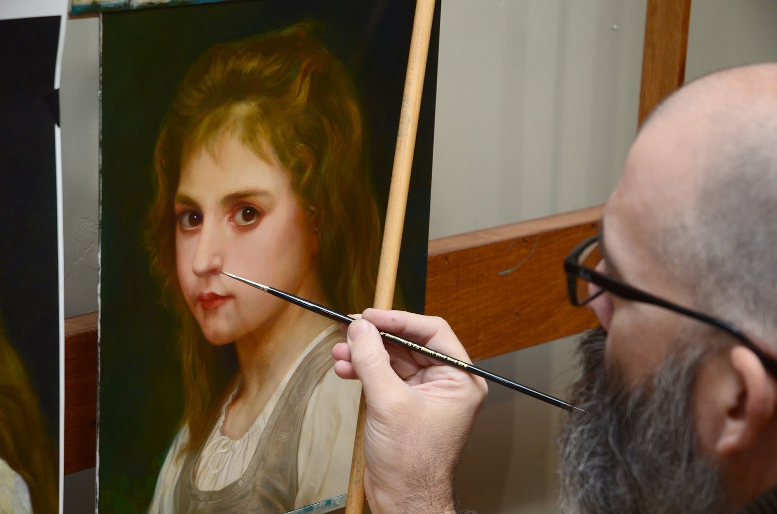
For this tutorial we’ll take an in-depth look at the benefits of copying an Old Master painting. I’ve chosen to copy a portion of the painting Jeanne, by William Adolphe Bouguereau.
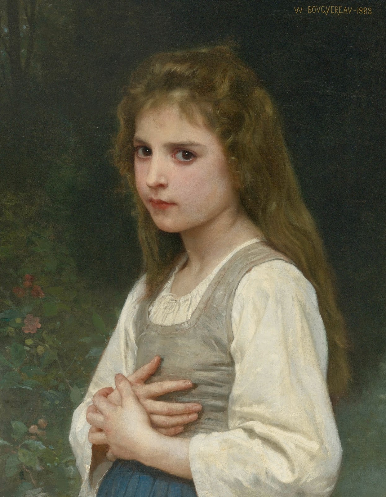
There are many artists who I admire, but I think Bouguereau sits at the top of my list because of his technical mastery. I’ve worked in the video game industry for 13 years, as a freelance artist and a gallery artist, and while my subjects and clients are varied, I’ve always been able to look to Bouguereau for inspiration.
The goal of doing a master copy is three-fold. The first goal is to learn from the aesthetic sensibilities of the artist you choose to copy. This is key to developing taste or connoisseurship.
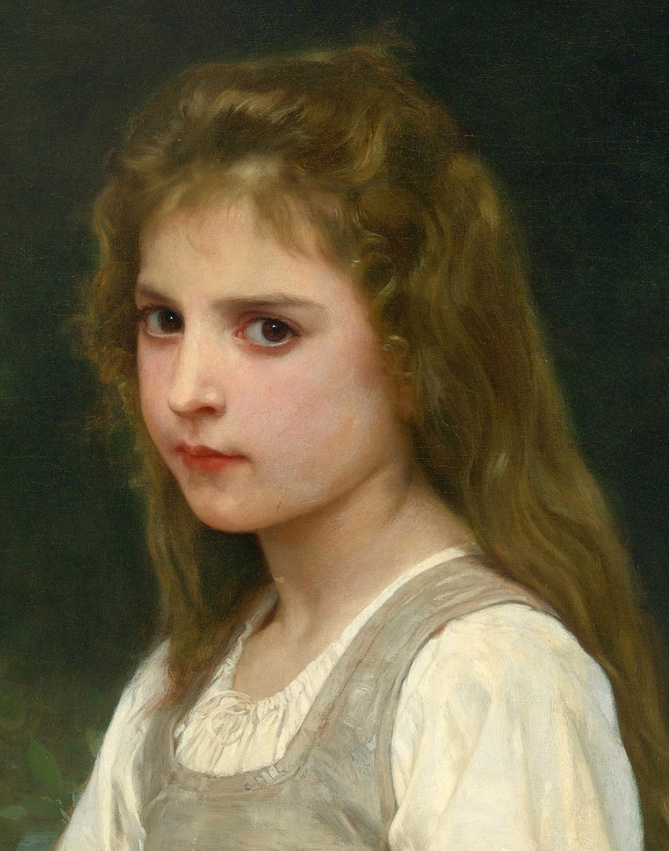
The second goal is to learn how the artist approached color, value, edges, and design or composition. I try to pay close attention to the way edges are handled and where the artist makes stylistic decisions, as opposed to being rigid to what can be observed. For instance, Bouguereau has greatly simplified the hair in his Jeanne piece to create larger shapes, and only in a few key spots does he render individual hairs.
The third goal is to be accurate. This is the least important, but still of great value. I say this because there may be portions of the painting that are near-impossible to copy with complete accuracy and paint in the same way that the Old Master did. If the original painting was done with big brush work that feels spontaneous and loose, you don’t want to get out your smallest brush and try to mimic a single brush stroke with a hundred small strokes, just to show how meticulous you can be.
I suggest that painting with similar vigour and manner as the original artist will be much more valuable to emulate, than creating a ostensibly perfect copy that misses out on the original technique.
Download the accompanying files for this tutorial.
01. Choose your Master
The first decision is picking an image to work from. In this case, I chose to paint a portion of William Adolphe Bouguereau’s beautiful Jeanne, because I want to study how Bouguereau handles skin and values. I’m also keen to try and paint hair in the same manner that Bouguereau did.
02. Prepare your surface
Gesso your board with either an acrylic or oil-based gesso. I like the Liquitex Professional gesso because it has some calcium carbonate added to give it absorbency and tooth. If you use oil-based primer you’ll need to size your canvas and give it several weeks to cure.
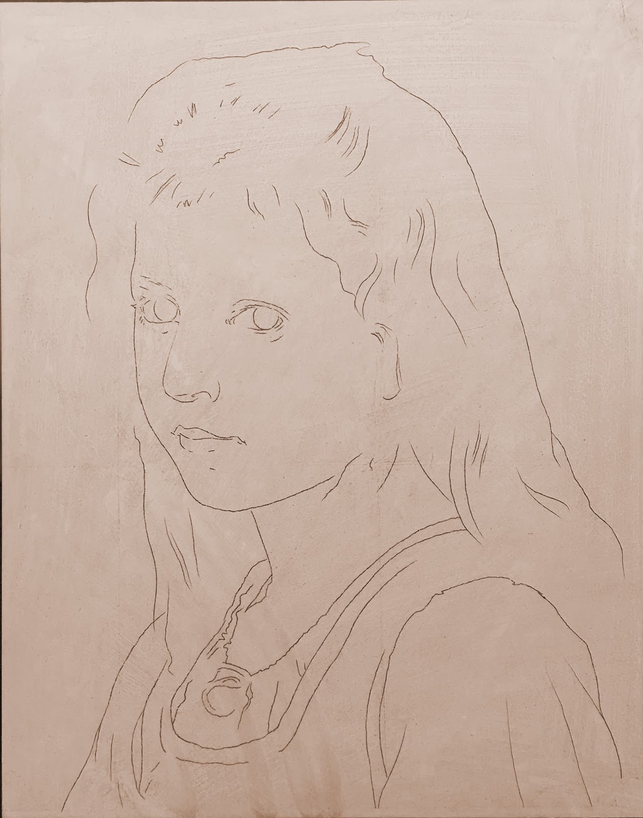
03. Grid up
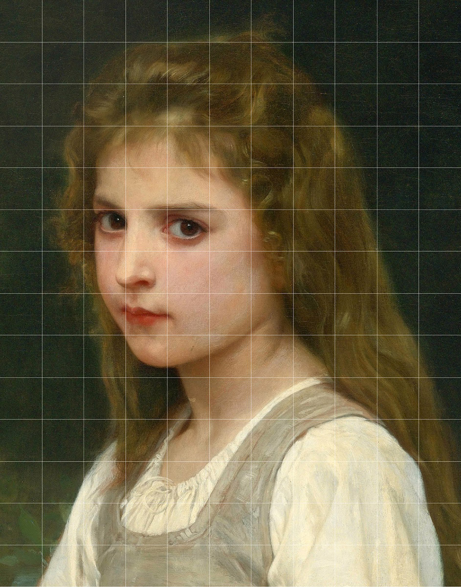
In preparing to copy the drawing to your board place a 1×1-inch grid over your source image, then lightly draw the same ratio grid on your canvas. Don’t make this too dark or else it’ll show through. Here I’m working at the same size – it’s a 1:1 grid.
04. Create an accurate drawing
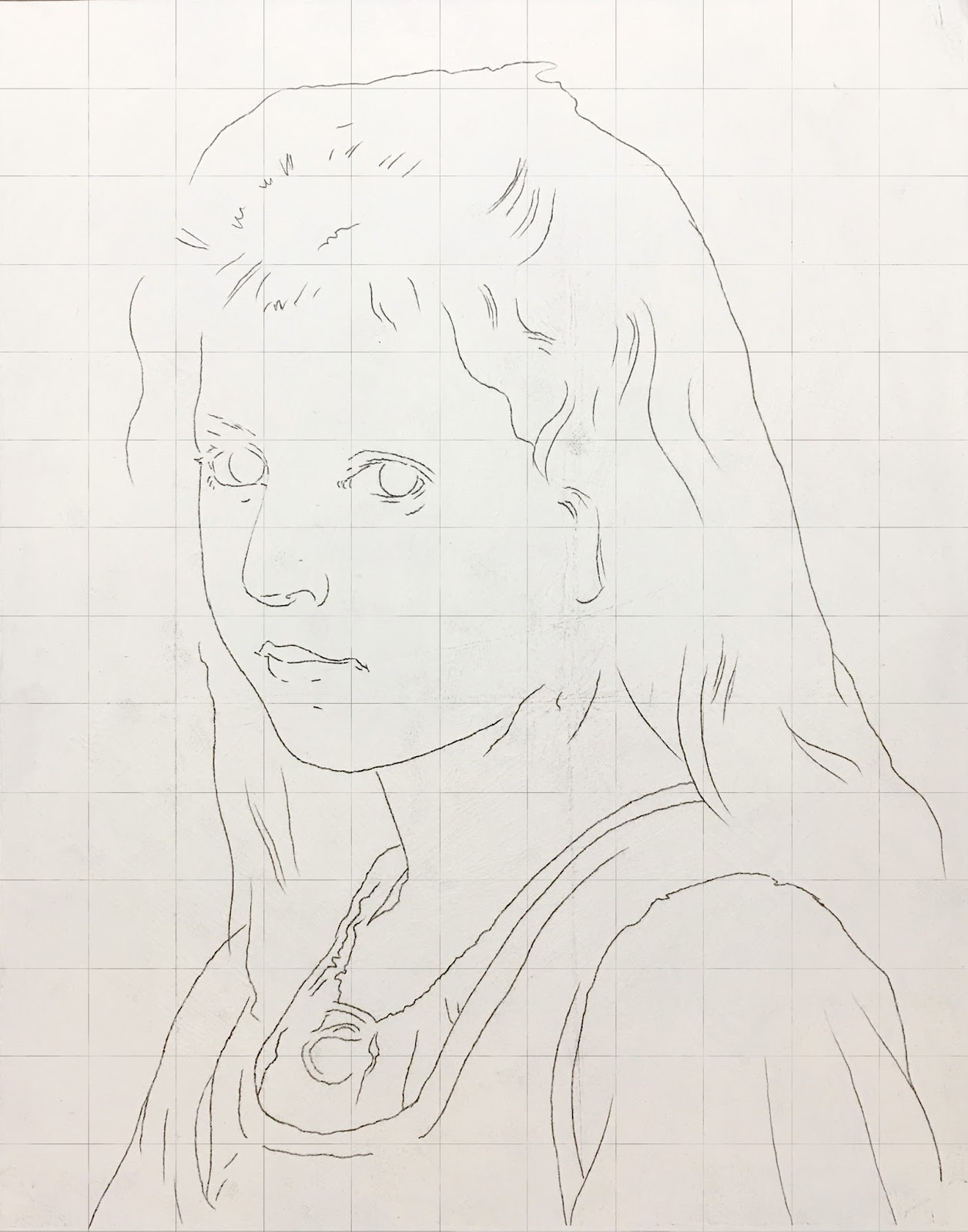
You don’t need to render out all the values when drawing your painting. Try to limit your drawing to just the landmarks that you’ll need to aid in your painting. Look for big shapes and clearly defined shadows. The sole purpose of this stage is to aid your final painting, rather than ending up with a fully rendered drawing.
Once your drawing is finished, either erase the grid lines and then spray it with workable fixative, or ink the lines with permanent pigment-based ink. Don’t use dye-based inks like a Sharpie or a ballpoint pen, because they can bleed through the paint. India ink works well, as do Micron Pigma pens. Bouguereau would ink his drawings with a brush.
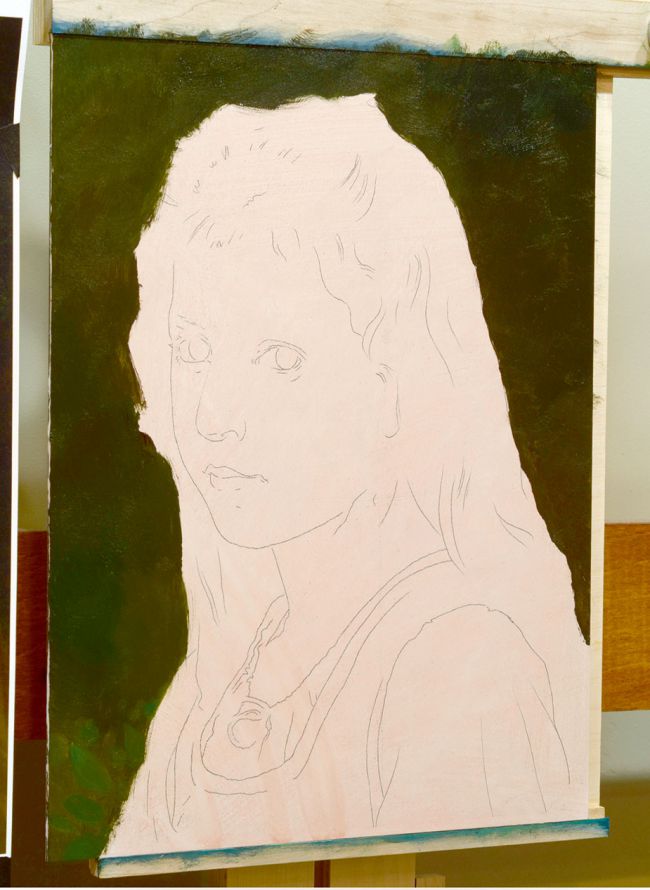
05. Apply the imprimatura
Now you need to tone your canvas. I chose to use a warm pink tone because I know from research that Bouguereau would often use a pink or warm grey tone. Research your artist and see what they preferred. This is called an imprimatura. Keep this transparent enough so that you can still easily see the lines.
06. Establish your flesh tones

My flesh colors are mixed from white, red, yellow and black. I mix a few values of grey rather than adding pure black to the flesh colors. This enables me to make adjustments to the saturation more easily. Mix plenty of paint so you aren’t remixing often. You don’t need to mix every color you see – just a few values in each color family
07. Establish values
It’s key to establish your value relationships early on. I try to get at least one portion of the painting as dark as it will be in the final, to help measure value relationships. In this case, the background and the eyes contain the darkest values. Save the brightest values for the final pass.
08. Paint in the hair
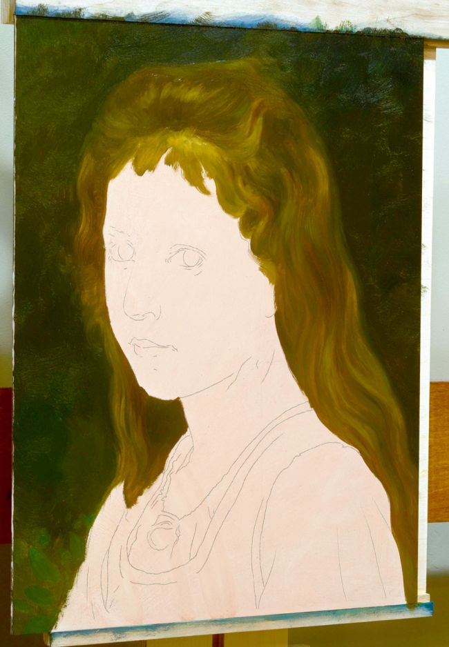
I’m handling the hair differently to the rest of the painting. I’ll try to get close in one pass to help the brushwork look more spontaneous. Later, I’ll add in some highlights and indicate some delicate hairs in the next stage, but you can get pretty close in one pass.
09. Paint the ébauche

The values and colors in the ébauche stage – my underpainting for the art work – aren’t going to be exactly how they’ll appear in the final. I look for the average color and value for the area that I’m painting. This will enable me to paint more opaquely in the final pass, but have small portions that show through, adding depth.
10. Finish the ébauche
Let the ébauche dry before you start the next stage. This will enable you to work more aggressively and scumble in paint without removing the ébauche. If you’ve added a drying agent such as Liquin or Galkyd Gel to your paint, it should dry overnight. Lead-based pigments like flake, and Cremnitz or Flemish white also speed up drying times.
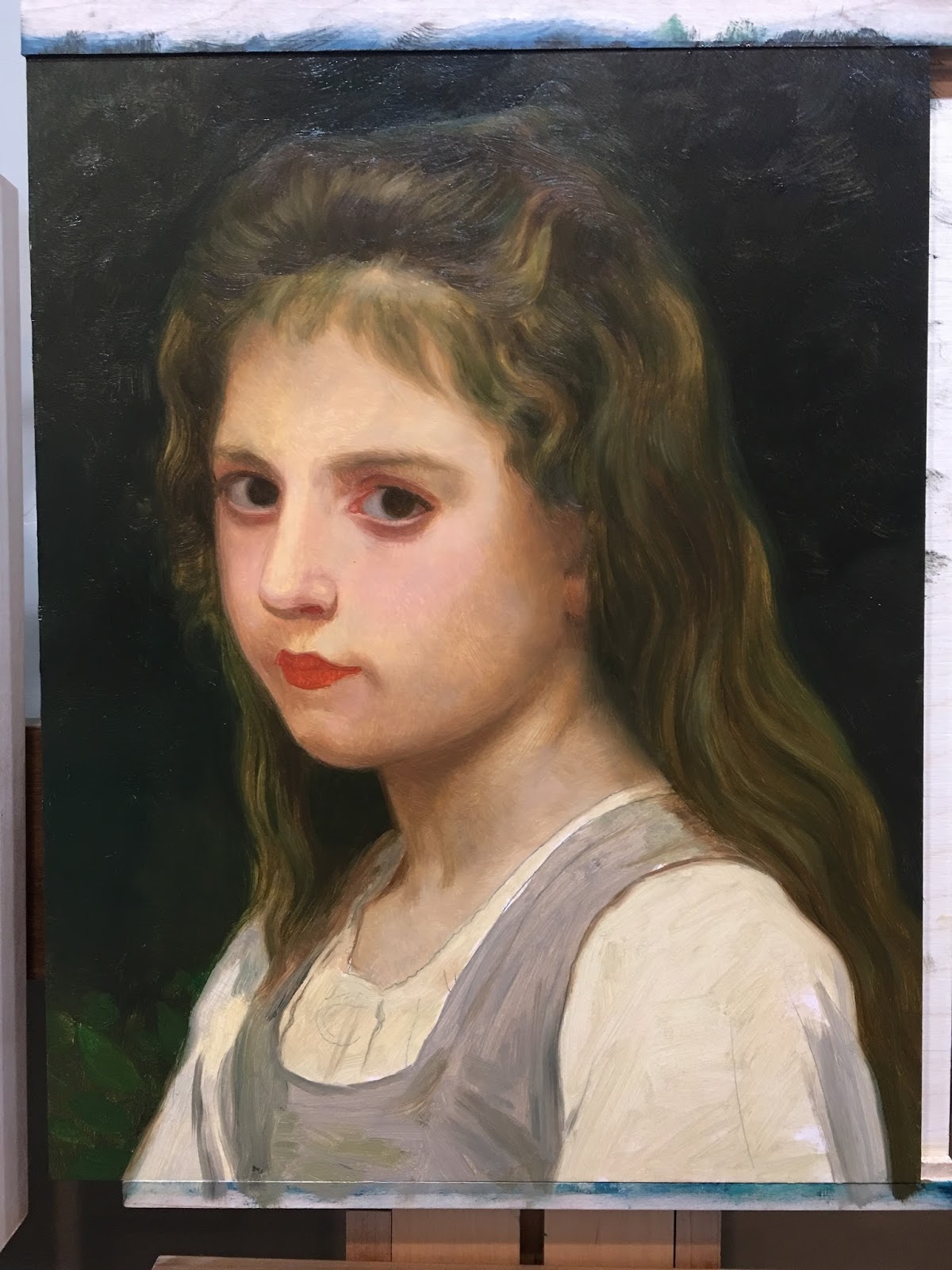
11. Start the final pass
Now we begin to render the final layer, and the goal here is to be as accurate as possible in the colors and values. Some parts of the painting might look dull and matte, so rub in a very thin layer of linseed oil or oleogel to restore values and lustre. Doing so will make painting into these areas significantly easier.
12. Focus on the eyes
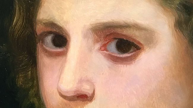
The whites of the eyes are really just a greyed-down version of the flesh tones. If you grab a painting of Bouguereau’s and take it into Photoshop, you can analyse the colours and see what basic hues are used. This painting is mostly red and orange in the flesh tones with low saturation.
13. Take a controlled approach
Work from one area to the next and try to avoid jumping around too much in the painting. This will help you in determining value and color relationships. Mix up plenty of paint, and if your paint starts to dry out mix up new piles of paint. If your paint starts getting clumpy under your brush then you need fresh paint.
14. Finish and varnish
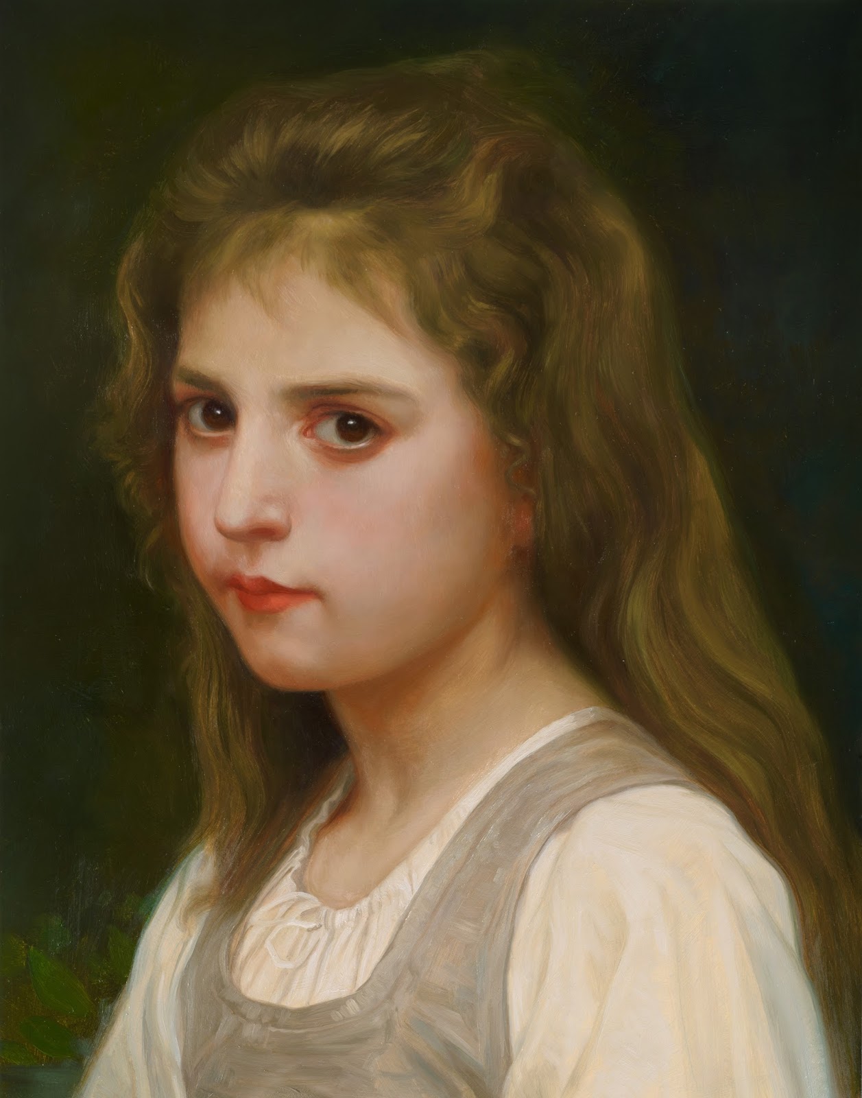
Look for the darkest accents and brightest highlights in this final stage. These will make your painting pop. When the painting has dried you can apply the final varnish. For Damar you need to wait six months, but with new varnishes such as Gamblin Gamvar you can varnish as soon as the paint is firm.
Below is a timelapse that was included with the article.
This article originally appeared in ImagineFX issue 144. As far as I can tell, the issue is no longer available, but ImagineFX has made it public for free so I am sharing it here. It is a wonderful magazine that is full of inspiration each month. I highly recommend a subscription, either to the print or digital formats!

Brilliant! Thank you for taking us through this process, very inspirational. Doing a master copy has to be one of the most enlightening exercises one can do.
Glad to hear it Nicolay! I am going to be teaching a class in January at the Scottsdale Artist's School in Arizona and can't wait to do another study for it.
Hey Howard, what are the details on the class in Scottsdale. I may attend, if possible.
대전출장마사지로 쉽고 간편하게 집에서 경험해볼 수 있습니다.