Last time I discussed the idea that for a painting to be great, it’s primary effect must be communication, not just the cultivation of appreciation. Of course you should still try to draw & paint well. Spend your whole life refining your craft if you can, but do it in the service of your message. At the end of the day: being able to paint well is the minimum threshold of your job. We all want to reach for something more, I think; we want these paintings to matter to another human being, to affect them.
Last time we barely scratched the surface. There are so many incredible and effective images out there that show off just how little is actually needed to get the job done; let’s take a look at a few more:
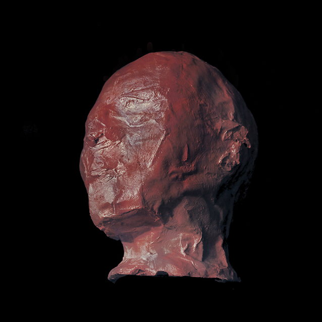
Jeff Simpson
This isn’t even a painting. Or maybe it’s a little bit of a painting. I know for sure it started out as a photograph of a papier-mâché sculpture on top of a styrofoam mannequin head. And after that…? Your guess is as good as mine, but it doesn’t really matter. This picture has power; it hits me like a sledgehammer.
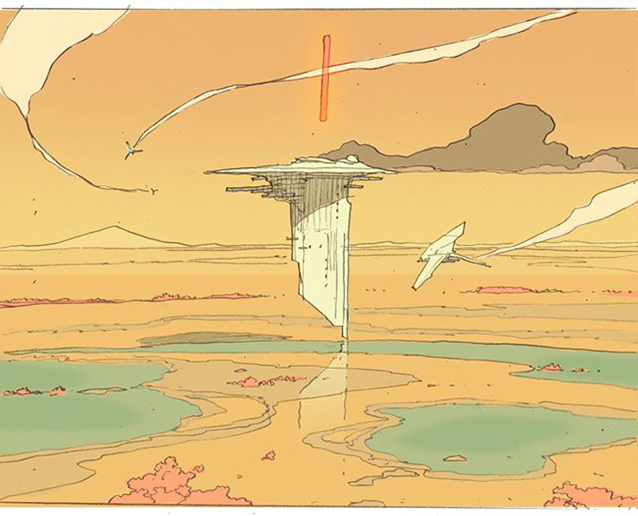
Linnea Sterte
Going the other way now. I love how many of the lines overlap and cross each other in ways that should affect the depth – something we’re not “supposed” to do – and yet with just pencil lines and a handful of colors the space is so clear, the effect so charming that I could stare at this forever. I know from stalking Linnea’s Instagram that she agonizes over her color choices, but the results speak for themselves. The right colors do the job; “more colors” seldom do.
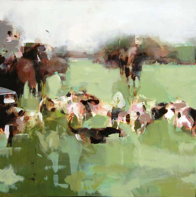
Alex Kanevsky
C’mon; I know you see them. It’s the brilliant patterns – how they mix and create the context our brain needs to fill in the rest – that does the trick. Alex sacrificed detail for a specific mood because mood is the message here. I’ve been smiling back dumbfoundedly at this painting for several years and I don’t think it’s done with me yet. I can hear them sniffing in the grass; I can feel them circling.
Katherine Lam
Katherine has been slaying the world of editorial illustration recently with her somber, intelligent pictures. She seems to know the exact visual language of a poignant moment. Take a long hard look at this one – there is usually more to find. Oh, and by the way: this is just flat shapes of color. There’s really no “rendering” to speak of. She pulls it off with a perfect use of key.
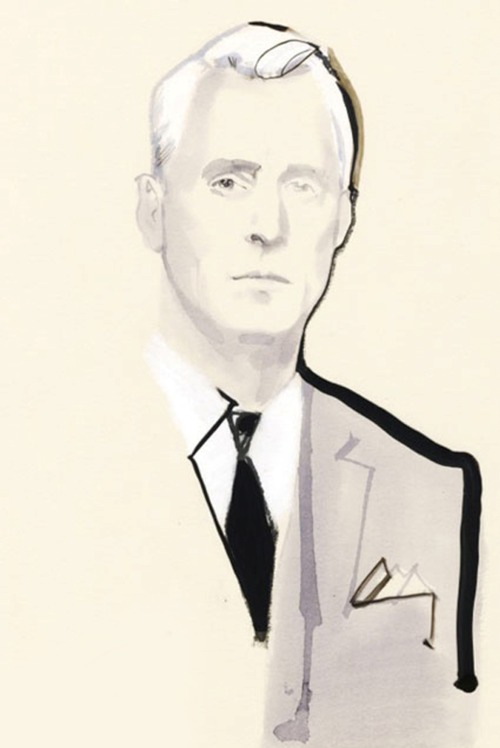
David Downton
One of my favorites. David’s images looks almost as if he’s unconcerned with anything other than the dignity, poise, and fashionability of his subjects, and yet: every almost-accidental-looking line has fallen in just the right spot to make a breath-taking drawing. I won’t pretend to know how something like this functions – how it can have such life and presence while also clearly being just an array of scribbles and graphic flats. The longer I look at it and try to figure it out, the more I’m affected and the more I’m just scratching my head. What I know for sure is: oomph.

It’s amazing how many of these works of art breaks the rules, but still work. Like Linnea drawing -horizon line near the middle! That’s a big no-no for landscapers.