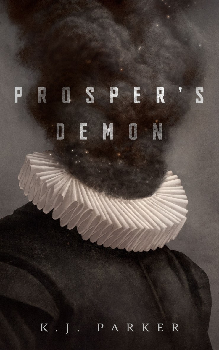
 Earlier this year I worked on a really fun project for Tor.com. Prosper’s Demon, by K.J. Parker, is a witty and wicked tale of Art and demonic possession, set in a high renaissance fantasy world. The language is whip smart and slightly dark, exactly the kind of story I like to make pictures for. I should thank the amazing Christine Foltzer for thinking of me in the first place for this project. It’s always so affirming when an Art Director gets your voice and can pair you with a project that compliments your visual language.
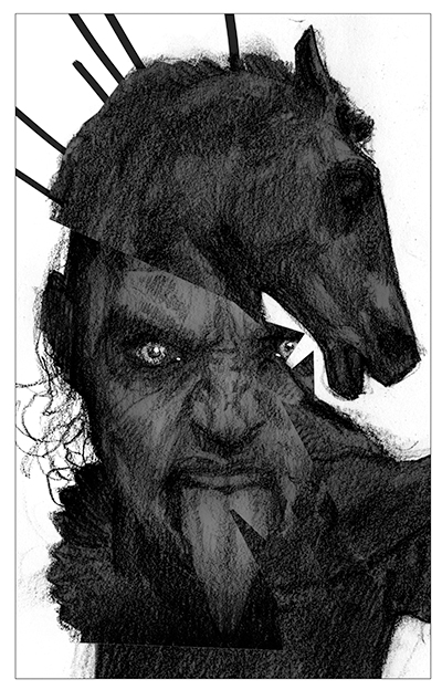
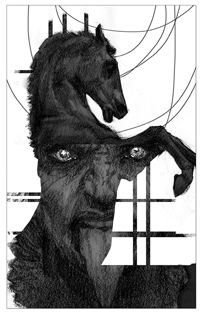
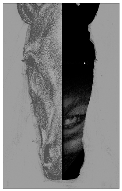
After spending some time reading the text I started to work on some sketches. My sketch process is usually pretty fluid. I’ll usually start with some interesting moments or symbols from the story that speak to me. I believe that a lot of what defines our style has as much to do with what we find interesting as it does with how we draw. What I’m attracted to visually is of course different from another artist, and it informs the kinds of projects I get.
The computer is a great tool for mixing and matching ideas. Although I like to draw with a pencil, photoshop is great for iterating quickly and seeing what sorts of interesting images arise when ideas combine in unexpected ways.

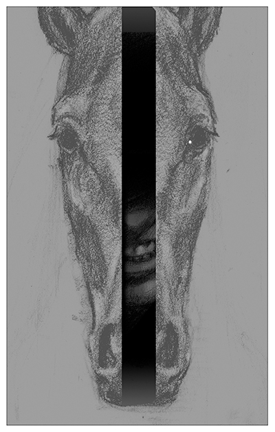
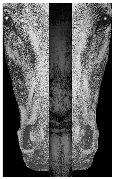
This is really just the same idea with slight variations, but I think it was worth exploring even though we ultimately went in a different direction.
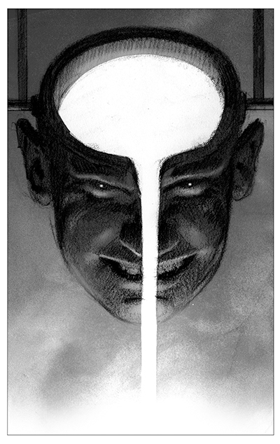
After sending through this first batch of ideas it was decided that these sketches were leaning a little too heavily in the horror direction, and I think Christine was completely correct. I mention this because as an illustrator, especially one working in fantasy and science fiction, it’s actually really important to be aware of genre signifiers. Covers aren’t intended just to make books look beautiful, they need to communicate at a glance something about the books tone and setting. Looking back at these now I can see there was an element of wit and perhaps even dark humor missing from these ideas, they just don’t quite fit the feel of the story. As anyone who reads a lot of fantasy knows, the genre has an incredible amount of variety, and readers are really good at picking up on those differences. Successful book covers, in addition to being beautiful, tell a reader what they can expect to enjoy about a story, beyond the particular details like character and setting.

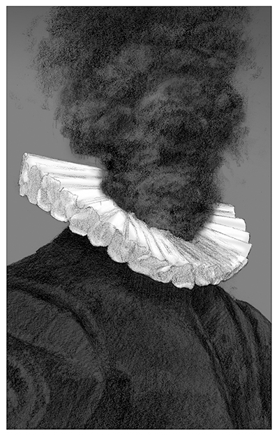
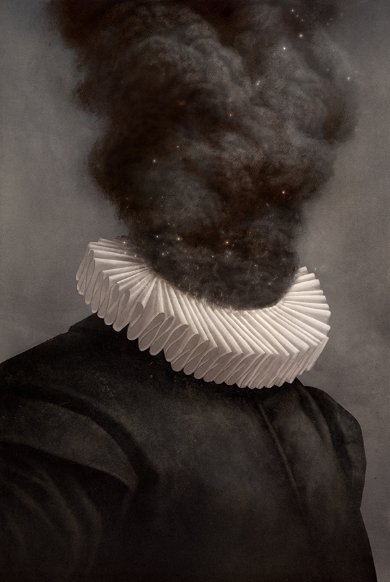
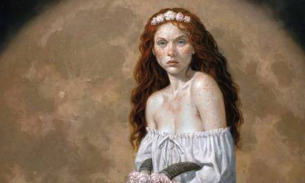
I sent over two more ideas after discussing what was and wasn’t working. We all pretty quickly agreed that the portrait and cloud of smoke idea was succeeding on a lot of levels. I like that it evokes the setting(high renaissance) and main theme(art and artistry), while at the same time give us a mystery or surreal vision to ponder(what the hell is happening with that cloud of smoke?). From an art making point of view I knew that I could really enjoy bringing some of the textures and forms in the smoke to life, and the collar would be a fun challenge. I try really hard to only submit ideas that I’m excited to make. I always like to ask myself while working on sketches, “Is this something I actually want to paint?” If the answer is anything other than a “yes!” I usually try to reevaluate what it is that I’m proposing to a client.
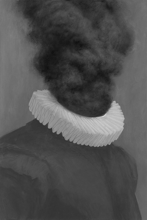
The final artwork started as an acrylic painting. There’s a lot of graphite drawing in here as well. Since I was planning to finish the image digitally, I wasn’t too concerned with lighting or form. At this stage I’m really just trying to establish all the big shapes, and bring in some hand made texture and surface treatment. The relative value is also really important, ie. the collar is lighter than the background, and will remain so for the entirety of the process. Being careful about those sorts of things lets me keep the softer, rougher edges that arise from working by hand.
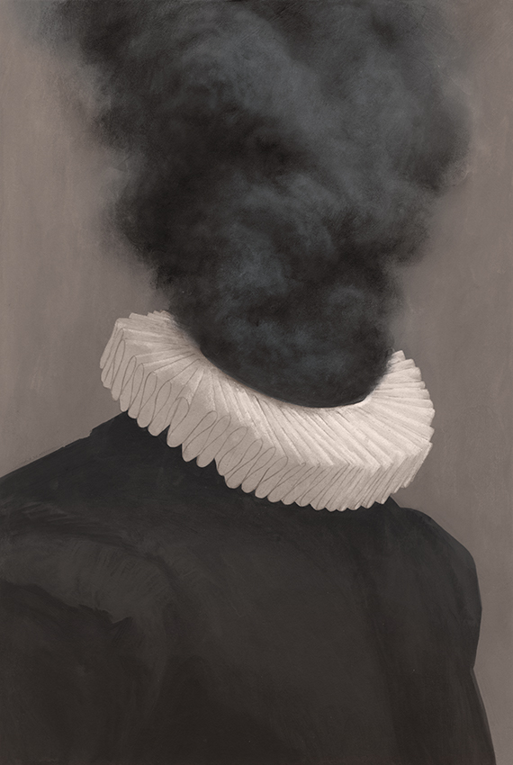
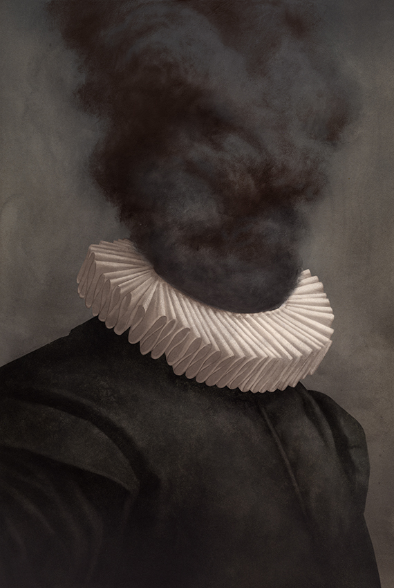 My digital process is really pretty primitive. I build shadows up using multiply layers, and add highlights with screen layers. Some Color Dodge for more intense highlights, and that’s essentially it. I use two brushes, the one that looks like a solid black circle, and the one that looks like a fuzzy, soft edged circle. I also like to make my own textures, from all kinds of natural media experiments. I have files and files of them.
Thanks so much for reading. I’ll try and answer whatever questions I can in the comments below.

Great cover. What size is the original image ?
So damn good man. awesome seeing your thought process and cool to see what you guys arrived at. and love the execution too. super nice finish.