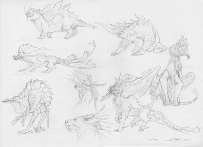
The new Magic the Gathering set is being revealed these days, and it is a set real dear to me. I was a part of the design team that fleshed out the style guide for that specific world called Ikoria. This setting is all about big monsters and small people. Monsters can be tall as skyscrapers and the humans are forced to live in defended cities called sanctuaries. Since the whole set was focused around the monsters and how they constantly mutate we had to come up with countless mixes and cross breeds of monsters. I did so many owl-cats and flying foxes and caterpillar-gorillas and so on. Some of them looking really silly and some looking quite nice and believable. Here is a spread of some of the variety.
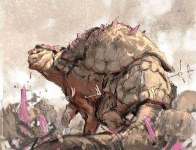
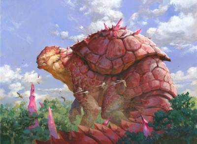
So when the set started commissioning art I got one assignment for a huge legendary creature called Yidaro. Andrew Vallas my art director trusted me to come up with a design myself for how he should look, but he should look both charming and possibly deadly. A gentle giant, but when angered would obliterate you to a pulp. I had a scene in my mind of a creature looking much like a cross between a turtle and a dinosaur. I pictured him in his natural habitat. An image kind of like if it was taken out of a animal photo book from a land far away. I placed him in a forest – well more on a forest because of his size – calmly eating the crystals growing among the trees. He is looking up like he heard a sound, mouth still dripping with the “food”. As if something – perhaps the viewer – disturbed his dinner and will soon be punished for it.
With that setting and mood in mind i started sketching.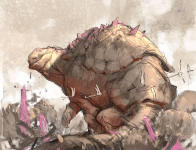
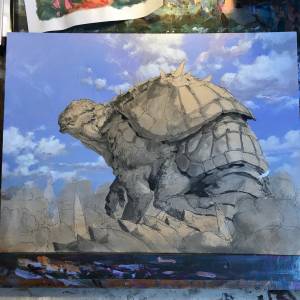
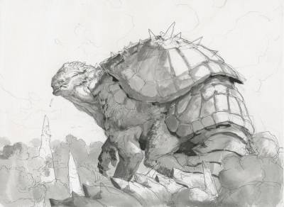
I showed my sketch to Andrew and he liked it if I made a small change. For us to believe that he was able to move fast if he wanted to, Andrew asked if I could raise the leg so that he was not as much sitting but rather walking. In my second sketch I raised the hind leg a bit and made it bigger, also adding a negative space between the tail and the leg. I added something like a shell-hat or plate to his head too, but as I started sketching it out onto the board where I was about to paint, I regretted it and removed it. I thought it made the silhouette weaker and added too much detail to the head. As I always do, I sketched the whole drawing onto a water color board and outlined it with a waterproof marker. The shape of the clouds I drew in with pencils only so that they would be covered up by the thin layers of the sky. Then I added all the values in black acrylics and took a photocopy to paint on for color rough.
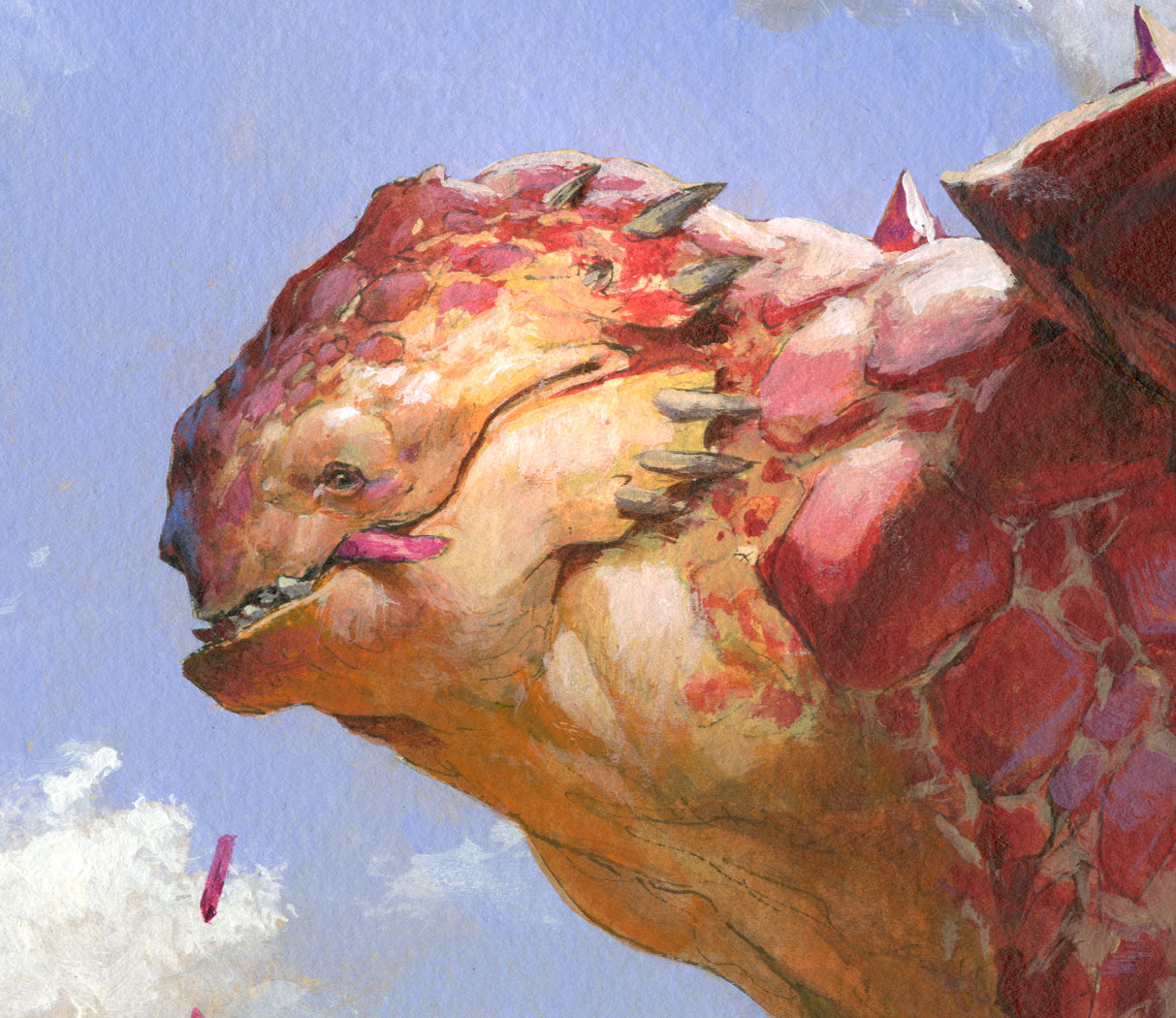
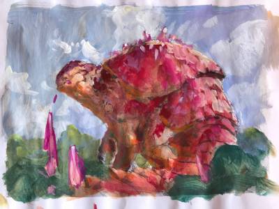
My color rough was a bit developed by luck and by limitations rather than skill. When I looked at the sketch, I realized that I had colored the crystals pink to show that they were different material than he forest.I kind of liked that, but looking at the yellow brownish turd of a creature I knew that I had to do something dramatically different. Here is the thought process. I hope it makes sense: I knew the sky would be light blue, so to get the highest contrast, I picked a heavy red for the body of Yidaro. Red and Blue are super contrast to each other and would get me the best readable shape of the monster. But I also wanted to explore a strong bounce light. If I wanted to have the ground reflect an orange light up into the shadow underside of the creature I needed a different temperature in the direct light, or else the whole body would seem flat and just warm colored all over. So the more affected the red body was to the direct sunlight, the more I turned the red into a magenta. The more it would point away from the white cold direct light the more it would be warm red, and the elements that would point down towards the ground and would catch the most bounce light would be colored orange. So most of the color choices was dictated by a need for a colorful creature combined with the blue sky and a constant evaluation to search for the best temperature contrast. I made a small error- at least when it comes to what light would do in real life: The temperature of the direct light in his face is warm and more sand yellow than the light on his back. If this was a real photo of Yidaro I think the white light would have burned out the orange tone on his face and made it cooler. BUT, I like to have the face the focal point and in keeping the warm color I get the best contrast to the blue sky color behind it and that outweighs realty for me. In my rough I also determined to have the threes in the foreground a cold green as if they were in shadow. That way I would further establish depth to the trees in the background.
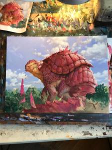
I mask out the figure using airbrush film or frisket film. That way I can paint a rough background not minding if I paint on top of the figure. I simply love painting clouds. Mostly because they are soft and organic shapes and you can paint them very spontaneously. I do that by first painting around them with the blue and then painting the white into the blue with a soft edge. Now that I have established the form and shape I go back and forth between painting blue sky into the clouds or white highlight strengthening the cloud shapes. I keep in mind that even if it is a fluffy shape, they still have to follow perceptive rules, No matter what clouds have a top middle part and bottom. When i was happy I removed the film and started on the creature.
Lastly I remembered to add the flock of birds flying by him that had been painted over during the process. They are really important for the reading of the image I think. The tail of Yidaro leads us into the picture up towards his face and then we follow his eye direction to the birds an their line of action. I think they help with the impression that he is raising the head and looking back towards us in a movement rather than a stand still pose.

after the release of the image on the internet I have had people saying that they thought it was his tongue hanging out of his mouth. That is so annoying. I never saw that, but seeing it now I can understand why. I wish I had changed the angle or size of the crystal in his mouth so that it was clearer it is a crystal.



Thanks for sharing! learnt something new 🙂
This is so inspiring. I love how alive your creatures feel
I love him.