
Help Is On The Way
Do you suffer from chromophobia (the fear of using saturated or bright colors because every time you do your picture winds up looking like a cheap effect from Star Trek TOS)? Well, turns out you don’t suck at anything, but you probably misunderestimate the role of something else…
It goes by many names: lightness (I’ve heard), luminosity (la di da), Mithrandir (I think that’s one of them), brightness (unfortunately), darklightitude (as I think of it, and screw you, auto-correct), or, put simply: how light or dark a color is. But since this is MC we’re going to be professional and use the proper term: value (though every time I do that the kids freak out and ask why I am being so judgmental about their art).
This mnon-descriptive mname does make for a mnice mnemonic device, though, considering HOW FREAKIN’ IMPORTANT DARKLIGHTITUDE, sorry, VALUE IS FOR PICTURES AND SEEING.
What’s all this stuff?:
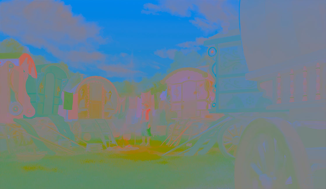
A color only world is not as much fun as it might seem.
Ok, that wasn’t so hard, but now take a gander at this:

Sorry, this is mostly how we see the world (I know… yawn).
When people talk about a certain “color”, they are explicitly or implicitly alluding to value as one of its components.
Q: “What color shirt are you going to wear?”
A: “Navy blue” (dark) or “pink” (light), or “yellow” (light), or “teal” (whatever)…
If the answer were simply “blue”, then we don’t really have a picture of what color the thing is. If it were “red”, we wouldn’t imagine pink, even though pink is essentially “light red.”

Which carries more important information?
The point is this:
- The world is made up of a lot of colors…
- By “colors” we also mean value…
- What we mostly see is value
So get a handle on how value works and color will become a matter of choice and expression, not agony and struggle.
There’s Color in Them Thar Grays
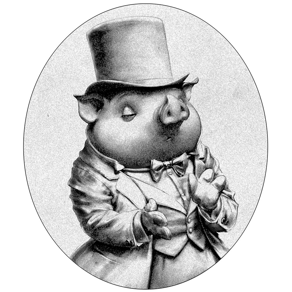
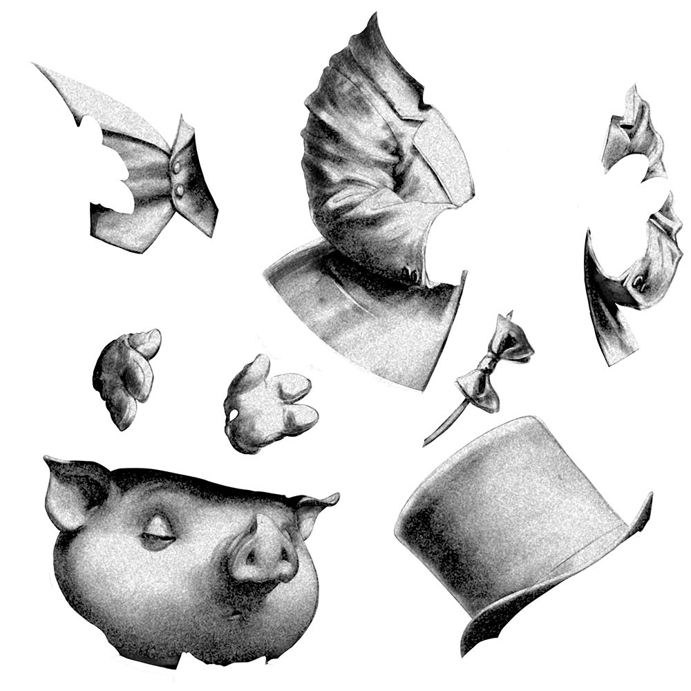
Meet Horace Cunningham, avid opera goer and hardboiled police detective. Putting aside his insistence on keeping his top hat on during the performance (and all the time, in fact—a practice I enthusiastically endorse), he can teach us a lot about the importance of value in pictures.

The various articles of clothing, as well as Horace’s skin LOOK LIKE THEY ARE DIFFERENT COLORS. We don’t know what those colors are, of course. They could be black, white and gray (or “grey” as Horace would say)—but those are different colors.
You don’t get this by simply painting in different colors then converting to grayscale—you get this by properly distributing values within each colored thing. And this is true whether you are painting in color or black and white.
To see what I mean about the illusion different colors, take a look at this:
Let’s leave this fellow for Halloween.
The poor, misguided artist who drew this* thought by turning up the contrast on everything the illusion of light would be stronger. He rendered the light and dark areas within each element using the full range of values, evenly distributed, then used line to hold the whole thing together. Regrettably, the result is no illusion of color and a crippled illusion of light.
*The slob in question bears a remarkable resemblance to a younger yours truly
There’s nothing wrong with this look. I think it’s kind of cool, and has a certain power. But if this is how you use value, when you work in color you are likely to have trouble getting the result you want.
Compare the two pictures of Detective Cunningham above, and study hard the difference between the illusion of strong light (which ghost Horace may have) vs. the strong illusion of light (which he doesn’t, because the value relationships are harsh and simplistic). The first picture is like eating a full meal with rich, balanced flavor, and the second one is like guzzling a bottle of hot sauce. Nevertheless, unsophisticated value distribution like this can hide behind solid draftsperson-woman-nonbinary-manship.
You may choose to work this way, or use line with flat value, or any other way you want, but for the illusion of light and “full color”, value distribution is paramount. It is far more important than any system of color organization you might come across. It’s also fairly straightforward to get your mind around.
Value Scales
When I was in art school a teacher said: “Every value in a picture must relate to every other value in the picture.”
Impossible! I thought. I couldn’t imagine how to do that—and he didn’t tell us, because it was the 1980s, and certain teachers were in the habit of pouring their derision upon everything we did, exposing every weakness, however carefully hidden, and… anyway, I found, it can be done!
You’ve probably been told about using a value scale—NOW HOLD ON! Stay with me. This horrendously boring concept is EVERYTHING. I’m not even talking about a physical scale that you use to gauge values in the real world—just the idea of a linear arrangement of values, for talking and thinking about value. A way of SIMPLIFYING it so you can spend your think energy, your thinkergy, yeah, on creating and trying to say something with your art.
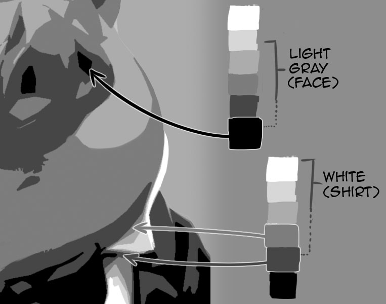
Let’s start with three values. Just three! Black, white and gray. Look how much we can do with these three values, by how we distribute them:

Color and light with just three values—what more could you need?
We still have the appearance of different colors:
- White (shirt, gloves—rendered with white, plus a little gray)
- Black (hat, coat, tie—rendered with mostly black)
- Something in the middle (face, vest, pants—rendered with mostly the gray, plus a little bit of white or black)
No white is used for the black things, and no black for the white things.
Now let’s double this to a whopping six values:

Subdividing the colors with intermediate values
When values are distributed with care like this they start to “pump” light—so much so that this begins to look realistic even with no detail or soft transitions. This is characteristically different from the disconnected spikes of value seen in ghost Horace, where every element has substantial areas of white and black. Even all that soft shading cannot bring him back to life.
For rendering light there are other factors on top of this, but the basis for all of them is understanding value ranges and this kind of value distribution. Take a minute to take this in and really see it. Compare the above to ghost Horace, so you learn to recognize when this particular thing is happening and is not happening in your own work.
This is how little it takes to get the illusion of light, when the RELATIONSHIPS are all pumping light together. With a little blurring you could almost believe you’re looking at an out of focus photo (if such things could be photographed).

Horace was known for giving photographs of himself in lieu of proper gifts.
That’s just the six flat values, blurred.
Once you understand this you can make the light bright, dull, colored, whatever you want:

The many shades of Detective Cunningham.
In these pictures every value has its perfect place (“every value relates to every other value”—woo hoo!). Can you say the same about your pictures? All of them? Well maybe that’s why you’re not happy with some of them. Maybe that’s why you THINK you are having problems with color. “Wah, I’m no good at color, wah.” I hear this so much. If only you knew that… now lean in close… I’m going to tell you a secret. Most color problems are actually VALUE problems. Really! When your value relationships are solid you are unlikely to have color problems. Maybe you didn’t appreciate the supremacy of boring old value! Do I need to show you the traveler camp picture again?
When Black is White and White is Black
In the three-value study we limited the values used for each colored thing (no white in the black top hat, for example), otherwise we’d certainly be paid a visit by ghost Horace, yes? No! Not necessarily, if we play our cards right. Looky here!

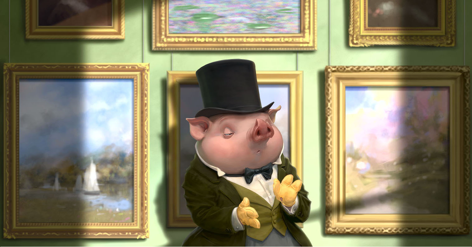
Detective Cunningham is moving up in porcine society.
Horace has upgraded his felted wool top hat to shiny silk. Now the hat includes every value from black to white, though it is still a “black hat”. Even Horace’s skin has gotten a polish, extending the upper end of its value range all the way to white. And his necktie, too, has acquired some shine, with lighter values, though it is still black. These white or near white spots are specular highlights. They’re what happens when a shiny surface reflects the light source itself, with some degree of sharpness and focus, most often perceived as white, typically the lightest thing in the picture.
And now… a confession. I told a little white lie earlier because you weren’t ready for the whole truth. If you look close you’ll see that in the six value picture, the white things DO have tiny little areas of very dark value, nearly or actually black:
Occluded areas are where little or no light reaches
These are called “occluded” areas, or occlusion shadows. They happen in small nooks and crannies where very little light reaches. It’s so dark in there it can be hard to tell where one colored thing ends and another begins.
These two factors (specular highlights and occlusion shadows) can increase the value range of any colored thing to include all values from black to white. But the way these values are distributed within each thing varies depending on the color of the thing, unlike what we saw in ghost Horace.
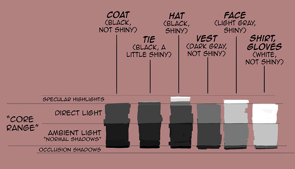
Highlights and occlusion shadows: small but important.
Color (Finally!)
Ok, here comes the big one… are you ready?
If your values are well ordered—ANY COLORS WILL WORK.
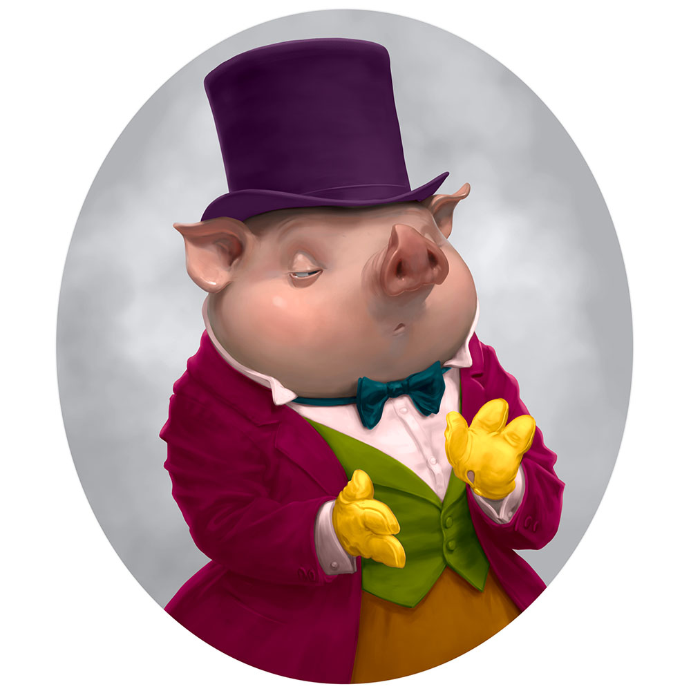
Here’s Horace fruitlessly vying for the hand of Elizabeth Bennett, perhaps:

Clothes maketh the pig. Good luck, dear friend.
Btw, his “green” coat is actually yellow.
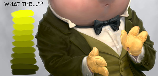
Dark blue, yes; dark red, sure; Deep Purple, rock on, but dark yellow—NO. Doesn’t exist. If you every come across it, send me a pic.
This and other marvels will be discussed in a future post (if you’re good—hint: it ain’t a pigment mixing thing).
Back to the present, here is Mr. Cunningham ready to pursue a different kind of fox (sorry):

Tally-ho, whatever the flip that means.
And now with muted color, for a little more class:

The perfect outfit for a dreary wuthering day on the heights.
And here’s… whatever this is:
BAM! KA-POW!
Batman villain, maybe?
These examples are the result of just straight colorization—no reflected light, no attempt to make the colors “go together” or harmonize in any way.
This is not a method, and these images are not picture perfect—but this post is not “all about painting light and color”. There is a lot more to that than just colorizing. This piece is to show how resilient and flexible your color can be when the underlying value structure is there.
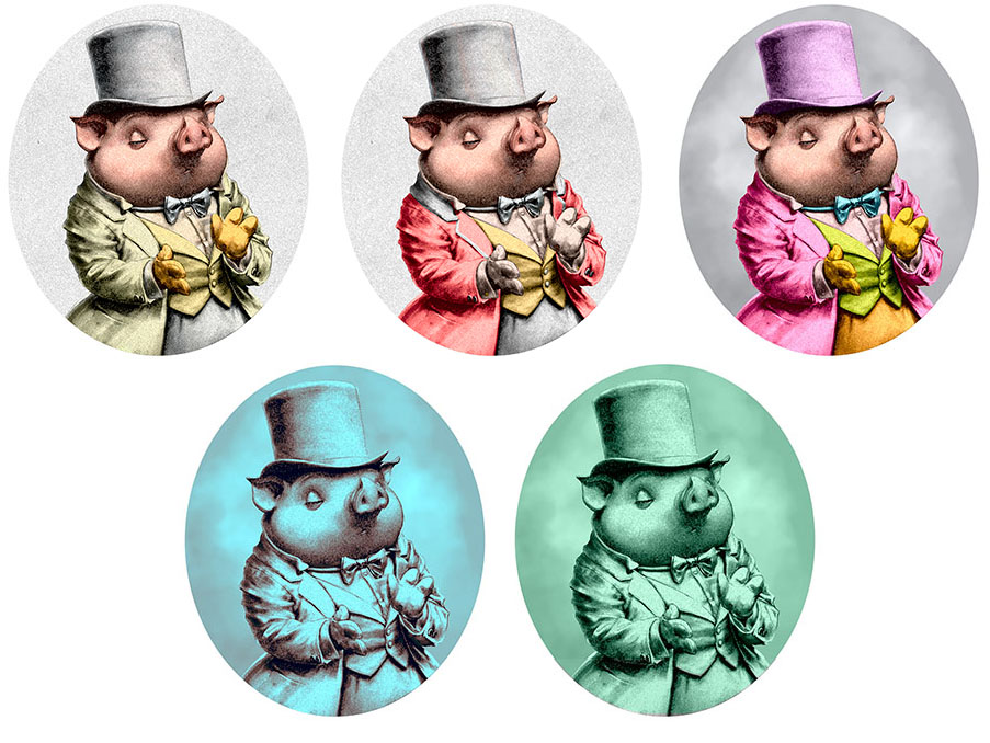
Here’s a two color gradient map over the base value image:

Gradient maps: the netherworld between monochrome and full color.
Here’s our garish friend with that gradient map overlaid to unify the colors:

Not so scary now, Mr. Pig.
Totally random color choices, and it doesn’t look half bad because of the concrete underlying value structure. The point is, if random colors “work” then I can choose colors to do what I want with the picture, including, monochrome:

I’d rather look at a monochrome picture with good value structure than a full color pic with none.
Painting directly in color (as we usually do) is NOT an automatic path to good value distribution. In fact, color misleads. Hue and saturation make it harder to judge relative value. Do the gloves appear to be the same value in the different colored versions?
To see through the color, painters squint. This switches the eye from cone to rod vision, so we see darklightitude more than color. You can also take a photo of your painting and convert it to grayscale, or use a layer to view your painting desaturated if working digitally.
Now, your colors simply working is not the ultimate goal—but it is commonly the problem artists have. Just getting your colors to not suck is a challenge, especially in the beginning.
You don’t need to kill your colors, you need to control your VALUES.
For the heck of it, let’s see how colors work (or not) with one-dimensional values (ghost Horace):
Now hardly any colors work.
Digital Painters Beware
In painting programs the terms “value” (as in HSV), “brightness” (as in HSB) and “luminosity” (as in Lab) do not represent the same thing. Lab color’s “luminosity” comes close to measuring darklightitude as the human eye sees it, but the others don’t (and are not intended to).
I won’t get into the math, but for example, in HSB, pure blue, pure red and pure yellow all have “Brightness” of 100%. But their “luminosities” are 30 (dark), 54 (medium value) and 98 (nearly white), respectively:
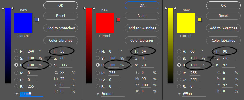
“Brightness” is a fairly useless variable.
Really you don’t need to use any of these numbers at all, but if you perform colorizing operations in any mode other than Lab, the resulting value is unpredictable. If you colorize a grayscale image in RGB mode, for example (which most artists work in), your values will not be preserved.
Think Flat
Here’s your homework: imagine a subject or find a reference or use life, then paint it with just three flat colors: black, gray, and white, one for each thing (but different things can use the same flat value). No shadows, no depiction of light, no highlights. Mr. Cunningham, for example, would look like this:

Modeling and shading aren’t everything—there’s light and color in flatness too.
Don’t worry that certain elements merge together (like Horace’s glove and shirt). If you are primarily a draw-er (as we all are at first), this will bother you. Don’t let it! Allow this to happen and get comfortable with it.
You can increase the value range a little if you want, say, another gray introduced for the face and pants:

And if you can learn to think a little more like that, and a little less like this:
You will be freed of your chromophobia once and for all.
Cue the applause.
And happy painting.
Mirab, with sails unfurled, for now.


Excellent… thanks for posting…
Thanks for the nice comment.
This was very helpful. Thanks a lot!
Great to hear. Isolating the variables is a great way to home in on what you want to learn.
I love your posts so much Chris! Thanks!
:3 I’m the kind that really struggles with color, so this is kind of morale, a good dosis of morale. I’ll be sure to keep track of those Mithrandirian flows of light.
That’s good to hear. Believe me, I went from being someone who was convinced he sucked at color (and painting light), to having a very solid grasp of it to the point where I can do what I want to do, and I can see what other people are doing or trying to do. It is a question of learning, that’s all. You can definitely do it. I think you will like my next post.
Oh, and thanks for picking up on my reference.
Thank you for tackling all these subjects so that I don’t have to 🙂 Big fan of the knowledge you’re bringing to MC right now.
Thanks for saying that, Tommy. I’m a big fan of your posts too. I am a thousand percent with you on the “talent” thing.
Love this, Chris. Thanks!
Thank you, my art sister!
Thanks a lot for explaining this kind of stuff. As self-taught artist, I discover each day that I don’t have any technical base about how to paint. Such articles help me a lot.
Excellent! Thanks for commenting.
Right now, I’m loving you so much, man! I feel like I’ve been waiting for this post all my drawer life. I read and read so much on the topic and, yeah, I felt I was just helplessly bad at colors. But now, there is some hope for me. Thank you!
Thank you for the note, my friend. I’m glad this helps you.
>You don’t need to kill your colors, you need to control your VALUES.<
I’m going to remeber this wording as I’m forever trying to persuade new painters that you ‘can get away’ with ‘unrealistic’ colour if the tone (or ‘value’ on your side of the pond) is right.
That is so perfectly said, Marion! The paradox of value is that it is SO fundamental, we don’t notice it. Maybe we see a painting with brilliant colors, then try to emulate that look, and our painting looks horrible, and we don’t know why. Value is the key to completely free use of color.
When I first tried to draw with pastels I always felt that just couldn’t find the right color I needed. So I bought a MASSIVE set of them, like 500 or maybe more. But, still, my pictures were falling apart. So I dumped the pastels for years. A decade later I tried something else: I chose 10 pastels based solely on value, and did a drawing using them. Basically I approached it like a monochrome drawing, except each value had a slightly different color. The result was transformative for me.
Jeezz…. this is sooo much information and very helpful. Values is so important. Thank you so much, Chris! Can’t wait to see your discussion about light & color.
I’m so happy you found it helpful, Steven. Value is the secret weapon of picture making. I say “secret” because when it’s working well and strong, people don’t consciously notice, and when it’s not there, people often don’t know what’s wrong.
Very enlightening, thanks for that!
Very glad you found it so!
Awesome post Mr. Beatrice. Seems so logic and basic that is hard to understand why nobody teaches this kind of things (I have only read Mr. Mullins talking about this same topic beore).
And yes, it makes me smile finding your easter-eggs-pop-culture-references, including “The happiest days of our lifes”!
OMG, I thought no one was going to get that reference!! Hah, hah, thank you for that. I, too, wonder why these fundamental building blocks are not taught like this, but I think many artists and teachers tend not to be analytical, so they freely conflate HOW THINGS ARE with HOW THEY DO THINGS. And if they make great pictures, then the difference seems unimportant (to them and their students). I only very rarely talk about how I do things, and when I do, I am very careful to make it clear that that is what I am talking about. Otherwise I focus on the objective stuff. Because a) this area is greatly underserved and b) I think this is the way to help artists find the fundamental tools to project THEIR OWN voice.
An excellent article, thank you, so very helpful!