 I was always fascinated by comic book artists. Especially Richard Corben. His, sometimes cartoonish line and exaggerated shapes combined with strong and contrasted colors, burned its way into my brain and sat there as a steering point for my art. I was always drawn to stylized art. I felt it could express feelings – at least my feelings – better than naturalistic art could, or at least the range seemed bigger.
Anyways; for me it was the CEO of Fantasy Flight Games that ended up defining my style. At the time I was still vague in my own style, but he told me they liked my covers for the stylized comicbook-like lines and strong colors. Also he thought that the level of cartoonish angle I had made it equally appealing to both hardcore fantasy fans and people who didn’t know much of the genre. He even said he showed some of my artwork to his grandma and she liked it. So to him it was a hit. For me it was defining. From that day I doubled down on everything he had said. I kept drawing inspiration from French comic books and used the color theory of the Hildebrandt brothers and started honing my own style.
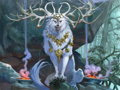
In the end it came out as it is today. In my most recent painting of “Anara, Wolvid Familiar” for Magic the Gathering I will try to exemplify my style.
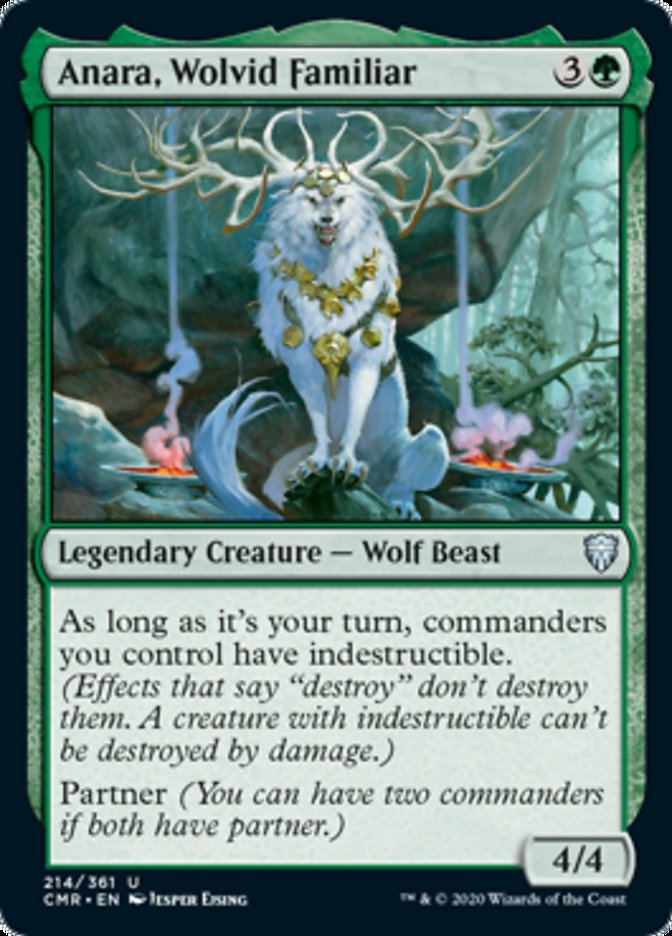
Here is what I aim at:
*Strong silhouette
Since most of my artwork is for magic cards I start every image by considering the reading of the silhouette. the image will have to be clear at a very small size. Good thing is, a strong silhouette works equally well in small and big sizes. In my wolf painting I went for a centered regal pose with the head straight on and the antlers forming a crown. The pillars of smoke frames the figure. The centered pose I find works well for serene scenes that has a holiness to it. Perhaps because religious ceremonies are slow and well choregraphed.
*Simple shapes
The huge boulder in the background I deliberately kept as one huge shape. The reason is I wanted it to act as a dark backdrop for the figure. the wolf was gonna be white so the background needed to be dark. Had I gone with a busy detailed forest background I was afraid it would have been too distracting from the figure and especially the antlers.
*Saturated clear colors
I choose only 2 main colors for this. A purple and a Torqois. And then an accent color of orange burning from the fires. I usually go with 2 colors that are from the same family and mixes well with each other and then a contrast color to add contrast and difference. This simplified color choice usually gives a harmonious image and keeps things simple ( meaning I will not mess up and use every color available,)
*temperature contrast
The choices of colors I base on temperature. If the main image is build up by cold colors, like the Purple and Turquoise, I will pick a warm splash color to add contrast and to give me a range of temperature. The fire just seems warmer when it is surrounded by colder colors. I like to add warm light to the shadows to imitate bounce light. And I find that an element such as the big boulder just seems more 3 dimensional when it has a warm bounce light to break up the huge shape. Its a matter of keeping things interesting even if the value is almost the same.
*Simple compositions
I try to keep it as simple as possible. My wife worked many years as an editor and she always said that the manuscripts they got in, could all use to be trimmed down by editing out a quarter of the words. “It makes what’s left, so much more important”, she said. I try to do that by keeping, especially my backgrounds, as simple as possible. Also In building up the composition I try to center everything around the facial area by using lines to point towards it ( like the antlers ) or by framing it ( like the smoke and the half circle of the boulder ) or by just using very easy to read poses like this centered straight-up-and-down-legs-next-to-eachother pose.
*Focus
I gain focus around the face by using the max amount of contrast and details here. The further I move away from the focal area the more I devaluate color, contrast and details. So that nothing much is happening in the edges. I kept the white top light strong on the wolf head and chest and just desaturated further down. Thinking about one focal point, makes me less inclined to start rendering unimportant areas and filling the corners with details.
When I look at this wolf painting I see the elements that makes it distinguish to my style. Sometimes its hard to tell, but in this one especially I think the points are very clear. I did take a lot of inspirations from photo of wolves and from nighttime photos of forests, but I tied to use the inspiration to add believable detail to my own sketch and drawing thus keeping it in my style instead of just copying from photo. I find that when I lean too close up against a photo ref, it dies a little bit and loose some of my personality. In the end, my personal style is what keeps me apart from the rest of my colleagues. My personal style is my art language, my way of speaking. My peroneal voice.
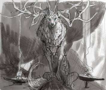
Thumb sketch
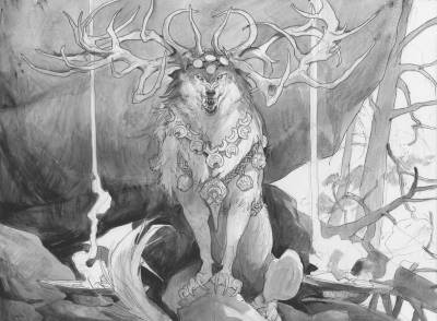
Preliminary
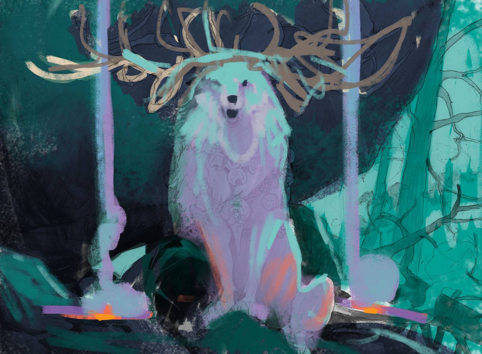
Digital color comp
Final Acrylic painting

Lovely piece and a perfect showcase of the elements you describe in this article. Thanks for sharing!
Thanks for sharing your process and the importants aspects of your art. I’m currently looking for my own voice and learning what is important in an art piece according to my personal style, my art language, my way of speaking without throwing the fundamentals out of the boat.
Reading about the thought process of an experimented artist, specially you, one of my main inspiration, really help defining this. Usually artists talk more about their technical process and less about the why this choice was made.
I found my art being really boring lately because it fit the industry mold and it just screams to my face that I want more expressions and exaggeration because always gravitate around expressive artists like you or Justin Gegard. I guess it’s time to get of my griffin and do a leap of faith about this.
Can’t wait for your next post!
Same Marika ! Though my “problem” is pretty the opposite : I feel like my art is screaming too much of my personal style and I’m looking to quiet it down.
Recently I was searching for something else like a more realistic style, but I feel I could lost my voice this way. As you say, we wouldn’t want to fit the industry mold, but keep our own voice!
Reading this post is telling me maybe I should just let it talk, just channelling it with the help of fundamentals, wise choices and strong statements like Jesper is talking about there. 😀
Thank you for this article!
Love your posts Jesper. This one was specially enlightening.
Thanks so much.
What do you refer to with Hildebrandt Colors? Would love a lil bit of expanding on that topic.
Best,