Up front, I want to tell you that the things I’ll be discussing about this piece aren’t really the things I want to discuss. But a few things have conspired against me that prevent me from really digging into the process of making this piece. First off, despite being released mere weeks ago, the painting was done over two years ago. That was before I was asked to be a part of Muddy Colors, and also before I started routinely documenting every piece with process shots. Thus, instead of talking about painting it then, I will talk about fixing it. Or improving it. You see, I have a bit of an issue with the finished painting. So I’m going to do a little bit of exploration to see if I can’t figure out a solution that works.
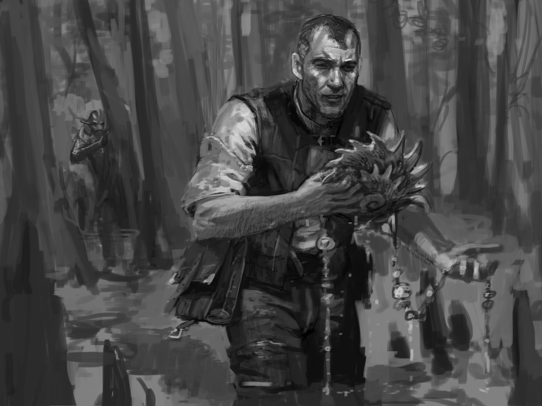
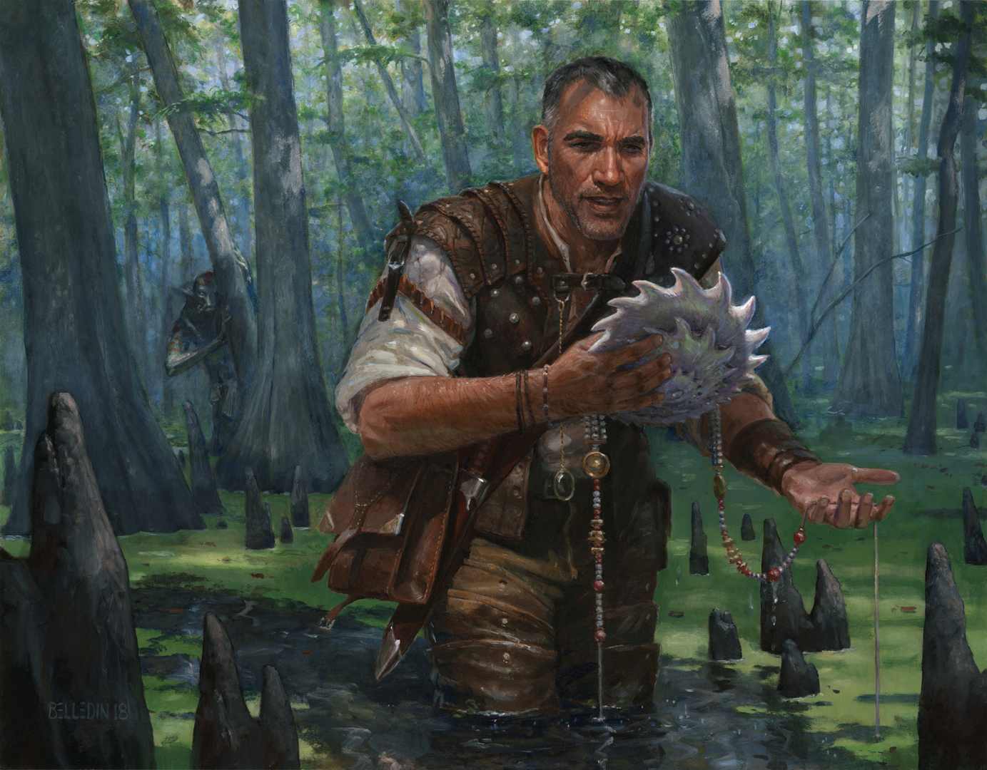
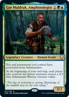
Before we dig in, let’s take a quick look at the piece as it stands:
The assignment was to show this character, Gor Muldrak, wading through swamps in search of merpeople artifacts, unaware of a merperson silently observing him. The design of the merpeople was predetermined, as was the basic aesthetic of their artifacts. The swamp was to be based on a mangrove swamp. As for, Gor Muldrak himself, he was mine to create.
Here’s my sketch:
While the overall concept of the piece was accepted, it was felt by the fine folks at Wizards of the Coast that Gor’s clothing was too simple. In my head, I was definitely going for an Indiana Jones vibe and I felt that simple, practical clothes made sense (he is wading in a swamp, after all). But, the client wants, what the client wants, and so I gave folks a bit more to look at:

The revisions give put his garb a bit more blatantly into the realm of fantasy, but I think I managed to maintain the element of practicality that I was originally shooting for. The folks at Wizards agreed and I went to paint.
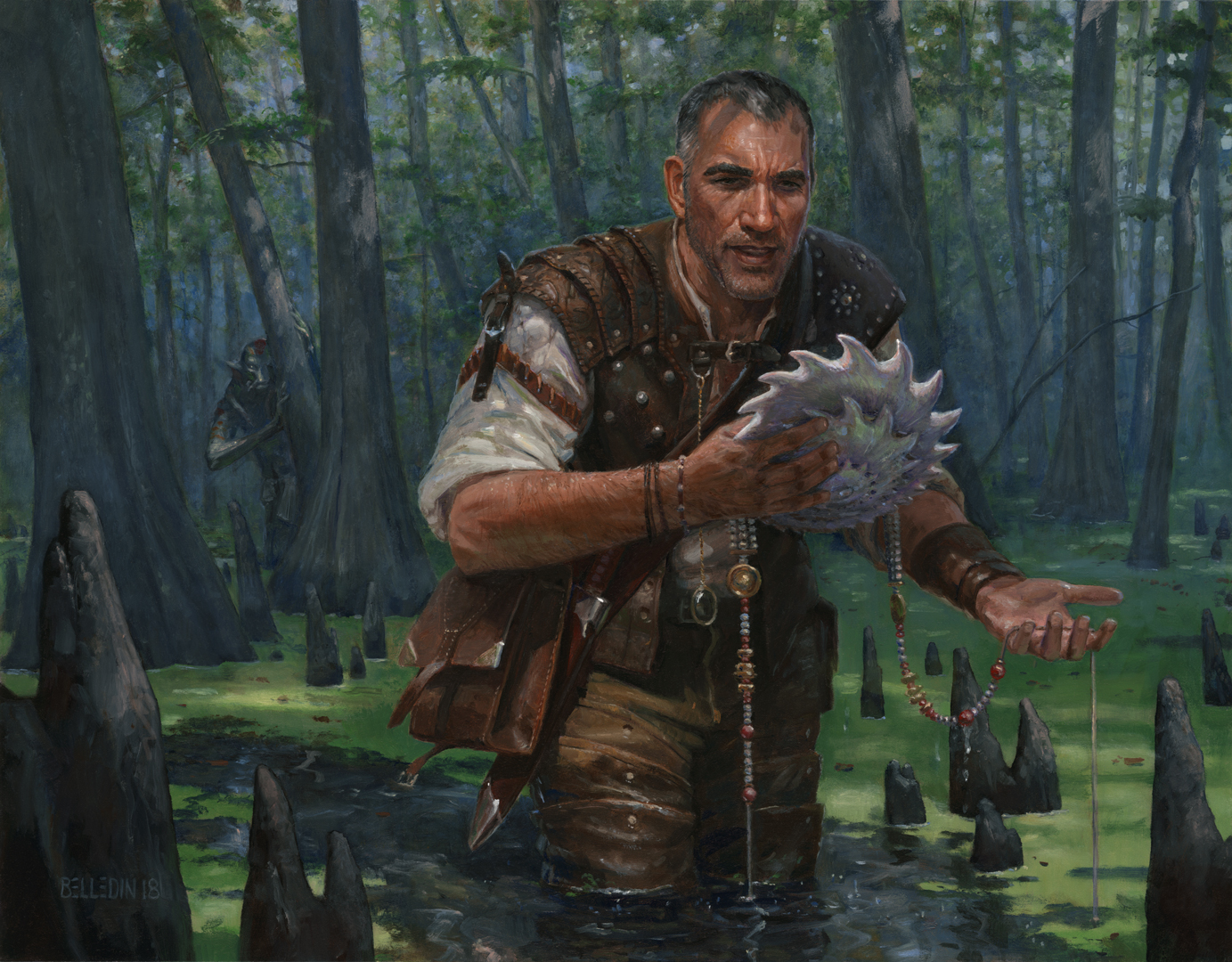
The finished piece is eighteen inches wide by fourteen inches tall and is oil on gessoed hardboard. It was art directed by Andrew Vallas.
Okay, what’s the issue I have with this piece? What am I here to talk about? Primarily, value and edges. Well, value and edges as it pertains to this piece. You see, while I feel like the piece works pretty nicely at it’s full size, I realized a little late in the game that I wasn’t really doing enough to maintain a clear figure/ground relationship. What I mean by that is that the figure’s silhouette doesn’t separate from the background to the degree that I think it should—especially for when the piece is shrunk down to card-size (which is only about one and a quarter inches wide).
The figure/ground relationship is something that has traditionally been important to Magic art in particular (though I think it’s something that is a factor in most paintings in some form or another), precisely because of the small reproduction size. Having the subject be clear within the scene tends to be the easiest way to keep it readable at the card’s small scale. The goal isn’t so much to have a figure (or any given subject, for that mater) that feels like a cutout, it’s just to have an image that makes for an easy read, and lots of lost edges can make the legibility of such tiny images a bit more difficult. While I don’t consider this painting a complete fail on that front, I feel it could have been better. So, I decided it might be worth pondering a solution.
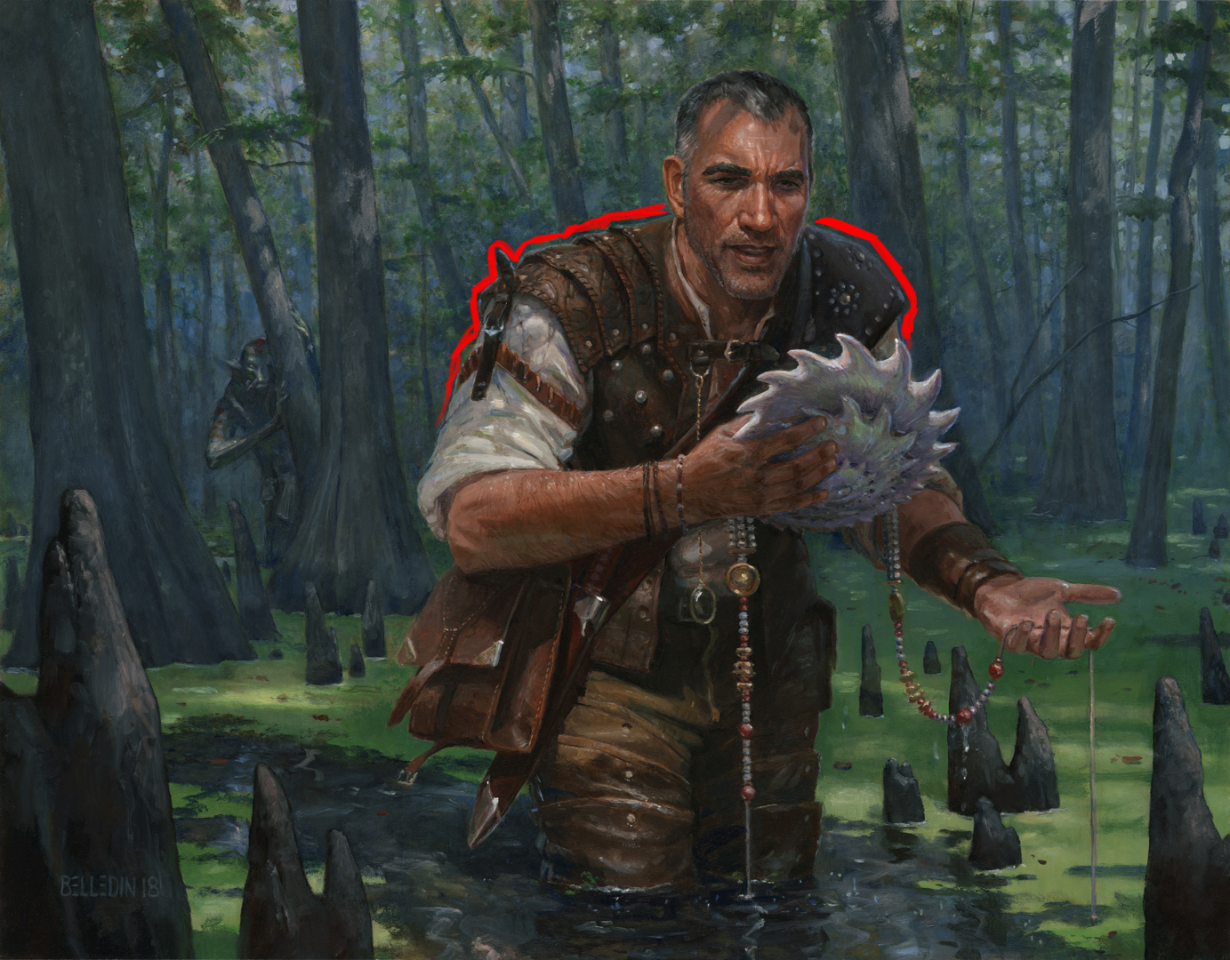
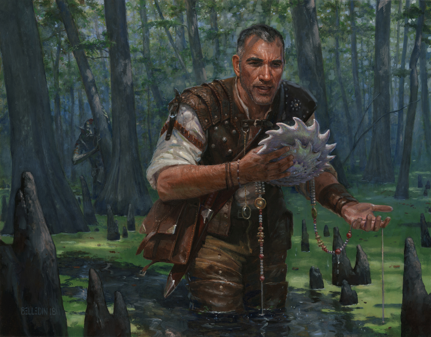
Where, specifically, is the issue in this piece? Well, where I think things are getting a little muddy value-wise is the edge along the top of the shoulders. To me, the value of the background (or the ground) is too close to the value of Gor Muldrak’s leather shoulder pads (or figure). For clarity, I’ve highlighted the offending area in red below:
Were I working digitally, the solutions would be many and easily be applied. But I’m a painter and I want to consider this from a more traditional mindset. So, I’ll be taking into consideration is how much work any given edit would require to paint in oils. This is an aspect you fine digital folks are free to ignore, but my fellow traditional painters will undoubtedly be thinking a bit about what some of these edits would require, as well.
So, for the sake of argument, let’s suppose that I handed in the piece and the art director felt that the figure/ground relationship was an issue. Let’s also suppose that the fix also had to be done in oil, or that I was really hung up on having a painting that matched the reproduction and so went back into the piece to match any digital edits I might use to solve the issue. Again, this is still something you fine digital folks can ignore. It’s all a mental exercise anyway as I never actually altered the piece, so let’s just roll with it.
On to exploring some solutions…
Off the bat, the obvious and simple solution is to simply mess with the values in Photoshop until it works a bit better and then paint that:
 Overall, I think this does a pretty decent job at solving the issue and it took me less than a minute in Photoshop. To match the painting to the above image, though, I’d essentially have to repaint it almost completely. Seriously. It’d be a lot of work. Every value has been altered to some degree, but mostly the lights and middle values. That’s 90% of the surface easily. So we’ll call this a last resort. Not the most practical solution, but one that we know could definitely work.
Since the issue is one of contrast, maybe it’d be easier to just darken the figure. After all, that would require reworking a lot less of the painting, right? Let’s give that a go:
 Not a fan of this solution, really. In other circumstances it could really work, but I think it falls short here. Darkening the figure causes some degree of flattening in the figure and also begins to kill some detail that I find pretty valuable. It helps a little bit along that edge, I think, but not enough to justify this course of action.
Maybe brightening the background is the way to go then. It’s more to rework than darkening the figure, but it falls short of having to rework the entire piece. Sounds good:
 That definitely pushes us in a better direction, and I don’t hate it, but it still falls short of completely working to me. For one, it changes the tone of the piece and pushes it into kind of a cheery space, which isn’t really what I was going for. Also, it made the merperson in the background a bit too important. It still feels like too much work for the level of improvement.
All this talk of reworking large areas has me thinking, is there a simpler way?
Keen eyes may have noticed something by now, and that’s that a major reason for the background and shoulder silhouette being so similar in value has to do with the fact that the background actually gets darker immediately along that edge. While that darker area does help define the edges along the sides of the figure’s silhouette, it definitely subtracts from the clear definition along the top of the shoulders. What if I were to just repaint the areas of the background that come directly in contact with the silhouette of the shoulders? Definitely worth a go:
This is a quick and dirty edit, but I think there’s clear improvement off the bat. A subtle difference and minimal work actually makes for a decent degree of change. Is it dramatically different? No. Is it improved? Yes. I think this is definitely something I’d consider and would probably be an aspect of my solution. Could I go even further with it? Sure. And I think by doing so, I’d probably gain more and more definition in that edge. But still, I feel like we haven’t completely cracked it.
Hold on a minute, some of you may be thinking. This isn’t just a value issue. This is as much an issue of shapes that are begging to be simplified. The background around his head is perhaps a bit too busy and detailed. Couldn’t simplifying and massing those shapes solve the issue? To that I’d say, yes. To a point. However, the value of the more simplified, massed shapes is still going to be a factor that I’d have to wrestle with.
Moving on…
So we know that that area of the background immediately around the shoulders is a problem. We also know, we can fix it to a certain extent. But how can we make the figure stand out even further? Something I often do when I have issues like this is to glaze the entire background back with a light color in order to sort of push it back in space and give it a bit more atmosphere. Something like this:
To say that this lightens the background, isn’t quite correct, however. It’s more that it crushes the value structure into a narrower space. If I glaze the area with a color that matches the lightest light, the lightest values will still retain the same degree of lightness, but the middle and dark values are brought closer to the lights. But you can also glaze an area back with something closer to a middle value so that you’re crushing the lights and darks closer to the middle. And obviously, you can do the same with darks and thus bring the crush the lights and darks closer to the darkest values.
Were there not a story element in the background, I wouldn’t hesitate doing something like this. But I think there’s a real risk of pushing that merpserson back a little too far and obscuring that aspect of the story. With careful planning and maybe some brighter dabs of light on the merperson, however, I think it’d be possible to tweak its visibility and kept its presence consistent within the composition.
So, what would I actually do to solve this? Practically speaking, I think I’d have both altered the area of the background along the shoulder edge and glazed the background back with a lighter color. It might have ended up looking something like this:
Again, quick and dirty, but it definitely feels consistent with how I’d tackle the issue.
But like I said, I never did. It was the kind of thing that nagged at me but I never got a chance to solve. The deadline hit, I turned the piece in, and it got approved. It sat in my flat files for two years and I thought about it the entire time. Periodically, I’d open the drawer to look at it and I’d realize it didn’t bother me as much as I’d remembered. It turns out that at full size, I was pretty happy with where it landed. Obviously, the figure could stand out more, and yes it could work better at card size. But even then, in the end, I think it turned out okay.
But yeah, the figure/ground relationship could’ve afforded to be better.
Still, while contemplating this article, I wondered what might happen were I to push the solution in a bit more extreme direction. As a final exercise, I did this:

Roughness and directional issues in the light rays aside, this direction shows some promise to me. Value-wise, a lot of the issues the piece has are solved here. But lighting-wise it makes no sense, and I’d have to repaint much of the piece to support this lighting scenario. I won’t lie, though, I wish I’d had the instinct to go this route when I originally painted the piece. It could have been a goodie.
But then maybe I’d have had even less to write about.

I like this process to find the solution 🙂
Love it! Great post. Before you went into the different ways you could solve it I tried to think of the ways I would try to solve the problem. I got some of the obvious ones, darkening the figure, lighten the background. But I completely missed others like just subtly altering the edges around the shoulder. I’m really impressed on how thorough you were on the different directions you could have taken. My personal favorite of the options you presented was compressing the values of the background with a mid-tone glaze.
It’s a good reminder that that there are many different options on how to solve a single problem. None of them are necessarily wrong. But the “right” one is going to be the one that tells the narrative you want to tell, meets the goals set for the piece, and also fits the constraints of your work load.
Thanks! You’re totally right. There are usually several options to solve any given problem. I find that the way we each tend to solve problems is a big contribution, in the end, to our personal aesthetics. Even two people arriving at the same way to solve something will have tweaked things differently and that could lead to dramatically different results.
Man do I love your posts. You’re so reflective. Are you a Virgo Steven? You have that way of thinking. Always striving to have something better.
I think the original piece looks amazing. Really enlightening to see how an experienced artists looks at it to go further.
Thanks!
Thanks for this. I am not a Virgo, in fact. I am a Libra. And despite my search for balance, I’m rarely happy with the bit I manage to achieve.
I love your analytical approach to self-critique, Steven. Being able to view our own work objectively, and make changes based on that is a critical skill.
My secret is not liking most of what I do. With that being the case, it’s easy to pull it apart and view as little more than an object. That being said, I had some excellent teachers that were incredibly instrumental in keeping some distance from my work and seeing it more objectively. For obvious reasons, it’s more difficult with personal work. But even then I’m constantly analyzing and reanalyzing every decision. That might explain why my larger work takes forever to finish.
Sorry to be late to the party. When you mentioned being concerned about loosing the figure I wonder if you couldn’t keep the muted background and convert one of the stumps poking out if the algae into the head of the creature. It would have a light backdrop and also heighten the sense of threat. “Oh no! It’s in the water right behind you!” Then you could do whatever you wanted in the back without the fear of loosing the figure