This week’s demonstration is short and simple, answering a few questions I was emailed about some images I posted in a previous article. The images were the rough sketches and the studies for the environment I am using in a graphic novel.
The questions were regarding how I make a cut away drawing, or a isometric floor plan and why do I make them for illustrations?
To answer how I make these drawings, I first start with a tiny thumbnail, or several as I stumble into other concepts that might work out better. This is called the iteration stage, and there could be (minimum 3 for most publishers up to dozens depending upon what the job is, the importance of the design, who it is, and how much time you have to work. These iterations are designed by having done lots of referencing and researching, visiting on location or by memory, watching video footage, and whatever other consumable way to input memory before sketching.

Once these sketches are done, they are then deliberated over by the production team until one, or pieces of several are found useful to move forward with. Mind you, these sketches are very rough and are done with a team of people who know each others skills, otherwise these would be dolled up with values, and maybe some conscious details to add some grit to them.
When the idea has been narrowed down, the next stage I develop is the blueprint. Just like making a building, I have to start with the floor plane to establish where everything is before I sketch the final shapes. This gives me command over any camera angle I choose to work from when I illustrate the space. If I raw a point anywhere on the blueprint, then draw a triangle from it emulating the viewing space seen through the lens of a camera, this triangle is a culling line that will help determine where in the composition(frame) from left to frame right where the objects in the drawing will be located. It is extremely helpful, especially if one does not have an easy time envisioning pictures in the imagination space.
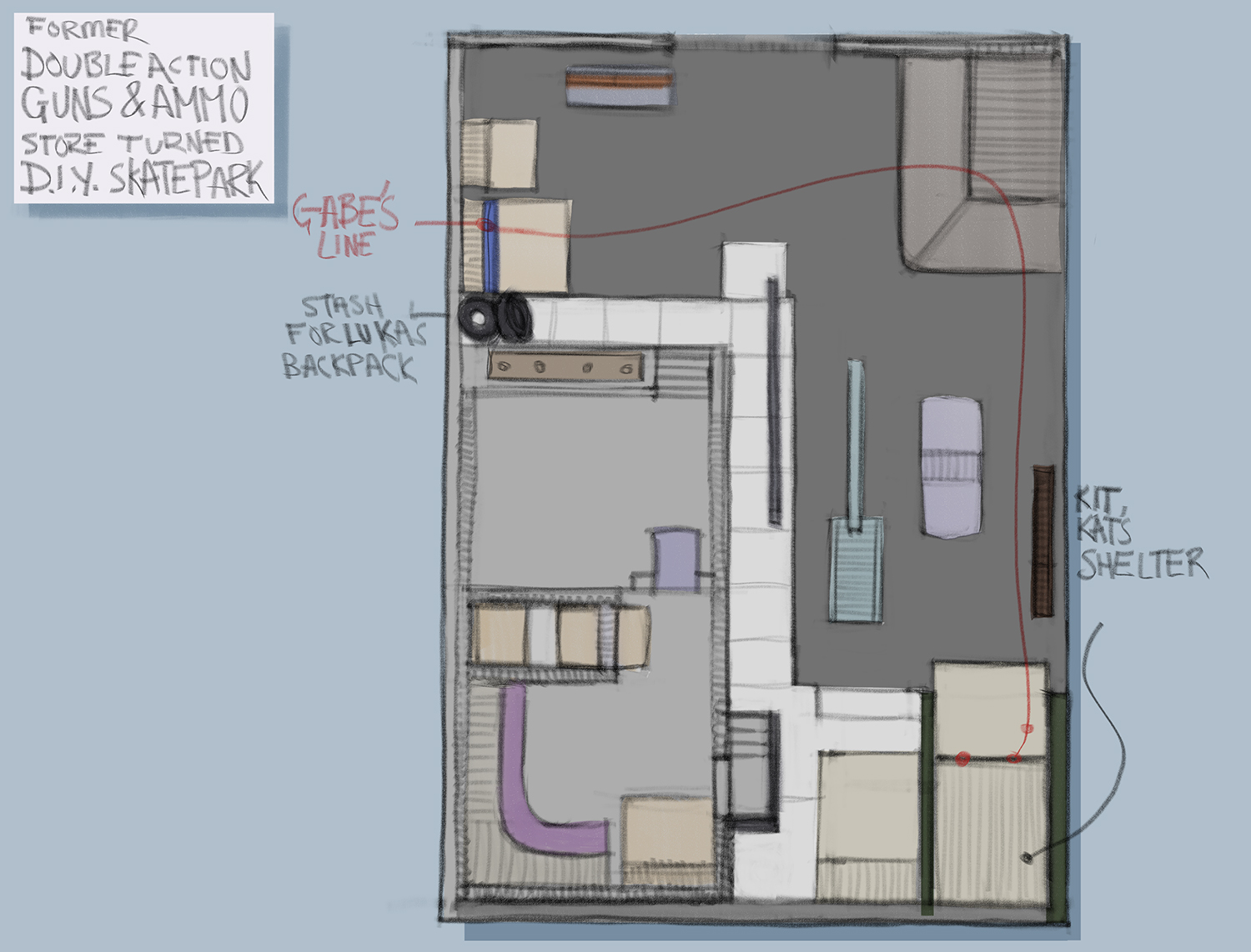
It is also helpful to devise a backstory to go along with your design, it does make things much easier to flesh out. I decided to make this a failed gun store, so I made up a name, and gave it a little history.
Double Action Guns and Ammo was run by a man involved in a gambling ring. He had cheated in a few too many games, and as a result, was taken out along with his store his store, blown up from within the vault where all the ammo is stored. The store blew sky high and took out the neighboring stores with it. While the other stores made their repairs and continued with their business, the gun store lot remained untouched.
Several years after the incident, the US govt went through a very ugly change, and all the small stores went out of business. The entire block remained untouched, and the gun store lot was overrun by DIY skaters who refurbished the space into a street skate park. This is the state of the lot as we begin the story.
Having a back story makes it easier to approach the layout. If you feel awkward starting a blueprint layout, look one up and start with that as a template. Type in “___________floor plan”, and more than likely several, if not many blueprints will show up in your search. Use these as a starting point, maybe trace a few, then alter them to your liking. This is very similar to making a dungeon for D and D, if you have been a DM then you can do this.
Once the blueprint is finished, it then needs to be redrawn, or in Photoshop, repositioned in 3D space to expand into forms. At this point I am very loose about the sketching I am doing. I have two different ways I flesh out these room views, either by drawing a “Y”, or a set of 3 lines that represent x, y, and z directions in space. All lines within the drawing box, except for diagonals and arcs will be drawn parallel to one of these three axis of the Y. This is similar to Isometric drawing but is a little bit more flexible because I can position the room at whatever convenient angle will best show the most in the drawn view.
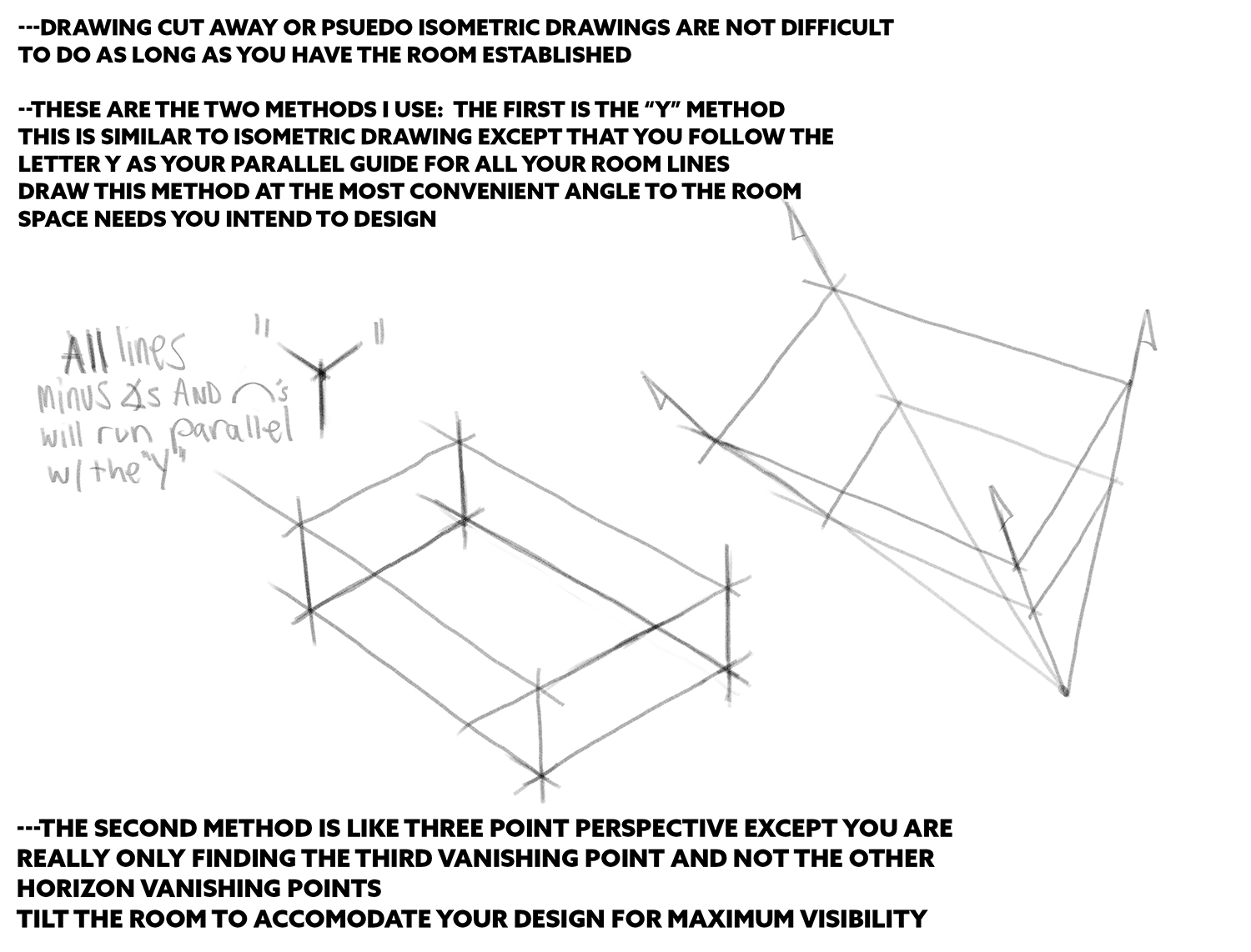
The other method is like 3 point perspective, or really like a mobile 1 point perspective because we are only using one vanishing point that is coming from the middle of the box being drawn. The horizon line VP’s are not used, the x and y axis are drawn loosely parallel to each other to maintain the box structure of the space. And again, all lines drawn in x, y, or z direction will parallel the outer contour lines, or radiate with the vanishing lines respectively.
The drawing is crudely sketched in with no intention of spotting details or making accurate angles. This is a muddy stage of fleshing out forms until they make sense, look like they are in line with the room space, and serve their purpose. This stage could take a moment to work out the proportions to make sure they all look manageable to human scale. If need be, sketch a rough person in the room so it can be used to help maintain scale with it.
Some might ask, why not build a 3D model and draw over that, which you can do, but at that point, just use it and do not worry about making a drawing since they both serve the same purpose. You are building usable reference for your final illustrations, and this idea has come from within you, does not exist anywhere as of yet, and these drawings are the first glimpse that anyone has the chance to see what you see in your imagination.
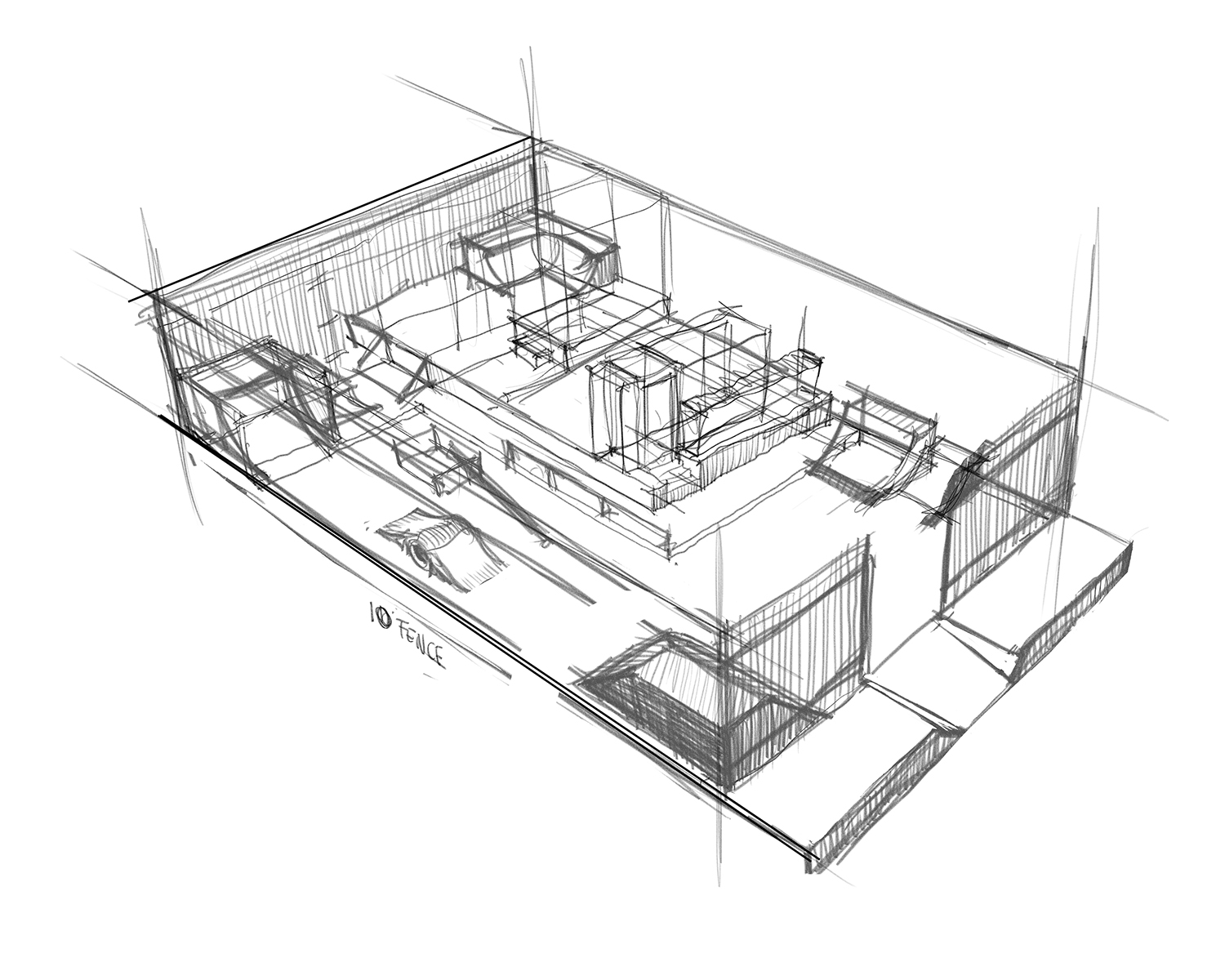
Once this layer has been designed and has been approved by the team, it is time to hardline the design. I usually make a white layer that sits between the sketch layer and my drawing layer, like tracing paper, so I can easily identify my new lines from the old one. I will go through and mark out just the primary shapes in the first pass making sure they are all true enough to scale, then I will commit to the tiny stuff, the secondary shapes, and the detail shapes that help reveal scale.
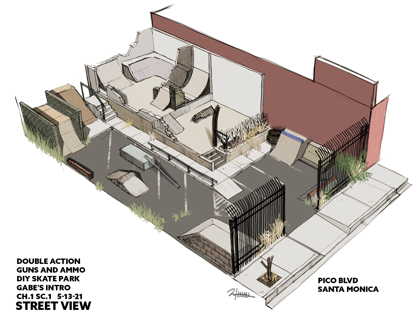
When view 1 is finalized, it is then time to rotate the blueprint into the next angle, from the back of the design, the two views revealing any hiding spots that the first image cannot successfully show in full detail. This drawing can be a little annoying at first because you are not only making a new image, but you are also trying to make them look identical from two different angles. Practice this enough, and it will all become second nature. Practice this enough in the rough stages, and the final painting will practically paint itself. It has been designed from the ground up, with enough knowledge and reason for designing all the elements in the space.

Now that I have a good understanding of the landscape, I am ready to draw this location from any angle using any lens to depict it. This is my reference for my painting. I do not need a location that can mislead me, or, influence me enough to just paint from it, never good when you are hard or soft world building.
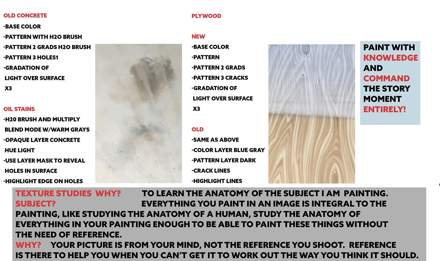
Once I have my drawings in place, the last bit of information I want to study is related to the objects I am painting into the scene. Like the human form, I need to study the anatomy of the subject matter in the shots I make, object by object, if I hope to make them all uniquely mine and uniquely fitting to these scenes I am going to illustrate. Part of the description of the scene is to give life to the textures of the decaying landscape, bringing it to life with as much color and motion as possible to add to the action, and the adventure of the story.
These are textures I studied in Photoshop since the scenes will be done digitally. I could have done these with any media, but I chose the media that best fits the final outcome. I take the surfaces apart one property at a time, similar to how a texture artist must think about all the properties included in making a surface look realistic in 3D. There is no difference in what I am doing, except that I will be making them in layers of pixel paint and uniquely to each image I draw. Each of these studies took about 1 hour, most of that time was spent looking at the surfaces up close to determine local color, surface deformations, whether it is naturally colored or manufactured, and whether that color has a clear coat over it or not, any occlusions that occur from deformation of the surface and any other surface imperfections that are easy to spot and identify as a shape or gradation mark.
I can break the drawings down further, but at that point it might as well be a video demonstration. I hope that these steps have been clear enough to understand and that the questions above have been adequately answered. Stay creative!
0 Comments