 This month I thought I would write a little bit about oil color, and how I use it in my work.
For many years I used a palette consisting of whatever colors I felt I needed for a specific project. I tried to have lots of paints on hand- in fact, too many colors on hand all the time, and just squeezed out whatever seemed to be a good solution at the moment- then I tried to organize those paints into the image I wanted to make. Hopefully it worked out. It usually did.
But it led to a bit of inconsistency, and I found myself battling my materials to be more consistent. In order to be more consistent, I went about simplifying my color system.

Eventually I started to limit my pallete. Currently I use between 10-13 colors at any given time.
I also read Richard Schmid’s book Alla Prima* which caused me to reevaluate my palette especially after doing color charts.
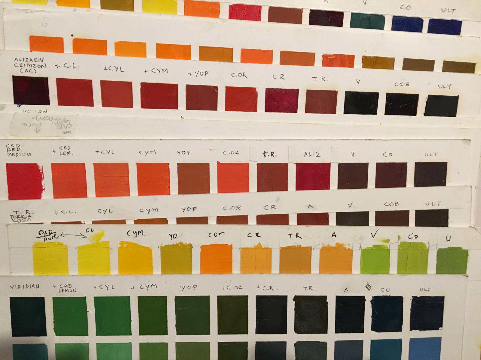
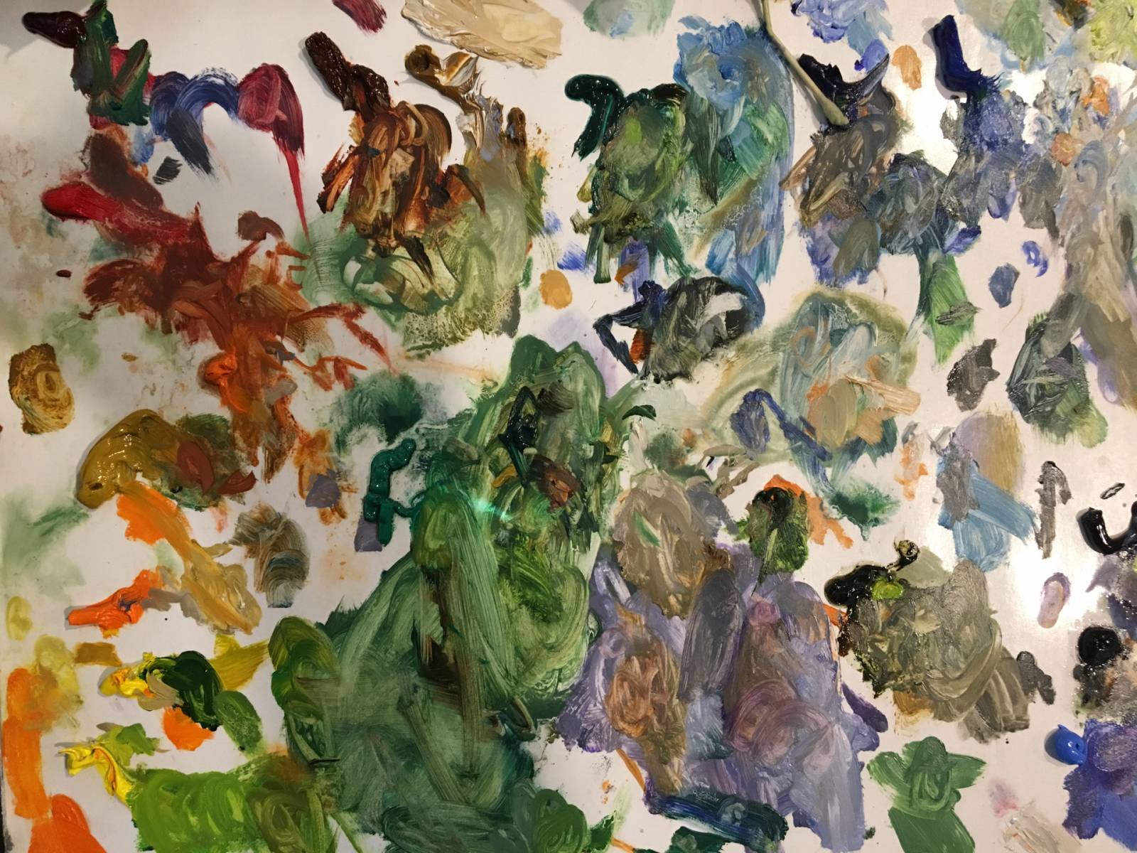
central to my palette development and simplification was to do a set of color charts. They need to be painted with a palette knife, not a brush and show the interactions of each color with the others, both as a dominant and subdominant color, and then those mixtures mixed with white.. These charts for 12 colors took me two weeks to complete- two of the best-spent weeks of my career.
I have been using my current color pallete for about 8 years.
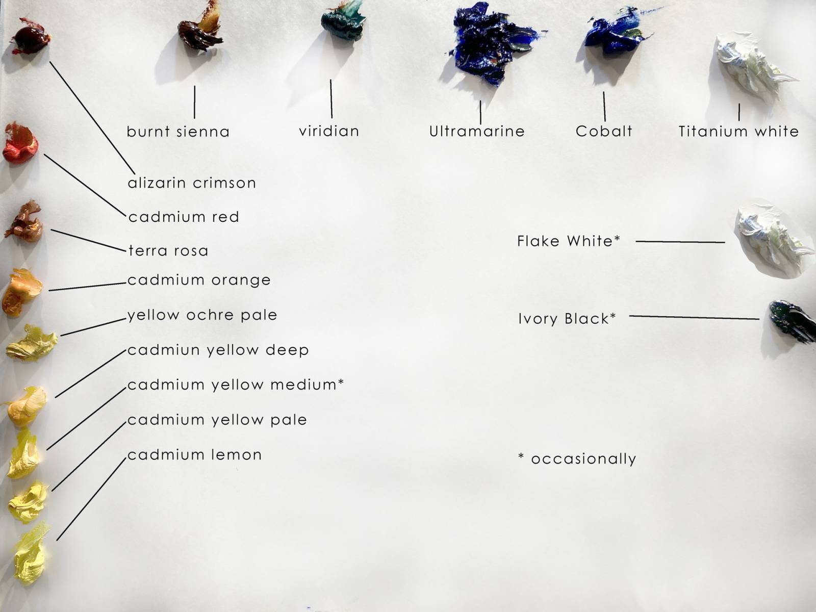
A quick review of colors I use, and the ones I have been able to eliminate, and why-
Yellows
Yellows
Cadmium Lemon- indispensable for landscape painting as a mixing color. Leans to green WN
Cadmium yellow pale- primary yellow. I use it in everything.
Cad Yellow deep- useful especially for flesh tones
Yellow ochre pale- a great warm opacifier. I try to maintain a consistent level of opacity in the final art when I am doing a painting that will be reproduced. Yellow ochre is often the basis of this, as well as titanium or Flake white. It is mixed from the three primary colors/.
Cadmium Orange- I use this in ways that I suspect are totally wrong, often to neutralize blues especially cobalt.
Terra Rosa
Alizarin Crimson- a “cool” red that leans towards the blue. Cadmium red- my primary red
Earth colors- all are mixed from the three primary colors, I usually use just one earth color, lately it’s burnt sienna. I way overused burnt sienna in my early career, I try to be more circumspect nowadays. I mix it with ultramarine blue as my “drawing color”. A good alternative (via Richard Schmid) is Transparent Red Oxide)
Viridian_ The only “tube” green. I sometimes think I am on the verge or eliminating it from my pallete, I think I can easily mix an alternative. It’s just convenient to have a green.
Ultramarine blue leans towards red
Cobalt blue primary blue
Titanium white

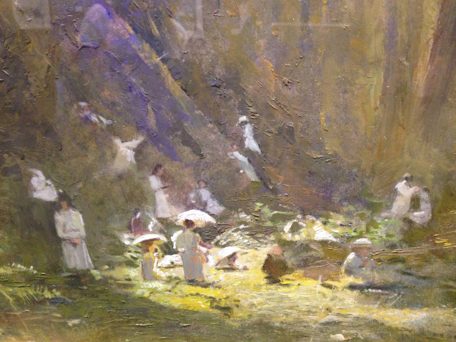
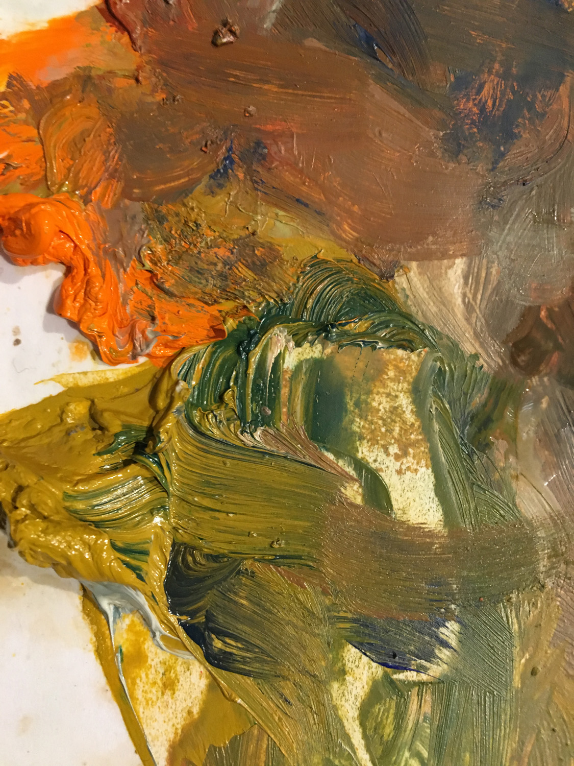
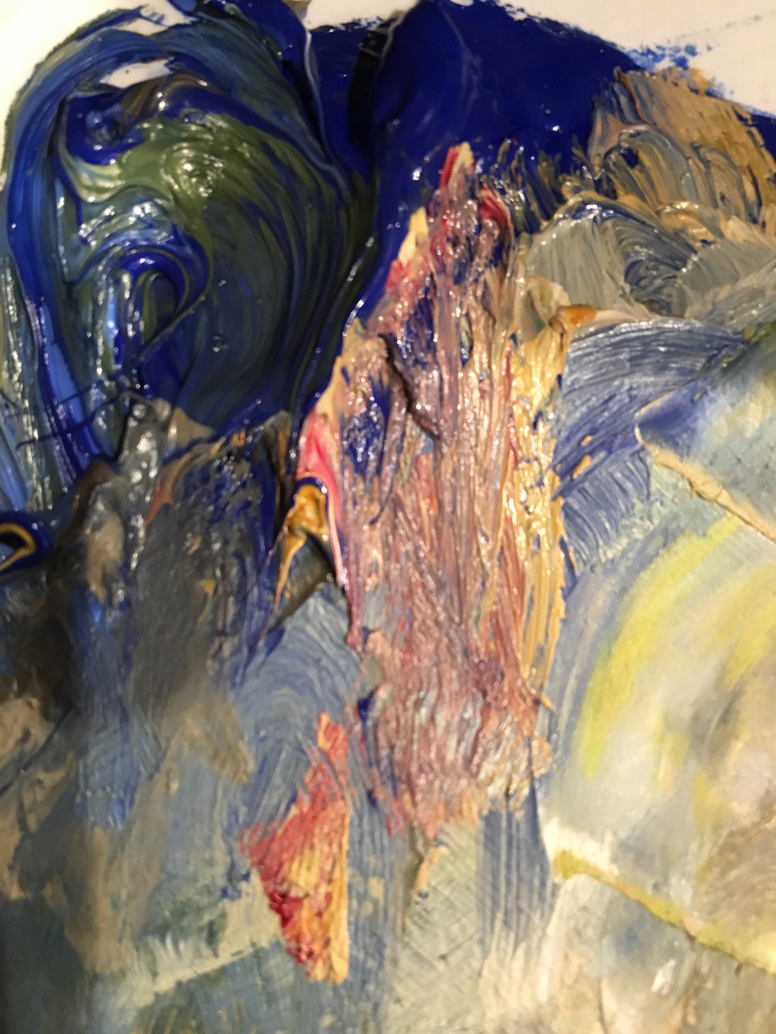
A detail of this painting shows the interplay of opacity and transparency.
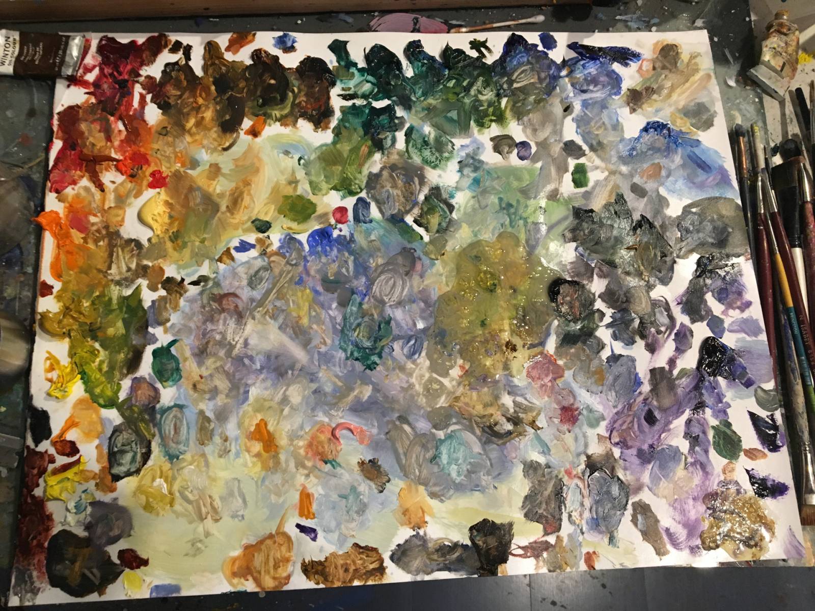
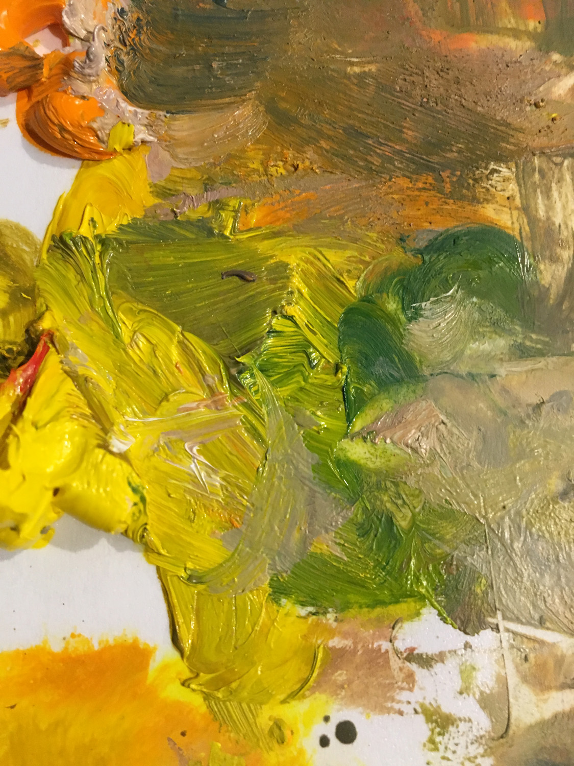
Note that the palette starts out neat and organized, and sometimes becomes a battlefield- or a minefield. Beware. I have learned that the painting in many ways will follow the level of organization of the palette- when it gets too chaotic, the chaos will begin to manifest in the painting. At that point, it may be wise to clean up the palette. This falls into the practice aggregation of marginal gains theory- the subject of a hypothetical future article.
I used to use these colors, but they either have drawbacks (Prussian Blue for instance, while beautiful, tends to stain into everything when it’s on my pallet- so I only use it on special occasions when only it will do.
Davys gray
Payne’s grey
sap green
Cobalt violet
Dioxazine purple
Pthalo blue
Naples yellow
Jaune brilliant

I often use leftover paint on the palatte at the end of the day to experiment. Prussian blue
Vermillion
“hue” colors
Cerulean blue I love it but I can make it
Terra verte
Windsor anything
I occasionally use flake or zinc white when I want to mix my colors to be more flat, like gouache- a handy thing to be able to do, especially when I paint on an absorbent surface like paper.
Black- only in an emergency.
A word about brand names- I appreciate quality materials and tools. However, I also think it’s more important to be familiar with the materials you use than to constantly explore different brands- so I generally stick to one brand that works for me in a given color.
I generally use Windsor newton oils, they are the most readily available quality oil paint as I’ve been using them a long time. Gamblin colors are more uniform in their opacity so might be a good choice for an artist working in a flatter style but I wind up fighting the opacity- your experiences will differ from mine. Michael Harding oils are great, as are Holbein and many others. But if I was on a budget, I would prioritize spending my money on quality brushes** and surfaces** before buying exotic and unnecessarily expensive paints. A tip – if you want to explore a lot of brands of oil paints, start with trying their titanium white- the characteristics of a white paint will tell you most of what you want to know about the rest of the brand.
Last of all- be sure to squeeze out lots of paint onto the palette. Art teachers quickly learn that students often don’t put out enough paint to really do much- you need to have as lot of paint at the ready, or it will effect the decisions you make about how to apply it- a false economy. It takes a lot of paint to make a decent painting, not just for the painting itself but for the many failures it took to get to the point of making the good one. That’s just how it is.
*See last month’s article on Richard Schmid
**Subject of possible future articles.


Thanks for showing your palette!. I am really fond of Payne’s Gray in watercolors and was thinking of adding it to my oils palette. What do you think are its drawbacks?
I’d love to know how you did your color chart!
No disrespect to Richard Schmid (rip) but, anyone can read Speed’s book for free on Project Gutenberg. Says everything you just did. SJ Solomon’s book too. The hard copies are cheap and have illustrations.
No disrespect to you, but no one needs more than 8 colors.
Use Viridian to dull Cad Red. Viridian + Al Crimson makes a transparent black.