Rendering, the final act of the long process of making a piece of art. It is not an easy thing to explain, and with all the amazing and brilliant teachers I had, only a few could articulate the concept to a degree where it made intellectual sense. The demonstrations would show what to do, but the words would fall short when trying to build an explanation around the moment.
It’s this lack of articulation that makes the arts seem frustrating to some, mysterious to a few, and what seems magical to too many. The act of making 2D or 3D representational art is straight forward, a technical science easy to dictate and put to practice with formulaic precision.
Rendering is skinning the surface of the object(s) within the pictorial field, bringing grids and charts into physical clarity, giving them substance, form, personality, and performance through the subtle change of value and temperature, the careful delineation of edges between colors and values, and a strategic eye flow carefully designed to aim the viewer towards a center of focus.
This is skinning a 3D model, the same thing we are doing when we render each form in a pictorial field.
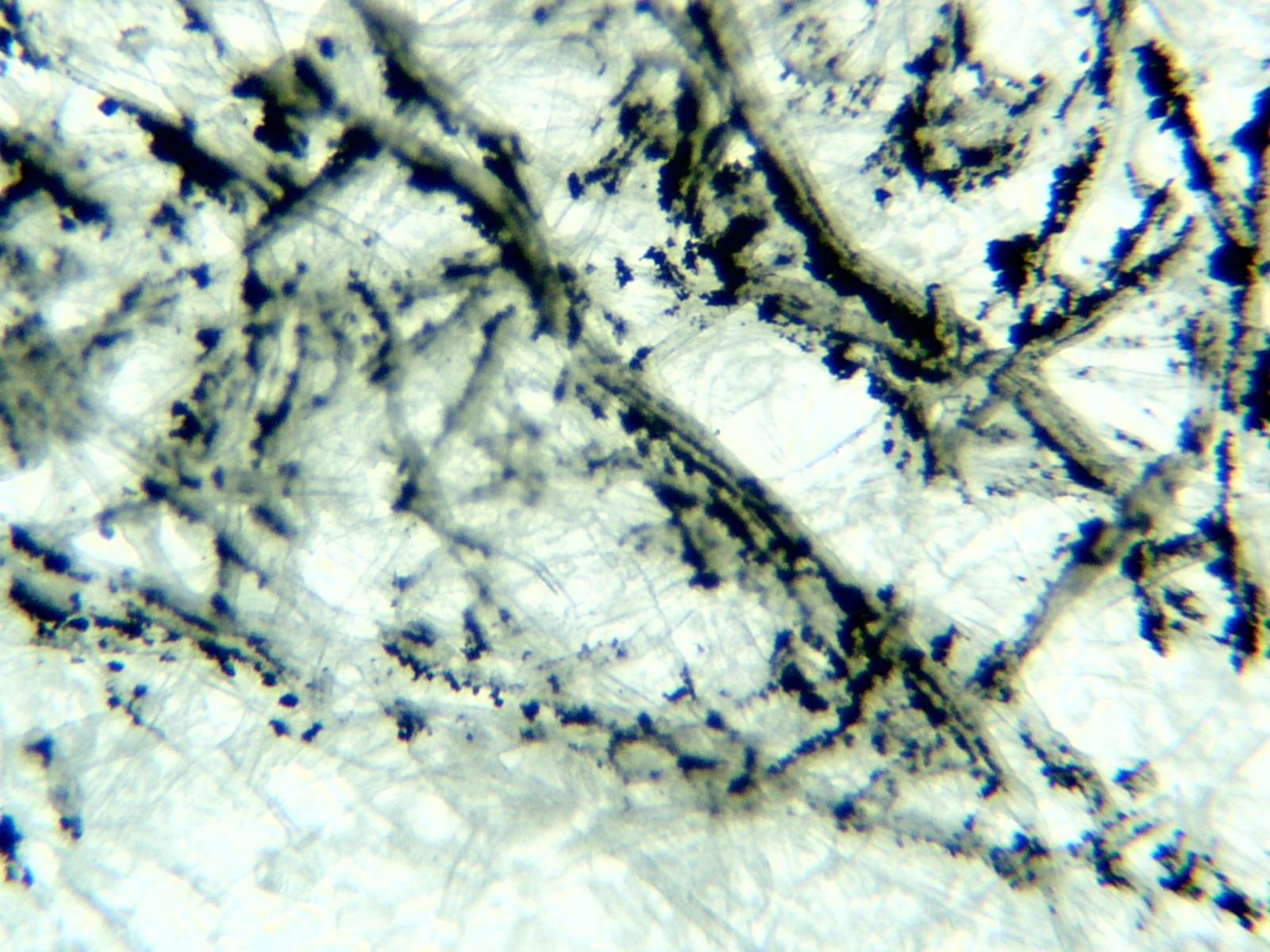
Diving a bit deeper into the act of drawing, there is some need to understand what is going on when we are making a connection with the drawing material to the surface. Looking at the surface up close will help solve the mystery questions when problems arise, like “why can’t I make it darker”, or “why won’t it build up anymore than it is?” Etc.
First, technically speaking, the paper is woven together making a very intricate pressed stack of interwoven fibers forming pits and furrows on a microscopic level. When drawn upon, this web of fibers catches grains of material and suspend them within their porous weave. The pencil or stick of compressed powder sheds its material as it is ground into the surface, the surface catches that powdery material and either suspends it or does not catch it at all and that material can be blown off the surface.
With harder leads, the density of the compressed material smashes the weave down, pressing it all together if heavy handed. The smoother the surface gets, the harder it is to get the drawing material to bond to the paper for lack of porousness to deposit the powder of the dry media. These harder materials stain the fibers that are woven together. Take a penny if you can still find one, and rub it against paper. You will leave a scored stain from the metal. This is why when we are heavy handed with a graphite pencil or lead pencil the drawing becomes reflective. To avoid the shininess, layering and softly handling the drawing material is required.
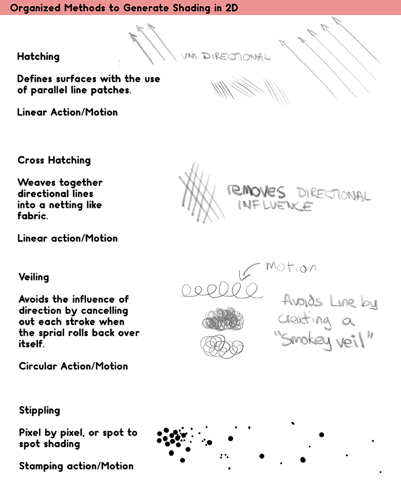
We have only so many ways to render the soft drawing material over to the surface. By name, they are hatching, cross hatching, veiling, or stippling on to the surface. Unorthodox shading is called scribbling. Modern invention has given us the ability to spray on a drawing material, otherwise there are really no other ways to draw on a surface with controlled intent to render something.
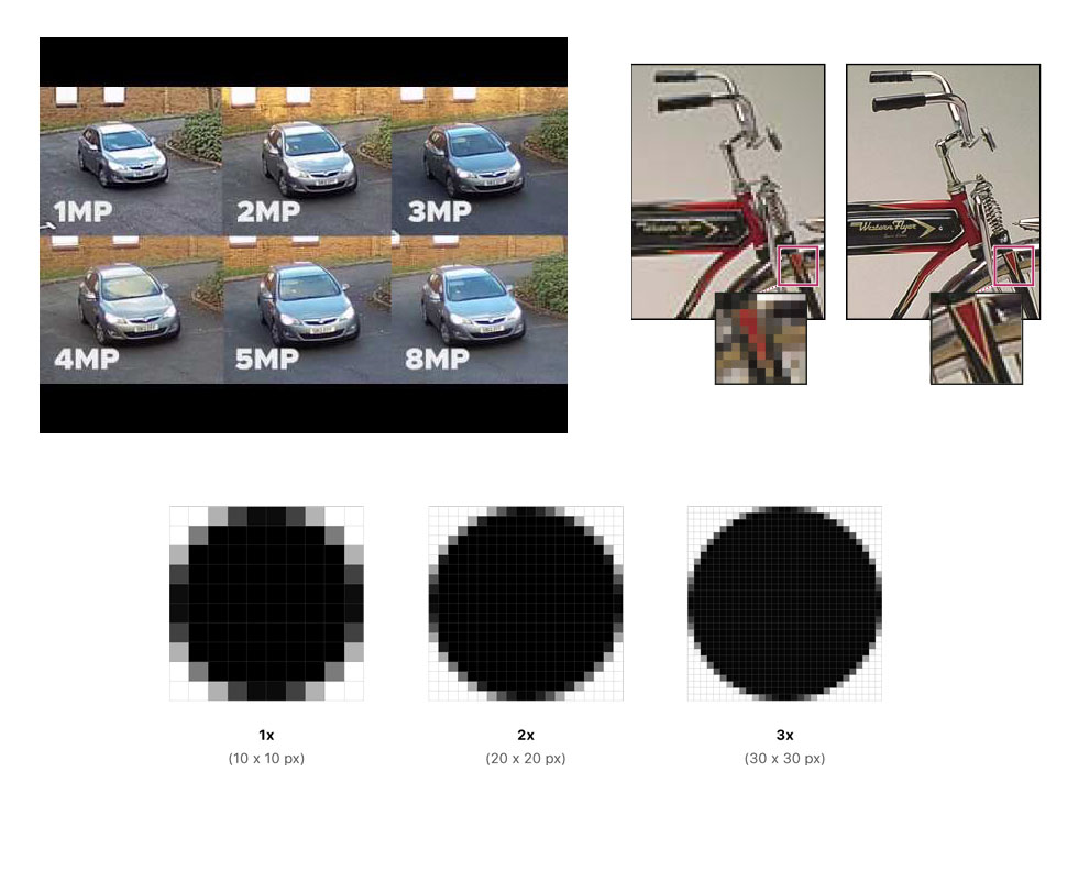
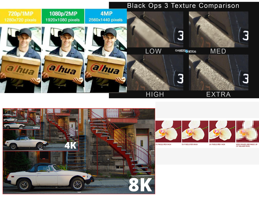
The act of rendering is bringing “Fidelity” to the piece. Fidelity in this case means exactness. The more realistic the piece needs to be, the higher the fidelity. I liken this fidelity to resolution, as in print resolution. If you work in print, photography, web, games, film, you work with resolution. The higher the resolution, the greater the fidelity of the content.
Rendering is generating resolution. The more precise you want the image to be, or the greater the need for an exacting likeness, the higher the resolution the piece must be. With better print and higher screen resolution HD8K HDR technology, the artist feels trapped with the need to render further and further into the surface down to the pores of the skin.
To achieve this fidelity of rendering, I have broken rendering into two parts, each part is a slice of the equation of “how to render”, coupled with dexterity, clear sight or vision, a sound understanding of the anatomical design, patience, and practice, and a desire to constantly improve.
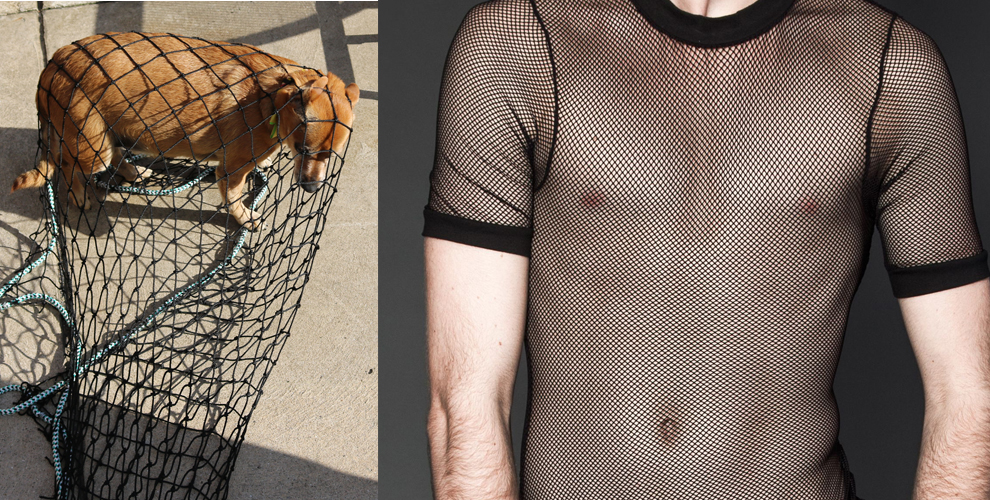
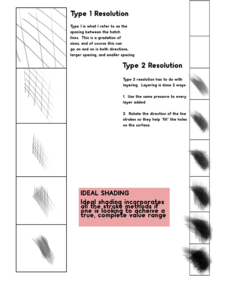
Type 1 is the tightness of the weave, from fish net to silk. think of hatching and cross hatching as a flexible net wrapped around the form we are crafting. The first pass is like a fish net, loose, abstract, but attempting to visually describe the shapes in the image that represent the shadows, the half tones, and the directly lit surfaces.
The netting of your cross hatching continues to reduce in scale, or increase in resolution!
Each successive pass tightens the net by reducing the gaps between each line stroke until you have a seamless turning of the form. Depending upon your pictorial needs, or improvements with your skill building, you will end the picture with a certain level of resolution through the way the tones have been woven together.
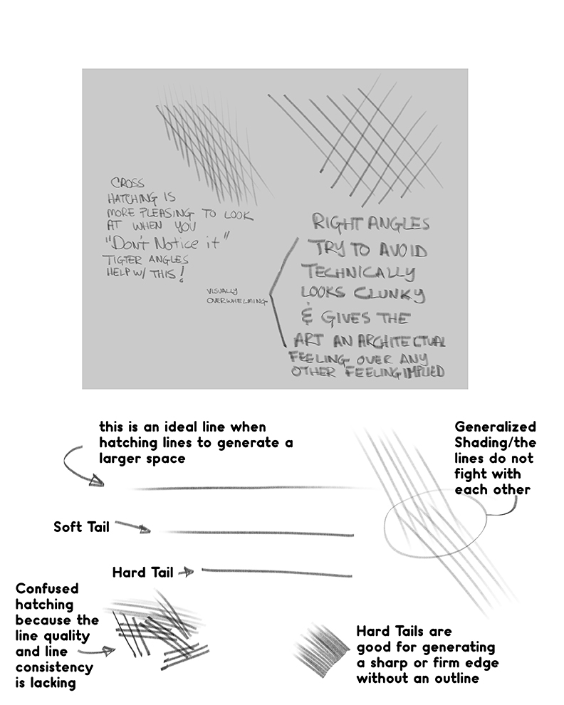
Type 2 is the layering process, controlling the pressure of each layer, and rotating the hatching produced over the surface. Each angle change across the surface hits the pores in the paper at a different angle, filling different parts of them with tone. If the material gets too built up on the paper surface, no more material can adhere and will just fall off, or ball up on the surface causing strange black blemishes, that are a combination of too much material mixed with loose fibers from the paper that have broken away.
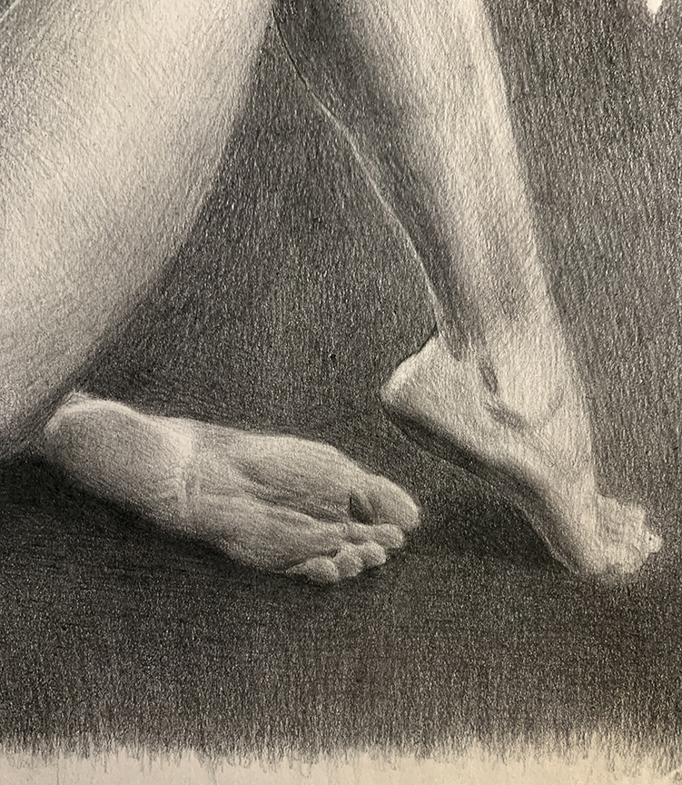
This is a good example of different levels of resolution. I have blocked both of them in, but with one, I drew the shapes with less contrast between them, or less sharp in its resolution, which makes it look out of focus compared to the other foot that I put in with more edge clarity between the shapes, or a higher resolution. Both are just a lay in, but show that even in the block in stage, resolution is a thing.
A third element that plays a part in adding fidelity to the drawing is the sharpness of the tool. As soft material is used, it blunts, or flattens in the tip. We pay little attention to this when we are zoned in, and as a result, the drawing begins to drop out of focus as the tools wear out. Keeping a hand full of pencils, and at breaks sharpen up the ones used to keep everything well tuned will keep the tools optimal for the greatest amount of fidelity possible.
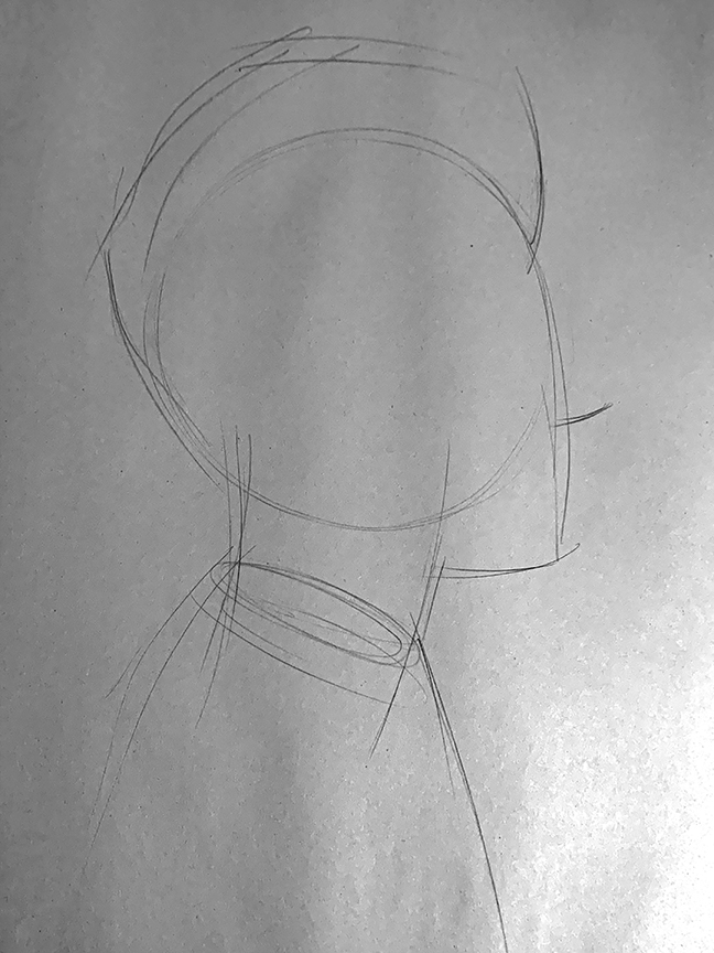
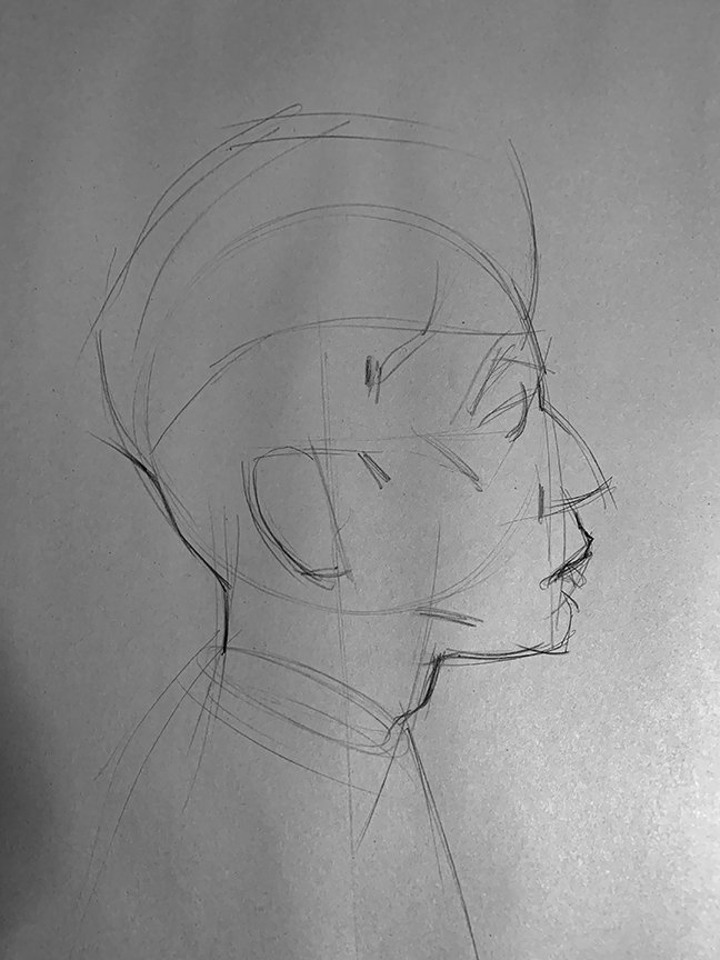
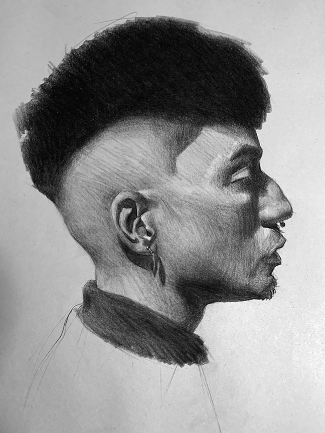
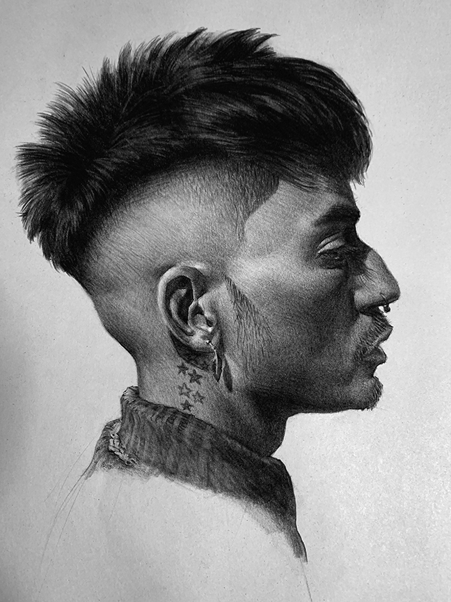
Finally, here is a sequence I took of a little sketch I did learning about a character type for one of the many actors in my graphic novel. I liked my starting point for Gabriel, but he changes through the story and I need those changes to manifest physically to help pictorially identify with the internal changes. In one of my many searches for characters, I came across a great profile that totally inspired the changes I would need with Gabe.
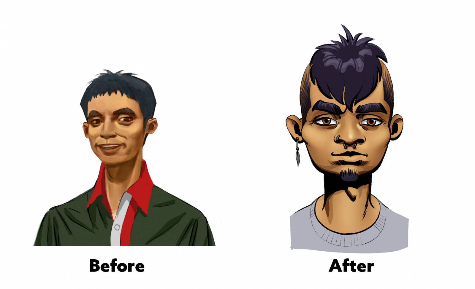
To take in this information and solidify my understanding of what I was borrowing from, I have to take the studies I do to an extreme level of finish, to polish every corner, and identify every change of direction and form on the surface. Having this level of clarity will make it much easier to do the daunting task of tilting the head in any direction, and give it any expression necessary to fit the role of my actor, and know when I have done something that has blown the likeness. It is an intimate understanding of the subject matter that takes it to another level where one can confidently rely upon the imagination for pictorial answers.
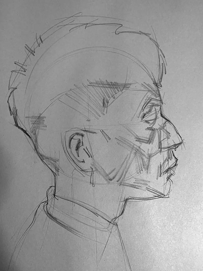
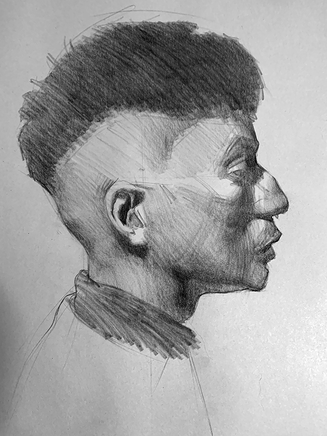
This sketch was done in a few hours paying attention to the entirety of his skull features. It starts with the universal standard shape block-in, it then evolves into a blueprint of angles set up to delineate the anatomical surfaces through light, half-tone, or shadow notans. Once the notan design is developed, the rendering of gradations binds them all back into one seamless form.
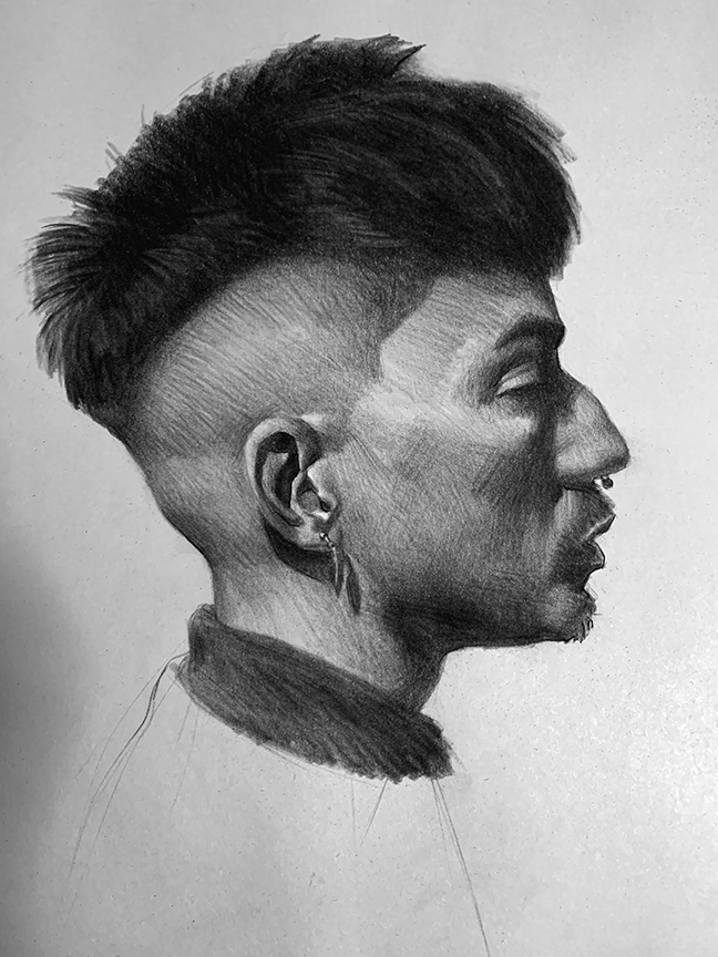
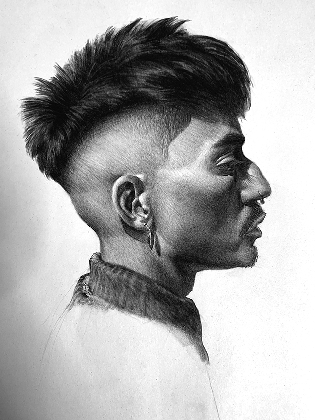
The darkness of the piece is not because I pressed down harder, it is because of all the layers built up using the same even pressure per each layer but changing the direction of the weave each layer built up. When pressing into the surface, scoring leaves an indelible mark, and if trying to lift back to a lighter value, well, good luck. Picture making is about control, a repeatable control that you can use industriously. Hacking at it or man handling the tools might lead to a one hit wonder, but little more, unless the story or the emotive response calls for it.
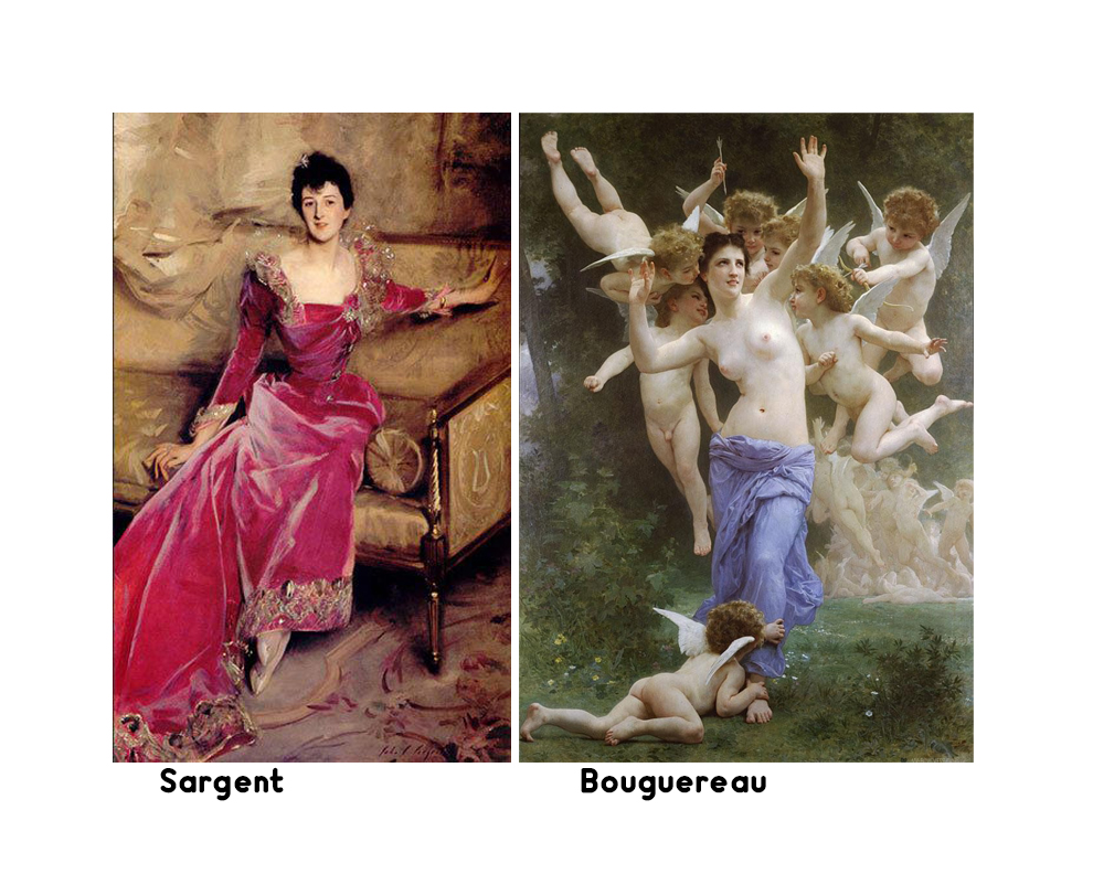
Rendering might look like it takes forever to do, but if done smartly, the quality of work can improve in the fidelity ten fold. Sargent and Bouguereau took the same amount of time to produce a painting, side by side the fidelity of a Sargent looks like a sketch compared to the mark making Bouguereau produced. Both are outstanding achievements but also serve to better understand a little bit more about this resolution concept.
The more informed you are of what you are doing, the quicker you can obtain mastery of the skills you are looking to use. Seek out all information you can find on the topic and learn the ins and outs, the whys and why nots, and this art thing will be so much easier to take in and perform.
Get back to work!
I don’t know why but every time I read any of your articles of watch your demos i feel the urge to draw. Thanks a lot Ron!!!
You’re Next Norman rockwell. Thanks for sharing good article sir..