This past May, Dan dos Santos made a terrific post on duotone illustrations. It inspired me to share my thoughts on limited color and the power it can provide a picture maker.
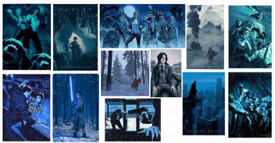
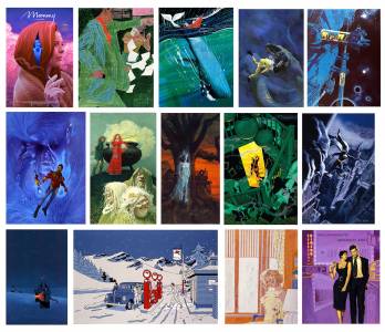
Consider the following collections I put together that stick to a single color:
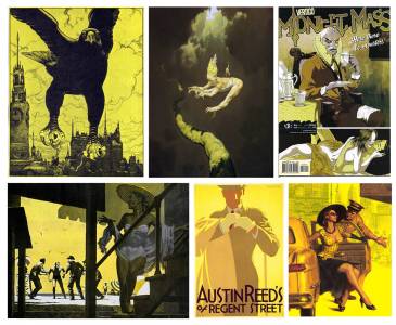
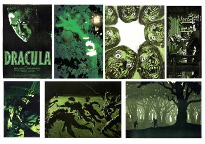
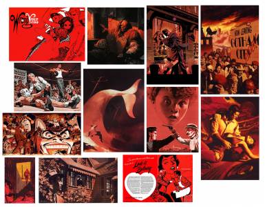
Pretty cool right?
Consider this experience I had putting together those boards above: I have an “Inspiration” folder on my computer that is HUGE and contains 15+ years of random art that indeed inspires me very much. I used it as my source for the above comps. I remember thinking, “Ok, time to look for blue images, they should pop out pretty easily amongst these full color paintings.” Now wait a dag gone minute!! Without realizing it, my brain noted that the simpler palette pieces would pop out amongst the more full palette pieces. That’s HUGE! This brought me to these 2 major realizations:
(1) The world we live in, and the world on the internet is generally full of color. As a result, imagery that isolates one single color really pops and presents the subject in a very digestible fashion.
(2) Artists commonly struggle with harmonizing very complex palettes (me for sure). Instead, consider utilizing a monochromatic palette. Feel free to explore temperature shifts if you desire a bit more variety. Simpler may very well be better. Instead of agonizing over color, focus on your drawing, values, and composition and let your color simply tint your piece.
Now, I’m not anti-color. In fact I love very full color imagery – see this piece of mine as an example. This site itself is chock full of some of the best colorists the world has to offer. But I tend to become overwhelmed with color, and the idea of limiting my palette and thinking of color as more of a designer instead of a naturalist….well, that lifts a huge weight off of my shoulders. Perhaps you might relate to this idea?
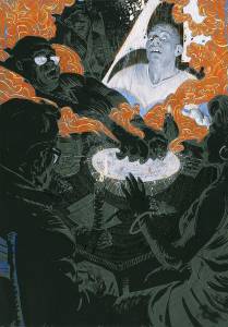
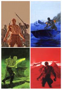
Want to spice it up a bit? Try adding a complimentary color to your piece, but don’t overdo it, and isolate it to the focal point. For example:
Check out the legend James Bama implementing these approaches in his Doc Savage covers:
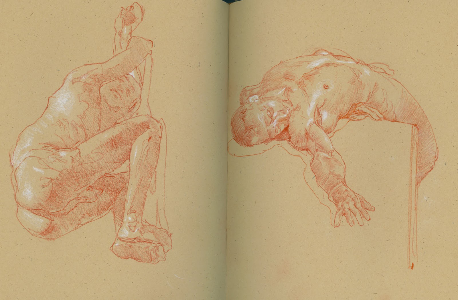
Here is one of my illustrations utilizing this approach:
___________________________
Hopefully this post may inspire some solutions in your own pictures! Be well.


Hi Francis,
a huge Thanks for your great Article, iam a big fan of your Art and Thoughts.
I´ve just one question about one of these example illustrations – can you please tell me from which illustrator it comes? I uploaded a screen grab so that you can see which one i mean:
https://ibb.co/xCpkLtF
Thank you and keep it goin!
Best,
chris