This project was such a crash job with such an insane deadline, I still haven’t fully processed the experience yet. All the work you’ll see below more or less happened in just 3-4 days total. which may be a record for me. Running this fast on something complicated means a lot of potential sloppy landmines getting left everywhere. Lucky for me I had my usual loyal and trusted cadre of keen eyeballs in the guise of the mondofriends, Rob, Mitch & Eric to keep me steady on through it all and spot the bugaboos where they cropped up. Regardless of it all, there were surprisingly few changes and edits that came in, and only one or two serious cleanups to do. So below is a walk through of the process how I handled it and went through as a guide and warning for you my art chums, to use as a cautionary tale for your own professional lives. Ready for the bang bangs? Sure you are.
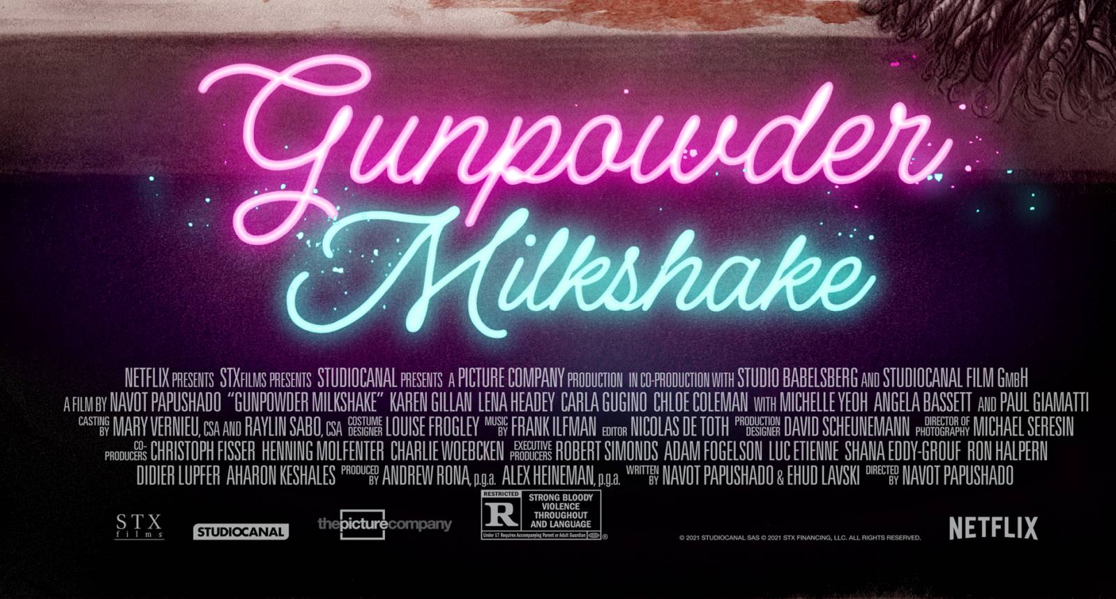
So I’ve kind of garnered a rep as Johnny-on-the-spot for a good long while now, and it wouldn’t be a lie to say it’s literally how I got started. The upswing of this is the hero complex it gives you when you manage to pull off an impossible turnaround schedule and stick the landing with the art, the dark side is that you get asked to do this again and again as a result. That said, I’m a special brand of idiot who loves and thrives in a crisis challenge like this so I tend to welcome all takers and ne’er do wells when they come in. If the subject is right of course. When Mondo got in touch with this project, front loaded as per usual with the attending apologies for the schedule, I had also just agreed to take on about a half dozen other things that all happened to have similar due days. Normally you say NO but I have a special place in my heart for all Mondo offerings and in particular any that involve the majesty of Lena Headey, Karen Gillan, Carla Gugino and Michelle Yeoh, There’s jobs that come that bring nothing but high stakes problems rewards and the promise of life unveiled as you slave away in there studio to meet the deadline, but if you can manage to land the plane on time and with the right kind of panache, then it’s always worthwhile.
There was just a couple weeks until GUNPOWDER MILKSHAKE premiered, but really that didn’t mean I had those weeks, because a lot of that time was padded out and spoken for with approval runs, edits, production mechanics, press and the usual and always expectedly unexpected snafus and glitches that happen along thew way. In the middle of that crowd, that is where the drawing and art making happen. I think I spent about two days in earnest drawing this piece, which is slow for me, and then another two getting the color right, setting the design for the title bar, credits and composing the various logos and actor credits early enough so we could get director approvals and actor sign offs on likenesses. It’s bonkers but the good part is everyone on this was keenly professional and we all hopped to like clockwork when things got squarely. But they didn’t. Not really.
The worst of the glitches was getting a proper screener link work and shaved a day off in trying to find the solve. When you’re doing film related work I cannot stress how much you need to have a screener copy of some kind available to you. Studios are super hardcore about this now given past leaks and some are almost absurdly so. The film or tv show is your source material- not just for the specific referentials you’ll want to have before you get going on the project, but also to get a sense of the tone, feel and themes of the film and story. How the characters relate, etc… Some studio reps will tell you they can send screen grabs by request or tell you what the movie is is, but thy rarely describe what the movie’s ABOUT. And even if it’s a deft descriptive take, it’s still their take and you are two degrees separated from the source by relying on it for your job. I had one recent gig that I almost had to drop because they were so reticent to deliver access to the material, and I think it was the only thing that finally broke the dam. In the old days we’d get dvd and as a result get access to a really sharp hi-rez source, but nowadays it’s all about screener service links like PIX or STREAMVIEW, etc… every studio seems to use a different one and they monitor that usage too.
I tend to watch the film through once, taking notes of various key moments that catch my eye… much how I work on a cover and have access to the manuscript and tag scenes or moments of character or plot that evoke a visual image I think might work well as a cover. After the first viewing I’ll see it again, but this time with a fine tooth comb, going through it bit by bit, starting with the scenes that first grabbed me and start making notes studies and sketches from that. If you’ve got a film like Gunpowder on deck, you’ll have a lot of marquee actors’ likenesses to get right and boy howdy getting it “right” is not the same thing as making it look real. Actors who have a say in their likeness approvals can be anywhere from your best cheerleader to your worst nightmare. And you won’t know what you got until it gets you first. I’ve found the best thing to do is to make sure to study and get it nailed down solid. Makes sketches thumbnail notes, whatever helps you get there. You are not here to draw the actor, but the character in the film. How they hold themselves reflect their character… all of that goes into the likeness. Not just making Michelle Yeah look like bada$$ motherf$&cjking Michelle Yeoh, you know?
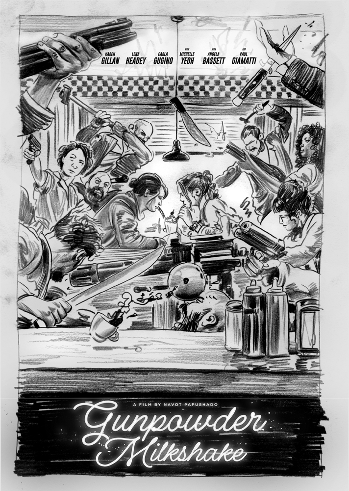
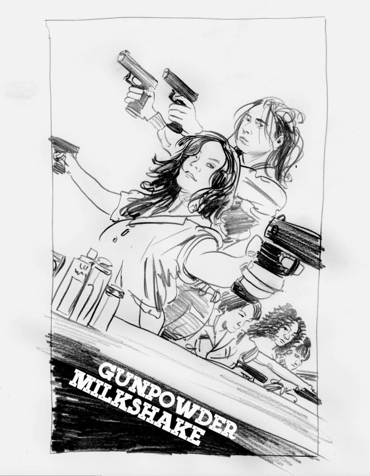
Once I’ve gone through it a few times and have a handle on what I want to do I would normally then just get right to the piece. I’m a combination of hyper and lazy in a way that steers me towards the final right away. Never been one for too many iterations and full scale studies as a result, but again, for a studio job like this you need to show intention first. There’s a ton of reasons why a studio might love or hate a design, and you can never know a tenth of them. They also need to feel involved and part of the process so you want to make sure you include and give nod to that ethic. You’re in a relationship now for this brief time so be sure to relate. Sometimes they send a pic that was built up by an in house AD or bullpen to show what they like. I got one for this and it can be confusing because in the case of a job like this, the poster being created is not meant as a standard photoshopped head-cloud parade of movies stars… you have the mandate to craft something unique and alternative, so take that permission and run WILD with it. For met part I made two rough sketches, one that followed their initial style of suggestion and then one I wanted to do based on my read of the concepts and themes of the film.
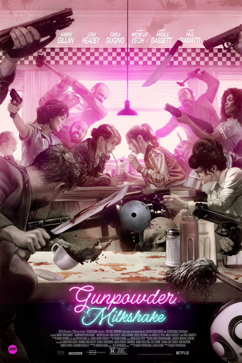
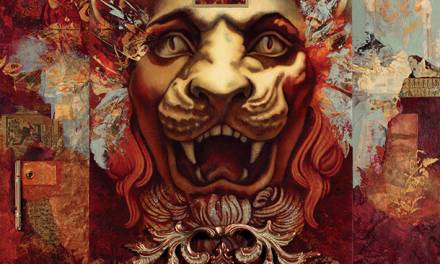
Personally the gut and centerpiece design is always the one I encourage you to chase: you’ll have a better time with it, and if your insightful to the film as I like to think I am, it can be a truer depiction of the project than what might be the standard commercial usual approach to chase down. Gunpowder Milkshake is a hyper stylistic romp and there’s a LOT to get lost in so I went for the full burly brawl approach, but only having it serve as a storm around which it circles the movies theme and core: the relationship between Karen Gillan’s Sam and her mother Scarlett played by Lena Headey, Ian also a fan of trying to find a picture to depict that is wholly of the film, but not necessarily a mere reproduction of some scene in the film itself. There is no moment where these two share a desert together like this, and while the big finale scene in the diner is in full view here, none of it is exact to that moment either… but they all together still are a part of and at the center of the film’s heart.
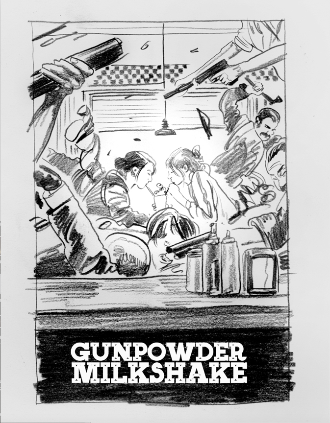
We got an initial okay on a basic level from Netflix with some notes, and the Mondofolk thought we should resubmit a more detailed sketch to the group to secure a final approval of the concept. Not only does Netflix get a say here, but the director almost always gets final sign off. Happily against a lot of bets we’d not get this approved in favor of the usual action poses, we got the thumbs up and were off to the races!
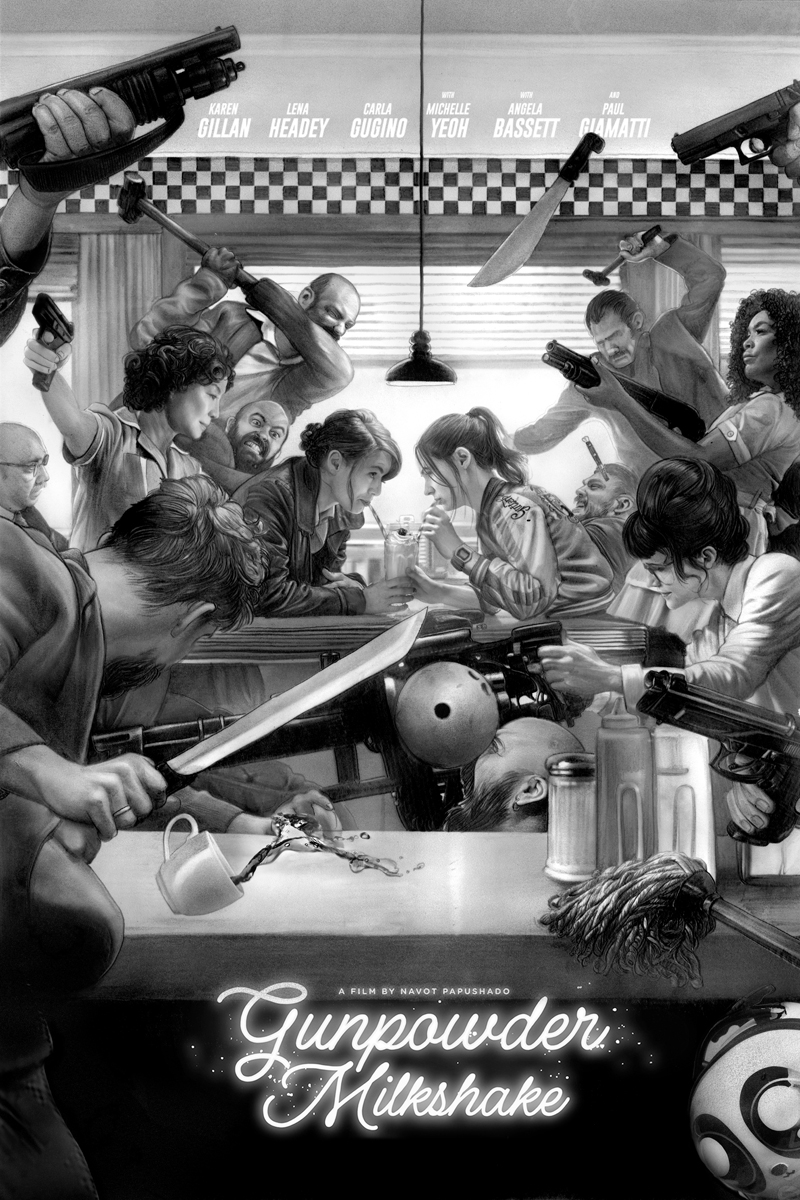
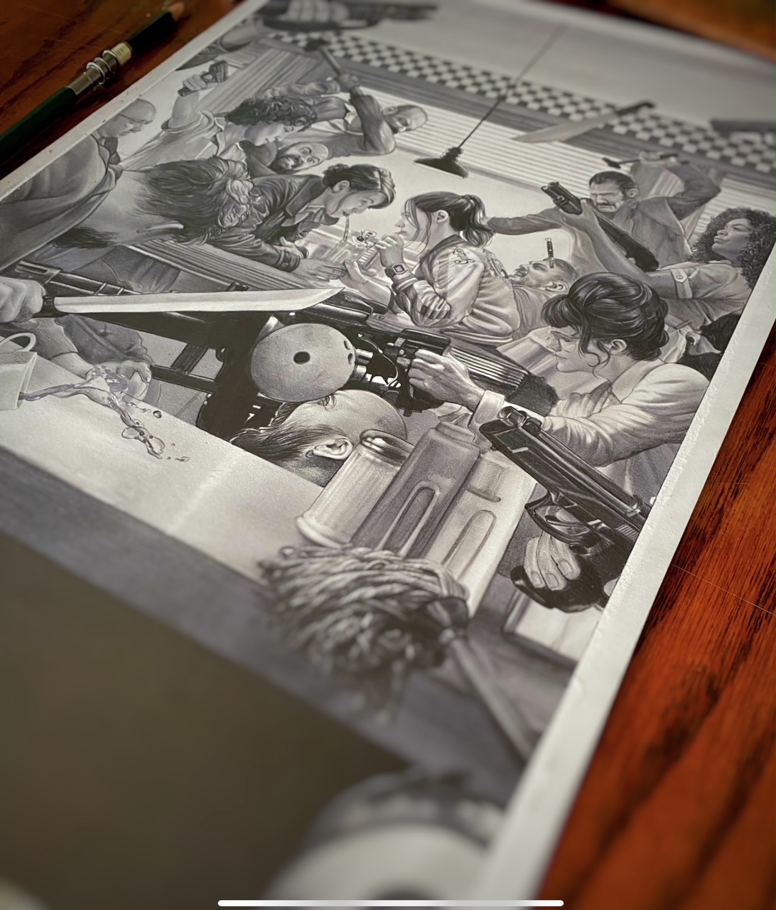
Now I mentioned the deadline for this puppy was a rough one and it truly was. So when I say races I mean it. I confess that getting what I wishes for suddenly came crashing down on my brain as I realized I had just promised to execute the most complex compositionally challenging and likeness approval hells cape ever known before, and I had a mere few days to do it in. Swallow hard and dive in is my way and so I did. Over the course of two full days I sat down with my head mere centimeters at times, from the page while I drew it, start to finish. This is a 13×19″ drawing that’s going to get upscaled and that’s always the worst possible reality, so that means it had to hold up n the most insanely detailed way. This was to be a clear crisp action sequence and not my usual swoopy impressionistic go to approach. More akin to a Marvel comic than a fine art expression thing. And when you’re working at that level of detail you will come under the most detailed scrutiny to get those details true and right. No mean feat, and there was more than a few times while doing this I felt hopeless, like a fraud who has lied his way into an arena for a fight he had no business claiming to be ready for, and contemplated fleeing too. To be honest when I take on a challenge I often feels this way even after all these years, and I suspect it’s why I seek these challenges. It’s on the edge of your capabilities where the excitement is, never in the comfortable zones on the safe side of that line.
Once the core drawing was finished it was off to the approvals, first to Mondo for notes then from them to Netflix and when ready the final line at the director, Navot Papushado’s feet. There were a few tweaks to hit if I recall, but mostly effusive giddiness from everyone so far at this point. I started taking it into color feeling a strong need to push into color tones outside of my usual browns and minimals. But thanks to a couple of other explosively colorful neon like projects to be announced later this year, I was already keenly in that electric colorblind and dove headlong into a pink explosion. Another thing I had to keep in mind for this one that’s a little different and more constricting is that this is to be a screen print, and as such the level of color and number of screens to capture that have to be considered as well as keeping the files organized towards it. When you hand in a book cover or even a film poster for online or mass printing you turn in a flat file file, but for a Mondo style screen print, you want to throw some mercy at the separator and given them a layered version so they can navigate the best way to lay out the seps and make a screen print possible. I do not envy my pal Jon Smith for the task before him on this one. Pouring one out for him right now…
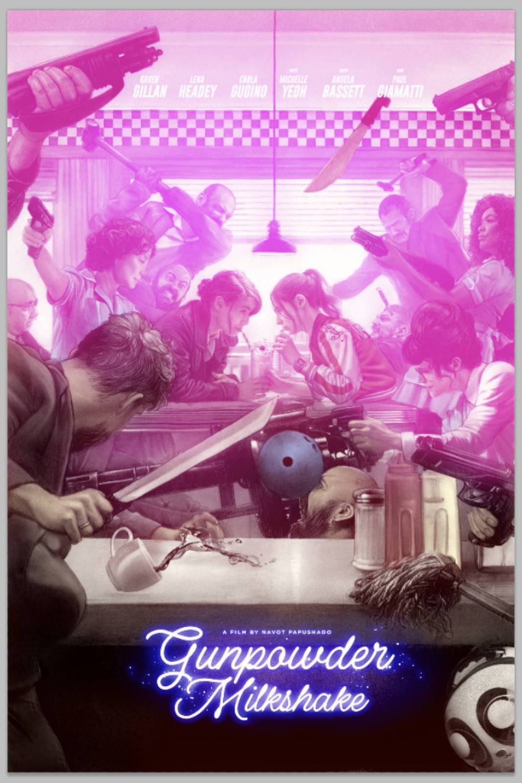
The basic idea of the entire composition wasn’t just the mayhem ultra violence of the set piece, but rendering it as a storm that swirled around the fraught relationship between this mother and daughter at the story’s center. So while the tonalities light and drawing made sure of this, it was up to the color to really hone down on the truth of it and solidify the theme visually. Layers and layers of scanned tones and colors began to build up more and more that sense. The trickiest of balances was that my usual dark to light. foreground to back method for showing space like this didn’t really work and put too much distracting visual emphasis on some elements at the expense of the theme it was supposed to support. And it’s in this stage my comrades where I cannot express to you the importance of having good clean and clear headed eyes that are not your own. Rob Jones and Eric Garza were instrumental to this aspect, like groundlings holding the rope tether to my hot air balloon and keeping me from flying off to far in some errant direction. When you’re on a crunch for time like this, being able to lean entirely upon your partners in crime like this is the most valuable asset you can have. The secretiveness and NDA aspects of a project like this means I don’t really get to invite outside eyes in to help guide, so their insights are always key.
I got title and credit copy from Netflix to drop in as well as any logos that were required. I confess, I was already anticipating much of this in the initial design and drawing of the piece, particularly the space below and the band across the top for the actors’ credits. This is not a thing you want to do later if you are able, and should always keep in mind for the design you’re executing. The work the copy into the design of the piece works better for everything and allows you as the artist to maintain some control over how that lays out so you don’t get some terrible surprise where a designer somewhere not he food chain slaps a title right over the front area of something important… Do yourself and your AD a favor, whether it’s books or this kind of thing to ALWAYS keep in mind needed copy. If you can get that early, great. Often especially in books, you won’t be able to get it until they do after the fact, and then you can only hope the AD does so with the utmost respect for the art in doing so. For film posters and the like, there’s usually already material to bring in on hand as they’ve made a bunch of in house posters or ads based not he forthcoming film, so it’s easier.
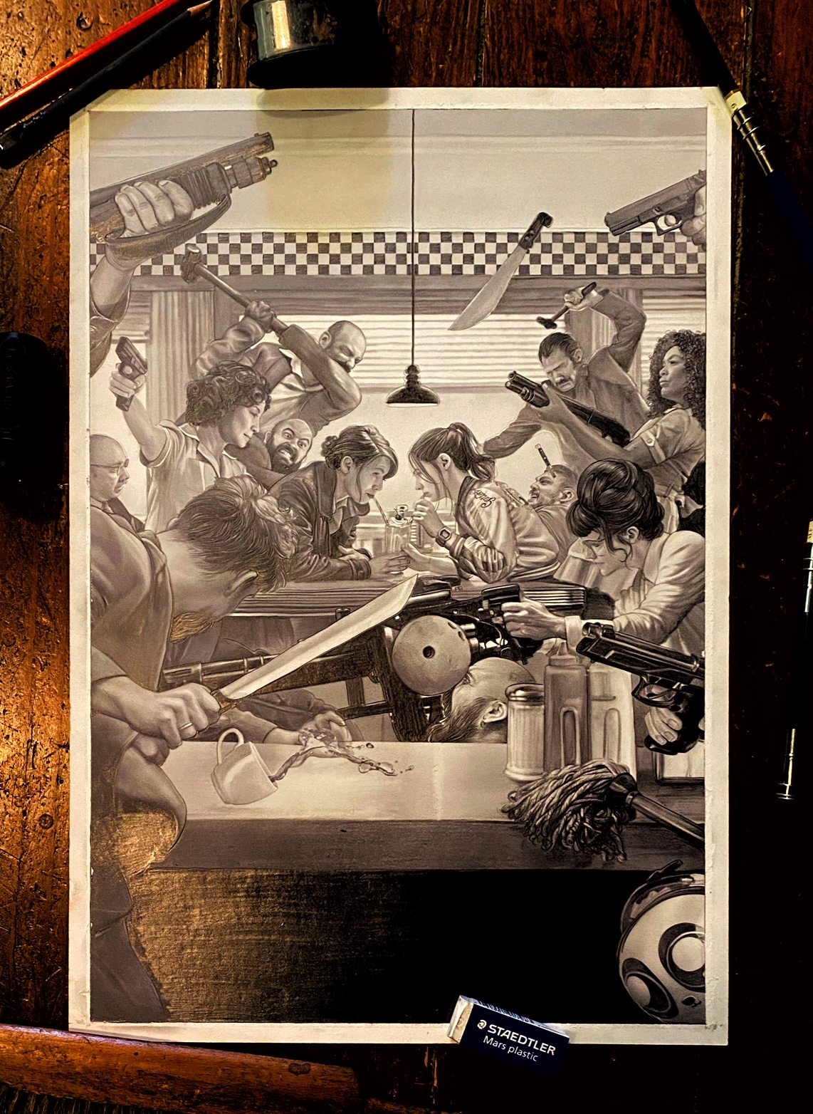
Some patches to add into the final. I’ll tend to redraw the offending areas and then tediously patch them in via photoshop.

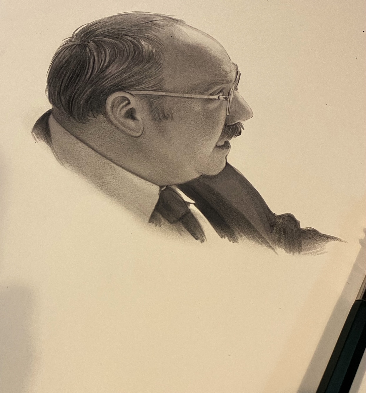
After fixing the weird gremlins that slipped past and fiddling a good bit more, including a redraw coffee cup that wasn’t working so well before, and being asked to rework Paul Giamatti’s portrait in the corner there, we were pretty much done. I expected notes from across the field on the likenesses of the other actors and happily received none. Atypical to say the least but always appreciated. Karen and Lena seemed especially happy with it and more was the fulsome excitement from Navot and his writing partner, Ehud Lavski. I think we only got the first hints of approval while waiting for notes when they reached out to get a hold of the original drawing for their offices. And let me tell you that is always the best and absolutely most meaningful approval to get when the director/writer wants the original art for their own. It’s happened a lot over the last year and each time is a surprise and the highest possible honor.
In the end of it all, being able to make the deadline was the greatest relief, made mores that everyone was so excited by the result instead of a deep accepting sigh that comes from needing to take whatever was available due to the time crunch. I talk about deadlines all the time, how essential they are both to the business but also to your own personal work. In this kind of enterprise it’s even more so. The deadline is almost everything. The marketing campaign for a project like this is like a massive rolling locomotive and you can either get on board with it and hope to be pushed up front as was the case with MY OCTOPUS TEACHER and PARASITE, or get tagged onto the caboose with something passable, but nothing anyone wants to shout out loud for. No matter what the subject or the project I always ALWAYS bring 150% to the chosen project. Once the agreement has been reached, it’s a full committed marriage for the time I’m working on it and marriages are work and effort to make happen and stay healthy. No matter how tight your deadline, or if you’re wholly disinterested in the subject, anything less is a discredit to the project, the people you’re working for, but mostly to yourself. Hacking out a project, or snobbishly dismissing it because its a silly action film and not Citizen Kane makes you look terrible, and if it goes into production, duplicates and broadcasts that terribleness everywhere like Vesuvius exploding. In this thing, every project is really about the next project, and the next project comes only if you do the absolute best thing you can for the project in front of you. Your personal issues and crises aside, your hangups or struggles are wholly unprofessional and irrelevant at the time of your working. They make for grand drinking stories later, but save them for that. While you’re in it, win it as much as you can. It doesn’t mean you will always- I myself have been fired from several gigs where I gave my all and could not somehow convince the powers that be that the work was working. It happens to all of us in this thing. And with the specialty poster thing, more so than you’d like to know.
One of the unique aspects of this kind of project is the downslope work and assets that come out of it later- such as Eps from the print run or lobby cards made or the sale of your original work and sketches from the project. That means whatever your upfront is, the downslope sales can typically beat that and expand further, but it also means you need to be able to capture and take on promoting and cheerleading those products ongoing. It’s a wild and busy landscape out there with new glorious purposes exploding into the cultural sphere near daily, so it can be hard to be heard in the klang of everyone’s pot bangings. Social media especially plays such a huge role in this regard, more even now that Cover has pushed us all into our zoom chat corners and movies burst onto our home screens instead of the theaters they were originally intended for. So all of how you behave even when you’re not working on the thing affects the thing you seek to work on. Always step up, be positive and kind and enthusiastically hard working, and it breaks through. Your audience isn’t just the internet’s many judges but the ADs, directors, writers and potential clients that are also witnessing your work, how you present it and how you behave as a creative force and a person in this sphere. Keep your eyes on the long game, on what may come from your hard work now by again, focusing hard on the work in front of you. It’s a continuum and if you can also make Johnny-on-the-spot be a known quantity of your own quiver of arrows, then Make that so. You’d be surprised how many projects like this swing in at the last possible minute. Rescuing it from a crisis can cause you to be the repent of expected saves later and that can be a little exhausting, but the overall impact of knowing you’re an artist that can make the deadline and deliver the goods in a reliable way can be everything. I’ve heard more and more from ADs and editors that during the last year with all the remote pandemic madness afoot, that this quality was one of the most keenly rewarded, and so it can be a real surprise boon for work when everyone else sees things dry up for a time. This is a deadline business and while quality really matters overall of course, it’s making that deadline that matters more than anything. However hard or rough that may be.

That is gorgeous. It looks like it would have been difficult no matter how long the deadline was