
Prompting this with a TL:DR but all noteworthy information. An info dump that will take a minute to parse.
Why do we have a theory of color? Can’t we just pick any color we want? Theoretically, there is no reason why you can’t just choose any old color and do whatever with it. But to control the colors to generate illusions so they realistically resemble something is a practice that requires training to understand the control of hue/value/chroma, when to adjust the colors, how to mix and blend, practice to make sense of the skills and memorize the actions, and then learn why you use certain conditions over other conditions, why this color over that, etc…these are some of the reasons we have a theory of what color is to us as an artist and how to work with them to create our products(images).
I want to explain a little more about what is going on here with the chroma studies and why this is an important place to start your color training.
This is ideally where you would begin your training, how light works. Chroma keys and chromatic study is the practice of observing realistic lighting conditions, identifying how and why we see these things and translate through the use of pigment/pixel. By identifying these conditions and learning to control them with success, we can then manipulate the pictorial field to suit our needs.
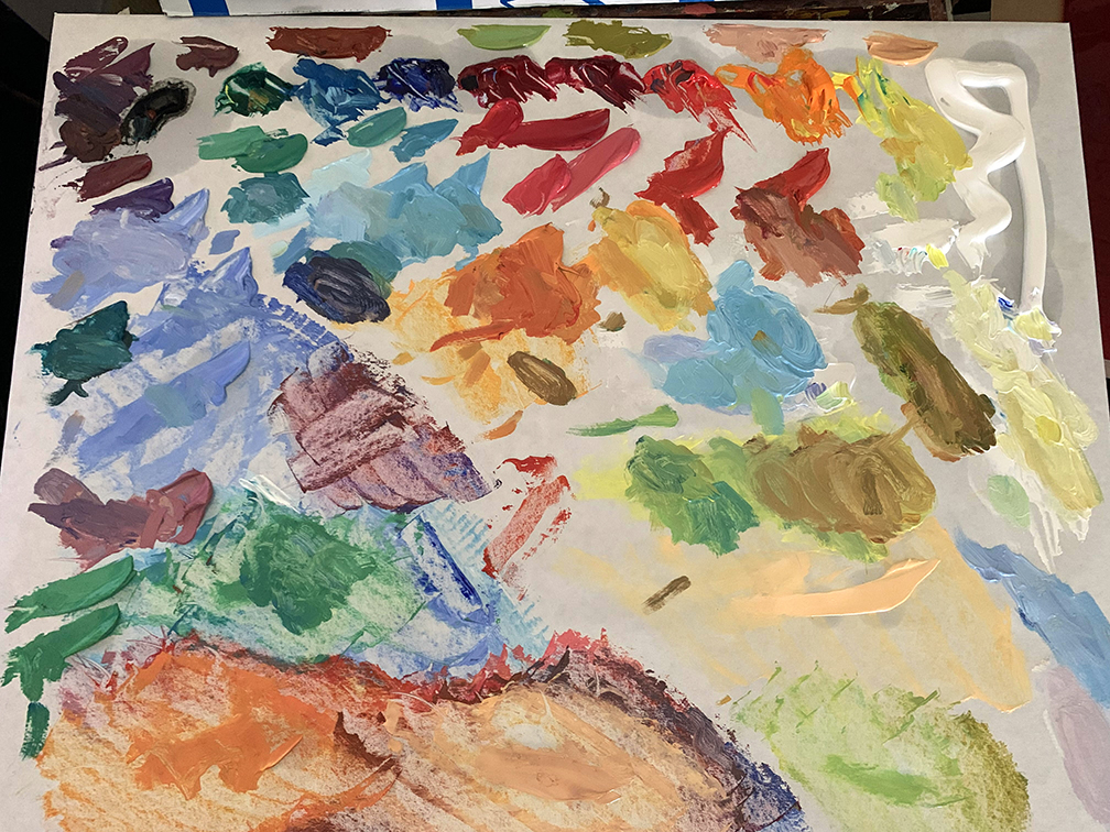
Here is the full palette, separated from my value palette. I use old paintings that mean nothing to me as palettes and wrap them in freezer paper. Freezer paper is palette paper but cheaper than palette paper will ever be. Here is a link to sample the goods.
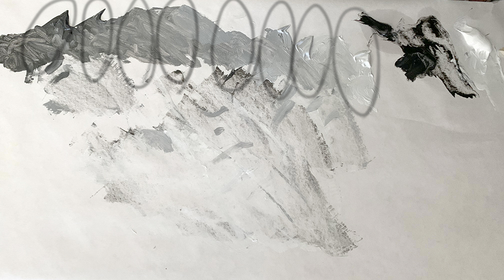
This is the value palette. Each value was made based upon the number of primary hues I mixed for the painting. Some of the hues share value so I did not need to make as many values as I had hues in the end.
Training from life, not from photos is most ideal. A camera cannot capture what our eyes can see, at it best captures only 70% of what our eyes see. Training from life will allow you to see beyond the limitations of the photo by understanding the complex relationships of space and spatial relationships. Realism is a gate system of tools you earn by successfully building with what you have until a greater need is warranted. This training includes edge control, tonal and chromatic transition control, understanding depth and form, surface nuance(texture) and suggesting rather than over rendering for the sake of true illusion, action and acting, staging, control of the falloff of light, the shift in planes, etc.
I started this conversation two installments ago with the most important aspect of an artists training, color = value. If you cannot see a color as a value you will have a difficult time controlling it. All colors are values regardless of their power to your eye. The overpowering property is called chroma, or colorfulness, and regardless of this powerful property or intensity of hue, it has a base value to it.
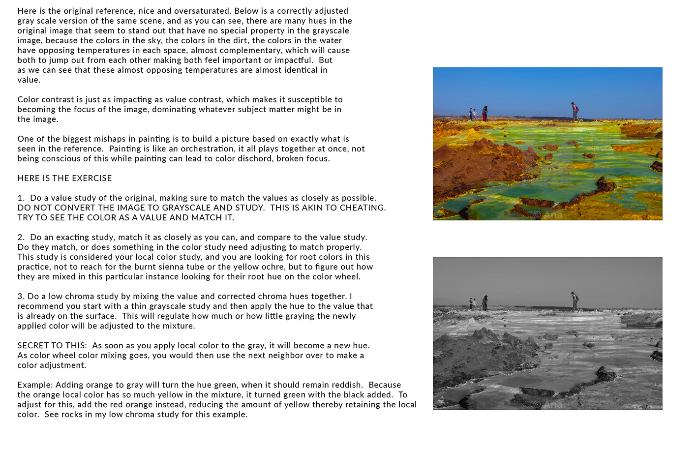
Our daily chromatic range on average is somewhere in the middle key of chroma with extensions in both the high and low direction. When you learn how to control the chromatic range the previous sentence will make complete sense. To understand this sentence, color needs to be broken down into divisible gradients of chroma that are clearly observable to any eye.
To exercise better “regular” colors in life painting, we test the limits of color and value to learn better color harmony for better painting. Low chroma painting helps one identify that color is value. High chroma exercises help the artist learn that all objects have an inherent base color regardless of how gray/brown they might appear to our eye. As an artist selling images, if we generate paintings that are lacking color control from corner to corner of each canvas, we will be stuck holding onto a lot of canvases.

I began with low chroma which I think is more useful and practical to a majority of painters and the least discussed, while my mentor started us with high chroma and it broke everyone that studied with him including me. I think he did this on purpose like all of those movie mentors do, to sarcastically pull the rug out from under our egos. We might be able to paint, but can we actually see? We quickly learned that seeing takes learning too.
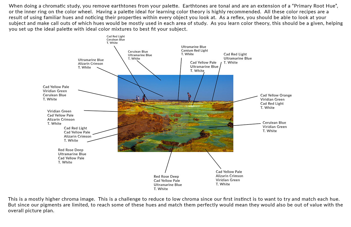
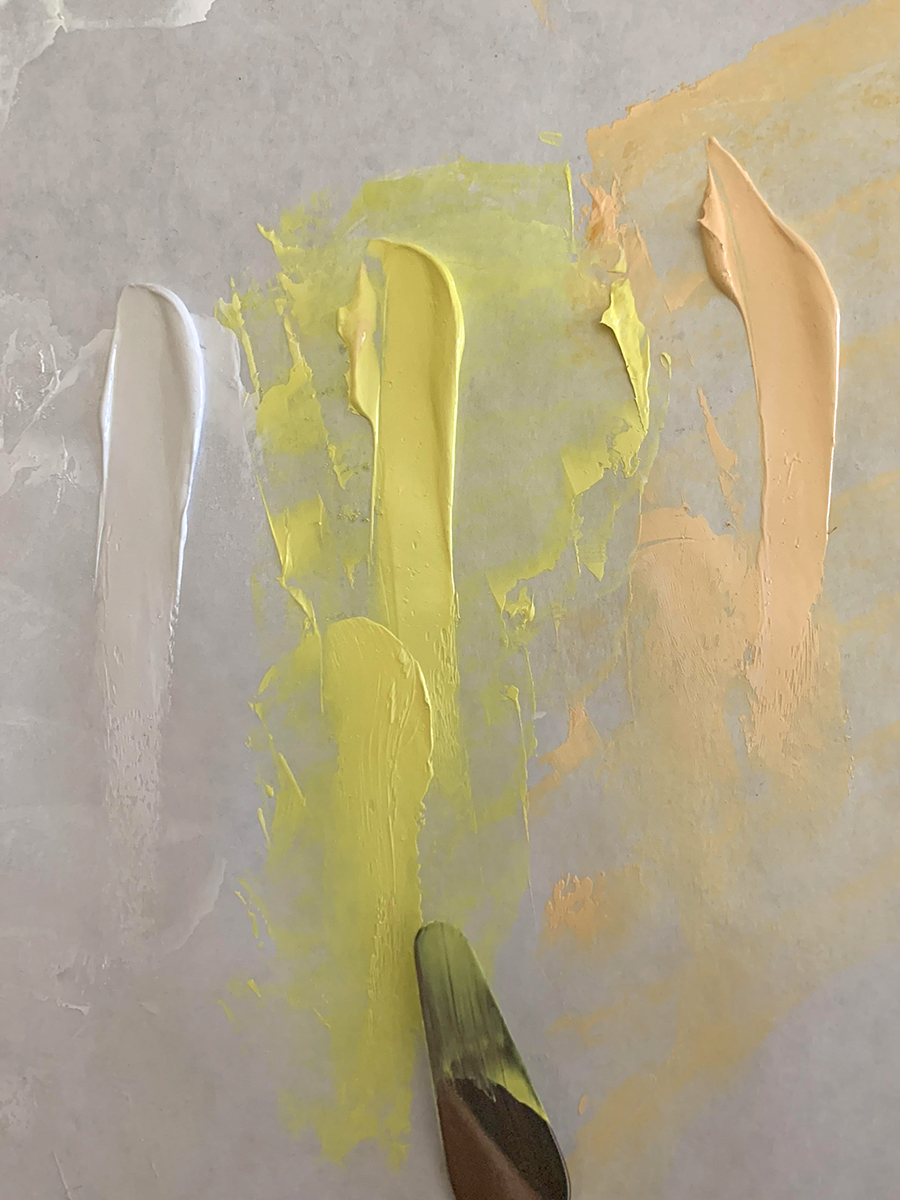
The above hues are decided upon from the color theory palette I have described in past articles, and will have a shot of it below here to remind that this is a specific palette designed to achieve almost every hue possible with the cleanest chroma possible. Clean color regardless of how gray it is is a must for paintings to sell well. We are practicing to find the optimal chroma for all of our color choices.
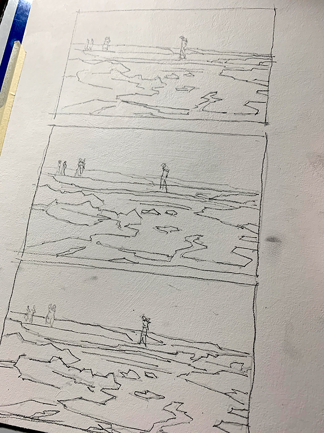
Make a carbon tracing of your subject matter so you can duplicate the image as many times as needed for the exercises.
In exercising low chroma painting, the idea is to first mix the values of the colors, then mix the hues to match the values, then mix the two together depending upon how chromatic vs how tonal you want the picture to be. The more gray you add to the hue, the more the hue will shift towards value, the less gray, the more the hue dominates the mixture making it more chromatic.
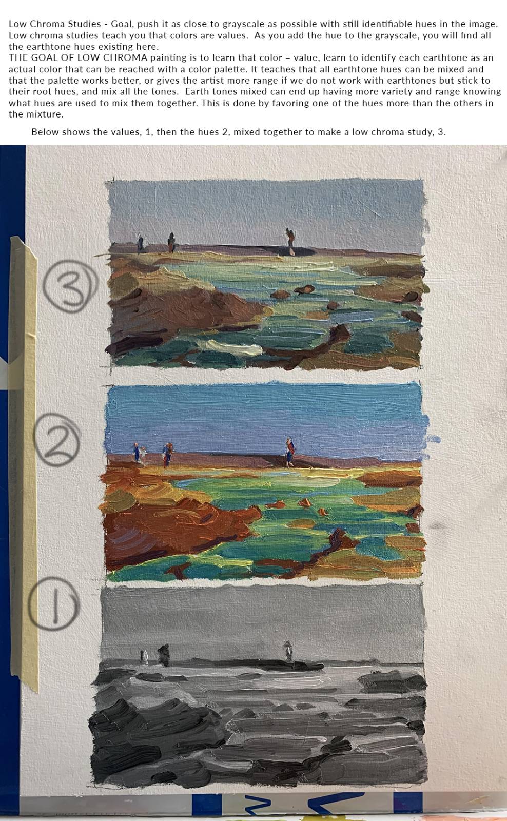
Low chroma painting is controlling the colors for the sake of value. If these are paintings we are making for a series, they would likely be moody pieces, darker, more melancholic, expressing neutral to negative psychological emotions, etc. Less color in a scene tends to give it a somber feeling and gives the canvas an older appearance. Most of our art history is made up of tonalism, colorism being a more modern attribute to the history of painting.
Technically speaking, low chroma studies are paintings of value = color while high chroma practice is color = value.
For the low chroma studies, before practicing anything relevant, practice matching values to colors that you have mixed, and mix to match objects using this method and compare to see if it has been matched.
Mix all parts to match value before mixing them into each other. This assures that no hue becomes dominant because of value dominance.
HOW DO WE KNOW IF THE VALUE MATCHES THE COLOR? There are two practical ways to do this, with one being a little less accurate than the other.
The first way to do this is to shoot the paint swatches with even light and a quality camera angle that favors the lit parts of the paint vs. the parts in shadow. TO shoot the palette, do not aim a light directly at the palette. Bounce the light off of the ceiling if you have a white ceiling. This makes the entire ceiling a light source with no central hot spot that will create a gradation across the palette surface.

This photo was taken from the internet showing how bouncing light off the ceiling unifies the light in the space.
Take the image into a photo doctoring program, Photoshop, etc. and convert the file to grayscale. You can then compare the value and color. If they are identical, you are correct. If not, what you mixed will either appear lighter or darker than the value pile of paint.
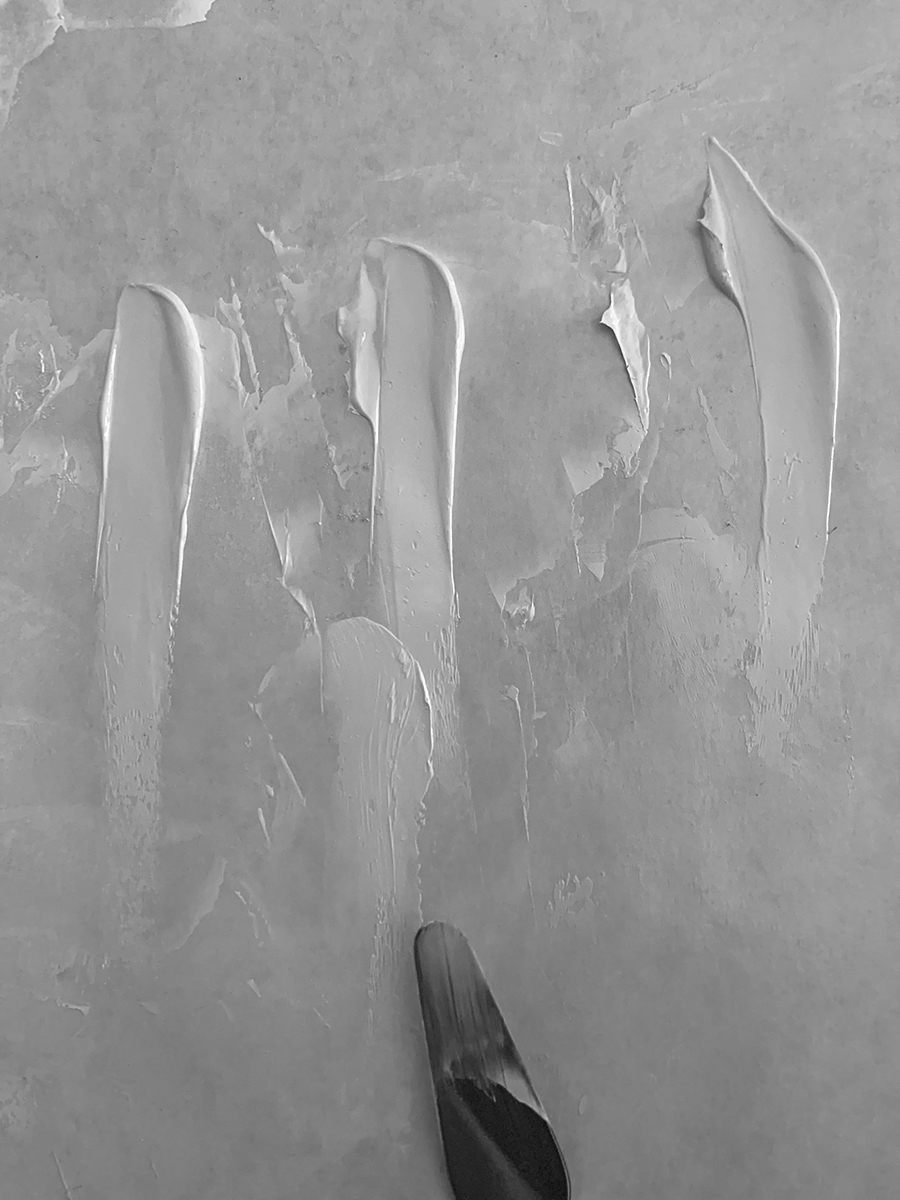
The other more optimal method is using a red piece of cellophane as glasses to observe your mixture. Red cellophane will remove all hues from the visible spectrum and leave you with all values, albeit they will be in the red family.
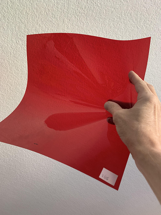
This is a photo filter you can purchase in a pack of filters for studio spotlights. Here is a link to such a pack.
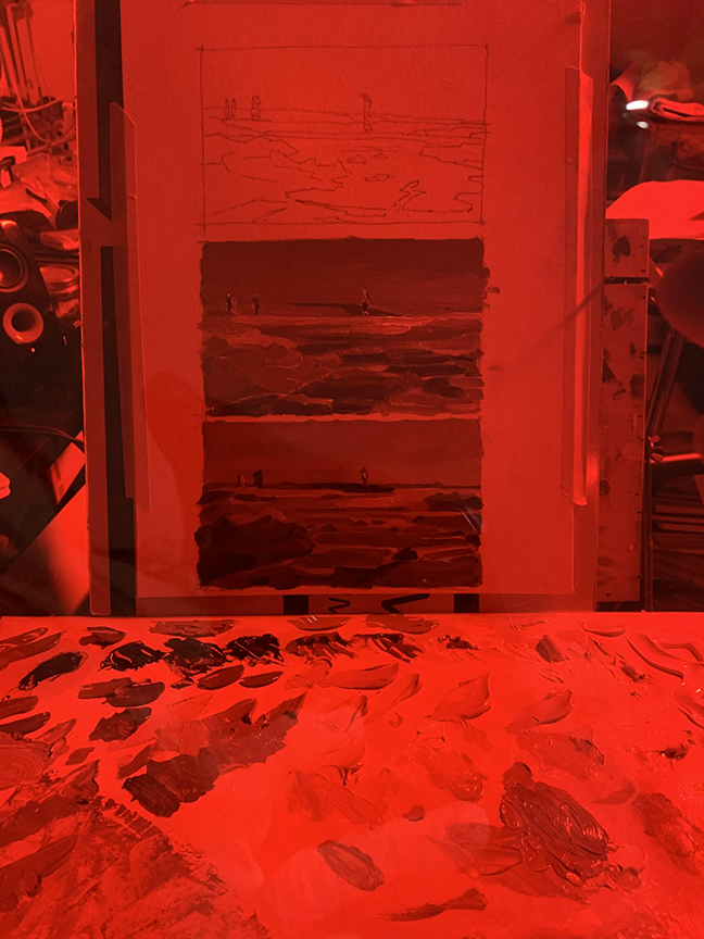
This was shot with the filter in front of my camera, and immediately showed me where adjustments were needed to match the two more accurately.

I made this one on purpose to show the effects of hue being so dominant that we want to match it rather than control it.
Once you have compared the image to the painting, if there are any glaring mistakes, remix and adjust.
Practice with these training aids until you can confidently identify the colors of your subject and mix them objectively observing only with your eyes. The latter methods of comparing are the training methods and should be reduced by need as you progress in your studies. Why? So you can eventually step it up and make art and not just more studies.
Learning to mix parts separately before mixing them all together feels counter intuitive to us at first because we all learned bad methods of palette painting by all of our instructors. Quite honestly, there are only a few painters out there that practice quality control before beginning the mixing process. And again, this is about learning, not about doing in practice. You do what you do to make your art, however, there is an objective way to learn, there is a big difference in method, mood, and mentality of the painter between them.

Here are a few challenges for you to try. Find other images and do the same with them.
Love learning to constantly improve, doing is only a part of it.


Hey Ron, I know this is an article about color but I have a question about the surface your using, it looks gessoed, if so can you tell what gesso you use? I’ve tried several gesso brands and all of them have made all my surfaces next to impossible to paint on where with acrylics I can layer only 2 times before the paint turns tacky and flakes/wipes off to reveal the raw surface. even staining the canvas before hand makes any stroke not stick and making any corrections is impossible. Even trying to gesso over failed paintings results in the gesso wrinkling up and flaking off. All my friends are stumped as to what the problem is and I was wondering if you ever had this problem? I’d like to do studies like this but with my current surfaces painting feels more akin to surgery than discovery.
What surfaces are you using? Brands.
Gesso is acrylic, so if put on too thick, will build up a polymer surface with little bond to it. It might seem like it will take a long time, but the preferred way to apply this kind of gesso is to cut it 50/50 with water and apply it in coats, up to as many as you would like but a minimum of at least 3 to build up a sufficient layer of gesso vs. exposed areas of canvas vs covered areas which will happen as the water will cause the gesso to fall downward exposing the topmost edges of the pulp, canvas, etc. that you are covering.
When painting, if you don’t give each layer time enough to dry then you will possibly distress all the layers causing them to fall apart or crumble since the layer of polymer is too thin to curl off. The water is washing off the acrylic in patches. Depending upon where you live, it could possibly not get warm enough for the paint to thoroughly dry in a reasonable amount of time. Temperature plays a big part in how all of this stuff cures.
How do you apply, what surfaces are you applying to, and where on the globe are you and what are is the avg. temp there?
I’m using canvas (Colvin and Co brand 100% cotton 280 GSM) and 2 types of cardstock ( both are like Bristol board but one has a plastic back). I bought it bulk at a flea market so I don’t know the brand name.
As for gesso I’m using blick white gesso.
I apply it the way you described using a hair dryer to speed up the process between layering but this is the first I’ve ever heard to dilute it equally. Any info I could find says to dilute by feel.This is also the first time I ever heard temp being a factor, its been about 68- 75 degrees beside a heater where I’m both painting and applying gesso. These 2 factors could explain why my first batch worked perfectly and the rest went south. And why the surface will have areas where the paint looks patchy.
I made some new tests (which is why my reply took a bit, sorry!) using the 50-50 ratio in a more climate controlled room at 72 degrees and I think it did the trick! the paint isn’t as tacky, the coverage is much better and I can layer again. The only problem I’m getting is glazing is still an issue. when I put water over a dried area the paint will peel off but only after an intense scrubbing, which might be from the under layers not drying enough, I’ll have to do more tests.
thank you so much for the info Ron!