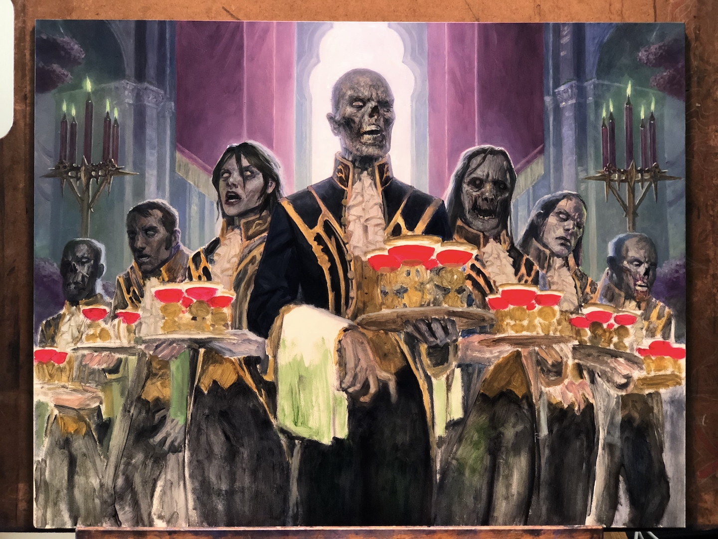
Back again today with another breakdown of a piece done for Magic: the Gathering. This one was done for the upcoming set, “Crimson Vow”, which takes place in the world of Innistrad. For the uninitiated, Innistrad is sort of a gothic horror setting with a Prussian vibe. Story-wise, there’s a big, old vampire wedding taking place and in this piece I was asked to depict the wedding’s wait staff…a wait staff that is composed of zombies.
Seriously.
Someone asked me to paint zombie waiters.
There was nothing I was not going to enjoy about this.
There were a lot of suggestions within the art order for possible ways to depict these ghoulish servants, and I really put a lot of weight and consideration into these ideas. Some things floated to me were things like zombies polishing silverware or trying to set the table. While amusing, these things worked better to me as 5-10 second video clips rather than still images. Those things that did work as single, still images worked better with one or two zombies rather than a host of them. I did some explorations anyway, and just didn’t feel like any of it was clicking for me.
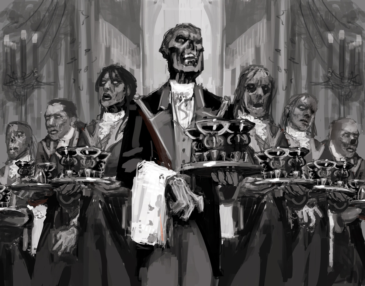
While doodling, I had this weird notion that I kept coming back to: in my head, I saw zombies lined up shoulder to shoulder, prepped to serve, forming almost a solid, wall of flesh and uniform. Admittedly, this image isn’t as strong a story-telling opportunity, but it felt like a really strong visual, and it became one I ended up feeling pretty confidant about. So I thumb-nailed a couple variations of this image, but eventually settled on this version:
 Before submitting my sketch, however, I decided I needed a solid plan on the waiter’s uniforms. Since there was no existing reference for these, It was entirely up to me to solve them. So I put my concept artist hat on and did a deep dive on servant liveries from the 17th and 18th centuries to find inspiration.
A couple of notes about servant liveries from over the course of those two centuries. First, there is a WIDE gamut in terms of style. Even from similar regions and similar times, the variation can be surprising and it’s actually impressive how many examples have been preserved. Second, there are some that are shockingly elaborate and even luxurious—some including beadwork, fine embroidery, and even metallic thread. What better way to show off one’s wealth than to dress your staff lavishly? Third, bright colors were very common—sometimes in combinations that would be considered quite garish or even ugly by today’s standards (and maybe even by the standards of the time (let’s face it, not everyone has taste)).
With those things in mind, I started to ponder the livery of the vampire’s staff. These are wealthy vampires, living in absolute luxury. There’s no doubt the wait staff would be dressed accordingly. So it was clear that I needed to lean on the costuming of the vampires since they were likely the ones who chose the uniforms to begin with. From the vampires’ clothing, I took subtle design cues, as well as color cues. Lastly, I incorporated some of the design work I’d contributed when I helped concept Innistrad to begin with back in 2010 (at least I think it was 2010). This included a linkage between the coat collars and the shoulder epaulettes (something that’s found in relatively few pieces of art set within Innistrad, but something I’ve personally stuck to as much as possible).
In addition to what the wait staff was wearing, another consideration was how they were presented. Would they be disheveled and dirty? Would they be a total rotting mess, their various fluids staining the liveries? In the end, I felt that those options flew in the face of the elegance of the wedding and was inconsistent with the tastes of the vampire participants. Instead, I preferred the juxtaposition of rotting flesh and crisp, clean uniforms. That was somehow more interesting to me, and so that’s what I went with.
So, I drew up a few livery options for the folks at Wizards to consider and submitted them along with the sketch.
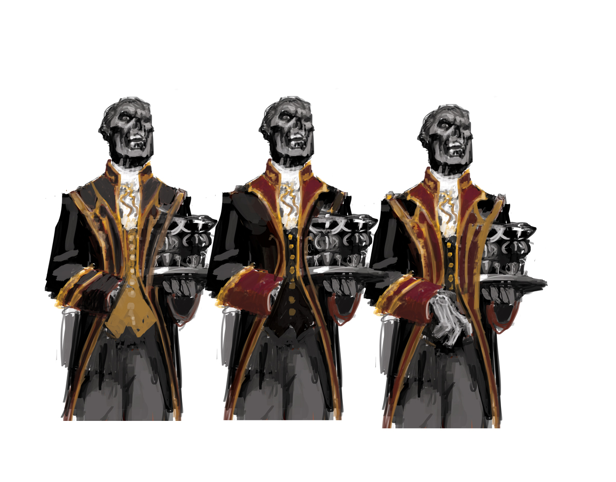 These options are not particularly garish or out there. But I thought they worked within the context of the aesthetics of the wedding and its decoration. In the end, they liked the least colorful of the three, and approved my sketch.
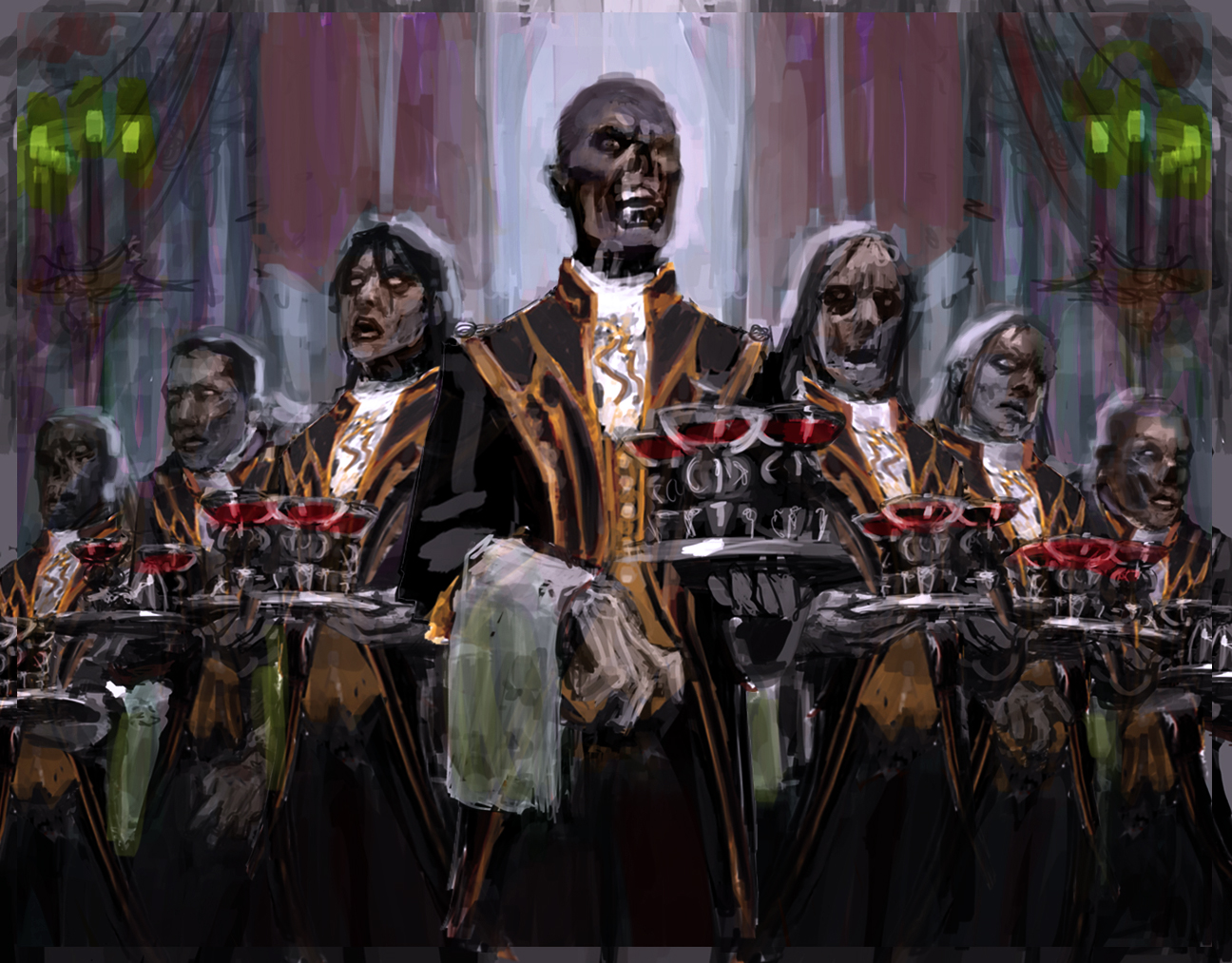
Before moving to paint, I took one additional step, and produced a digital color study.
 And with all the major decisions made, I was off to the races.
Somewhat unusual for me was the level of confidence I had going into this piece. I was so confident, in fact, that I skipped any kind of ground color or underpainting and went straight to mostly finished work from the start.
 Above is after the first bit of work I did. I could have started working on something less juicy than the faces, but I really wanted to nail those down and then use those to establish palette and value structure.
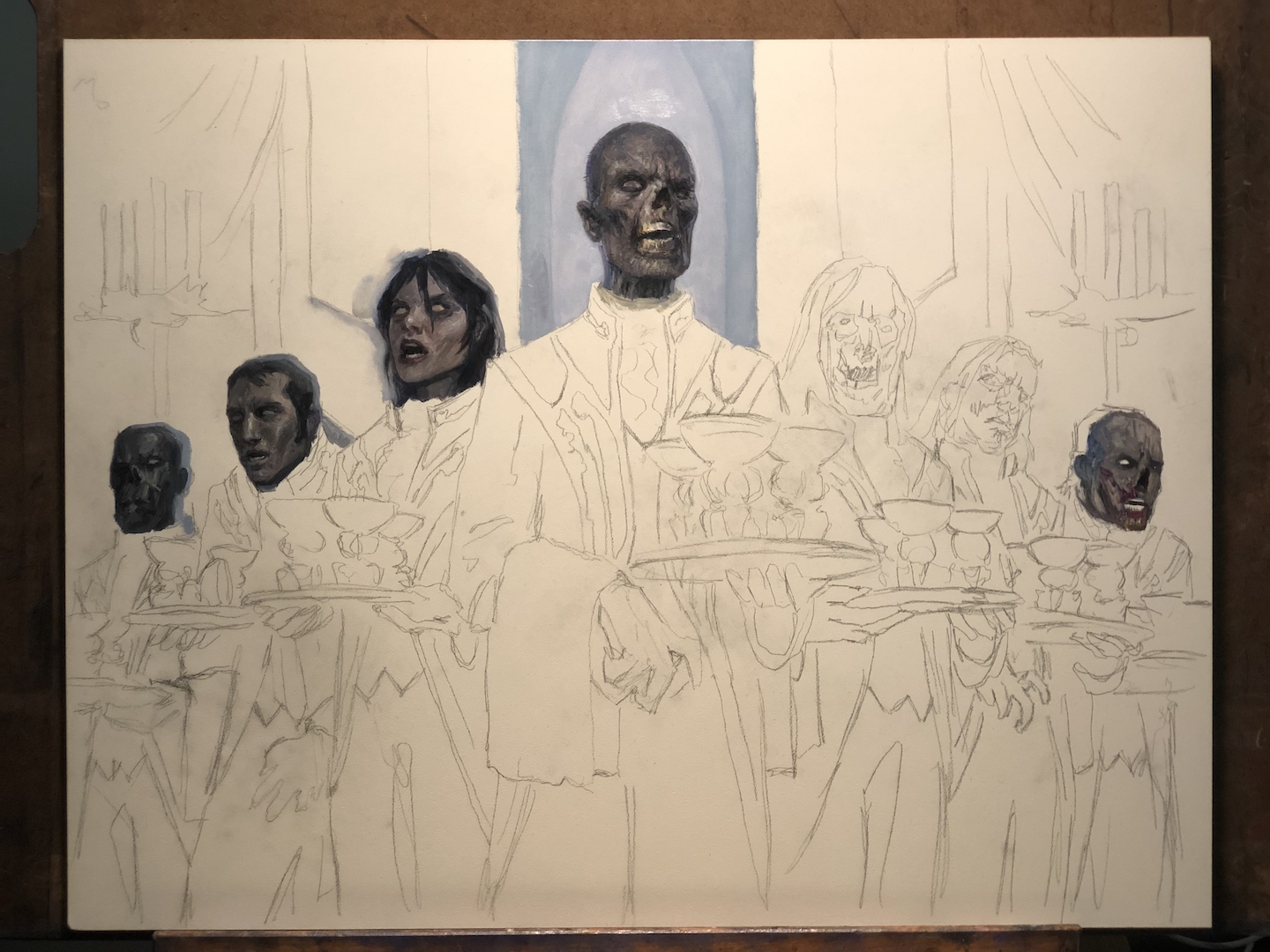
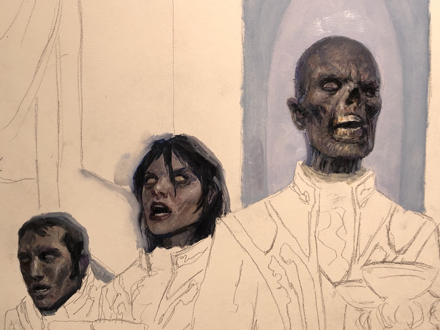 And I just kept painting faces.
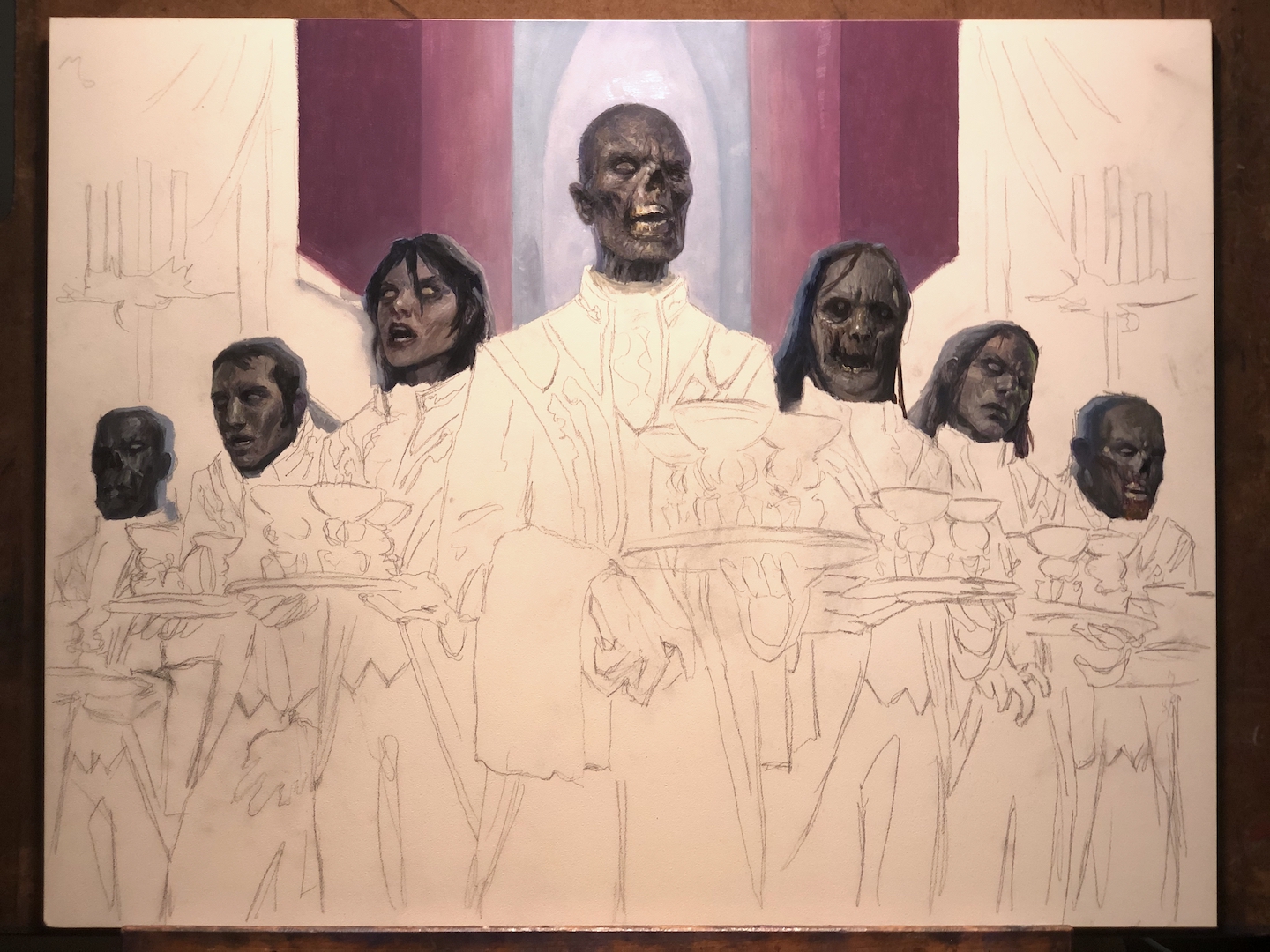
Eventually, though, I ran out of faces to paint. So it was time to start painting everything else.
 Most of this first pass is quick and dirty. It’s more of a scrub in than an actual painting. But it’s solidifying the value structure and general palette.
 Eventually, though, I realized I needed to start getting a bit more figured out in order to start making bigger strides. So at the end of a painting day mostly spent revising background areas and starting to establish the uniforms, I went ahead and scrubbed in the rest of the piece.
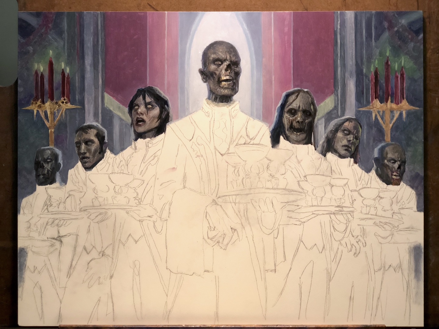
 Once scrubbed in, I start refining and finishing each area.
 A logical way to approach this might have been to do something like painting all the black fabric on the uniforms, followed by painting the gold details, then moving on to the towels and ruffles, etc. But I’m not always logical. For me, the best thing to do was to establish the lead waiter first and then expand from there. In essence, my goal was to solve all of the problems with the first zombie and then take the lessons I learned from him across to the other six. I don’t know if either approach is superior or faster, but this one worked for me.
 Regardless of the logic of my preferred work method, one lapse of logic that I’m constantly guilty of is working from left to right despite being left-handed (this sets me up to drag my own hand through wet paint). You’d think that I’d have figured out how bad an idea that is after several decades of doing this. But no. No I have not.
Anyway, some of you may notice that in going over the darks at the bottom of the piece, I also destroyed the silhouettes of the zombies on the far left and right. To bring the whole thing closer to the vision I had in my head, I realized I needed to get rid of those details to reinforce the overall shape. The monolithic nature of the zombies was what tickled me and I needed to preserve that.
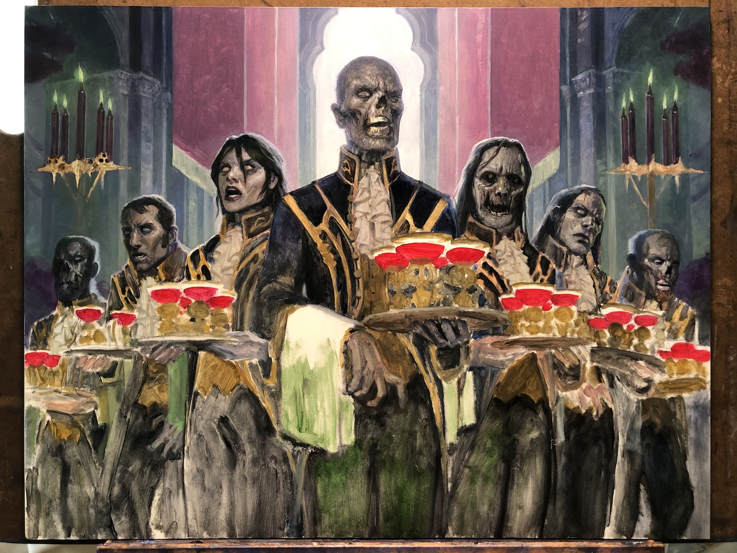
 One aspect of the piece I vacillated over was the blood in the glasses. Basically, the thing I was trying to decide was whether to paint it naturalistically or whether to go bold and garish—almost graphic—with it. So I kept kicking that decision down the road. There’s only so much road though.
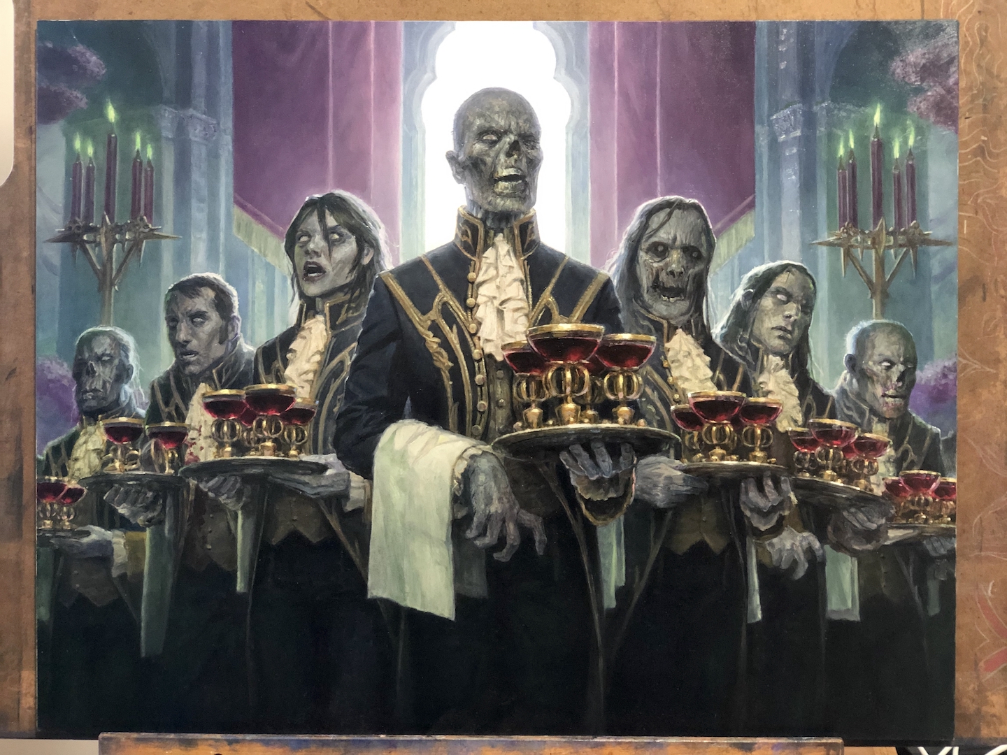
In the end, I felt that since I’d treated the rest of the piece naturalistically, I should continue that with the blood in the glasses. I do think that as I painted it, this decision was the right one and the blood-filled glasses just sit better in the context of the scene. However, somewhere there’s an alternate universe where Jeremy Wilson did this painting and nailed the balance of graphic shapes and colors and the blood in those glasses is just graphic red shapes and it’s glorious. But I stand by my own decisions. I’m definitely not Jeremy Wilson.
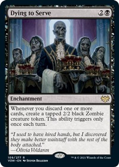
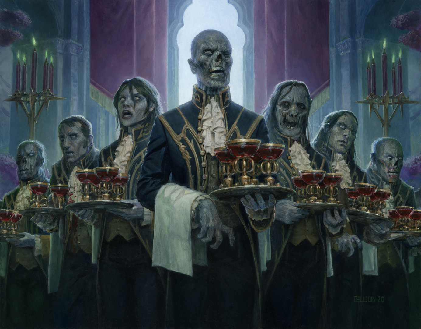 Here’s the finished image. It’s oil on hardboard, measures eighteen inches wide by fourteen inches tall, and was art directed by Zack Stella. It, like the card, is called Dying To Serve.
This is a piece that…well, I don’t think is going to end up hanging above anyone’s couch, but man was it a lot of fun. It’s among the weirder and sillier things I’ve been asked to paint, and I’m really pleased with how it came out. Hopefully you folks find it interesting…or amusing…or something. Regardless, hopefully my approach and process are clear and of some use.
Before I go, I wanted to share something else about this piece that isn’t pertinent to its creation but adds a personal aspect to the piece. You see, the painting contains reference to an oddity of my childhood. Here’s a (true-ish) story:
When I was a boy, my Mom was a beautician. In other words, she cut hair, colored and permed peoples’ hair—that sort of thing. She did this out of a studio in the basement of our house. Among other things, this studio contained a single hair dressing chair, a stand hair dryer, and a small waiting area. A lot of my Mom’s clients were elderly folks from around town and most of those were very loyal and very nice to my folks, my sisters and me. However, among my Mom’s customers were a married couple who, for the sake of their privacy, I’ll call the Howells (I watched a lot of “Gilligan’s Island” as a kid).
I never saw the Howells separately. They were always together. Whether he was getting a hair cut or not, Mr. Howell accompanied Mrs. Howell when she was having her hair done. Despite there being ample space to wait in my Mom’s basement studio, Mr. Howell refused to sit down there and instead chose to sit at our kitchen table (often in my father’s chair, no less). Though occasionally he brought his own book to read, most of the time Mr. Howell instead chose to help himself to our daily newspaper (he never bothered to ask permission, I guess he just figured the money he and his wife spent on having their hair done at our house entitled him to use of the paper).
On many an occasion, I found myself at the kitchen table while Mr. Howell perused the local news. I tried always to be polite, greeting him whenever I saw him. But he always responded with silence. To a point I can forgive some of that silence as he was quite deaf, but his level of deafness seemed to vary depending on circumstance. The point is, he was mostly silent and also pretty grumpy. To my knowledge, the Howells had no children of their own and it was years before it came to my attention that he was from a school of thought that children should rarely be seen and never heard. But this was out private home and he was at our kitchen table, so that was never going to happen with my sisters and me.
At some point, he took it upon himself to give me grief for some minor infraction or another. I don’t remember him yelling per se, but I can say that he spoke out of turn and wasn’t polite about it. I wasn’t a fan of being corrected in my own home by a virtual stranger. Neither were my parents. While I continued to be polite after that, I definitely wasn’t upset when the Howells stopped coming to my Mom to have their hair done.
Anyway, my memory of what Mr. Howell looked like is vague but I decided to include him in the painting nonetheless. I’m probably way off in terms of his actual appearance and I’m quite sure I’ve been too liberal in the amount of hair I’ve given him. I’m not sure why I included him, honestly. Regardless, there he is on the far left, grumpy as ever…ready to wait tables instead of sitting at ours uninvited.


Nice piece, thanks for the in depth breakdown!