By Annie Stegg Gerard

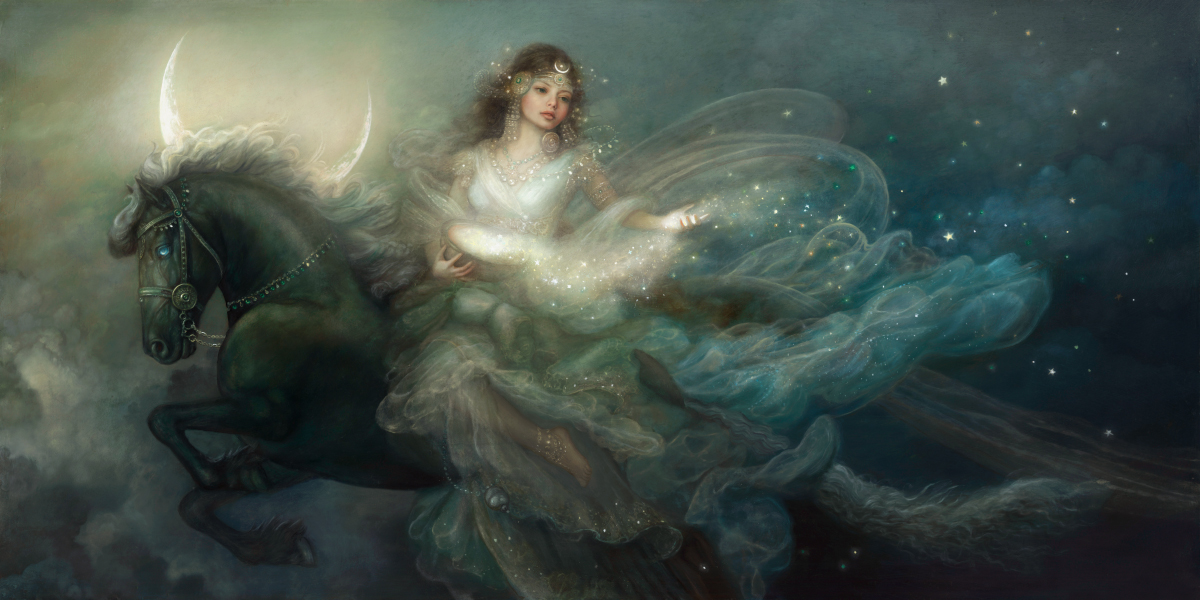
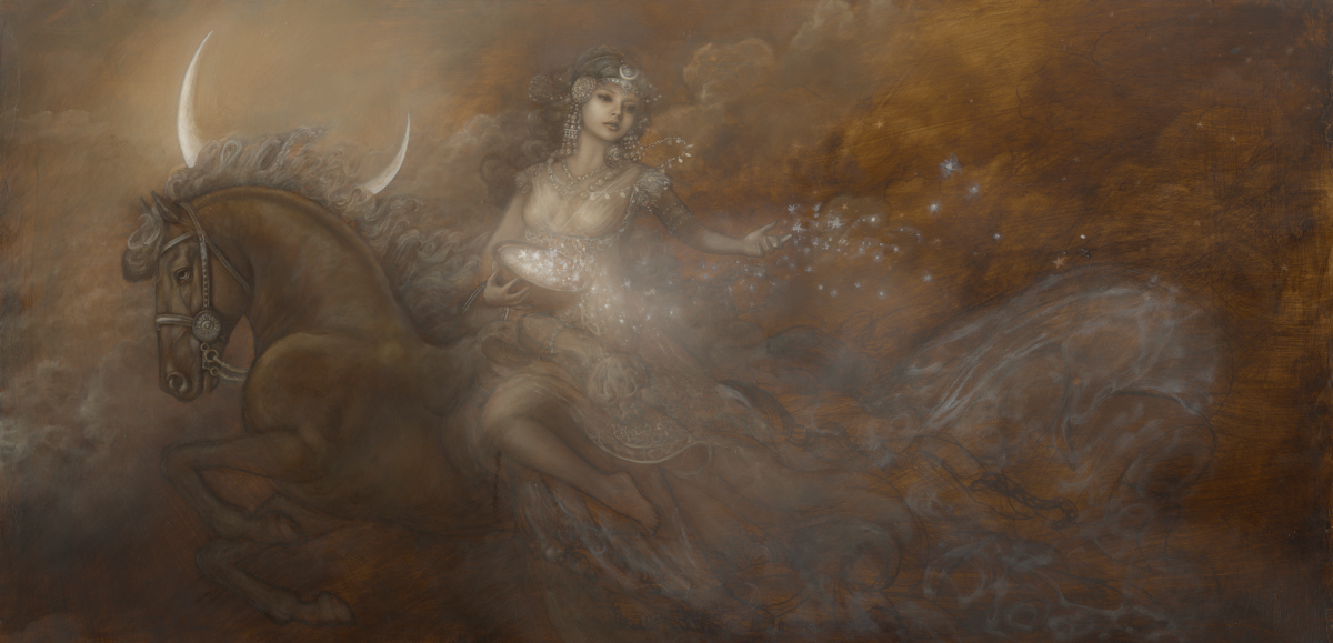
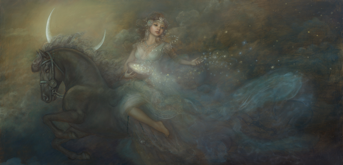
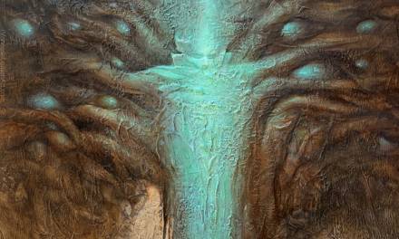
“Herald of the Night” Currently on display at the Norman Rockwell Museum
Earlier this year I was asked to create a painting for the Enchanted Brush Exhibition at the Mazza Museum of International Art from Picture Books. The theme of the show is Maidens of Myth. Mythology and folklore has always fascinated me. I have not explored much from Northern Germanic legend, and jumped at the chance to do a little research on some deities that I’m unfamiliar with. There were quite a few that stood out to me, but one in particular who I knew I wanted to illustrate for this show.
In Norse mythology, the goddess Nótt is the personification of night. She is seen riding her silvery maned black horse, Hrímfaxi, across the sky with her son (and foil), Dagr. As the personification of day, he rides a white horse named Skinfaxi. I plan on illustrating them as well, but since they didn’t fit the theme of this show I’ll have to save the pair for later. As the herald of the night sky, I will be illustrating Nótt holding a mazer of stars to sprinkle across the heavens on her journey. A nightscape filled with stars and clouds, and of course a moon will be essential to the background atmosphere.
In this tutorial I’m going to be focusing mainly on painting technique. I’ll discuss how to use an underpainting to achieve a lighting effect that captures form and volume. I’ll also be sharing how to use glazes to enhance color and create a jewel-like effect for your painting.
I’ll be working in traditional oils for this painting, but the principles here can also be applied to other mediums.
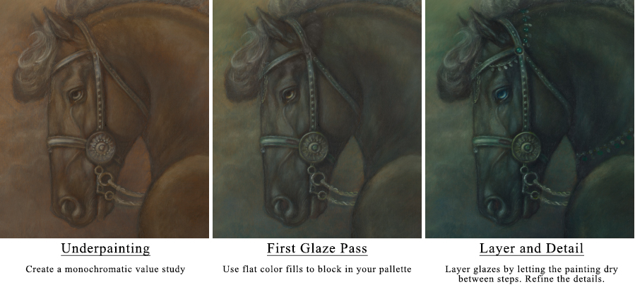
Step 1: The Underpainting
I like to create an underpainting for my paintings to get a better sense of value before I start to add color. These can be as detailed or rudimentary as you like. I find it best to gage the complexity of the piece before deciding on how detailed to make the underpainting. For this image, there are more organic background elements going on than say, in a portrait piece. You tend to loose the smaller details when glazing from an underpainting. I like to create a less developed underpainting when I know that I’m going to have a lot of small details. This saves me time instead of having to essentially paint the image twice. I’ll be focusing on the figures mainly during this step, and then the basic shapes and values for the background.
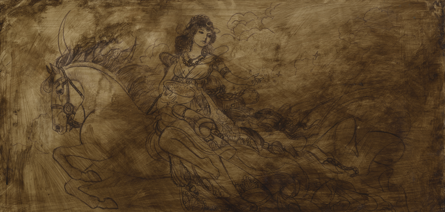
For this piece I am using a 12″x24″ cradled Ampersand Gessobord that has the transferred drawing and has been toned using Old Holland Raw Umber oil paint. This gives the image a nice mid-tone base to begin the underpainting. Before I start adding value, I like the toned board to be completely dry. I begin to paint the foundation of my image using Titanium White for the highlights and Raw Umber for the shadows. I do not like to use any medium during this stage, just the raw paint. I find that glazing can be applied more smoothly later on when a painting has a strong base free of medium.
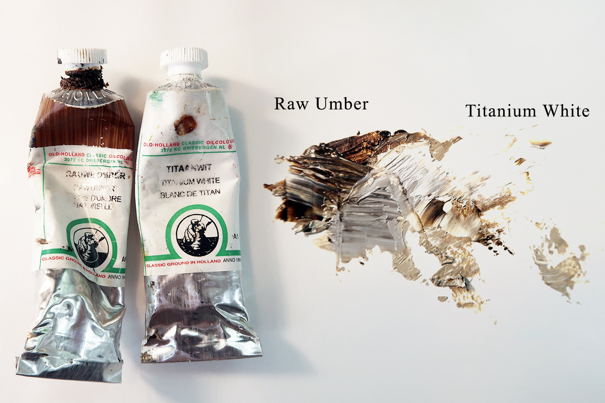
Old Holland Raw Umber has cold-pressed extra virgin linseed oil, for optimum drying in the paint. It has one of the quickest drying times (2 days) which is why I prefer using it for underpaintings. I find that you can get a range of colors from using it alone or mixed with white. On its own, it is a cool, transparent brown ranging from yellowish brown to greenish brown. When mixed with white, it tends to cool to a greyish color.
You can see below the value rage from these two colors alone. The background appears much warmer than the cool tones in the foreground where I have applied the Titanium White and Umber mixture.
This part of the process is focused solely towards achieving accurate value. Because of this, the contrast of tone is more significant than the final image will be. I’m most concerned with capturing the lighting effect. This stage of the painting acts as an important guide for subsequent layers.
For this particular illustration, I am not going to focus on the flowing cloth or the background too much. I know that I want the drapery to have a sheer transparent quality, so it makes sense to paint the background first before I start to flesh out those areas.
Step 2: First Color Glaze
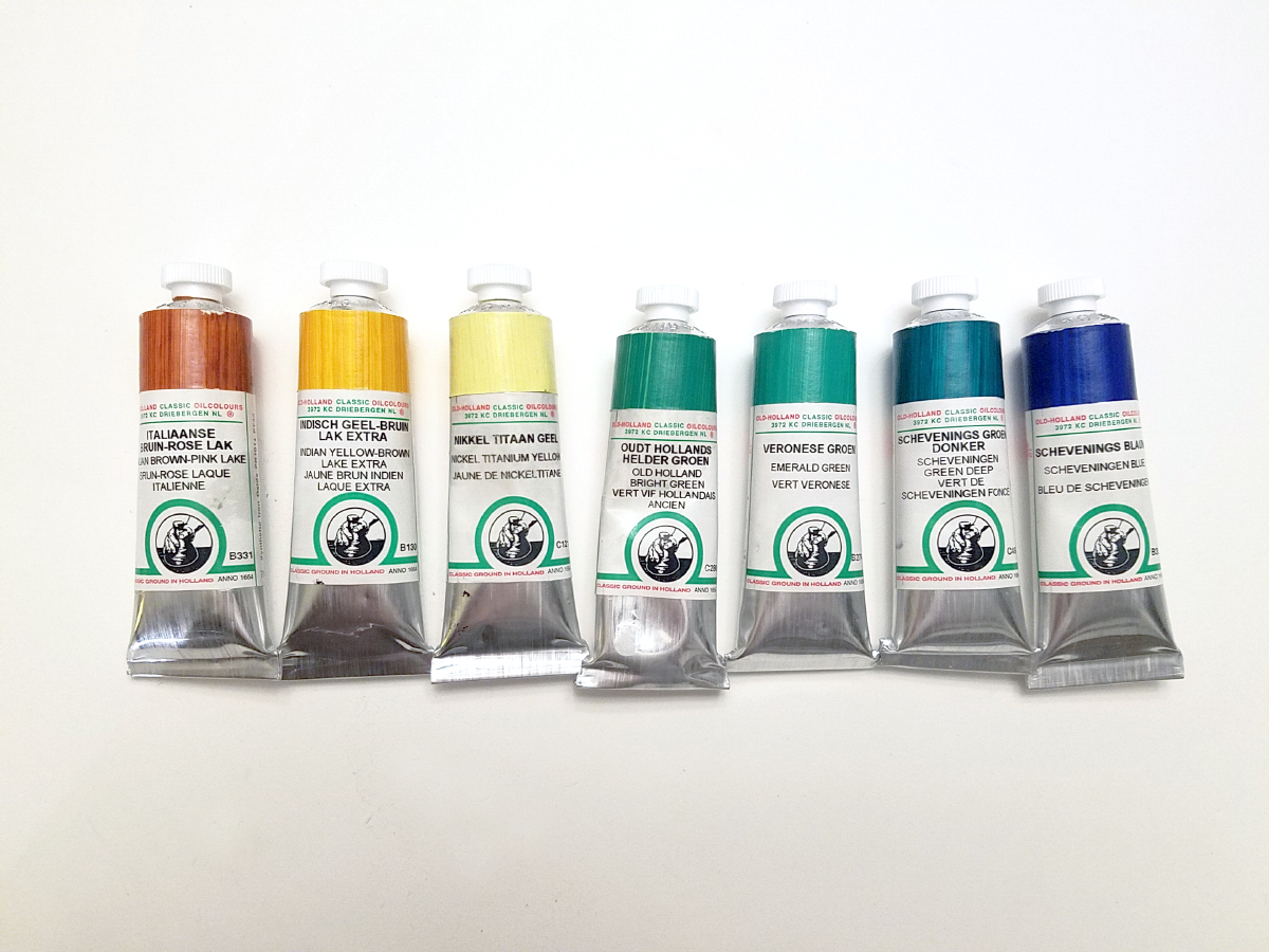
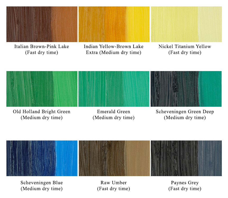
Once the underpainting has completely dried, I like to start to add the first layers of color. I usually like to work with 6-7 colors per painting. A red, yellow, green, blue, brown, white, and grey. I have a standard fast dry palette that I usually stick to, but I decided to try something a little different for this piece. Since I’m not under a strict deadline, I am going to be using some medium dry time paints.
*Dry time varies depending on the humidly in the air. I found the fast driers to be between 1-3 days, and the medium driers to be between 2-4 days
I am going to be using:
Italian Brown-Pink Lake (Fast dry time), Indian Yellow-Brown Lake Extra (Medium dry time), Nickel Titanium Yellow (Fast dry time), Old Holland Bright Green (Medium dry time), Emerald Green (Medium dry time), Scheveningen Green Deep (Medium dry time), Scheveningen Blue (Medium dry time), Raw Umber (Fast dry time), Titanium White (Medium dry time), Paynes Grey (Fast dry time)
To start, I like to use a large soft brush to buff in the colors. For this stage of the image, I just want to get a color base down. This helps me visualize the image as a whole.
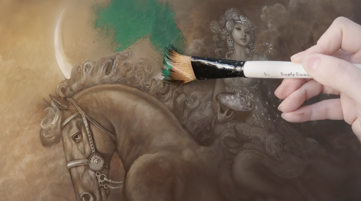
Colors look much different on the palette than they do when they are interacting with one another on a painting. I use the straight pigment (without any medium) until the entire surface of the painting is covered. It’s ok to be messy in this stage, and the colors often bleed into one another. This is my favorite time to experiment. Since the underpainting is dry, I don’t have to worry about undoing any hard work. While the pigments may look saturated initially, I buff them in until they are distributed evenly enough to still see the underpainting.
Step 3: Building Color
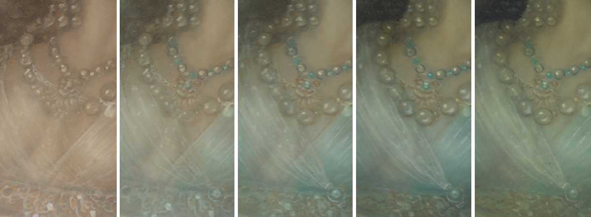
Now that I have a good idea of the direction I want to take the painting, I can start to deepen my color choices and add detail. Between each step, I like to make sure the painting has completely dried. This way I can gradually build up the layers of paint, while leaving hints of the previous layer intact.
I have made an example of this below. You can see in this close up of the background, how as the layers build there are still hints of previous layers underneath. And despite the fact that the colors I am glazing are cool, the warm underpainting still shows through in certain areas. This slow build of color will give your painting much more depth in the end.
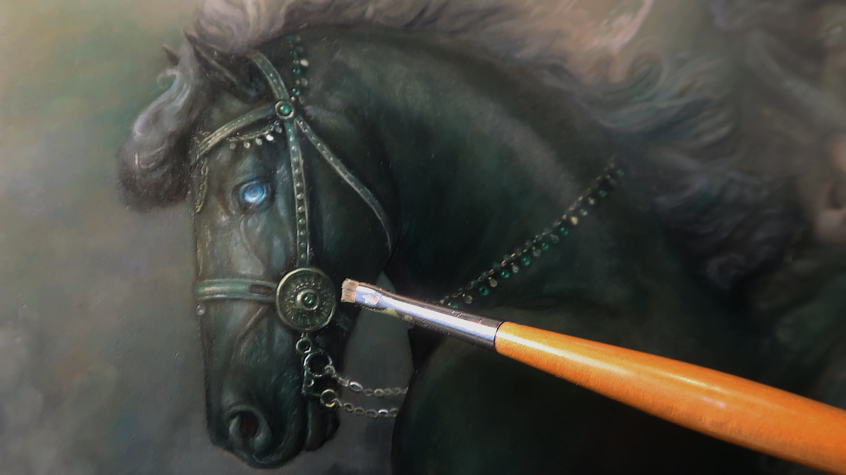
As I work on these layers, I like to tone the painting in the same way I did in the first color glaze step. I will then work in the details on top of the glazed surface. In mythology the horse Hrímfaxi is described as being black with a silvery mane. I find that by mixing different hues instead of using straight black pigment alone, gives more life to an image. I use Paynes Grey combined with Scheveningen Green to give the illusion of a very dark, almost black tone.
The bridle ornamentation is painted over the wet glazed surface using Nickel Titanium Yellow. For these finer details I use a small amount of Walnut oil alkyd to thin the paint.
Artist Tip:
You don’t have to use toxic chemicals like turpentine to clean your brushes between steps. Use linseed or walnut oil to remove all of the pigment from the brushes by gently wiping the bristles on a paper towel. Rinse your brushes with soap and water. I like to use The Masters Brush Cleaner And Preserver Soaps
Step 4: Detailing
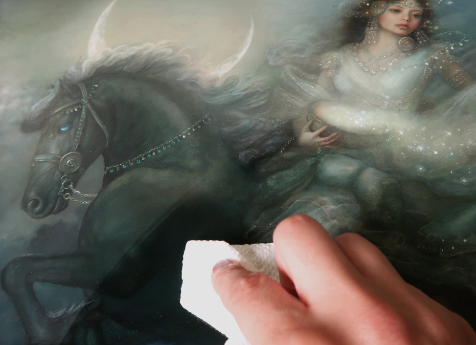
As the layers build, the surface of the painting starts to become more and more uneven. Colors can begin to look dull and sunken in as certain pigments seem to lose their luster. I find this to be true especially with Old Holland’s Paynes Grey. Because it contains Bone Black, it dries with an almost chalky finish. To remedy this, I will rub a thin layer of Walnut oil over the surface to reinvigorate the colors. This is a process known as oiling out. You can see below the difference in the dark surface of the horse. The painting now has a more even surface to paint on.
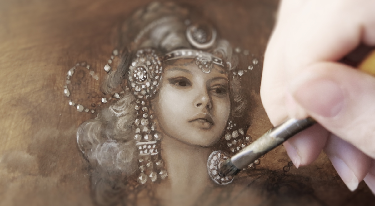
Another effect of gradually building layers, is the loss of detail. Some of the finer lines will have to be repainted as the painting progresses. I like to save the more intricate details for the final layers of the painting. You can see below how the jewelry has to be repainted each step to keep it from completely receding into the background. I use Nickel Titanium Yellow for the highlights and much of the detail. Raw Umber mixed with a small amount of Paynes Grey is perfect for the soft shadows. It may look stark at first, but remember that it will be glazed back as the layers progress.
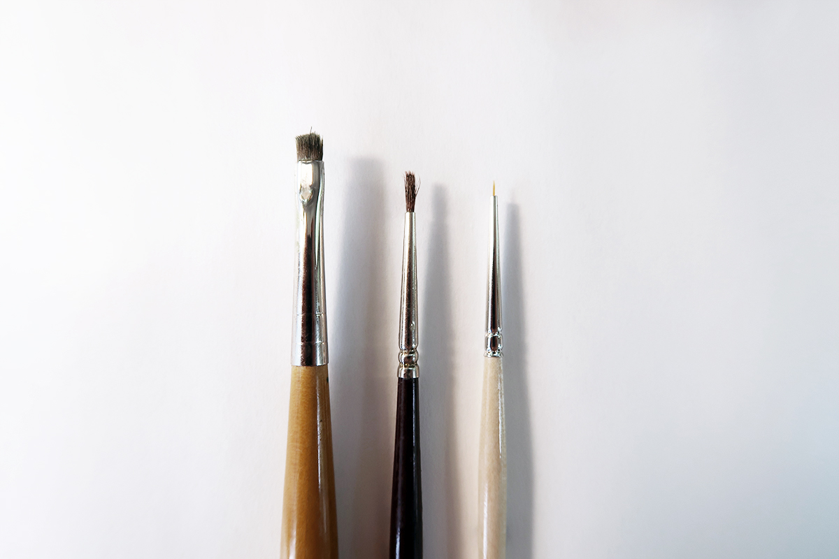
For the jewelry on both figures, I use a small round 0/20 brush to add the sharp details, and then a larger brush to soften them. I prefer to use an frayed brush for the blotting. It’s nice when you can find use for those older brushes that don’t have the nice sharp tips anymore.
Pictured below are three of my favorite brushes (from left to right) Isabey Isacryl Bright Size 0, Pointed Round Galleria Size 0, and 20/0 pointed round detail brush
The highlights are especially important on the bridle since they are on such a dark background. You will notice that on the reins, only certain chain links are focused on. I like to vary where I place the highest points of light to give the metal a more reflective and shiny quality.
Step 5: Evaluate
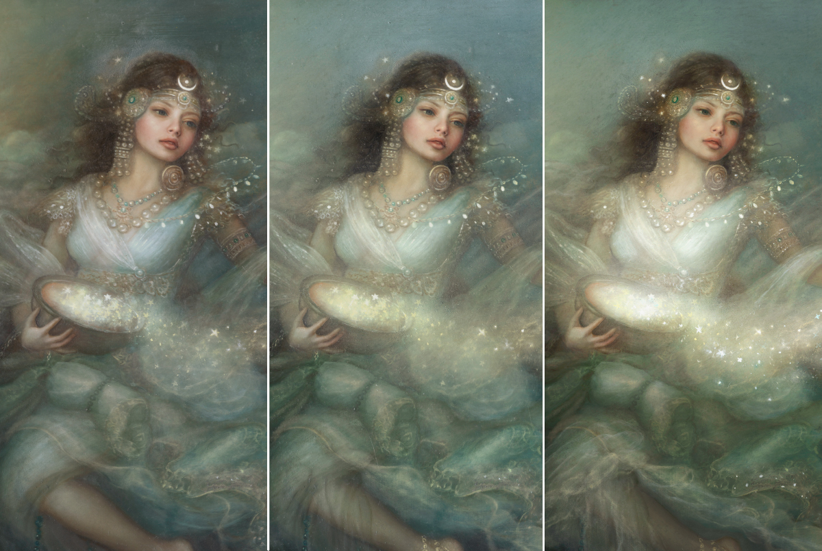
After working on a piece for awhile, I like to leave it alone for a few days so that when I come back to it I can see it with fresh eyes. A piece looks much different once color has been included, and now that I have been adding areas of focus with the highlights, I want to make sure my composition still works.
Usually at this stage, I either photograph or scan my painting so I can make easy mock editing decisions in photoshop. This way I can get an idea of what I should change on the painting, before I start actually painting on it again. As you can see here, the painting draws your eyes from left to right. It doesn’t flow around the piece how I would like. To fix this I am going to start working on the drapery and stars. With some quick digital scribbles, I can get an idea of where to take the painting next.

I love that the new changes would give the piece more of a cyclical flow like an Ouroboros, the infinity symbol (which is a perfect symbolic depiction of the passing of time, night and day cycles).
Step 6: Final Touches
I want the cloth to have a transparent veil-like quality, so I’m only going to be focusing on the areas where the folds and light would be hitting.
Because the layers underneath the veil are dry, it’s much easier to achieve this effect.
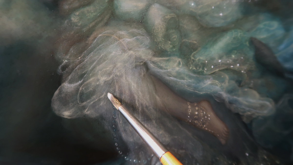
Much like the detail in the jewelry, I am going to be painting the cloth using Nickel Titanium Yellow and Titanium White. Because it will be toned back with glazing, I do not need to worry about how stark it appears now.
I am also going to focus on enhancing the stars. By adding these small points of light, I can push the composition I am trying to achieve with these changes.
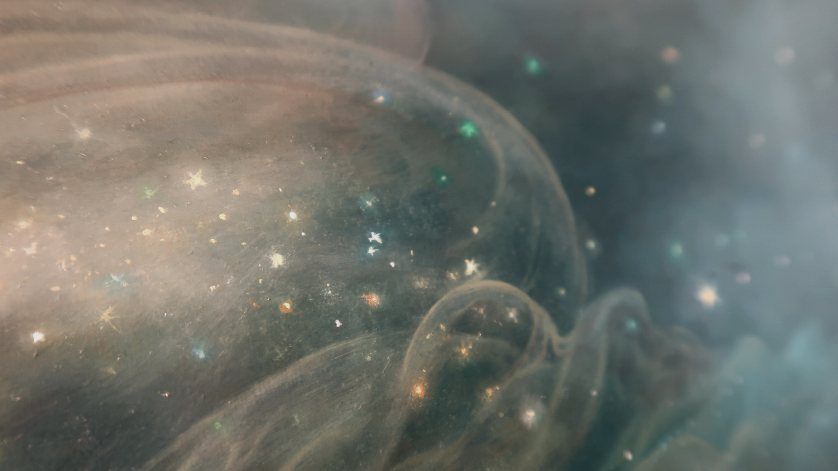
I buff in different colors on top of the stars to give them a more glittery, chromatic effect. Indian Yellow Brown Lake, Old Holland Bright Green, and Scheveningen Blue are perfect for giving the stars that extra dimension and glow.
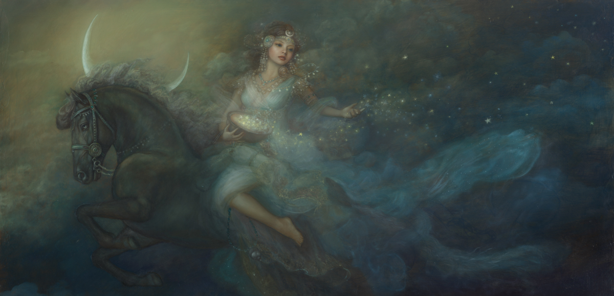
After making these changes I scan my image again to check on the composition. I am much happier with these adjustments. I’m going to continue the glazing and detailing steps a few more times before calling this painting complete. I usually like to apply between 10-30 layers of glazing on a piece. The slow build of color will really give the painting that “Glow” I’m seeing.
Step 7: Depth
In this stage I like to enhance the volume and depth of the piece. To create the illusion of depth, atmospheric perspective is created by using more subdued and lighter colors. Using a large round brush in a circular motion, I am going to soften the sky behind the figures. I use drybrush technique which involves applying the paint to a dry brush with no medium. I get a softer effect with a slight texture using this method. Unfortunately, this is hard on my brushes, as the pigment is scrubbed onto the surface of the board. As I mentioned in Step 4, the brushes with ruined tips can be set aside to use a blotters.
Scheveningen Blue mixed with Nickel Titanium Yellow and Titanium White gives me the perfect bright neutral color. The figure is beginning to stand apart from the background. I also brighten the highest points of the piece using a mixture Nickel Titanium Yellow and Titanium White. By drybrushing these areas, they appear to have more volume.
A final color glaze is added to the image to unify color and atmosphere, using Indian Yellow Brown Lake.
Step 8: The Final Scan
Now, my painting is ready for the final scan. Because this scan is the most important, I want to make sure the surface is even. Once the image is completely dry, I am going to apply a very thin layer of Galkyd as a protective coat. It dries to a glossy enamel finish that works as a protective layer while I’m waiting to apply the final varnish.
Artist Tip: Scanning your painting
If your painting is too large to fit in your scanner, you can go to file, automate, photomerge in Photoshop to batch merge multiple scans for a single piece. This is especially helpful for very largeimages.
“Herald of the Night” will be on display at the Enchanted Brush Exhibition at the Mazza Museum of International Art from Picture Books June 4-August 10, 2018
I hope you have enjoyed this tutorial! Feel free to write me with any questions regarding technique.
-Annie Stegg Gerard
Adorable piece of perfection. Thank you, Annie.
Thanks Valerii!
It’s a gorgeous piece, thank you so much for sharing your process.
I have, what might be a very silly question. You describe glazing in multiple layers and the drying time of your paints. Do you glaze wet into wet? Or do you wait for each layer to dry between glazes (which, I would assume, would be a process that takes several weeks).
Thanks,
Nathan
Thanks Nathan! (This is Annie on Justin’s account) I glaze only when the painting is dry. I use a walnut alkyd medium when I paint, and I also paint with mostly fast-drying colors, so my layers usually dry within a couple days. ~Annie