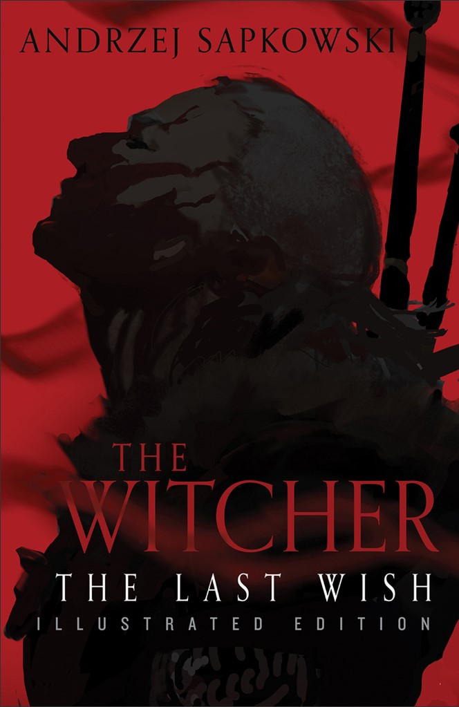
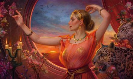
The final product (where we’re headed).
On the first day of WitchMas a Tommy wrote for me…ONE. BIG. ASS. POSSSTTT!! (I know you’re singing it in your head – it’s OK).
This post turned out to be exceptionally long, so I’ve broken it into three parts. The second part will follow next time, and I’ll further break each of the three posts down into “major stages” using section headers.
(fade to black)
(Star Wars theme plays)
Before The Beginning
This job started in a bit of an unusual way, because I knew it might happen before it “officially happened.”
Lauren Panepinto is the Creative Director at Orbit Books, and she’s also someone who’s taught me a lot about the book cover industry over time. She’s like my industry big sister / personal Yoda. She and I can dive into the nuances of the publishing world together, and both find it all super fascinating. She can go deep on just about anything. So she calls me to ask me some questions about how much I’m getting paid on illustrated editions for companies like Subterranean Press, Grim Oak, and so on. I get the idea I’m not really supposed to know why, so I don’t ask too much. But I’m honest about what I’m paid, how the process tends to go, etc., just glad for a chance to help Lauren out because historically it’s always the other way round. She asks if anything would be different if the illustrations were two-color, but as the Murderbot books I did for Sub Press were already black and white I said: “No, not really, and honestly black and white is tough in other ways.”
(For context: an interior shot, painted for the illustrated Subterranean Press edition of Network Effect, the first full-length Murderbot novel)
It’s not super relevant here (yet), but as an aside: black and white art has to be so much more striking in Value alone that you spend a lot of time refining the design to make sure of impact. You only have that one weapon: Value. Certain comps that would just kill in color absolutely won’t work. It’s like you get asked to make a barn with only a hammer. You just spend a lot more time on one thing, instead of a little bit of time with a lot of things. But I think painting is B&W in EXCELLENT practice for painting in color, as it trains up that one muscle – maybe the most important muscle besides drawing – to incredible levels if you do it right.
So Lauren thanks me for the info and we move on to other topics. A month or two later she reaches out to ask about my cover availability. Apparently during our last phone call she was putting together what’s called a “P&L,” or “Profit & Loss Report,” basically: a document designed to convince a publisher to make a book, or not make a book, from a financial point of view. My meager contribution was just one touchpoint in a sea of data she was collecting. I think if I remember correctly, Lauren said later that she actually put together two P&L’s:
- one where the interior illustrations would all be full-color, but where the rest of the book would be printed in B&W
- and one where the entire book would be printed in two-color, limiting the illustrations to that palette but opening up a range of design possibilities for beautifying non-illustrated pages
After they (Orbit) decided to go with the two-toned option and proceed with the book, Lauren put together an Art Proposal, suggesting illustrators, project direction, etc., for approval by the author and his agent. Now it’s their turn to decide if they want to do the book.
….and after some time: huzzah! It turns out the author doesn’t hate money, and Everyone wants to do the book. The illustrators have all confirmed their tentative availability at the rates noted in the P&L, and NOW…now we actually get to make the thing.
By the way, the other artists on the project were:
- Martina Fačková
- Jeremy Wilson
- Allen Williams
- Winona Nelson
- Jen Bartel
- Bruce Brenneise
and
- Kiri Leonard
All of them helped make the project awesome, so check them and their art out if you’re not familiar! I’m sure many of them will be releasing their Witcher artwork soon, if they haven’t already.
The Sketches
Lauren and I had a brief phone call to talk about her vision for the project, beyond what I picked up from the art brief. Since the cover was allowed to be in full color, I had more options than just “red, black, and white.” Still, it seemed like we would need something iconic, design-forward, and that would transition well into the interior – making the whole physical item feel unified. If the cover color was too bombastic, it might not harmonize with the rest of the project.
Beyond that, Lauren was remarkably open to whatever I might come up with. She basically said, “read it and give us options, so long as all the options are Geralt (the Witcher).” So exciting! Especially because I knew that this first project was a test-run. If the book did well, we’d likely be doing ALL of the Witcher books in illustrated format, and I’d (hopefully – there’s seldom a sure thing) be doing the covers for those as well. So this was a chance to make a major contribution to the project, and also steer the direction of potentially seven future projects. So it needed to be something I could really enjoy working on iterations of over time, and also something that would sell the book. But it’s best not to think about such things; just know them. Really all I was thinking was “oh boy oh boy oh boy oh boy oh boy!”
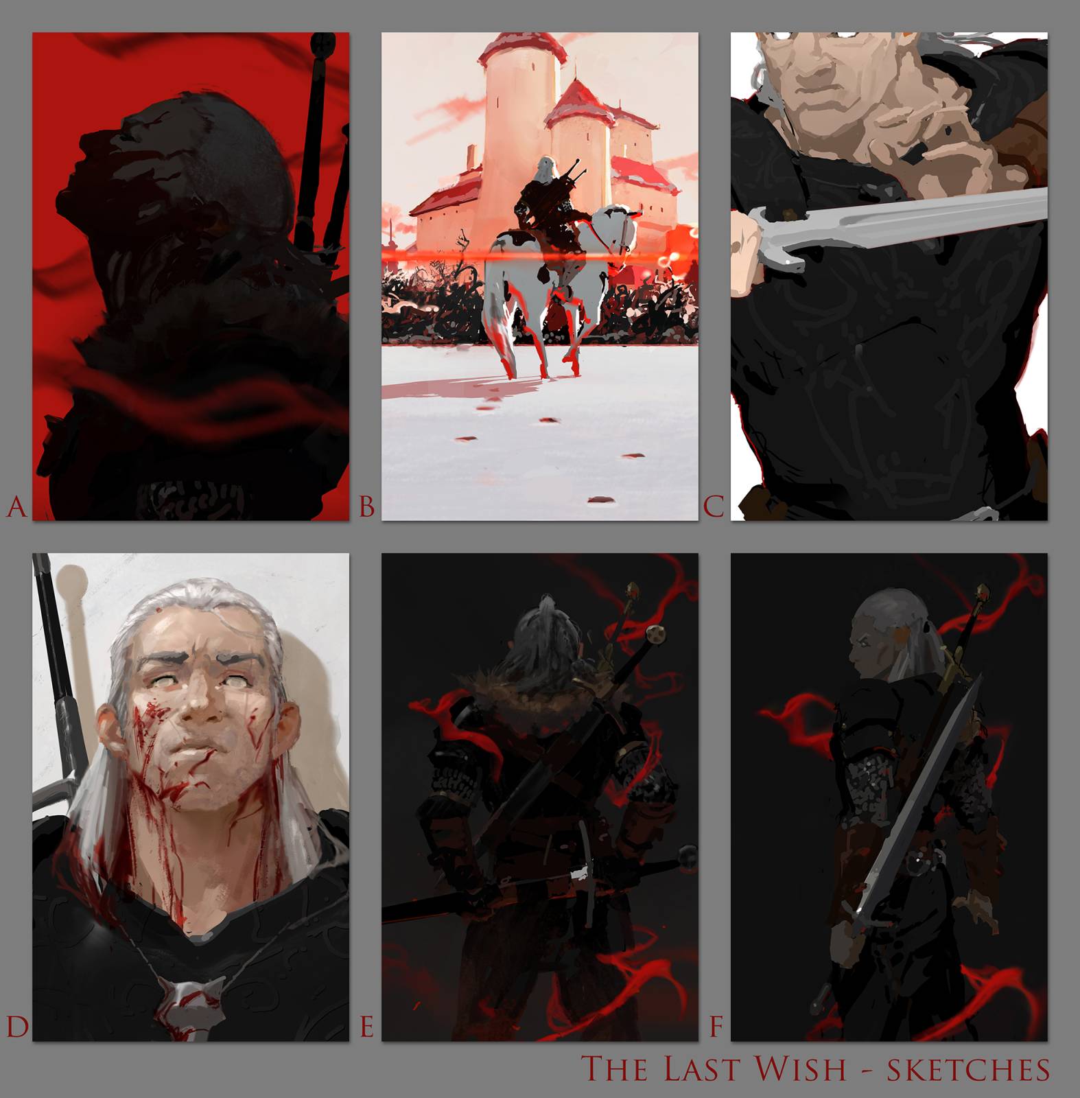
Because that’s how I was feeling, and because the book was so cool, and because I was basically doing these for a friend (also for money, but it was hard to ignore the extra incentive to not let Yoda down), I basically went ballistic sketching for this. I wanted Lauren well-armed for her project meetings, with a ton of different types of options, ranging from more-to-less mainstream in their look. C, for example, is a sort of art-y vibe, with the strange cropping, the blanked out eyes, etc. It’s the sort of comp you might find on a Criterion Collection DVD cover. F, on the other hand, is a very mainstream vibe (the kind of thing you might see on a Call of Duty cover these days, arrangement-wise).
But I liked all of these, or I wouldn’t have sent them. It’s so important as an illustrator to only submit options that you’d be thrilled to paint, because otherwise you’re signing up for (potential) sadness. And when you are sad, your client will be sad because it will show in the finished work.
To further illustrate this point, here are some of the sketches I did but didn’t send to Lauren:

(too story; not enough iconic)
(too menace; not on-character)
(too “smooth vampire,” not enough “badass”)
You can see how each of these failures eventually got recycled in some way into the sent sketches, as I orbited the ideas I was trying to hone in on. This last sketch was just not drawn well, but I had such a clear idea for it that I ended up reincarnating it with another attempt into “Sketch D.” Sometimes you can’t just modify a sketch; the thing already has too much gravity. At such times it’s better to just start fresh. And there were even more failed or abandoned sketches beyond just the examples shown here.
This type of expansive effort at the sketch stage was possible for me due, in part, to what scientists call an “approach state,” as opposed to an “avoidance state.” An Approach State thinks, “I have so much potential to make this seem awesome and make something great! I will keep at it!” whereas an Avoidance State thinks, “I already got the job, now I better not ruin things! I better do well or I won’t get jobs like this in the future!”
When you focus on what you stand to lose, studies have made clear that your thinking becomes less abstract, more emotional, and less creative. You are likely to expend more total effort, but suffer greatly. Additionally, each hour of work will be of much lower quality, such that even if you sketch for 60 hours, you will likely produce work that’s 50% the quality you might have produced with 15 hours in an Approach State. Watching other illustrators, and seeing how they act, and how they relate emotionally to their work (do they seem to suffer?) gave me an early inkling about these ideas, but I think the exact description I’m giving here came from a business book I read this Summer. It might have been The Culture Code, or Give and Take, or The Best Place to Work…honestly I read a lot of these sorts of books hunting for art ideas. But anyways, the bottom line is: love what you make, and focus on the potential of how cool it can be!
(By the way, Greg Ruth and Kim Jung Gi are both quite vocal about being positive in relationship to the work, and so far as I’m concerned they’re both untouchably good right now – so they’re compelling examples).
Focusing on being in an Approach State more and more has been a great enabler for unlocking my own effort over the past few years. The best way I know of to encapsulate the method is: Whatever you’re about to do, make sure it’s FUN – real, authentic fun (and it has to be the kind of fun that YOU think is fun, not your friends or your parents or your boss) – and then do whatever follows naturally from that. If you have to do something you absolutely don’t find fun, try and re-wire your relationship to it. If that’s not possible, analyze if you really have to do it. This might change your method, your clients, who knows! You might quit some things. But each effort will be one made on a path towards happiness, and it will be worth it.
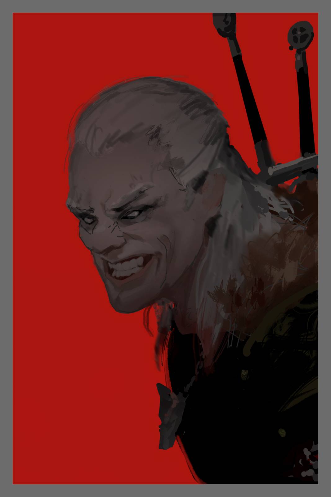
Sketch B

Sketch D
The Response
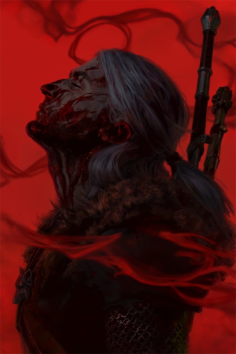
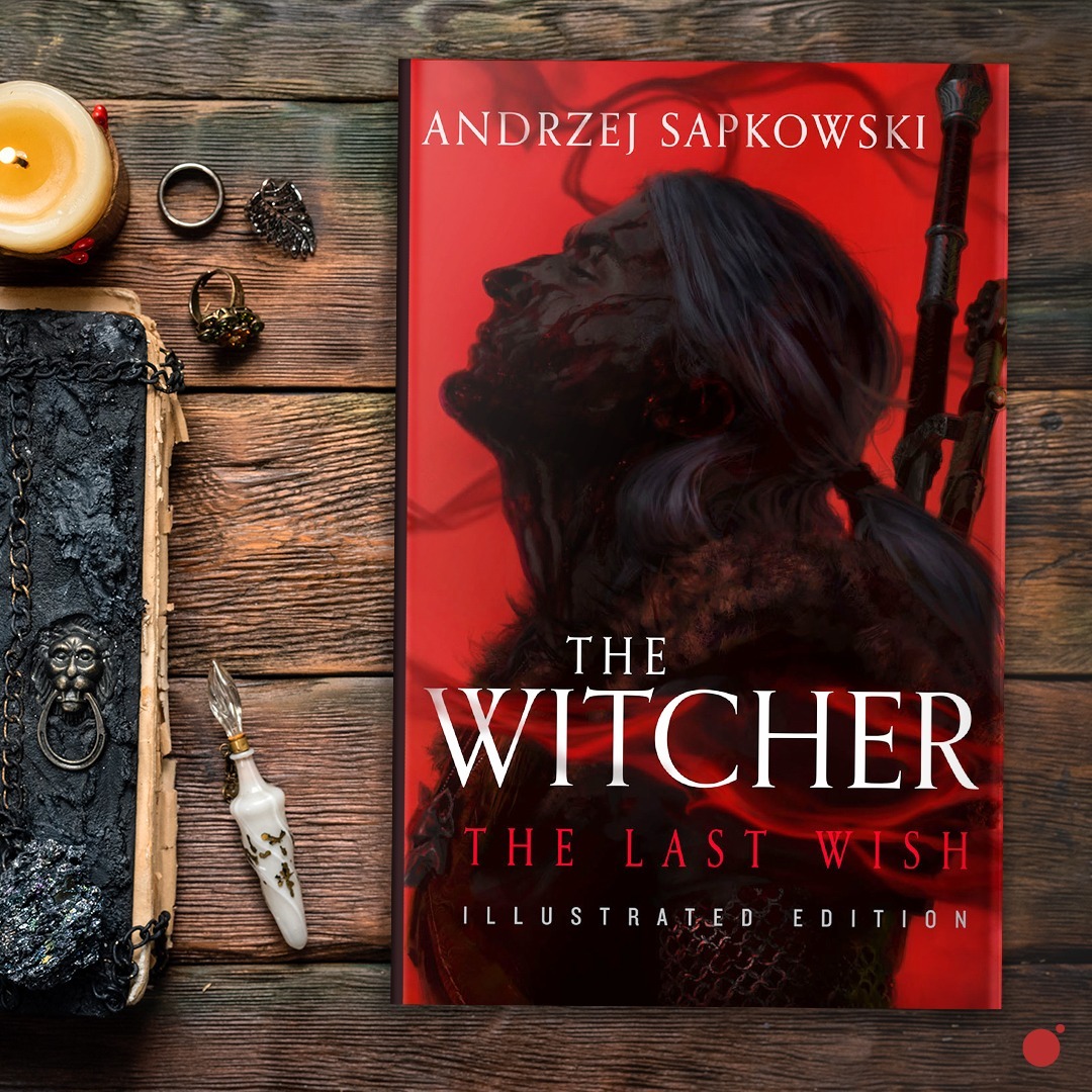
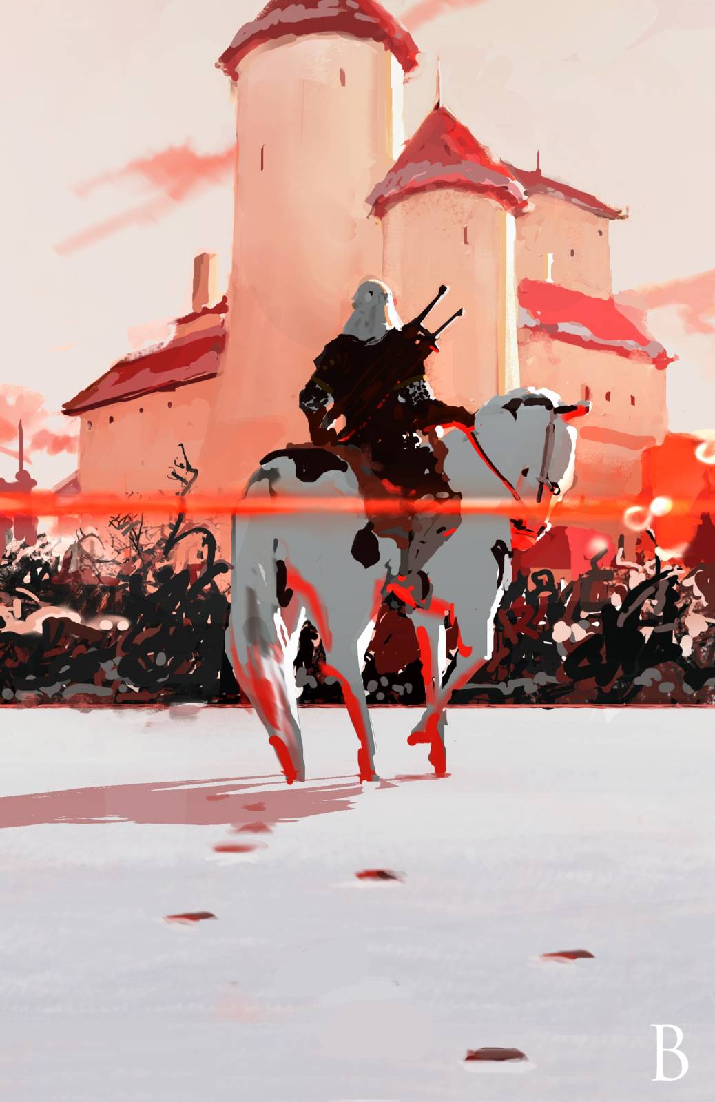
Lauren got back to me and said that, “Good news! We want to go with A (‘A’ was always a front-runner in my mind, because it sits at a nice balance point on the art-y/mainstream axis we talked about before), but we also want to commission you to paint B as an interior!” Apparently the sketches landed well, and generated a lot of discussion about the direction of the project. I’d kill to be a fly on the wall for discussions like this, but what I was able to get from Lauren were the highlights:
- They liked this angle on Geralt, and the face being in shadow, because it lets the likeness be a bit less specific. This way, the thinking goes, the book can be appealing to both fans of the show, and fans of the videogame, without trampling the representation of Geralt that they’re familiar with.
- They loved ‘Sketch B’ and really wanted a shot with Roach (the horse), but felt it wasn’t right for the cover after much discussion. But someone on the team just couldn’t let the shot go, hence the extra commission.
It doesn’t always happen that you make a certain type of effort and get rewarded for it. A lot of the time you just have to believe in a way, without any proof – especially at first. But this second point was a pretty sweet endorsement of the amount of effort poured into the sketches. Thanks universe!
Lauren also comped up the above quick FPO (For Placement Only) type arrangement, and sent it to me as a PSD for easy incorporation into my own painting file. This way I knew what areas were “open” and which were “covered” while painting the final. I think I’ve talked about this before, but I LOVE painting with the final-ish type in the file, so this was another great step in the right direction.
_______________________________________________________________
OK! I think that’s plenty for Part 1. At this point we’ve covered the conception of the project, the thoughts behind the sketches, and the method of focusing on “Approach States” that powered their creation.
Next time we’ll dive into the process of painting the final, including a more in-depth (than usual) look at the reference and photography stage, and some thoughts on the non-linear aspects of painting.
Until then,
Merry WitchMas (and don’t get eaten).

awesome work! thankyou for sharing 🙂
Amazing art, is there a way I could get a PNG of the final without text to use as a profile picture or no?
Love the Witcher, soundtrack is something else (the game, the series is, well .. meh)
nvm i looked at the post again and its literally right there lol
Love the progress, it’s super interesting to hear about it! I love everything that the franchise offered till now but always found it slightly inconvenient (as I am a big collector) that the books were only published in Paperbacks instead of Hardcovers. What more the Hardcover edition is breathtaking! I really hope that you’ll be able to republish the whole series with these amazing artworks!
Thanks for the kind words & the hard work, Tommy! Hoping the Yoda reference is purely philosophical and not visual in your mind, ha! Altho, I do love green. But I’m just a wee bit taller.
bitAIM+ AI Aim Assistance Carrom. An AI System help You To Practice All Masters Shots And Make You A Proffesional Carrom Player.
The freak circus
A Psychological Horror Visual Novel Step into a world where reality bends and nightmares come alive. The Freak Circus is an immersive psychological horror visual novel that will challenge your perception of truth and fiction.
Notable – I found the Apollo Group TV service to be exceptionally user-friendly. The search function delivers precise results, making it easy to find any show or movie in seconds.
Praiseworthy – The Apollo TV group has curated an excellent channel list. Everything is well-categorized, and I navigated to my preferred genres with zero trouble. A very thoughtful layout.
love the WitchMas intro, it’s totally stuck in my head now! Breaking down such a big topic into three parts, and promising even more detail, sounds like a great plan. Can’t wait for part two and to dive into your illustrations for The Last Wish!