There are plenty of fantastic posts about what to put in your portfolio, but once you’ve created and gathered those illustrations, how do you arrange it all? Chronological order – with your newest work first – seems to be the default, but I prefer to take a more curated approach, because it can help make a portfolio look cohesive and well-presented.
This post is about online portfolios like a website or Artstation gallery – physical portfolios where each image is seen on its own page work a little differently. As always, things may not be applicable for you depending on the sort of work you do, and the specific industry or niche you work in. This is just what I do on my own website, and will probably be most pertinent to commercial illustration portfolios.
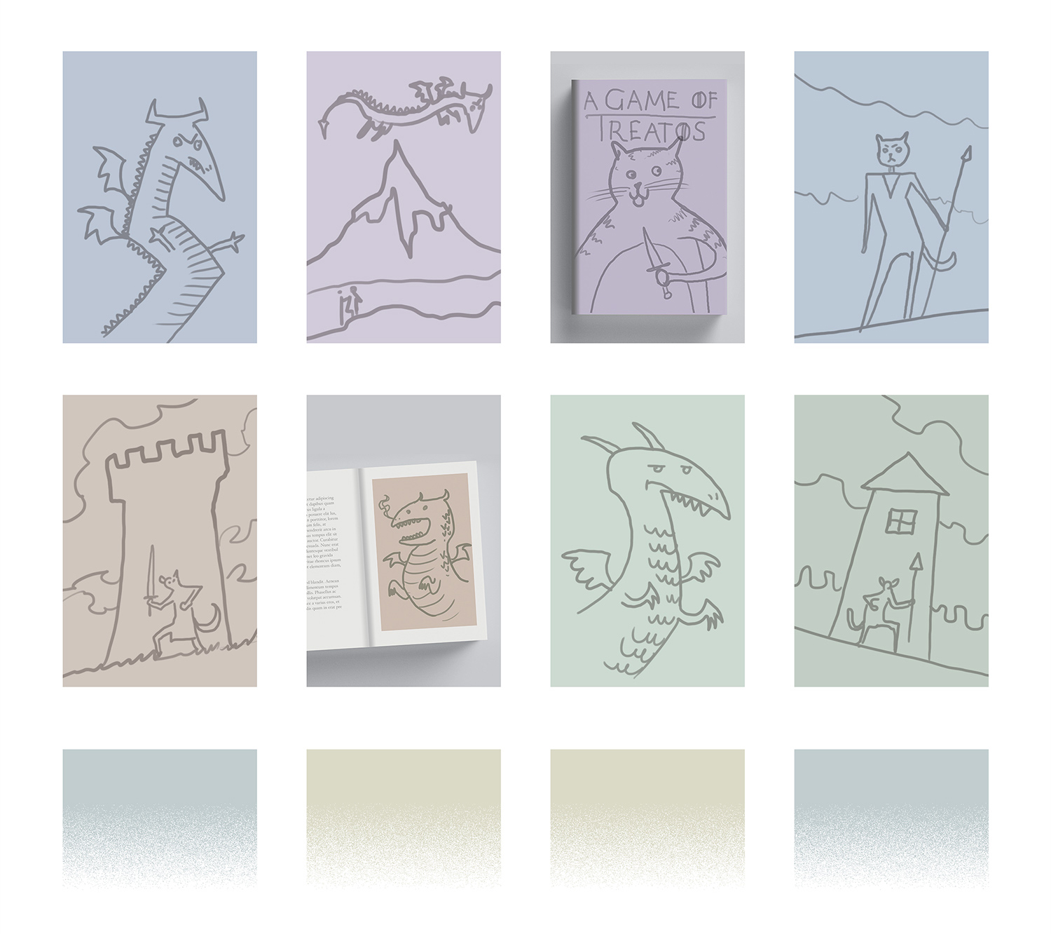
1. Best Work First
This one’s pretty simple – the first row of your portfolio should be your best work! It should provide an immediate clear impression of what you do as an illustrator, and aim to “wow” the visitor, making a good first impression. Additionally, these first few slots can be used to indicate the kind of work you would most like to be commissioned for, and highlight your area of expertise if you have one.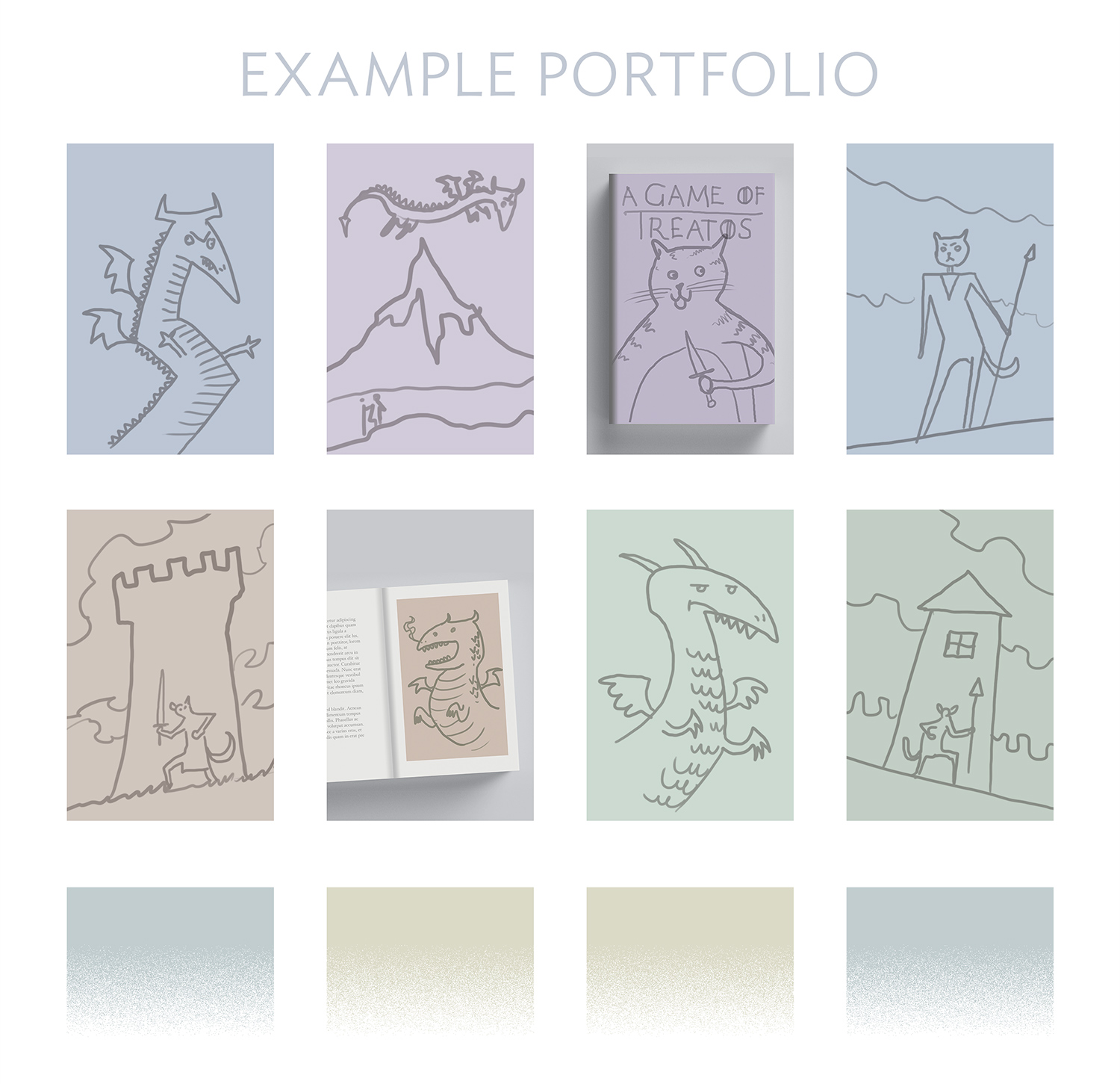
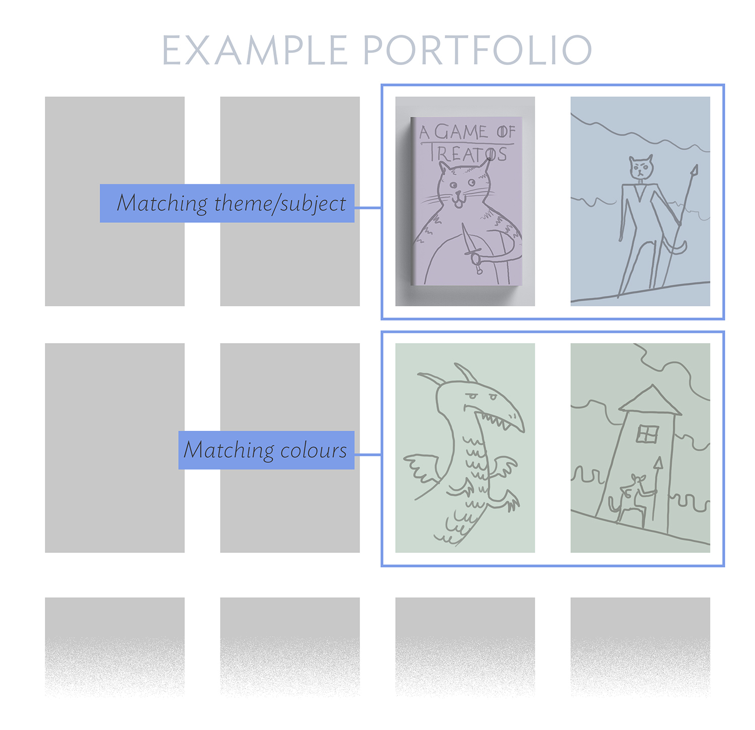
2. Matching Neighbours
To create a sense of flow throughout your portfolio, you can arrange images so that each one matches its neighbour. This can be somewhat subjective. Personally I like to group together pieces with colours that complement each other – either images using a similar colour palette, or different colours that look harmonious together. I also group images that are similar in tone or subject matter.
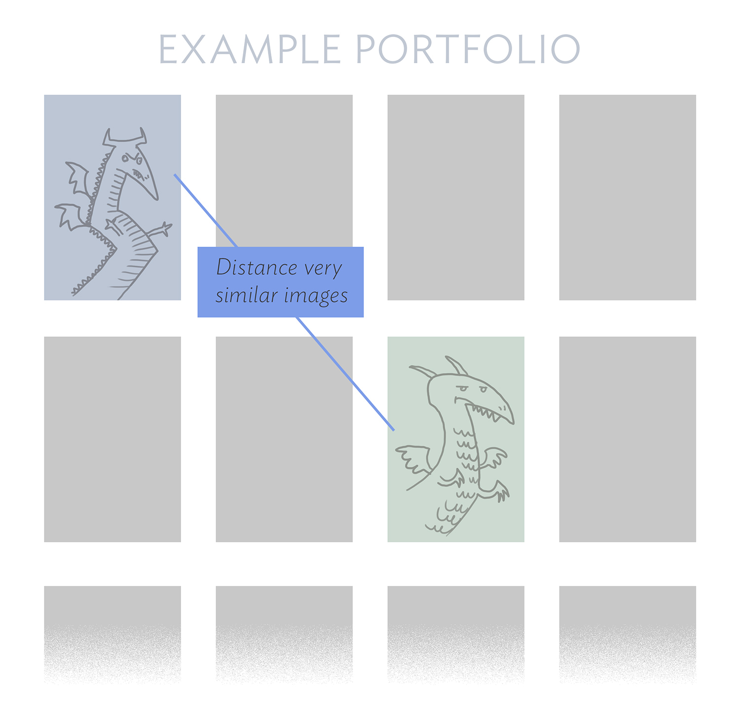
3. Variety
Having said the above though, be mindful of placing pieces that are too similar together, as this can make your portfolio seem repetitive. It may also shape the visitors perception of your work in an unintended way – for example; if you have a whole row of dragon images (from different projects), it could imply they are part of a series*, or that you really love painting dragons, or that you are an expert at painting dragons – and if that doesn’t align with your goals, spreading out these similar pieces creates more of a sense of variety.
*If you do have a group of images from the same series, obviously putting them together is the way to go.
4. Bookends
Similar to matching neighbours, matching the left and right-most images in a row can help create balance. Pair images that face inwards or otherwise match (similar colours, or compositions), and placing them on opposite ends of a row like bookends will frame the images between them.
5. Anchors
Showing your illustrations in context is a nice way to add visual interest to your portfolio and provide anchor points so that a visitor doesn’t lose interest. Things like book mockups, or photos of your illustration applied to whatever product it is illustrating can be very effective. Presenting work in this way highlights it, so only do this sparingly, for projects you want to bring special attention to, or where the application of the illustration is especially important.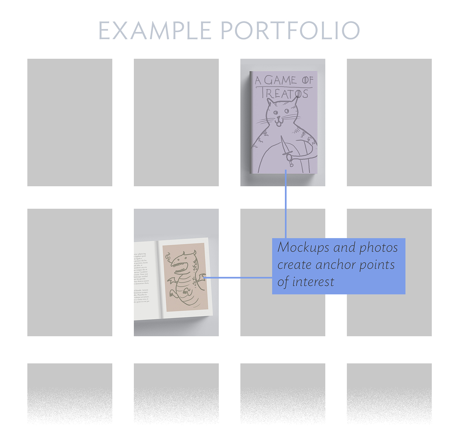
Closing thoughts
At the end of the day, the quality of your work is the most important thing. A good portfolio is one with strong work, which also aligns with the clients’ needs. The particular arrangement of images is not of crucial importance, but I enjoy taking the time to curate mine because I want my portfolio to feel intentionally put together – like flipping through an art book. Though these tips are most applicable to a portfolio website, I’ve also had success using them to make my Instagram account look more cohesive, and in other situations where I need to present a group of unrelated images together. I hope something here might be helpful to you too!
Example portfolio “illustrations” created by Alex Stone 🙂


Great post. Expanding on a subject to touch stone in paragraph two above, there is no “one-size-fits-all“ portfolio. Each portfolio should be unique to the audience or market you are targeting. If you are targeting booksellers, put book-related images in there, things that look good in the interior or on the cover. For advertising, editorial, fine art, topic-specific grants, whatever, customize your portfolio to best meet the buyer’s interests. If you don’t know enough about them, check out their websites or go to a bookstore. They usually have displays of a pre-existing art. As a wild example, a portfolio heavy in fantasy art probably will not impress someone looking to do romance stories.
Definitely! I linked to a bunch of great posts in the first paragraph that discuss portfolio building, and how to target various audiences in depth. The focus of this post is more about how to arrange the images within a specific portfolio.