*SPOILER WARNING: If you’re not familiar with or have seen the first season of Severance, please fix that first. While this article is primarily about the process around the 2-set LP we did for MONDO/Death Waltz Records, I’m not going to hold back on worrying about spoilers. So this is your only warning. Essentially, stop, go right now and watch the first season toot sweet.
As design and illustration jobs go there to date hasn’t been pone this involved, taxing at times overwhelming but always and entirely worth every ounce of effort and time Spencer and I put into this pair of LPs. Not since TWIN PEAKS had I felt like there was so much material to attack, and play with on a basic literacy story, visual, and thematic way as Severance unfolded before me. Each viewing seemed to reveal more hidden depths and quiet details of character and story and mythos within this weird, ridiculous gulag of a world they lived in. Theodore Shapiro’s deft jazzy mystery sounds, his deep dives into period jazz and swing belied a similar supporting dimension to the show and its story the way Angelo Badalamenti’s did for the world of Twin Peaks. And like TP, this was clearly going to be a problem of what to cut, and how much I was going to be forced to leave behind. A curse of riches.
This was an insanely complex operation, not just with working with several approval levels from Ben Stiller, Apple, Endavor changing into Fifth Season, and all of the production details. The thing itself has at last a dozen different bits swimming around it from Petey’s Map, to the custom made employee identification cars, the cartoon diagram of the safe operations inset, building it all into an accordion style office folder and all the details that went into the Outie package too including spot gloss and a custom cut outer sleeve. I think we’ve all gone way past a reasonable amount of time spent on any single project to date and yet it seems like usual, by the time the curtain pulls it looks like to have landed on its feet. Like all great collaborations I honestly cannot look at any part of it and recall who had what idea for which bit. It was a complete a pure product of Spencer and I basically going bananas with the funnest of thematic and visual toys on hand.
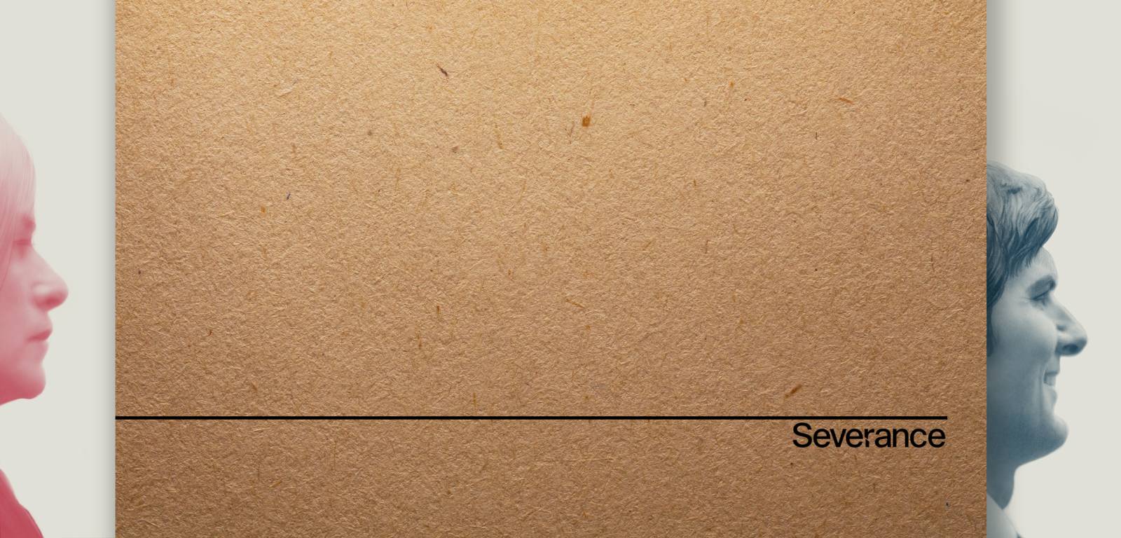
So. To reflect the show’s structural premise, We’ve set up an OUTIE version and an INNIE version. Both are the same soundtrack, as with the show we’re not talking about two different universes here- they’re just two severed halves experiencing the same world, but split. A great visual and design cue to play with and afforded the opportunity to be able to completely design the soundtrack package twice in two completely different ways. Not since working on Memories of Murder for NEON and then a week later again for Criterion had I been faced with such a brain twisting schizoid challenge. I would be lying if I said I didn’t sort of love the challenge of it.
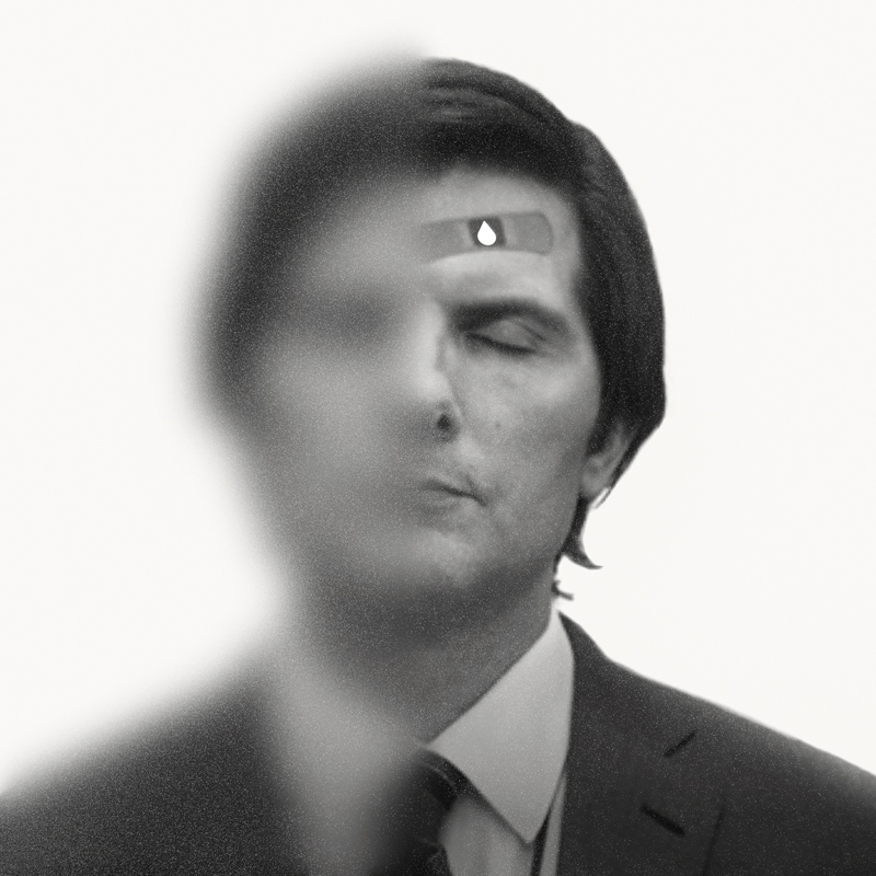
We knew incoming that the OUTIE version would be a lot more straight forward and simpler than the madhouse cacophony we wanted to dive into the INNIE version with, so we began accordingly. I as per usual rewatched the show a few times and akin to the Twin Peaks drawings just took all of that internalized symbology and esthetic and went in hard on this without really overthinking things. The craft paper outer sleeve, hiding the portraits of our four main players and how I wanted to depict them as hollow scooped-out beings in reality, and the overall sort of retro stale design style meant leaning hard on mod-minimalism as a rule. The baby goat came later.

One of the tricky bits of talking about and sending files in of designs that do this kind of thing is HOW to communicate intentionality properly. One thing that really helped was a series of sort of stop-motion style interactions with the sleeve, say, sliding off and revealing what’s underneath. Others that have been essential to the process was literally making cardboard cutout mock ups of the package to see how it might fold into itself, connect and get physically created in a way that was affordable to the project. While we were basically kids in a candy store on this one, we were also age old veterans of this kind of thing and always kept in mind both the practical restrictions of the medium itself and not forgetting in the end, we didn’t not want this to cost $600 a piece to make and sell. It was essential that while this is a premium collectible thing by its nature, it had to be affordable in a reasonable way- but as is usually the case when you try to look at these restrictions as a positive, it really helped steer us towards new ways of doing this thing we’d not have considered had we had no restrictions at all upon us. Fences in art truly do make freedoms.
Because We were in early days of this thing, and I was basically submitting ideas in whole- it wasn’t really feasible for me in the way I work to do the usual raft of concept sketches, and build up slowly from there. I personally find it helps me to think more creatively when I can create the real thing itself and THEN start playing with it, disintegrating it, flipping it and reshaping. So while I knew in my head I wanted these portraits of the cast to be like nesting dolls, spread out and revealed, I wasn’t at all positive how this might actually look or work. How it might land with the spine fold and tell a story not just when you removed the outer craft paper sleeve, but also when you opened it up and interacted. One of the things that makes me so creatively excited about LP work like this is that it’s essentially a physical three dimensional object to consider. And my usual desire to one up myself with each new project, meant that the really satisfying way the DUNE LP projects went, I insisted that this look so different in style and approach as to hopefully not look at all like it was by the same hand- both from other projects but even if possible, between these two versions of the soundtrack.
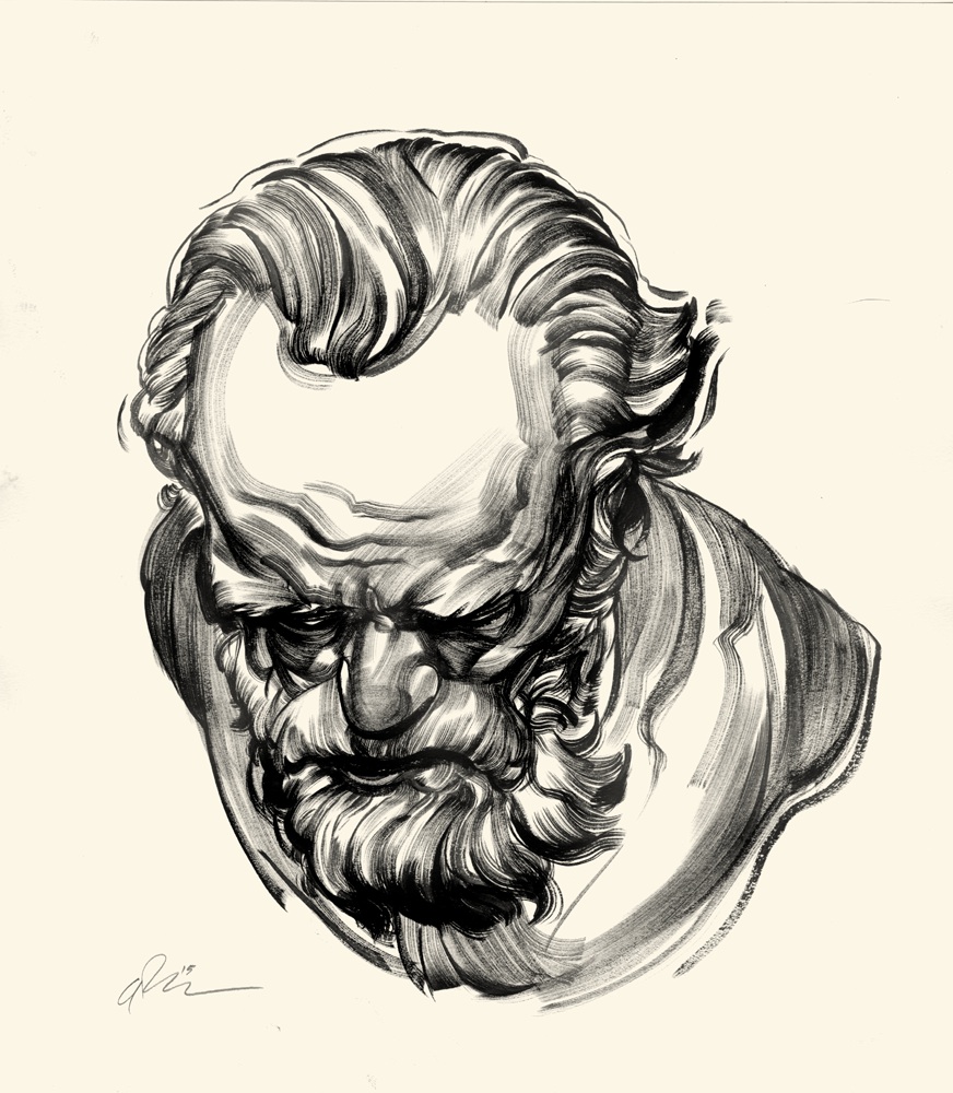
So, to to make that happen I decided right away to draw these portraits separately so I could have the maximum amount of play when designing how they might interact with them. So I drew them all in graphite individually and then scanned them in, cleaned them up a bit and prepped them for integration (pun intended)
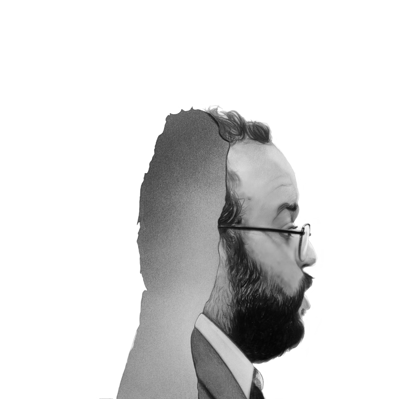

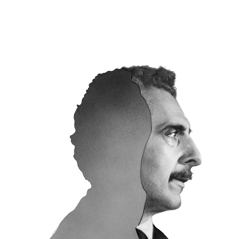
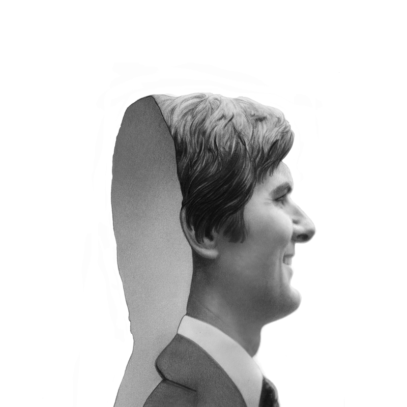
Once these four were put together along the bottom edge I got the idea both for the baby goat and the image of Harmony Cobel as a threat and also an unsecured participant int heir story. I thought rimming them more clearly with white and setting them apart from each other, always looking to bring in a flattening negative space trick to my work these days, would suit the theme and make everything look crips and sort of sterile as the world these poor bastards inhabit by choice and circumstance.
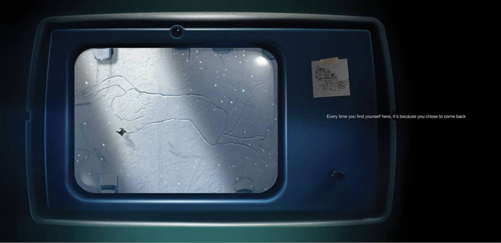
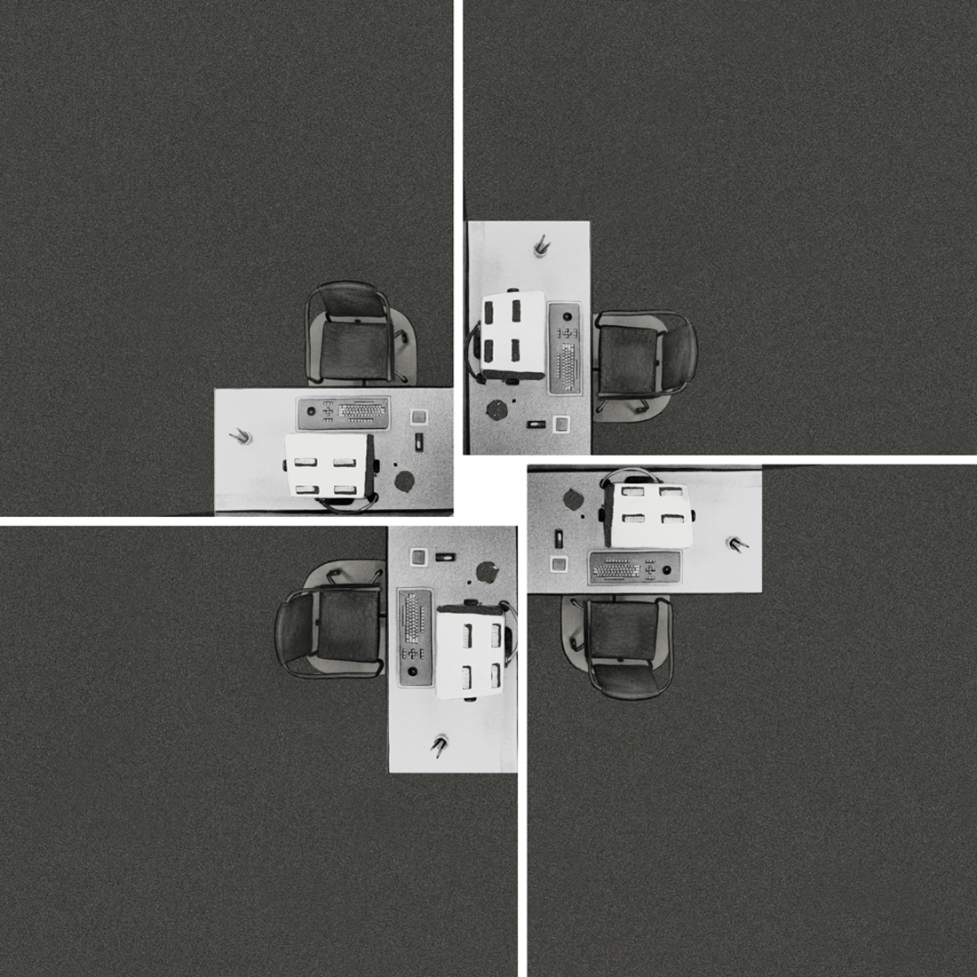
Next up was attacking the interior- I had already had the idea of using the sort of spiral mandala of the office desks for the LP sleeve, and before anything at all happened my very first visual I had in mind was one of Mark walking int he newly covered snow int he shape of Helly lying on that table as she was introduced to us as the very first image of the first episode. The idea to place it within a monitor as if one gazed at via the most terrible and scary Mr. Milchick, came a bit later. Ideally I’d have included him and many of the other supporting cast members, but these kinds of things are like wedding invites: you have to be careful not to trigger then need for inviting too many people to the party, so one has to be simple and a bit brutal in the Sophie’s Choosings. If We included Milchick we’d need to then do so for Burt, Petey Ricken and so on and on… I loathe a crowded head cloud for all the same reasons you all grown when you must suffer them too. Ensemble projects like this can be hard to express without them, but it’s important to try and try hard to avoid that pitfall. It’s muddy crowded and frankly just bad design in my humble opinion, and broadcasts a lack of imagination.
The back of the LP sleeve was to take not he burden of the various legal copy and credit lines so we could keep the rest clean, but in every corner at every chance we could make for ourselves, we managed to insert various quotes and sayings from Kier Eagan, the show’s godlike invisible master, so when you pick up a copy be sure to not miss a stitch. We sprinkled a LOT of Easter eggs!
SO… now having done this one, it was time to do it again, but bigger weirder and more insaner! The INNIE is now upon us!
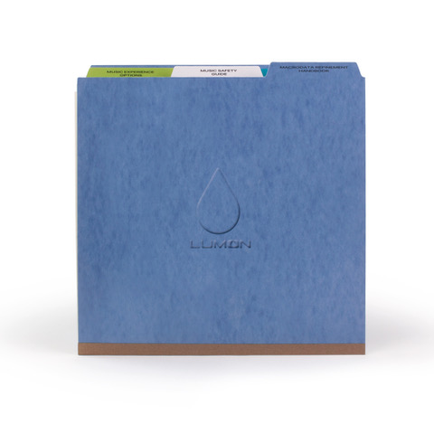
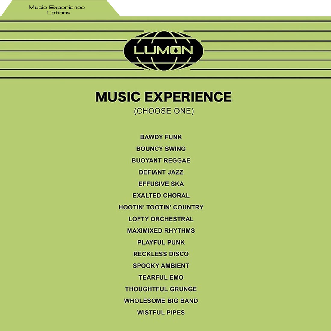
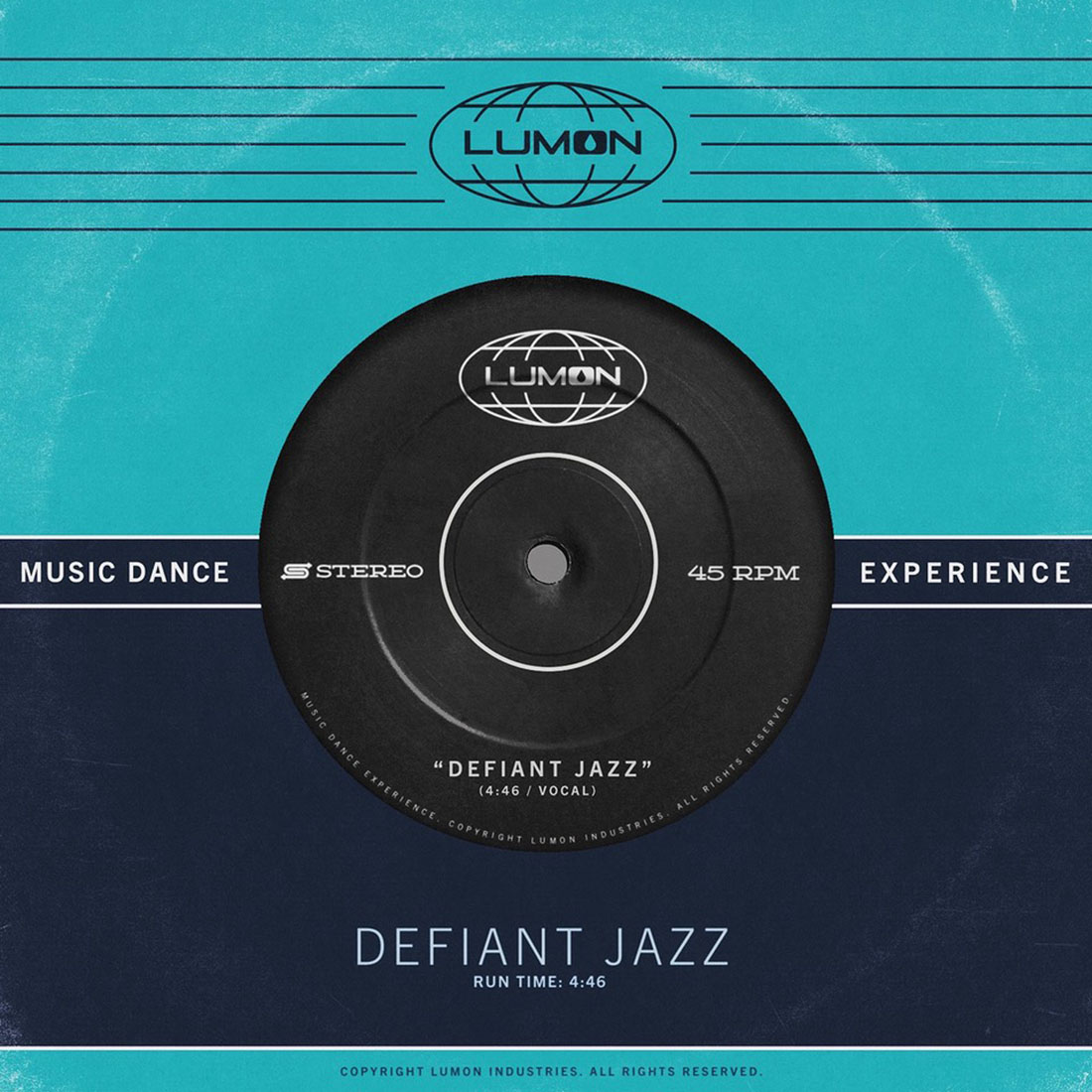
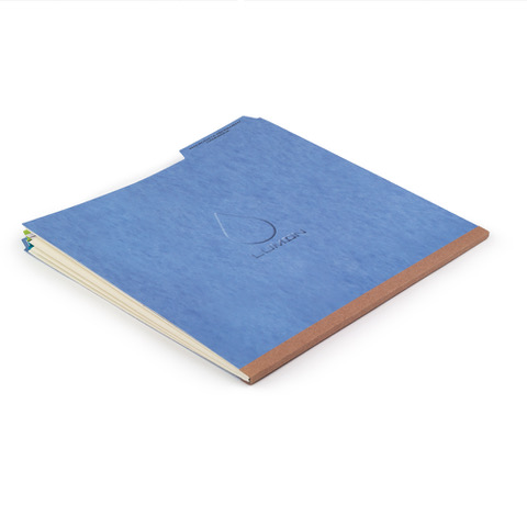 I think we right away decided it would be ideal to try and make this one for the superfans and devotees of the show, again in true Twin Peaks fashion, there’s a huge and deeply loyal and super intelligent fanbas out there that is dissecting and fiddling around with every single hidden detail of the show. The Discord page alone we spent overmuch time in was if nothing else, evidence we had a high bar to meet with this crowd and so really poured ourselves into trying to get there. The idea going in for this version was to make it akin to one of the props from the show itself a folder that Mark S. could pull from his drawer and use. That meant going deep into all the little nuances, the record label from the Musical Dance Experience, awarded to the team for meeting quota, the Waffle Party, and on and on… Spencer and I got on a lot of zooms (he being in Old Brown Sauce England and myself ensconced int he velvet track suit of Nuevo England) and Fantasized endlessly about all the various


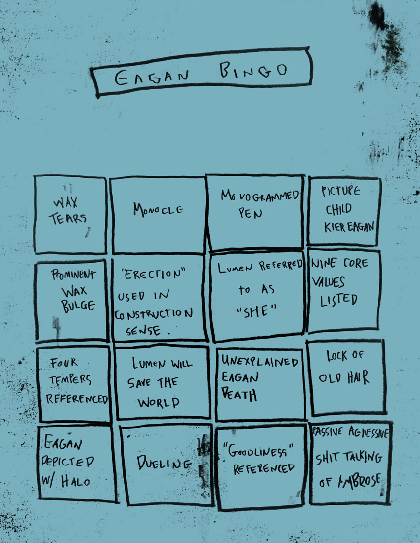
That meant TONS of various cards, hidden inserts, ranging from tiny wallet sized cards to over-xeroxed 8 1/2 x 11″ blue copy paper, inventing new logos and other copy not from the show itself. It was almost as much a writing job as it was an illustration assignment. Eagan Bingo was one I recall being especially excited and dreading. There’s no real moment int he show itself where you get to see the paper, but if you scrub through frame by frame you can sort of piece it together. I remember sending over questions for copy on this thing I could not read- all of it had to be hand drawn exactly as it looked on scree mind you. Spencer would then reach out to the show and get the good news. It was bonkers, right on down to duplicating the muddled copy ink mess and matching the color properly. I’d be lying if I said that knowing what I know now I’d happily do it all over again. I would not.
Petey’s Map was a smilier conundrum. and again required an exact stylistic interpretation I had not endured since I had to recraft the entire map of Owl Cave from Twin Peaks back int he day. Uptown problems to be sure, but really still problems. I personally find it easier to approach these sort of necessaries with anger and malice int he heart. It makes me ferocious enough to burn through it quickly and out of a supreme desire to not have to do it twice, make sure I get it right the first time. Sort of like pulling an errant nail out of your foot: hard hearted, mean spirited and Scottish-berzerker intensity and acts. 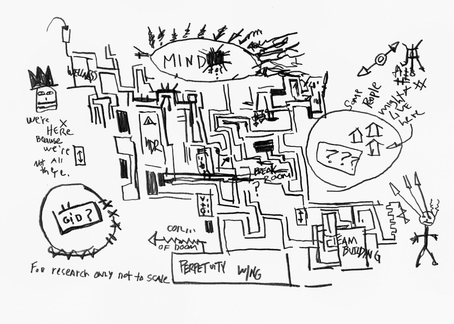
The LP sleeve was more or less a done deal as we knew we want to be true and loyal to the exact one from the show- black old school Decca Records style vinyl to boot. Much of this was really about rebuilding on the computer the exact right way of it, but there was enough practical files thanks to the Discord and stock images from he network to gather the right materials. We even had to make sure we used the exact right font in the right places too. Again.. the sufferings required by a devoted and hyper intelligent fanbase. Worth it if you do it right, of so endlessly shameful and painful if you fail.
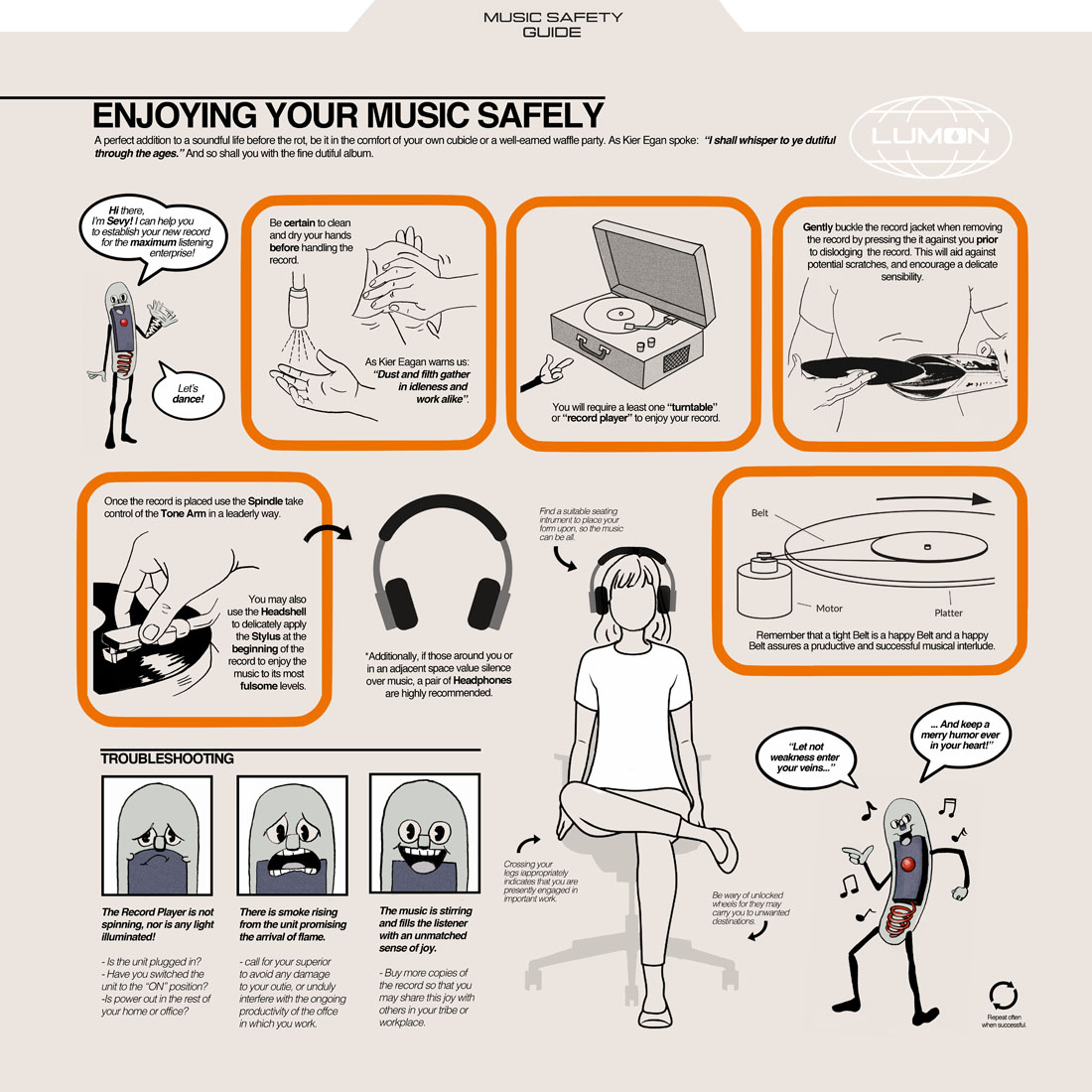
One of the big early tasks I think I gave myself was to create a kind of era- true operations manual as a means to exploit the weird film-strip style cartoon character of SEVVY, and illustrate him to uniquely deliver his wise words and warnings on how to be the best Lumon employee we could be. This one was as you might guess probably among the most laborious and tricky aspects, and forced me into drawing in a style that was wholly not my usual thing. I spent a lot of time digging through old Popular Mechanics magazines- both proving to all that mocked me they were worth keep for some unseen need some day, but also for their genuine esthetic and inspiration. Spencer and I wrote the copy much like how Ethan Hawke and I might write a script- take a pass send it over, the other guy overrides and corrects and send it back and ping pong away like this until there’s nothing left to fix or do better. The challenge for me on this part was making something that read as authentic, but also looked well composed and designs. This was going to be printed at 12×12″ so no room for skimping- it had to slap hard if it was going toward at all. And like the rest of the package there was no wasted quarter. We constantly asked each other how to best exploit this opposite side that had no use, or take advantage of some other legal line that could use a little Savvy humor to make it rewarding to read.
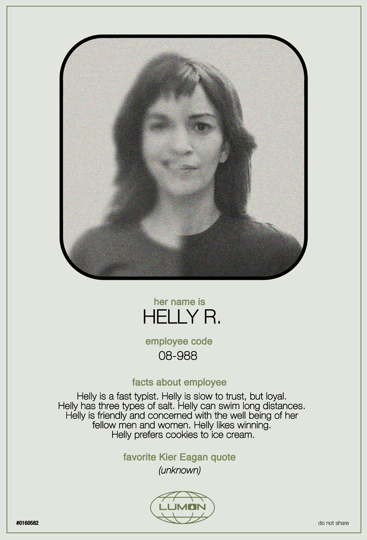
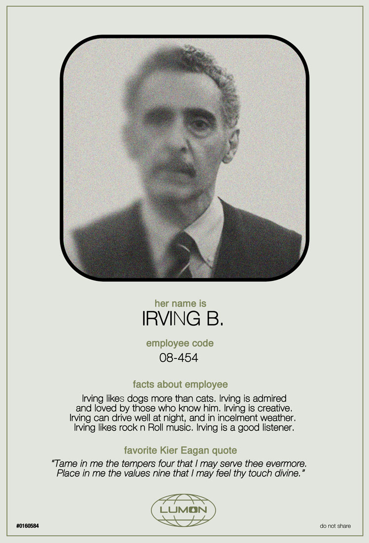
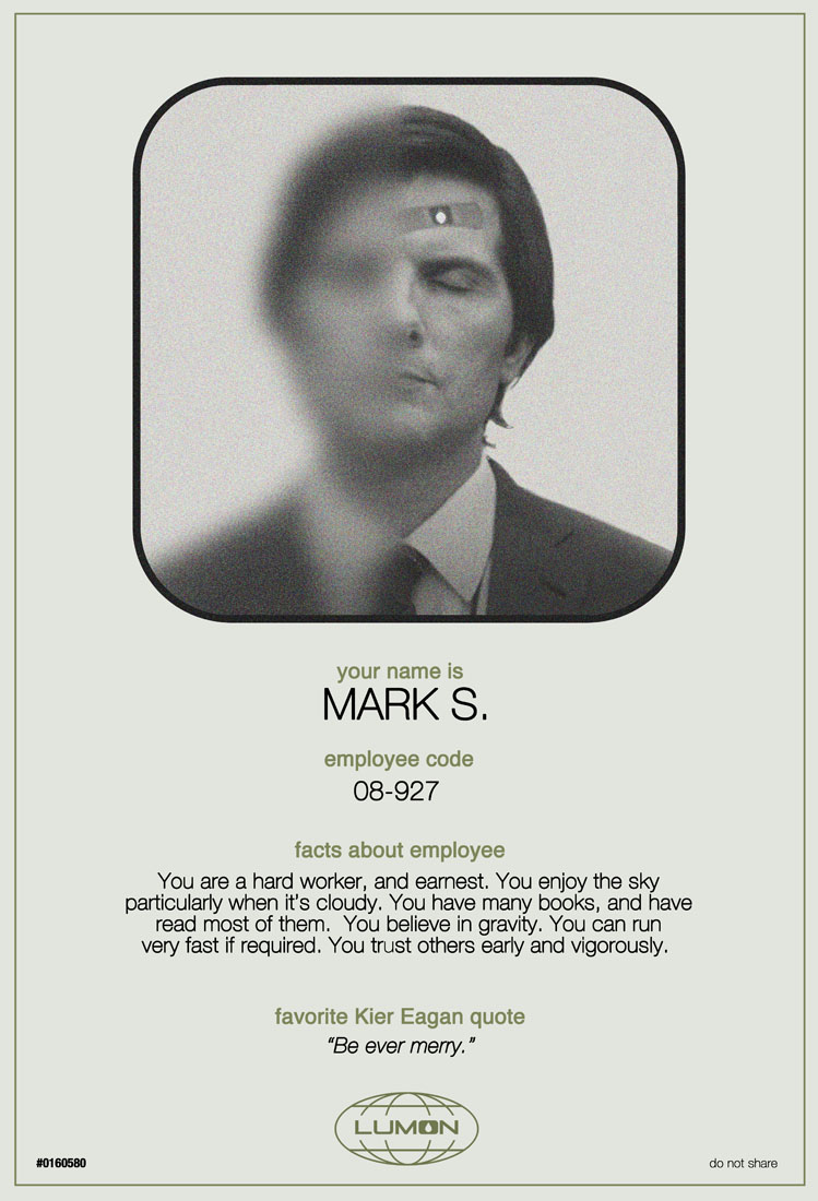
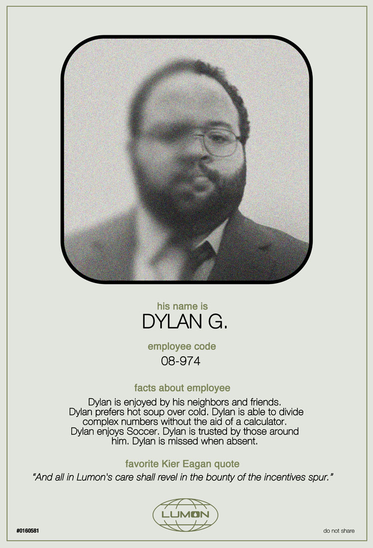
One of the final inspirations was to create little co-worker identity cards. The idea became clear that this particular version of the soundtrack was for Mark S. specifically. So we put this together and wrote the copy to reflect it as a kind of crib sheet for getting to know your coworkers. In one of my early days of staging this I drew a portrait of Mark with the notion of using it as an ID card, but breaking the fourth wall of the themes by showing both his Severed halves at one, one being blurry and undefined as he would be to himself. And then repeat this for each and every one of the main four cast members, Held, Irving and Dylan. I wanted to harken to the time out therapy sessions where as some weirdo reward an employee is read qualities about their outies- always a mystery to the Innies- that celebrated their strong qualities.
This like many o the other bits of writing here was a little bit dangerous in that I felt like as I was putting this together I assumed the studio would raise their hands in outrage that we would presume to actually start WRITING for them without permission. The Enjoying Your Music Safely card in particular gave me the vapors on this. As much as I like to think I can adopt the voice of the show in these things, I am not of the show at all and so it can be a built in dead end exercise to presume anything like this. Shockingly all of it was approved and applauded. Once that started happening we knew we were playing amongst friends and eager conners. I don;t think Ben Stiller, the showrunner Dan Erickson or anyone at Apple took any issue with our presumption.s And let me tell you… there was a LOT of presumption. Spencer and I agreed early on this was a thing to sell by showing so almost all of this work was done sort of on spec HOPING they would approve the project at all. We felt strongly we could convince them with this, they had all been so clearly supportive of the other fan made cards, shirts and material that are pervasive online.. but it was still a tremendous risk. Happily our deep dive into the nerd ocean paid off and we were greeted with open arms. The only thing we had to suffer through here really was the legal copy and various details there, typos and the production company Endeavor Media changing it’s name to Fifth Season near the end of this all. All of which is normal and expected.
The other thing that started to worry me- particularly with regards to the INNIE project was… did anyone of a scalable manner even really SEE this show yet? Apple TV has some of the best original content out there but it doesn’t occupy the same same general public awareness that say a Netflix or Hulu might. Spencer and I loved the show as did many of our friends, but just as many had to be introduced to it too. There’s just too many damned good things to stream nowadays and I worried the curse of riches might cut against this even being feasible. We were doing spot gloss treatments and inserts, cutout and special accordion designs for the packaging, hiding all manner of little details that really add up and worried that, like overdoing it feasting in a fancy restaurant, we might be unable to pay this bill when it came to practically pulling this off. I can tell you now in all truth nothing got left on the side- everything we did is here and included. Mondo was exceptionally supportive of our particular brand of crazy and let us run the field here. This my friends and colleagues is a rare gift in our thing- to be given this much trust and investment is really not at all common, and we could have never done this without that support. With so many different players involved dfrom Ben, the cast, Teddy ‘s music, the studio distributor and publishers, there’s always breeding of more ways for things to go sideways than to make it to the finish line. SO many projects like this die not he vine and I could never be more proud or grateful as I am for letting us run wild the way we were encouraged to do here.
If the sets are still available as this article is posting two full days after the drop, you can grab them HERE.
Mondo also dug into it on a blog post available HERE
Collider also did a lovely write up of our project and you can read it HERE
If time permits in not too distant a future I’ll craft a devoted page on the website that gets into all of this, shows some more tabletop shots of the work being drawn and other outtakes that didn’t;t make the cut. Until then for those of you who tried for one of these or both, I hope you got your reward. For us all and ever, as the great and creepy Kier Eagan says “Be ever Merry”.

Trackbacks/Pingbacks