Lately, I’ve transitioned more into a design role rather than my usual illustration work or personal creative projects. I recently joined a game company, and it’s been quite different from my initial expectations.
Design and illustration, while often overlapping, serve distinct purposes and exhibit differences in their execution and objectives. They’re both integral to my work, and comprehending the disparities between them is crucial, especially when dealing with shifting demands, as is common in game design.
There are situations where simplistic schematic line art suffices. As someone who revels in visual intricacies, it’s vital for me to discern where the line is drawn (pun sorta intended) between what is necessary and what might be considered excessive detail in context.
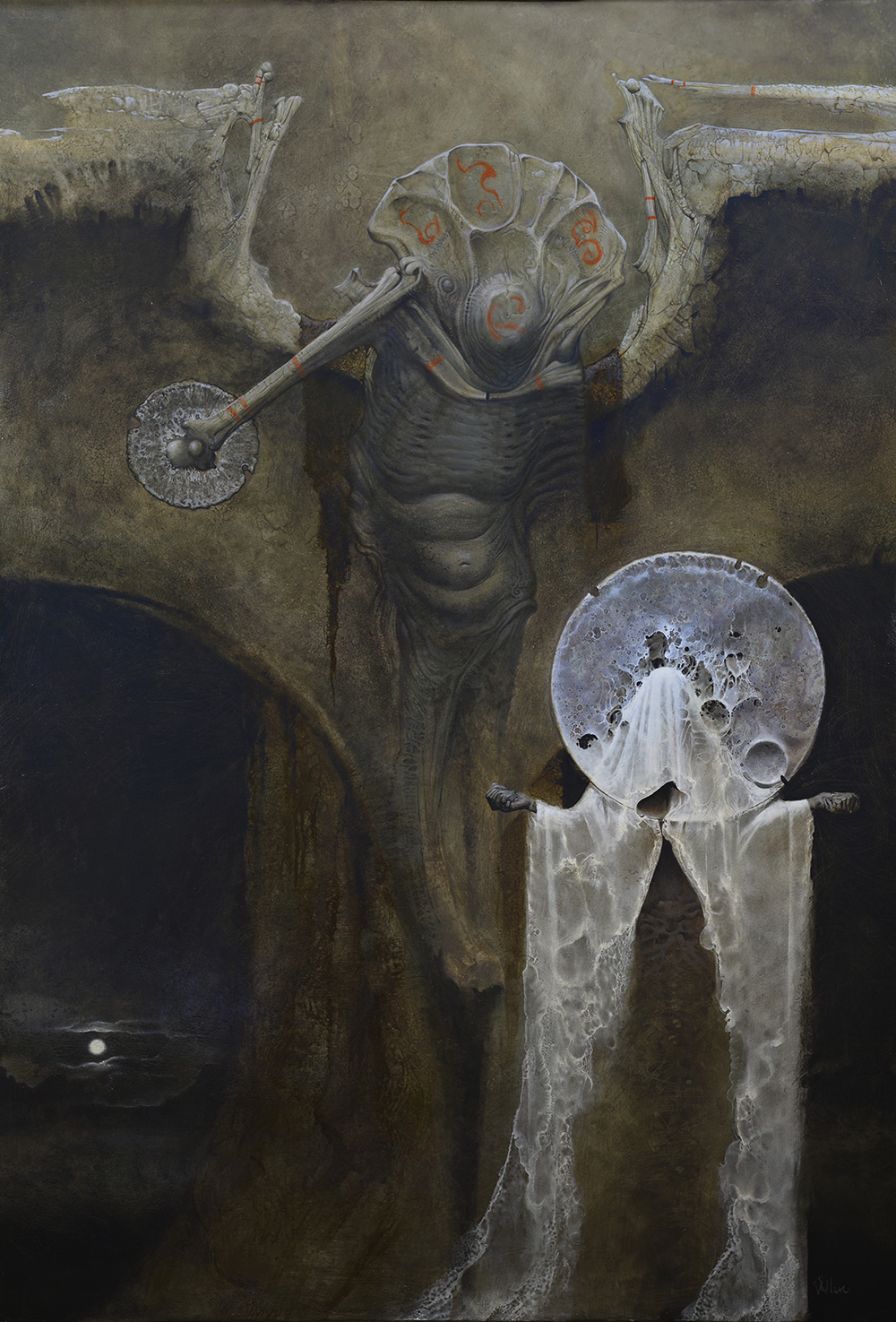
However, there are times when a more illustrative “hero” shot is required to convey an idea more effectively than a purely pragmatic design layout. For me, the pivotal question revolves around whether I am “discovering” the idea (as in production design) or “selling” the idea (such as in pitch work or proof of concept). Sometimes, it’s a bit of both, particularly in the case of illustration, which, to me, often encompasses both aspects, especially in the pieces that resonate with me.
To be fair, there’s a touch of glamor that should accompany a design, depending on the audience. It doesn’t serve much purpose if they can’t discern the message within the work. It must possess a professional level of readability and a certain level of polish, which is where one’s illustration skills come into play.
Conversely, having a superb illustration paired with a poor design can be vexing, perplexing, and occasionally distracting. It’s not uncommon for a finely crafted illustration to progress significantly in the production process only to unravel when the design turns out to be obfuscated by excessive glamor. When I mention “glamor” here, I’m referring to the captivating allure of a well-executed illustration, which can sometimes conceal aspects that should be clearly addressed. I’ve even been guilty of this myself. I once had a production manager tell me, “I can’t determine if I’m reacting to the design or the artwork.” It was a brief statement but a valuable lesson.
Ideally, there are situations where both elements should shine. Yet, there are times when it’s more important to showcase a critical element and its integration rather than bury it under visual storytelling, which is how I often view illustration—visual narrative. Yes, there can be elements that contribute to selling the design, but they should never overpower what must be clearly visible. While this may seem like common sense to some, for an artist like myself, who has long inhabited my creative realms, it serves as a constant reminder posted right on my desk (I mean it will be once I’ve illustrated it).




Recent Comments