 ©Wizards of the Coast Shared with permission of Wizards of the Coast.
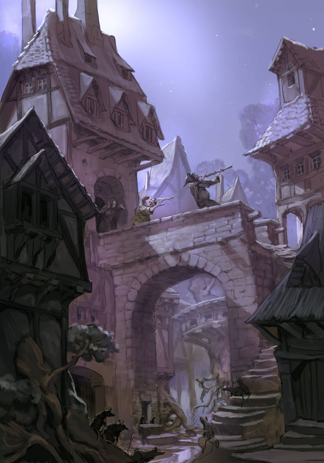
A little over a year ago I was invited to work on the concept team that shaped the second set taking place in Eldraine. This time called The Wilds of Eldraine. I really loved the first set. The vibe of european faerie tale speaks to me and is a place a feel home.
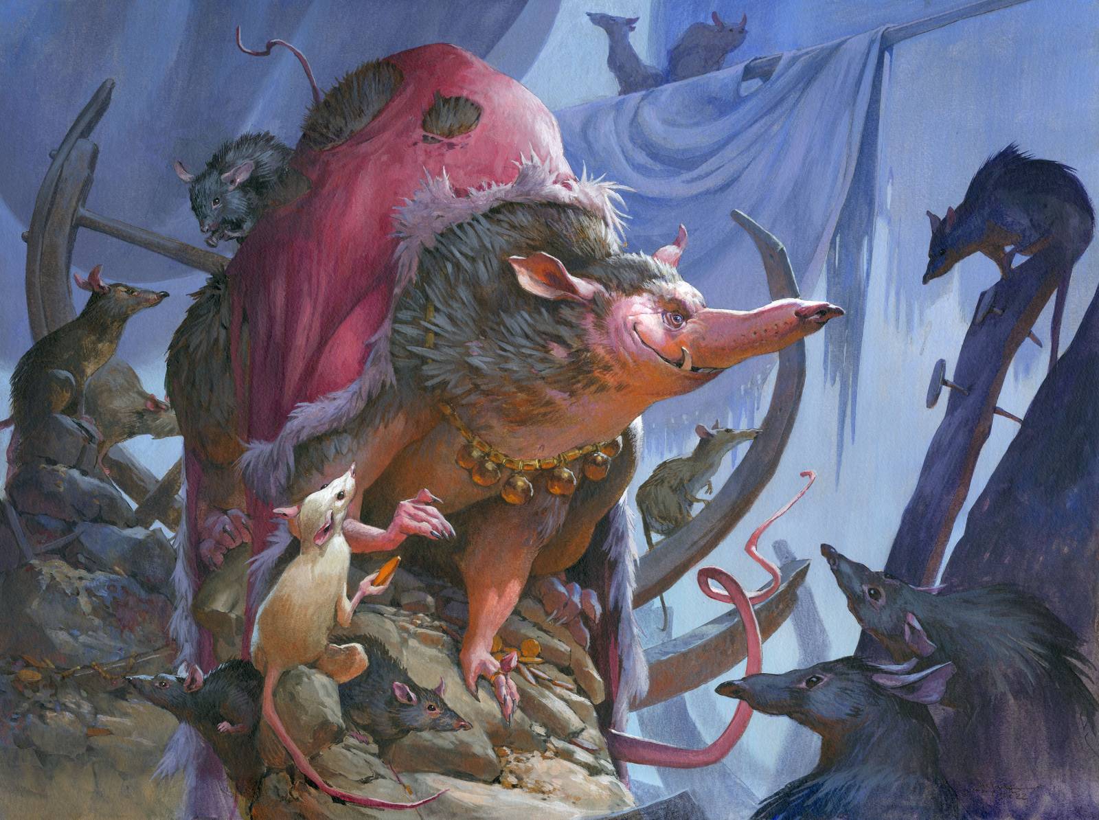
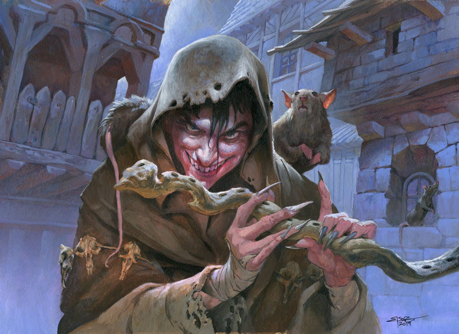
And I felt even more at home when I found out that some of the characters from last set was having a leading role in this one. Mainly The Pied Piper. I painted a close up of him for the first set but this time I got to do a full design of him. This leads me up to the assignments going out a couple of months after the concept weeks. I was asked to do the Villain of the sewer – The rat King called Lord Skitter. A huge fat rat ruling over all the rats in the city. He is clever and greedy and rests on a throne of trash surrounded by trinkets and stuff his underlings has brought him.
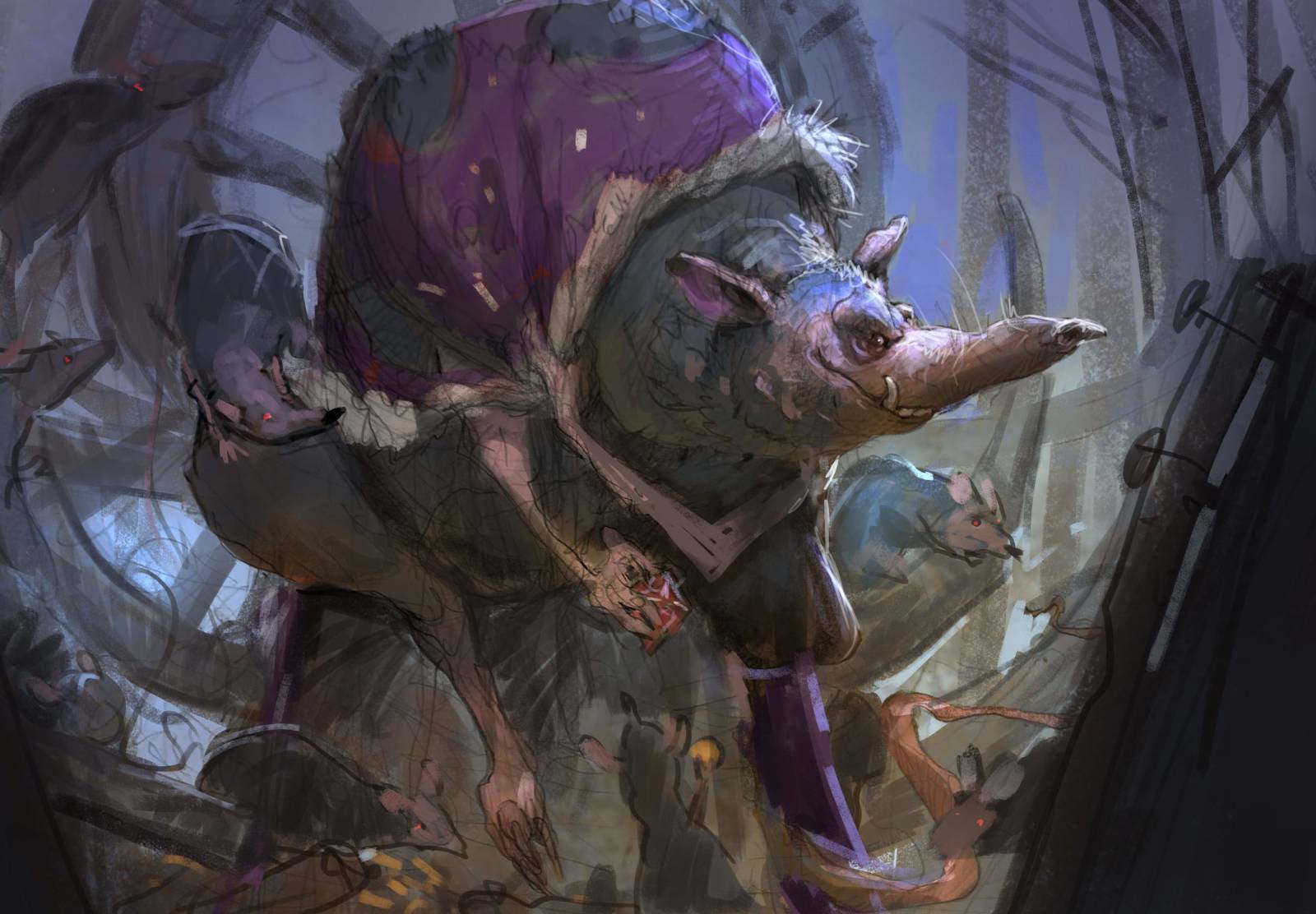
I worked out a sketch and gave him a royal looking cape tattered and worn. The head turned sideways to show off his magnificent long snout in silhouette. I even tried a crown of silver wear but turned away from it because it ruined the reading of the silhouette, and made him look less sleek and more ridiculous. I knew I wanted the same color palette as my original Piper painting because i wanted to create a sort of connection between the two, so yet a gain I used my purple/blue themes that I tend to like a lot. ( I know )
The sketch was sent and I waited for a “Good to go”.
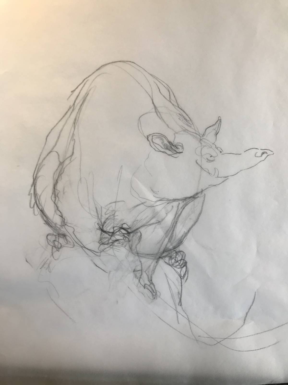
My art director asked me to change the body to be more animalistic and less long limbed. Looking again at my original sketch I noticed the wide man spread and feel lucky for being asked to change the pose. I went back to the drawingboard and sketched a new body, one with more deapth and shorter limbs.
I am really happy with the changes. The way we look into the body pose makes him seem much more creepy. The lifted hand gave me the idea of a rat servant in front of him handing over a piece of gold. And my next thought was to make the small rat white – innocent but still forced to give tribute. I was afraid the painting would end up too dark and gloomy so I decided on an orange bounce light to give some contrast to the huge surfaces of blue and purple. There might be no logical reason for a strong orange bounce light, but it gives a sense of reflection perhaps from more gold laying out of frame.
It is one of the most cartoonish magic card paintings I have done, but I think it works anyway to give him character and personality.
The level of cartoonish-ness often concerns me. In the being of my fantasy career I was told my style looked too much like children book art and not like hardcore fantasy. But no matter how hard I tried I constantly gravitated to the more stylised look. the decision to keep things cartoonish but then rendering the figures like if it was a realistic painting came from being exposed to the paintings of Paul Bonner. Having a less believable figure treated and painted like it was affected by real light and shades and with ton of details and light effects some how “sells” it and makes it acceptable.


Good to see you posting again Jesper, it’s been a while, a beautiflly painted as always.
Nice to see him out in the world.