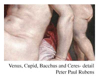
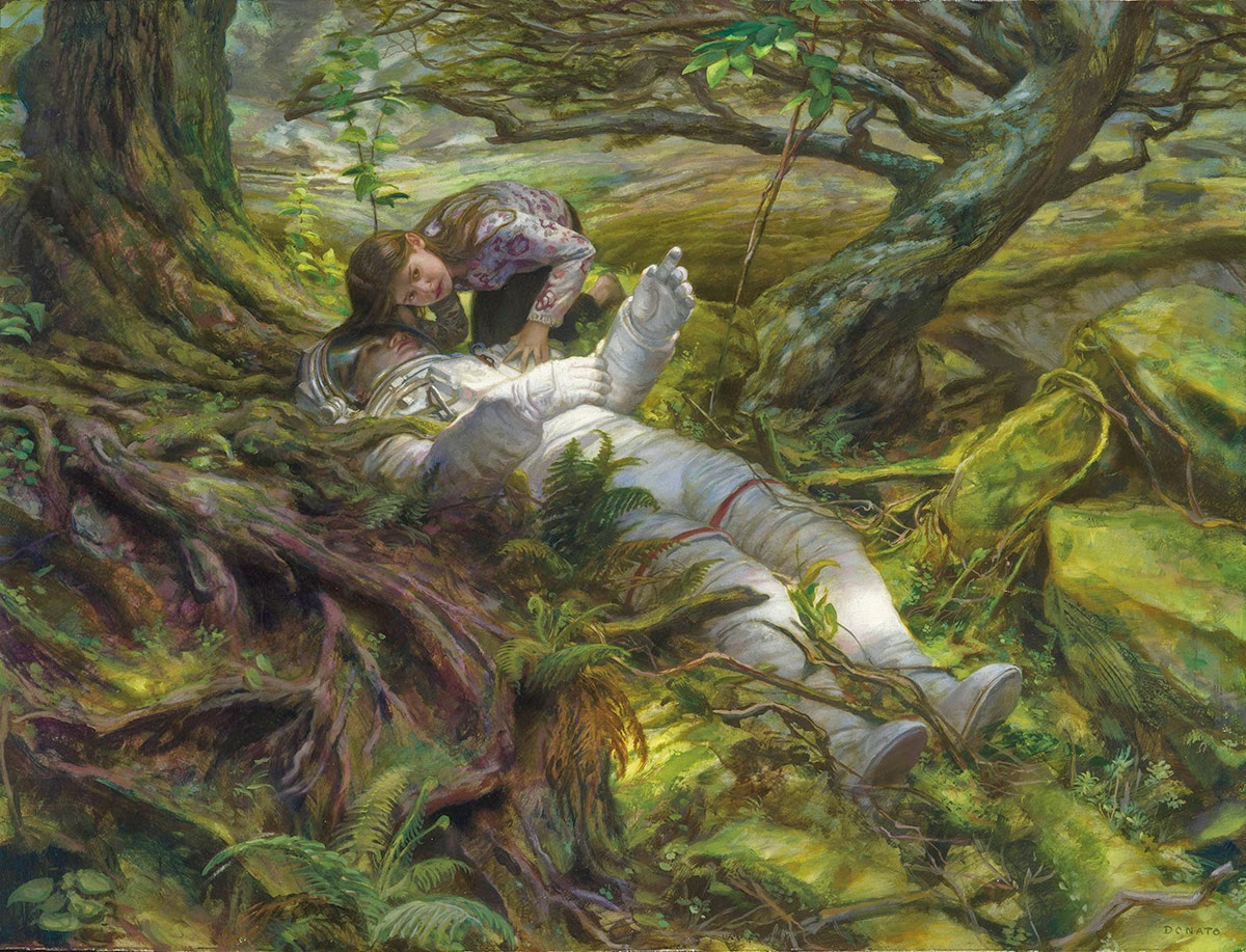
“I can paint you the skin of Venus with mud, provided you let me surround it as I will.”
A perfect statement to start off my presence here at Muddy Colors.
Delacroix compressed a great deal of art theory into that one sentence, and the most profound for me was that color is all about relativity. What clump of ‘mud’ you place next to another clump will impact all your color decisions thereafter; cool/warm relationships begin to evolve when even the subtlest of differences are managed between color and form. Nearly every painter comes to this revelation some point in their career, and the sooner the better!
The need to call upon the massive weapons of ‘exaggerated-complimentary-color’ to solve a problem is not always what is called for in an image. Many times the poetic harmony of similar values and hues
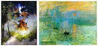 can deliver your message with greater clarity. I have certainly used both methods to great success over the years and evaluate each new project to determine what color system may best work for me to resolve the pictorial constraints of a new commission. There is no right nor wrong way to approach color, and as N.C.Wyeth and Monet have shown, exaggerated color can certainly be used with mind-blowing effectiveness.
But I want to talk about ‘mud’.
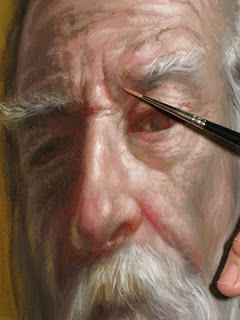
From muddy cool reds to dirty warm greens, all of this can become the stuff of flesh and Venus. I think Delacroix had boasted with such bravado about his virtuosity with paint because he already knew that to paint flesh, an artist is really manipulating a bunch of mud! For next to any hue, a subtle shift cooler will allow any tone to appear warm. It is from these temperature (and value) changes that we infer mass and shadow as they play themselves out over a form. The slower and smoother these transitions, the softer and more diffused the light. It is for this reason of working with ‘mud’ that I am never able to answer the question –
‘What colors do you use for your skin tones?’
For in its asking, I respond with questions of my own- what kind of skin are we talking about, Caucasian, African, Indian, etc…? Lighting effects? Source light color? Reflected surface colors? Overall saturation of the painting? Environmental concerns? Opaque vs. glazing techniques? etc… All of these and much more go into the choices made about skin tone. There is never a concrete answer nor singular starting point for generating these colors. It is all relative.
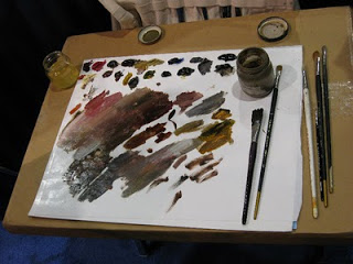
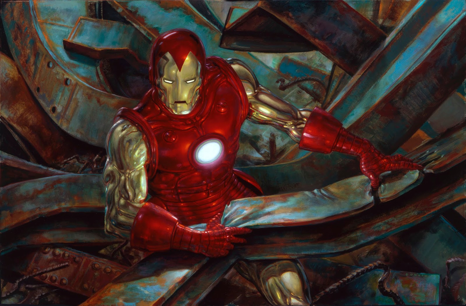
But a decision must be made in the painting process about where to start – what first dab of color to begin with. When I have made this commitment, usually through a color study or example I have found in another work of art or photograph, I am ready to create my ‘mud’. From lights to darks, warm to cools, I attempt to blend and mix a full range of values and hues on my palette based upon observations with my model/reference and what color scheme I wish to bend towards. Rather than create a single string of blended color, I create a large puddle of mud, painting the model from lights to darks as if the model melted into a pile of mud. This is all without cleaning my brush to facilitate the neutralizing of intense colors. Beginning with a ‘dirty’ neutral tone created from umbers, reds, whites and ochres, I then expand out producing a line of darker and warmer tones. Parallel to that range, I create a similar cool string and then blend a portion of these together. A mirror image of these cool/warm strings plays itself out into the lighter tones.
 This method provides plenty of paint on the palette ready to sample from with the option of warm and cool hues of varying values surrounding nearly any selection from this puddle. In the end I have arranged a complex color wheel constructed around paint I will use in the flesh and surrounding areas of the figure. A total mud pit! I invariably make modifications to this mixture, but find it a wonderful resource pool to dive into during the painting phase, without much worry about trying to remix the ‘exact color’ you just ran out of, because you never had any pure color to worry about. These mud colors also prove to be excellent sources for testing out background colors and values, as the test originates from a tight range of balanced relationships, and a sample from this source easily harmonizes the whole image.
Having read Delacroix’s quote when I was a young painter, its insightful meaning could only be fully grasped after I had spent years discovering the truth in painting with mud for myself. I hope it comes sooner for many of you!
My next post will deal with the other insightful observation from Delacroix’s statement. Until then..
Happy mud slinging!
Donato
Haha, and all my painting teachers in school were telling us to avoid mud. 😛 But of course, every piece of advice has its place. Thanks for sharing Donato!
We were discussing your use of “mud” on a recent podcast over at Drawn Today. This article helps clarify its uses even more. Thank you for sharing, Donato. I look forward to visiting this blog daily. Keep up the great, informative posts.
The information of this new blog is already one of my favorite reads. A direct link to my favorite artists and their knowledge? Thank you, internet.
Great post! this blog is AWESOME!!! I am so thankful you giants have started it!
this reminds me of 'broken hues', unequal combination of the primary colours, the kind we see in nature. And it is easier to shift colours from one temperature to the other.
Great post.
Great insight Donato, I look forward to your next post!
Wow really, good start post for this blog! Looking forward to read more!
I really needed to read that right now, thanks Donato, I'm sure I'll read it again tomorrow.
Great first post, Donato! I'm really excited to see what you bring to this blog.
What a fantastic and insightful post! Thank you Donato.
Great info Donato, thanks.