I started this installment with more, but I realized after putting this part together that this in itself is an article. hat I started I will post next time, and Rockwell will take over this time around. This installment looks at reference and how to use it more effectively using Norman Rockwell as our guide. For those of you who feel you shouldn’t use it or refuse to use it, read along anyway, you might find some of this information helpful on your quest for a more vivid image in the minds eye.
Before we look at Rockwell, I want to say a few things about reference and the once again growing concern about whether to use it or lose it. The simple fact is, you can’t draw what you have not seen, experienced, or encountered without there being some visual issues and technical difficulties. Think of reference as “getting acquainted with your internalized subject matter”. You don’t need to use the reference in the final painting, but at least study it with your mind so you can memorize something as a take away to help you build upon. And it would be wise to have practiced the painting with some kind of visual aid(s) or have painted the reference as practice to assist in familiarizing yourself with your idea, and your subject before the final execution.
Unless your goal is to work in a “folk art” or “totally innocent” approach, familiarity with your subject matter is vital for the image to come together with depth and intellect. Familiarity with the subject matter means painting it with less demand on “how” and more focus on “how to economize”, which is a SMART way to work. When economizing, the work simplifies rather than intensifies in detail and effort (a less is more way), the brushstrokes reduce and the work has a more “painterly” appearance to it, meaning that it was not over rendered to a plastic-like finish. Norman Rockwell had masterful brushwork, having done many sketches from his subject matter long before his finish was executed.
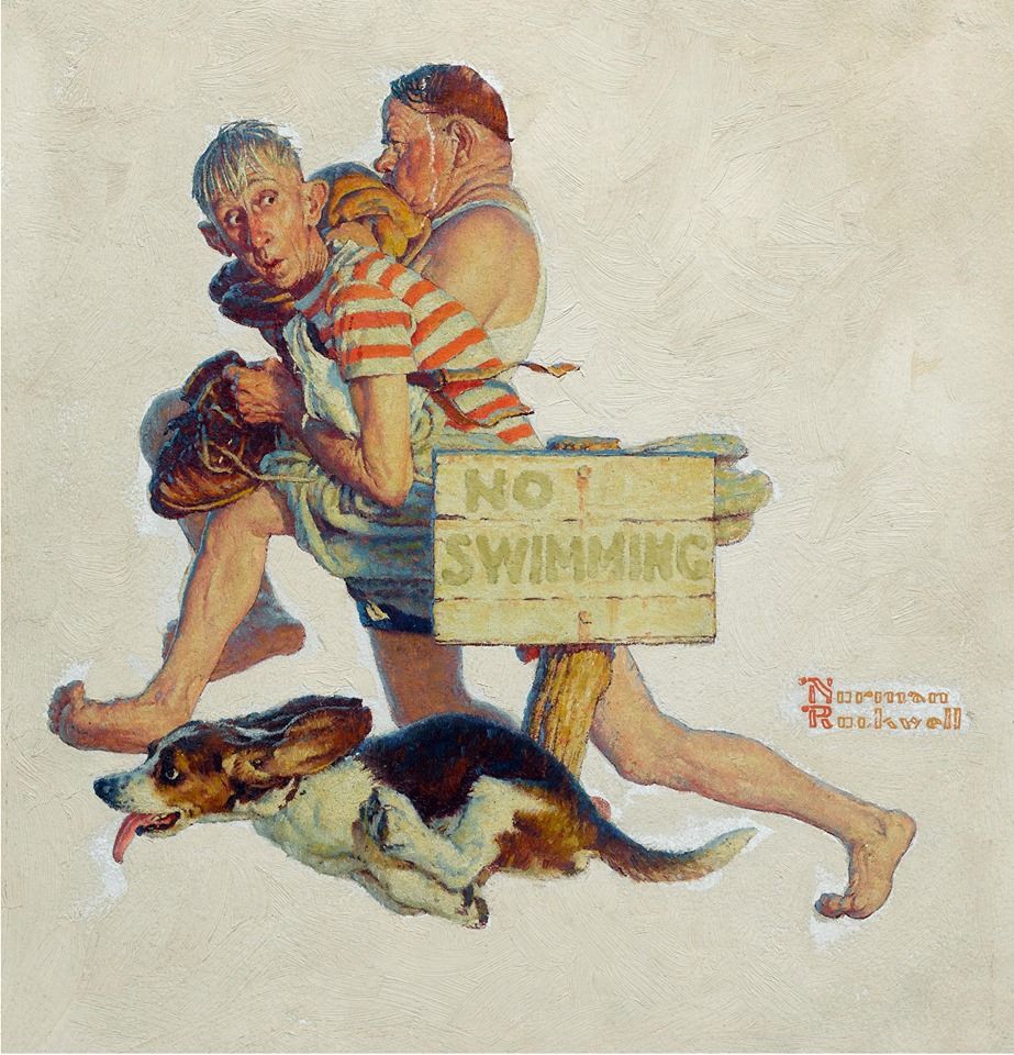
Norman Rockwell used his practice paintings as his reference to finish his final painting. Not only are the practice canvases correct in value and in color, but they also articulate the brushstrokes, already solved, or already practiced, giving insight into the final marks and the order to put them in.
The cinema, movies, and the big screen experience was a newly emerging industry when Rockwell was a child that had a major impact in the way he became a cover artist. His earlier covers were similar to the stage play, the Broadway experience, and as cinema grew more popular Rockwell’s covers took on a more cinematic feeling. The editing process Rockwell used to paint his covers was on par with the top Hollywood directors of his time.
Rockwell was a fantastic photographer, and a much better director. His vision was clear, he knew what he wanted in his work and was determined to work with the best suited reference possible with what he had around him.
The photo shoots started with his already well designed thumbnails, showing them to his actors/models, for their motivation to perform. Since most of his models were just friends or neighbors, he could only expect as much as he directed them to do. And as you will see below, he went to great lengths to make sure he got exactly what he needed. Depending upon who he was working with, he knew he could push the moment and get more from them and knew when enough was enough, except for when he used his own family. These stories will be left for another day.
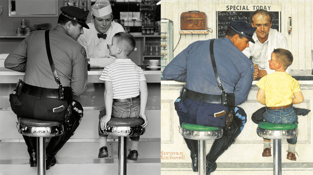
Here are a few images from online and a few from a book on Rockwell’s photography to show how he worked with his models to shoot better reference. I hope these give you some idea of what it might take to do a comprehensive photo shoot for your illustrations. There is a list of tips at the end of the article to help sum it all up.
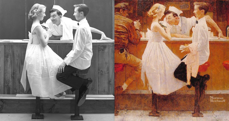
I want to break down a reference photo he used along side the painting that was made, pointing out the changes he made to improve setting moment and achieve the story beat he truly wanted. This image was not the only photo that was used, but it does show a glimpse into his iterative thinking process. Like a great movie director, Rockwell knew what would work, what to remove, what to alter, what to re-position, to find the strongest and most powerful moment for every cover he made.
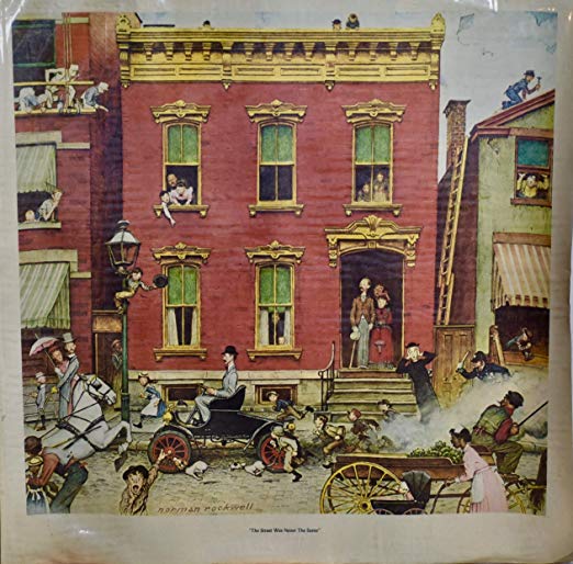
First major obvious change is the background. The first shoot was too urban and needed to feel a bit more rural, to help show that the city kid traveled quite a distance and as a runaway he stands out in the country cafe without parents. The flatter background brings more attention to the foreground figures, and something Rockwell was already quite familiar with. While that wall could have been just a flat surface, he added the slats as part of the design of the cover, a nice symbolic touch to “getting caught”.
Rockwell leaned the police officer in more to the kid but kept the stern expression on the model’s face. He also broadened his shoulders to a Herculean scale, but subtle to his appearance with the shirt smoothly painted. He also changed the angle of the left leg to better line up with the left elbow, giving it a more muscular appearance.
On the right leg of the police officer, Rockwell varied the undulations in the striping on the pants where in the photo there is less variation in it. This variation in the striping keeps it from having any monotonous, repeated shapes within it.
In the photo, the runaway boy appears to be in good spirits, almost like he’s having fun taking pictures, but not the tough little man Rockwell depicts him as. The arms are at his side in the photo adding to his playful expression, while Rockwell depicted him with his hands hidden from the viewer, in his lap, giving him a more grown-up appearance.
The boys feet have been re-positioned, better balanced in the composition. The shirt was also changed, removing the stripes and coloring it yellow to better balance the primary color scheme between the three actors, and further enhancing the ruddiness in all of their faces. No doubt Rockwell thought about the symbolism behind his choices, and with that, I’m a bit conflicted with the symbolic meaning behind the yellow color, as it can represent youthful energy as one of its positive attributes, but negatively, it can also represent deceit. Both can equally apply here, and with that you make the call.
With the additional figure, he changed him from a young soda boy with a sarcastic look on his face to a more adult-like, or fatherly looking man. The younger kid looks like a city kid, the fast moving upbeat soda jerk at the new corner diner/ice cream parlor. The older guy portrays the cook and counterman in the family owned country cafe. Rockwell was thinking about the complete story, the history, the context behind everyone and everything in his paintings. Rockwell was also thinking about his audience and what they would respond to.
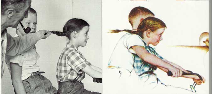
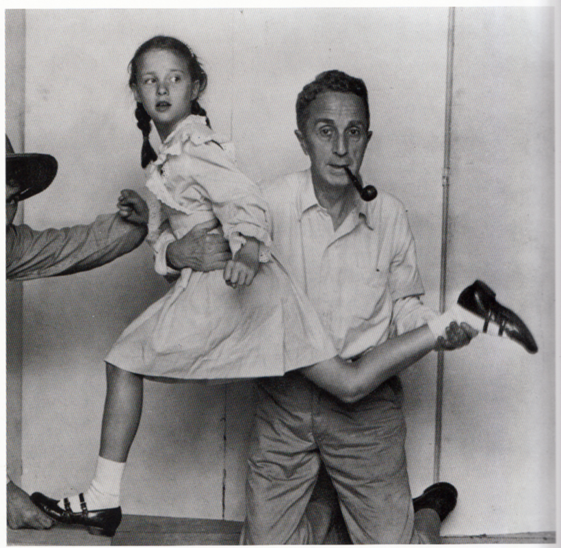
Here, Rockwell’s painting shows two children speeding along on a bicycle, an impossible action to capture in motion the way he designed his concept, and hard to make look convincing from a posed model. Rockwell was very good at working out the action so that his photo was shot with the most convincing and believable action possible. He knew staged or stiff from the real deal and worked very hard to make it feel convincing, like holding the girls hair up to make it look like its in motion and tilting her face more diagonally so she looks like she is leaning into the forward action.
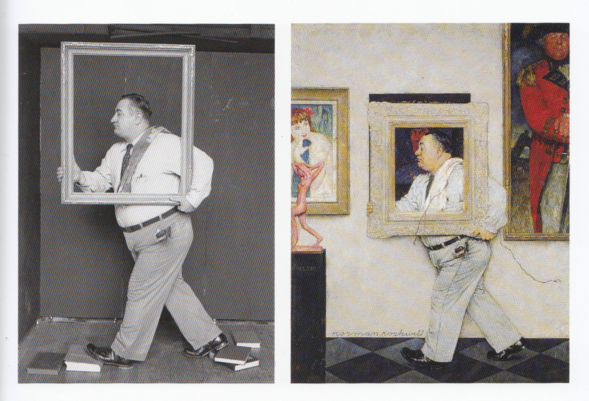
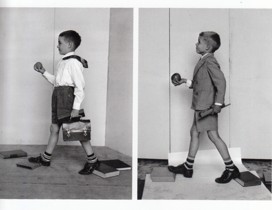
In this reference, Norman Rockwell knew how he needed to capture the figure in motion, destroying his library of books in the process. This was a trick he used often whenever he had a character walking. Here is another example of the books in use to keep the feet properly placed.
![]()
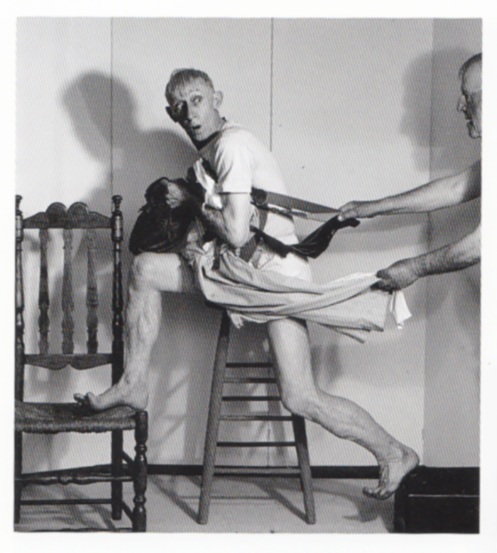
And what about running at full speed, how did he capture this motion? Here are two examples of directing motion and effectively capturing it. The top model propped up on the chair, both legs up braced up against the chair and suitcase.
Rockwell assisted in this reference holding the girl and lifting her leg to the angle he drew it in his sketch. He went to all this effort just for one small figure in this huge multi-figured composition as you can see below.
She is seen above on the left to the right of the light post. That little almost cartoony looking character in this painting was just as heavily directed and photographed as any of his other covers.
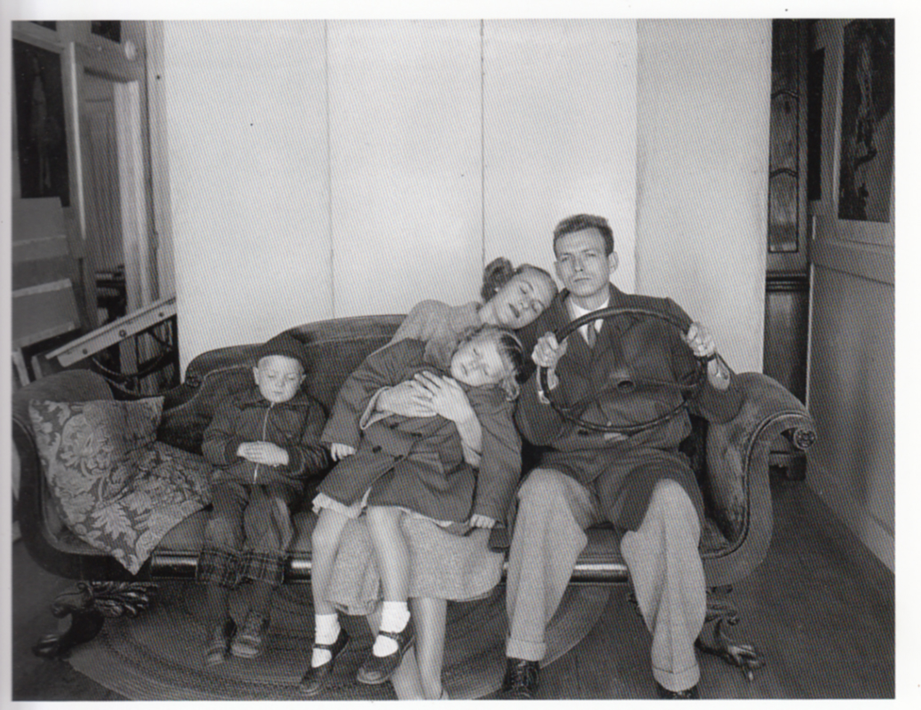
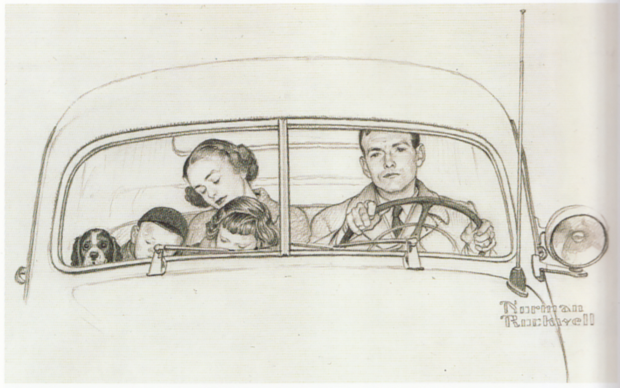
When Norman Rockwell painted people in a vehicle, he did two shoots. The first shoot was in the vehicle to get the lighting, depth, and ambient colors working together. He then did a second shoot with the models fully exposed so he could work out their poses. Keep in mind that Rockwell said this over and over again, that he couldn’t do a finish without the reference being exactly what he needed to do his painting. He took no chances and made up very little when it came to his finishes.
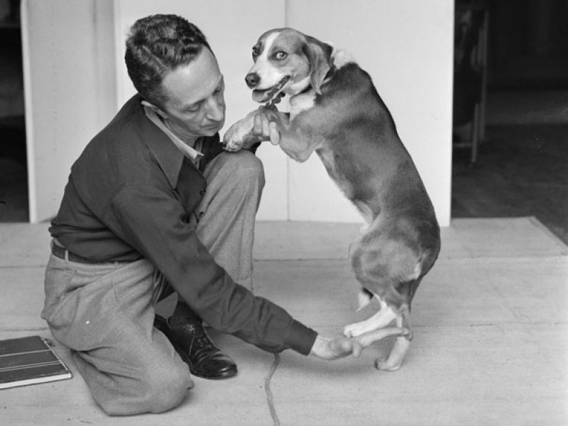
The reference above is for the drawing below. As cartoony and almost “made up” looking as it might appear, that dog is drawn from this dog above. This is one of the many photos they shot to get the dog to “dance” with the couple.
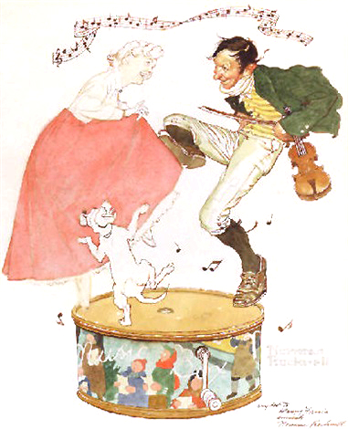
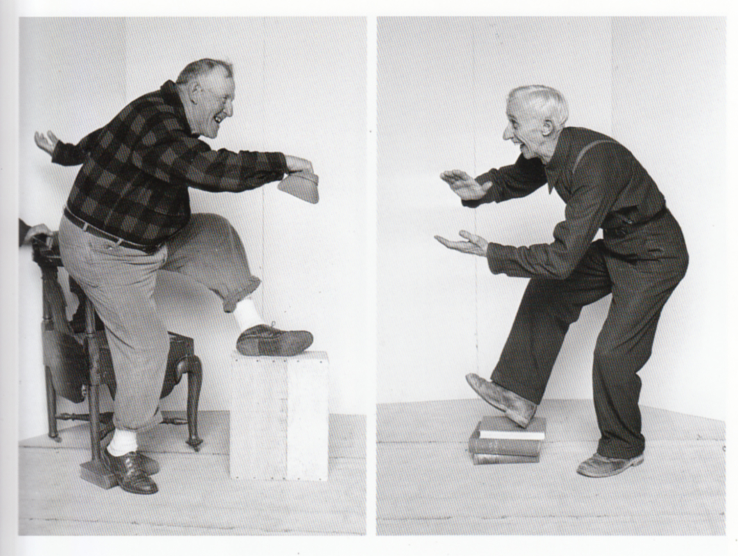
And if you were wondering how he was able to capture the male dancers leg so high up in the kick, the reference below gives us some idea how that was accomplished.
A List of Improvements for Our Reference Photo Shoots
After looking at what Rockwell does to get the best photos he can, here are a few things we can try to help improve our own reference:
- Anyone can be used to shoot your reference, but if you do not give it strong direction, you will only get back what they can physically do, and they are either embarassed to do it, or eager to over act. In either case, use your best inner Hitchcock to direct your subjects towards your vision.
- Use props to help you shoot better reference for motion shots. And if we really want to modernize the moment, video shoots are the best way to do it now, let the model breathe and move, capture them in action and take a frame grab. It is the best and only way to do it these days. Stills are nice, and stiff, motion is motion and the body is very different looking while in motion. Capture the right likeness if you really want your art to move.
- Find types that fit the mold. I know, many of us are closed off artists in our studios, not a place where you can find a character type. But you do have the internet, and you have the friends list you have, and some of your sketches ready to send them. Ask them if they would try to do a shoot with someone who can use a camera, see if they can match the reference to the best of their abilities. Rockwell saw archetype in all his neighbors and found a way to use them in his stories. Your friends list is full of them too. Who is a character for your story and how can you work with that friends list to make it a potential archetype file?
- It is important to solve the entire pose regardless of how much is cut from view. What shows should feel convincing, knowing the pose from top to bottom will help drive that home.
- What applies to humans applies to animals as well. Work with your subject, try and pose them in the action you are looking for and this time, use video and not photography. It is hard to time the subject and the camera together in a still shot session. There is a certain way to talk and act around them as well to get the most cooperation out of them that you can. It takes a little work to figure it out and it can be a bit frustrating, but to get what you need or want for your work takes some doing. It’s satisfying in the end when it all works out and the piece is everything you were hoping it would be.
- BONUS – After your shots have been fired off, check them all over before your model changes out of costume or leaves. Look for improvements, from the pose, to the lighting, or the model type, or the setting. Do they work or do they need improving. The second go around is a faster shoot, both of you are aware of the goal and can get to it much easier from the experience. Don’t be afraid to request a do over if what you shot isn’t exactly up to snuff.

Thank you so much for breaking this down! What valuable information. Thank you for sharing!
Thank you for reading the article. I’m glad it could help you out. 🙂
Thank you so much, Ron, for this analysis. It’s so inspiring
You’re welcome. Thank you for taking the time to read through.
Thanks Ron, I appreciate this.
Thank you David.
Wonderful explanation and analysis. I didn’t even know Rockwell worked from photos.
So glad I found this. Thank you for sharing. Rockwell was a master with reference. Makes me strive to do better with planning and preparation for my illustrations.
Thank you so much for this article! Its always neat to see how artists work and getting the analysis of an artist on top of it is like the icing on the cake 🙂 . I struggle with “walking” poses and the right position of the feet – seeing this trick with the book was a real eye opener. it is so simple… but i never thought of it nor have i seen this advice in any course or tutorial.
SPICYSHE is dedicated to offering a new era of sex dolls and sex toys that blend innovation, quality, and customer care. At the heart of our mission is the belief that adult dolls and toys can be transformative tools for self-discovery and intimacy. With a focus on realism, craftsmanship, and customizable features, SPICYSHE’s products allow individuals to explore their desires safely and fulfillingly. We offer more than just a product; we provide an experience that nurtures confidence, comfort, and self-expression.SPICYSHE sex doll link: https://www.spicyshe.com/</p>