I was recently commissioned to create the cover for the 12th book in the #1 New York Times Bestselling Mercy Thompson Series by Patricia Briggs, called ‘Smoke Bitten‘.
Typically, most book cover jobs start with me receiving a manuscript, and reading through that to get ideas. But because of the success of these books, the Publisher actually begins promoting them very early, in some cases, before the book is even fully written. Which means instead of reading through the manuscript, my job starts with a phone call to the author who gives me a complete run down of where she thinks the story will be headed, major beats in the story, and any ideas that she personally thinks might make for a nice cover.
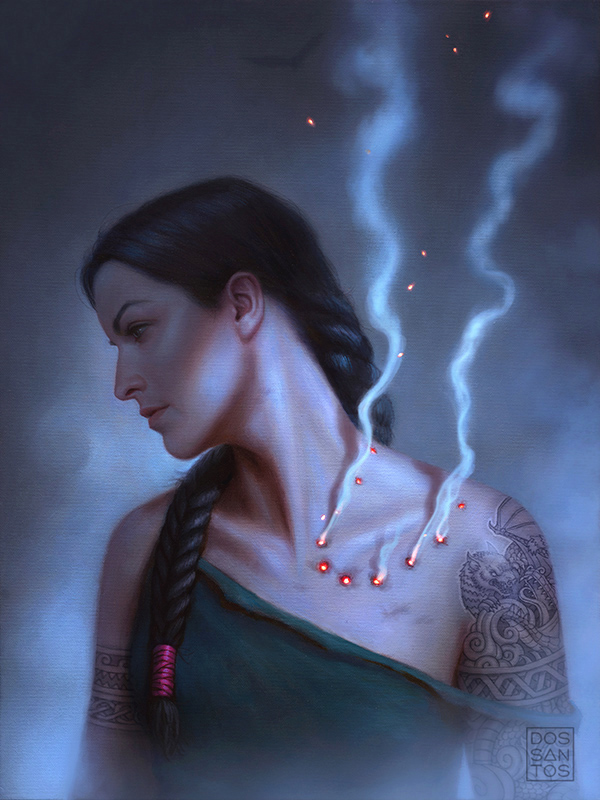
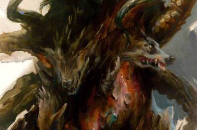
Because these books are full of great characters, lots of magic, and fighting and romance, there is no shortage of great scenes to pull from for an interesting cover. However, more times than not, it’s usually the title of the book that really dictates the image for me. If the name of your book has the words “smoke” and “bitten” in it, you kind of need to have some smoke and some biting on your cover, or it just won’t make visual sense to the buyer. So when the author, Patricia Briggs, told me that the antagonist would be a creature that could take the form of any creature it wishes, including that of a dragon, I knew I had my cover concept. I would show Mercy having just been bitten by this mysterious creature, with smoke and embers pouring from her wounds.

I worked up a few cover concepts for the Art Director, giving her a choice between something close-up with a more confrontational expression, or something zoomed out that was a little more solemn. The client chose the close-up version you see above.
Once I have sketch approval, the next step for me is getting reference so I can improve on my original drawing. I have used the same model for this series for the past 12 years, so that part was easy. However, my model lives in a different state than I do now, so getting specific photos of her can be a bit tricky. I sent her a copy of the approved sketch, along with a diagram of how she should place her cameras and lights, and she shot the photos for me.
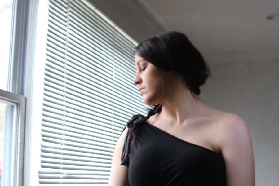

Using a combination of the models photos, along with some supplementary reference for the neck and smoke that I shot myself, I was able to revise my sketch into something better that still looked like the established character.
Because this cover is a close-up of the character, I wanted to make sure that the face had a lot of detail in it. So I painted the figure roughly life size on an 18×24″ canvas.
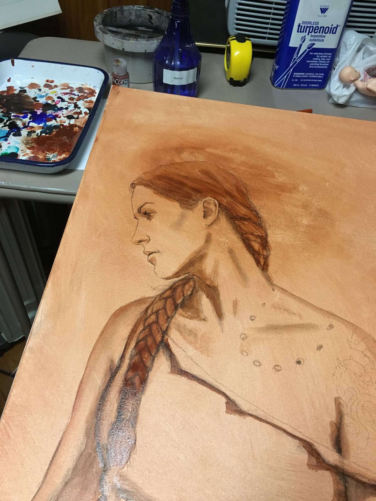
I started with a simple pencil outline, and then toned the surface and established the major values with a few washes of acrylic paint. I chose to do these washes in a warm tone, called a Brunaille, which is a very classical approach to underpainting, and allows some warm colors to peek through some of the shadows later on.
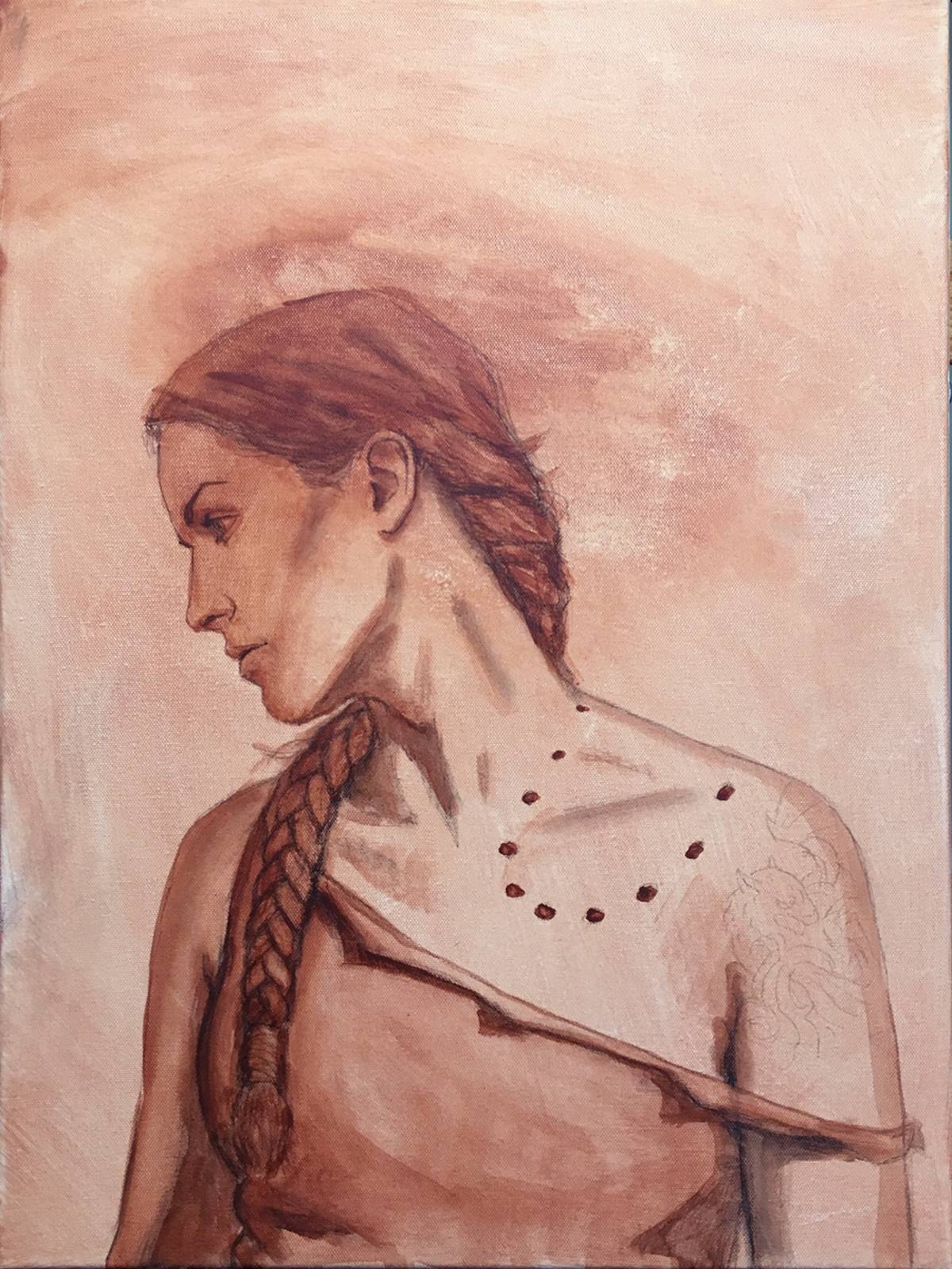
Once the acrylic lay-in was complete, I began painting the final image using oil paints, beginning very thinly so as not to lose the drawing underneath too quickly, and to let it do as much of the work for me as possible.
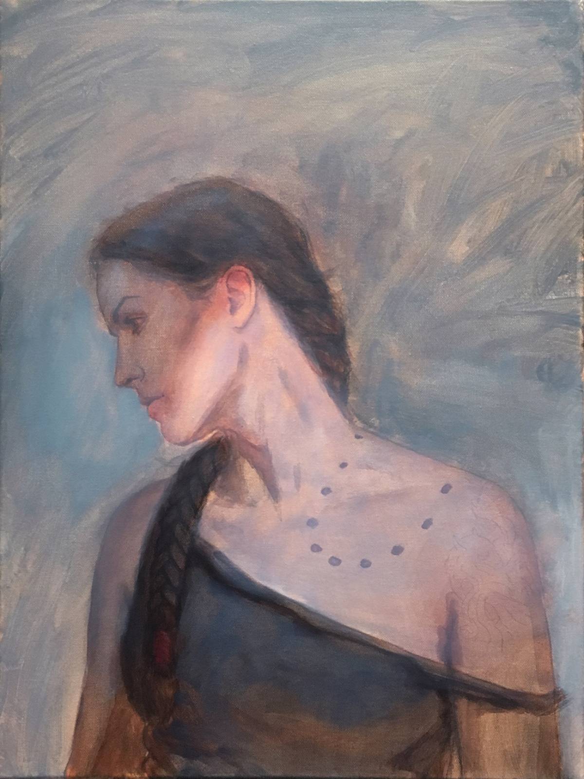
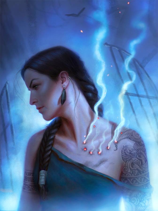
After another week or so of work, here is what the finished painting looked like that I submitted to my client for print…
Unfortunately, the client felt the above image was just too dark, and a little too “quiet”. These were qualities I was intentionally going for, which I felt suited the story. But what makes a for good painting doesn’t always make for a good cover. Once the client saw it all finished up, they simply felt the image wasn’t going to jump off the store shelf the way they needed it too. We decided we needed to brighten it up a little bit and add a bit more drama.
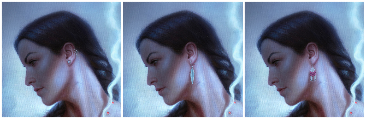
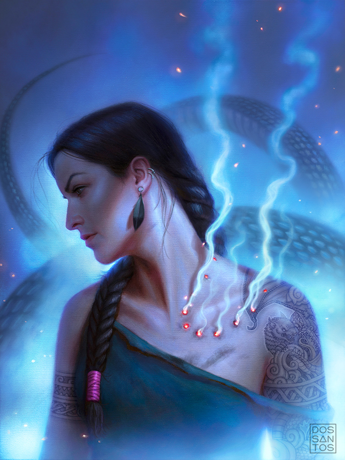
One of the initial client criticisms was that the image was too stark, so the client asked that I put Mercy’s iconic earring into the image. However, knowing that too large of an earring would likely interfere with the composition, they asked me to keep them very small. The earrings may seem inconsequential, but because of the close cropping, and the selective pop color they might add, they could potentially change the feel of the cover quite a bit, so I gave my client 3-5 options of different earrings and colors to choose from.
The same feeling of ‘starkness’ to the image also prompted the client to ask me to add some more smoke and embers, and change the color of the background, in an attempt to turn up the overall drama of the image. After a few back and forths, exploring a lot of different color options, we decided it would be wiser to add a background to the image. We could let some new element add the drama and narrative that we were lookign for, rather than forcing the figure to do something it wasn’t originally intended to do.
So I called the author again, and got some details about possible settings we could place the character in. The idea of a gate/portal came up, and seemed like a great option to add some mood and spacial depth to the piece. I worked this concept up digitally, along with a few others, to show the client some of the different options we could go with.
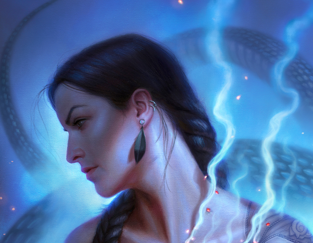
Ultimately, we decided on a background which showcased the antagonist in it’s dragon form, feeling it added a sense of danger, and helped the viewer better understand what was going on with the bite marks on the character’s neck. The image you see below is the final version of the painting that will make it onto the cover.
‘Smoke Bitten’ ©2019 Dan dos Santos
It took a lot more revisions than usual for the client and I to get to this spot, but in the end, I think it was really worth it. So often, the inclination is to simply settle for something less than intended when an image isn’t quiet working the way that you want. So I’m really grateful the client stuck with me on this job, giving me repeated opportunity to get it right, for everyone’s sake. In the end, the author has a cover they feel is a good representation of the story, the client has a cover they feel will pop off the shelf, and I have a cover that I’m proud to have painted. For me, that’s a successful job.
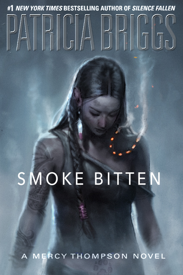
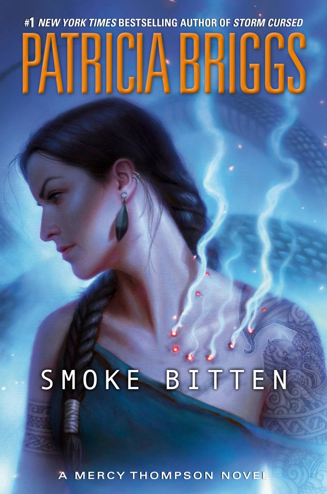
Lastly, here is the final image, with type treatment, as it will appear on the cover of the book.
For any fans wanting to grab a large poster of this image, you can pre-order a special embossed edition right here: https://www.dandossantos.com/store/smoke-bitten-poster


Awww, I thought the gate made such a nice reference to your first cover for this series, though!
What? Me, cyber-stalking your work for a very long time? I cannot imagine what you mean …
Ha! I actually thought the same thing, and debating making it the exact same gate, only broken and aged.
Hello, very interesting process and final result, Wonderful painting. One question: why did you decided to go with canvas as surface instead of wood panel?
Lovely image to one of my favorite series! Very interesting process – loved reading about it.
Surface is a weirdly personal preference. I typically paint on Illustration board. I find wood to be too smooth, and canvas to be too coarse. But I opted for canvas on this one, because I wanted the original painting to have a more classical look.
Thank you for your reply! I understand, perfect. One thing though: Dont you get any negative feedback from clients because of the canvas texture? I know texture sometimes is appreciated, but i feel that a texture from a illustration board (which is kinda organic, soft, inviting kinda feeling) is different from a canvas that sometimes seems too simetrical (like small lines cutting trough the piece). Please if im speaking nonsense let me know. Anyway, im a huge fan, and spent a very considerable time on your website some years ago, trying to figure out HOW do you paint things soo smoothly and perfectly. Thank you for everything!