Happy new year to you all and welcome back to this amazing new year of Muddy Colors inspiration. I am very glad to have you back, ready to learn and enthused about the next great level up in your artistic life and career.
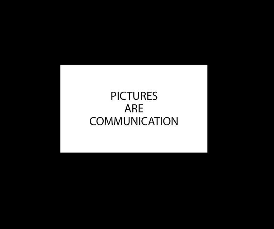
It is said that a picture is worth a thousand words, in other words, effective pictures communicate on many different levels. Simply put, “pictures are communication”.
We are taught at an early age how to form sentences on paper(now digitally), how to articulate ideas using these sentences, how to organize these ideas to clearly, and effectively communicate them to others. (If only we were taught this early on with picture making, it might be taken more seriously by more people).
Like a sentence, the picture should be clear, effective, organized, orderly, and more often than not, simple to understand. Pictures can be extremely deep and complex, but the delivery should still be clear and simple to understand on some basic level.
Words are carefully chosen, effective and specific to the concept conveyed, and in the case of our art, what is drawn in is pertinent to the mood and feeling, nothing is left to chance, everything counts in large amounts.
Picture making does not need to be difficult as long as we remember that the idea of communication through imagery is like a visual sentence(statement) that requires the same structure and clarity.
I like to use the following examples at the beginning of a semester when I teach my students pictorial composition. They are designed to help break the mysticism that somehow seems to surround the subject that makes many feel like picture making is an impossible endeavor. These examples remove the “art rules” we learn about for a moment and make practical sense of what we are trying to do when manipulating the subject matter and all the other stuff that goes into the image.
The idea is to form a clear and effective sentence, easy for an audience to engage with, easy to immediately understand.
Now, here I am sure to disappoint those expecting a bunch of cool art from different artists…THIS TIME, The following examples use words for the pictures and they show in the simplest way possible how communication can confuse the reader, in the same way that bad composition choices are problematic for the legibility of our pictures.
This list is not a hierarchy of important to less important, or most common to least.
Here is the control, simple, and easy to read.
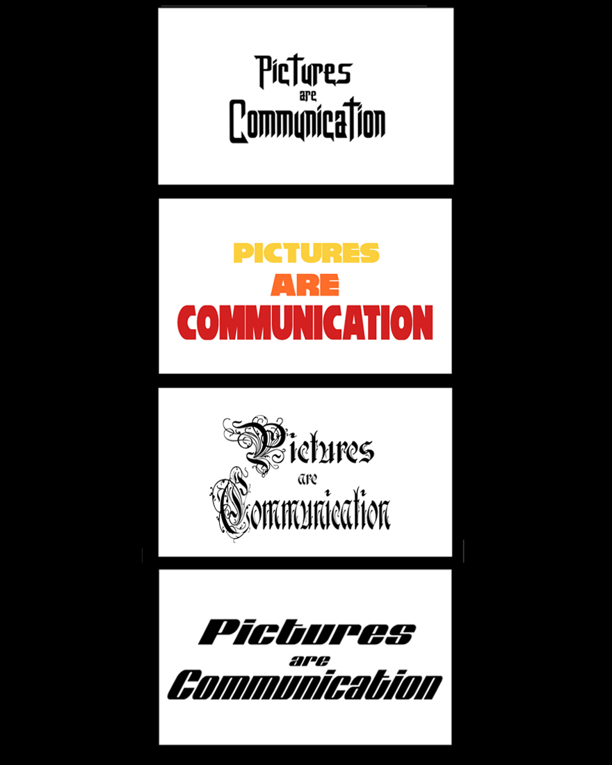
Changing the Font is similar to changing an art style; the style of the art, or in this case the font changes the way we react to the words we read.
Here we have two different levels of depth within the picture space: version one is a long shot, distant, comfortable, pleasing to the eyes, while version 2 is bold, up close and in your face, almost difficult to look at. Both are effective in their own way. How do you want your images to feel to those who view them?

Here are 12 errors that artists are liable to make while learning how to make pictures. There is so much to take care of, like shooting a feature film, directing so many parts that the big picture can suffer as a result of mismanagement of any one of, or several of those points.
1. Monotony happens when there is equal spacing, or equal scale between the players or objects in your art. In this example, it takes a moment to find the break in the words to read them effectively, during that time, the audience is likely to move on to other things. More and more, people do not have the time to find the meaning in an image, more often they are just looking to be entertained by the image and looking for the story is less likely on the whole of the viewing audience that sees it.
In the thumbnail stage of an image find the focus first and build around it controlling the elements from dominating the shot.
2. An over emphasis on detail can Overwhelm the senses. Putting in too many details, too many props, the same care and detail in each costume, can lead to a shift in the focus, or a lack of meaning in the piece and it then becomes a technical study about nothing much at all.
In the planning stages, the thumbnails should be a place of consolidation, removing and stripping down the moment to what is most important, and defining the image through a series of shapes and values that best characterize the moment without emphasis on the details. It is important to find the focus and build the lighting, and the value groupings of items surround the subject so that they emphasize focus on the subject rather than compete for it. This simplification will then lead to what is and what is not important to put in the piece cutting out all that is unnecessary and all the meaningless details that offer no assistance in telling the story.
3. Too much space, or placing the subject matter around the edges of the frame can lead to a very disconnected experience. This is usually done when the artist lacks the understanding of how to work with perspective either technically or illustratively, and/or does not quite understand the concept of the picture matrix.
The edges of the canvas are the NO FLY ZONE, so when we thumbnail it is important to keep the center of the stage the space where the main players intend to be. There are some instances when distance is needed, but that negative space, unless cleverly crafted can quickly kill the moment in the void.
4. Have you ever done an fantasy illustration where you had to go reference all different types of armor and clothing, shops and stalls, parapets and spires, dragons and demons, and without much time to practice, you over emphasize the stuff you are not as good at handling leading to the wrong actor as the focal point, or worse, when someone you show looks at the piece and tells us an entirely different reaction or story they see taking place? Miscommunication comes from too many technical parts that we had little to no control over.
Or have you ever designed a pose where you thought you were clever in solving a new way of swinging a sword, or casting a spell, and instead it looks like the hero has fallen, or the wizard has a stomach ache? Without having gone through a series of iterative drawings to seek out the perfect solution the picture falls short of a clear and proper performance.
PRACTICE, PRACTICE, PRACTICE, and when you think you’ve done enough, dress rehearse the shot a few times to get all the unknown factors out of your system, then commit to the final performance. You would never go out on stage to perform for an audience of 75,000 people without having had some practice first, same applies to any image you are sending off for commercial reproduction.
5. Awkward Cropping of any object can freeze time when it should be at high speed, reverse motion when it should be going the other way, cause a perfectly healthy hero to look and/or feel like an amputee, or place emphasis on the wrong player or item in the moment. In this example we cannot make out what the words are attempting to say, and the emphasis is on the word “are”, two problems in one.
Centering the subject in the first round of thumbnails can help reduce the problem of awkwardly cropping something, and trying various angles of the shot is also a solution for finding not only the effective shot, but can also lead to unknown solutions, never been done or seen camera angles that thousands of artists will copy as a new source of inspiration.
6. Awkward overlapping forms can also lead to absolute confusion on so many levels, this is the stuff that Memes are made of.
Making pictures is like making a miniature stage play. Remember that the actions, emotions, items of interest need to be clear, and in focus, easy to grasp and easy to read for your audience. The ideas should start at center stage and then moved to where they are most effective in their portrayal. Every now and again we can work against the rules, but only in rare and special case scenarios.

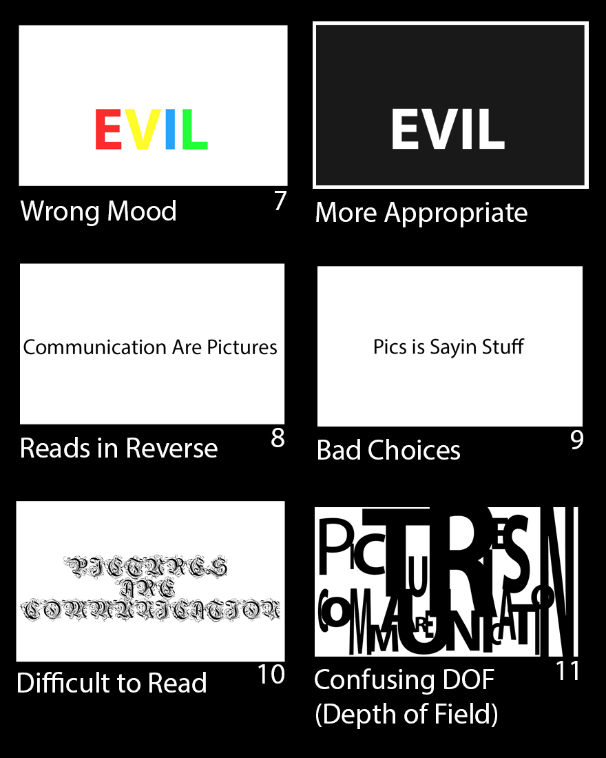
7. Wrong Mood can happen when we don’t pay attention to or decide to paint the picture without a color comp, without visual guidance. Mood is an additional element that can and usually does help emphasize the meaning or emotions conveyed. It can be depicted by lighting and shadows, by color, or it can be the atmosphere, the air surrounding the subject.
To remedy this issue, when working out thumbnails do them in tone and not in line. Line is great for identifying shapes but not so helpful when describing form or depth. Thumbnails are not about you feeling comfortable when you do them. The thumbnail stage should feel awkward, like trying something new for the first time and using that curiosity to drive find a solution. I know so many who say that they can only think in line and still have to color their images in the end, finding the excuse a safety net to avoid the things they feel awkward doing. If we engaged in the awkward things, eventually, nothing we do will feel awkward, and that garners a lot of confidence as well.
8. Reads in Reverse – I have had done images that work really well in my mind, the action is clear, the staging is strong, and when I give it to someone to critique it they say the reverse of what I intended. Or, I thought I had a winner of an idea and when I send it over to the AD for approval, they send it back in reverse, AND IT LOOKS BETTER! How on earth is this possible? Maybe it’s that I’m left handed and everything ends up backwards because of that. Or maybe, it is because I live in Western Culture where we read from left to right and I made a critical error working in the other direction? At any rate, it does happen often and I am sorry I do not have a concrete answer for the reasons why we do this.
Somehow most of us have gone through art dyslexia at one time or another, and the simple solution for this problem in our work is to look at the work in a mirror, or on screen use the flip function often to read the picture in reverse. Have a mirror in line of site of your art table so you can practice expressions and so you can look at your work in reverse to find the problems that might come up when we are putting it together.
9. Bad Choices in the delivery– There are so many ways I can say this wrong, so I apologize if this sounds offensive to you; moral choices and taste are acquired and fostered, cultivated, sharpened by those we surround ourselves with. Some of us say things without thinking, text or put out there on social media the first words that pop into our head without a filter and without refinement. Some of us love Campe films and crass animations, the B-Movie experience and alternative entertainment. These things can lead to tasteless, illogical, trite, meaningless, often insulting or degrading decisions in the work we make. Shock art can sometimes fall under this category, especially if it is just for the sake of shock.
A way to remedy this, if it is something you wish to fix, is to visit museums and take the time to learn about the art, the meaning behind the images, the symbolism, the metaphors, the allegories behind the older works of art. Learn why the lighting is treated the way it is, why the subject matter is what it is and how it conformed to popular trends of their times. Have meaningful conversations with people who pride themselves as experts on the subject, usually eager to debate any and all topics regarding their passions towards the subject. Read multiple authors on a subject to discover the conflicts and similarities, overlapping yet contradictory conclusions, differences in opinion, all to help you find and refine the path you feel is most useful for your work and what you wish to say to the world.
10. Difficult to read – decadence, over detailed, rococo, over-flourished, these are words that come to mind with this kind of pictorial error. It is like painting a forest for every leaf and twig that is in it and putting equal emphasis on all of them.
An over emphasis on detail can Overwhelm the senses. Putting full value emphasis on every object in an image, and every detail on every object, along with all the bright white shiny highlights on everything all the way back in space can quickly dominate over the focal point of an image. Emphasis on details without a game plan of how to control them early on can lead to a busy painting and a nightmare of a time trying to finish it on time.
In the planning stages, the thumbnails have a tendency to feel flat, lacking depth or detail, and more often than not they are more effective than a finish. When we scale up the art and render into it, and we have extremely clear and detailed reference to work from, the natural tendency is to get lost and add in all the details, disregarding the meaning of the moment, the staging, and the feeling of the piece. The nuances become so important that each detail almost has the same amount of emphasis on color and value as everything else in the image. Hopefully, the thumbnail drawings and comps are as visible as the reference to remind you of the ultimate goal of the piece and to remember to let go of exacting details and allow the piece to breathe the way the thumbnail does.
11. Confusing Picture Depth – or a lack of clarity between foreground, middle ground, and background can make it difficult to find what is important in the piece. This can be caused by a lack of control over the perspective, using totally unrelated references and paying little to no attention to grounding them all in the same pictorial space, or coming up with content along the way with little to no preparation or plotting out course direction through strong thumbnails.
Perspective is not a necessity to create deep space images, but some set of tools, conventions, or systems is necessary to help control the pictorial space and clarity of the subject matter. It can be governed by graphic design, overlapping shapes as opposed to linear perspective, or creating an image of symbols, as long as there is a set of rules/tools that allow for all decision making to be governed in allegiance towards a meaningful goal or focal point.
Utilize the 3 layer system of depth of field that has been used in art for generations which includes the foreground, middle ground, and background. Define each layer clearly enough that you can catch most of the tangents and other problematic design flaws that can cripple depth of field and the feeling of continuous, endless space. Take advantage of alternating spaces between light and dark groupings or between lit and shaded spaces. Refine the edges of objects in deep space by using color grads instead of “blurring” the edge boundaries. It is wise to study paintings from the old masters to see how this is handled, most notable in the chiaroscuro techniques of the 16th and 17th centuries. Study film, especially modern cinema. There are so many memorable filmic moments that can be effective and inspiring to the canvas artist, and our search for new and inspiring ways to say what we have to say in our art.
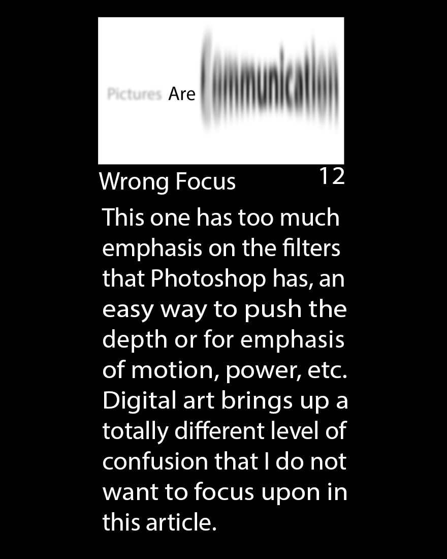
12. Wrong Focus – TOO Many Digital Tricks can lead to no focus, or the wrong part of the picture emphasized, namely the effects of the piece.
Try to design the image in traditional media, effects and all, learning how to develop a short hand for them so they do not become a rendering nightmare. Use the filters of digital painting only when they are not noticeable, and when you really have to use the blur effects etc. find a clever way to add them so they don’t look so much like all the other images that do use them, over use them, or rely upon them to make up for the inability to build them by hand.
Digital effects are cool but are procedural, which means they are always, and will always be the same or similar each time you do them. After a while, like a J.J. Abrams lens flare, they get old and predictable, cliche and dated very quickly. The best solution for any artist is to learn how to do it by hand, by observation, by memory. This will ensure that it is purely from within albeit inspired by external sources of reference. And you will be so much happier having done it “that hard way”, and so will your growing audience.
Share your experiences and thoughts on this subject, I’d love to read about what has challenged you and how you found a solution or a work around to get you out of the predicament. Also, I am inspired to write content based upon your input. I can find more interesting things to isolate, demonstrate, and break down with your help. What you contribute only makes these posts that much more meaningful so please feel free to leave input, questions, and curiosities regarding your work, your studies, or career changes you seek out for yourself.

Excellent article!
Great article Ron, as someone who transitioned from writing to painting being able to think about composition in terms of written communication is very helpful. It’s always very striking to me when I show someone an image that I think is saying one thing and they give me a completely different response to the one I was expecting. I suppose learning the principles of art; colour, composition value etc. is a lot like learning the vocabulary that you need to speak. If you try to form a sentence without understanding the language miscommunication is going to happen, or worse you’ll end up garbling something that doesn’t even make sense. I guess learning art is a lot like learning a new language, thinking about it like that makes it seem a lot less intimidating and mysterious.
Hello Ron,
I have been going over my composition notes from Greg, Todd, Marc Scheff and Donato’s classes over the past weeks and now you come with this great article. Your timing is nothing short of impeccable. Thanks.
Having gone through my notes has helped me further develop my composition skills, and with your article the “how” of my notes takes on a “why” aspect as well.
One aspects of composition that has been driving me forward is simplification. I feel I am moving more and more to a practice where I simplify the parts so I get the composition I want. I have come to think of any well executed art form as a way where a few well chosen accents contrasts beautifully with the rest, much like the spices a master chef uses to give a dish that little extra.
During class I saw it in Greg’s brushstrokes, Donato’s compositions or Todd’s “gorilla’s and chimps” (stars and co stars). But it’s also obvious in so many other works, not only of all the smartschool teachers, but also truly greats like Arthur Rackham, Bernie Fuchs, David Grove, Norman Rockwell, Leyendecker, Dean Cornwell , Frazetta and N.C Wyeth. I’d love to see your idea’s on this or even an analysis might make a great series of articles on composition.
Anyway, your article is great, and as you can see it’s really stimulating.
Thanks once again
Christof
Great article, Ron. Illustrating with font is a great way to clarify these points for newcomers without swamping them with all the things that are happening in a picture.
Love the break down! Thank you for the excellent insight Ron!
I?m not that much of a online reader to be honest but your sites really
nice, keep it up! I’ll go ahead and bookmark your site to
come back in the future. All the best