Greetings.
It is a huge honor to be on this blog which features some of the greatest fantasy and sci-fi illustrators in the industry. Before we get started I would like to thank three artists – Donato Giancola, Chris Quillams and Todd Lockwood – who have freely given of their time to help me improve, I owe them all more than I can say.
My career is five years new and I have worked mostly on interiors, a few cards, and covers for many, many small companies. I have almost no formal training, just an intense drive to improve. I love b&w and monochromatic works and this is a b&w tutorial.
I want to touch on some general points I think are important that you may not hear about very often.
(Disclaimer: The following statements in no way represent the opinions of Muddy Colors or its individual artists)
1.) Be emotionally connected to your model
Now I am not saying sleep with them, but get to know them as much as you can, carefully observe their moods in the same way you do the shape of their body. Have coffee with them, explain the importance of this to your mate ahead of time so there is no conflict.
2.) Get Inspired by watching movies
I look for works that blend environment and characters so well you are not sure where one starts
and the other ends ( just like speed lines merging characters and environment in the very best manga). Examples:
Director Werner Herzog-Aguirre – the Wrath of God, Fitzcarraldo, Cobre Verde
Director Terrence Malick – Badlands, Days of Heaven, The Thin Red Line
Director Akira Kurosawa – Dersu Uzala, Seven Samurai
Director Charles Laughton – The Night of the Hunter
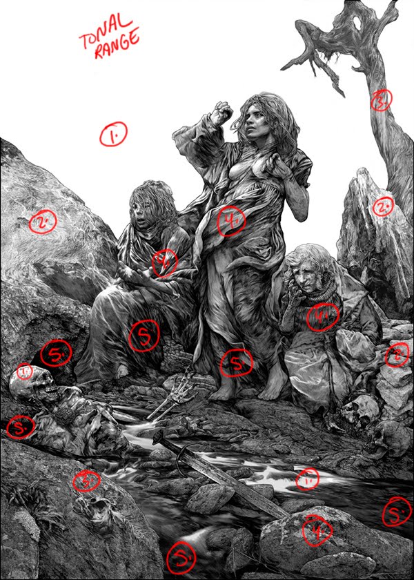
3.) When working in black and white less is more… but… more is also more).
Popular opinion these days says that one line can do the work of three lines if used correctly ( and that is true) and that if you put too much into an ink drawing it is a mark of amateurishness and just overworked (false). If you like working in extreme detail do not be intimidated by anyone who may mention this ‘opinion’ to you. Any process done right is right. All you as a young illustrator have to say is…
‘Durer, Dore, William Sharp, Joseph Clement Coll, Franklin Booth, Alan Lee, Bernie Wrightson, Gary Gianni.’
Do what feels right to you, practice hard and everything will work out.
4.) Pretend you are better than you are (only while working)
Embrace every stroke, tell yourself how wonderful your flow is, pretend you are slashing into that paper in a way that would put Rembrandt to shame. This will give you the strength to get through any piece no matter how difficult. Save the critique for when you are done.
5.) Live it, breathe it, see it. Every second.
The secret to being a great artist (or so the great ones tell me).
The patterns of broken concrete, the blending of tree roots and dirt, that nasty fly buzzing behind your sweaty back. Draw them, paint them, study them, but first, really learn how to look. Focus and concentration are king followed closely by endless practice. Sure, draw the hotties but then draw everything else.
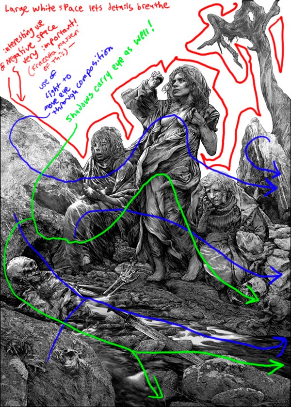
6.) Control the eye!!! (This is not a reference to O.M.A.C.)
Negative space, mild tonal variance, extremes of shadow and light all allow you the artist to push and pull the viewer along as you desire. Always have these in mind from thumbnail to finished piece. These tools are our gifts from the muse.
7.) Be humble
For all the tech and training we have available at our fingertips in modern society none of us are
William Bouguereau. Always remember this.
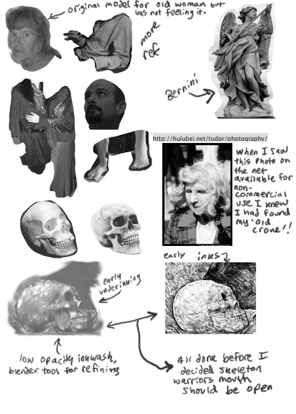
1a.) Reference
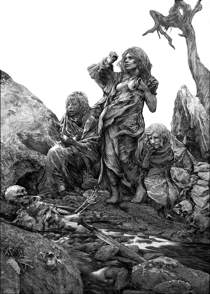
For this piece I was heavily relying upon Bernini, Alma Tadeema and Waterhouse (all masters of fabric and everything else for that matter).
2a.) See the differences
Rendering all rocks, trees, fabrics in exactly the same way is very tempting but everything is different, nature is full of variety even if they are only small divergences. Note the subtle variations in the inking from the river rocks to the middle ground rocks, to the tree and the
three types of fabric. Be careful on this point because straying to far from the central style will make the piece collapse as a whole. Risky business but an exciting challenge.
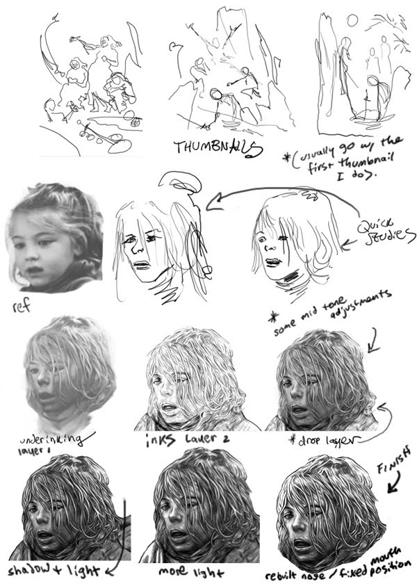
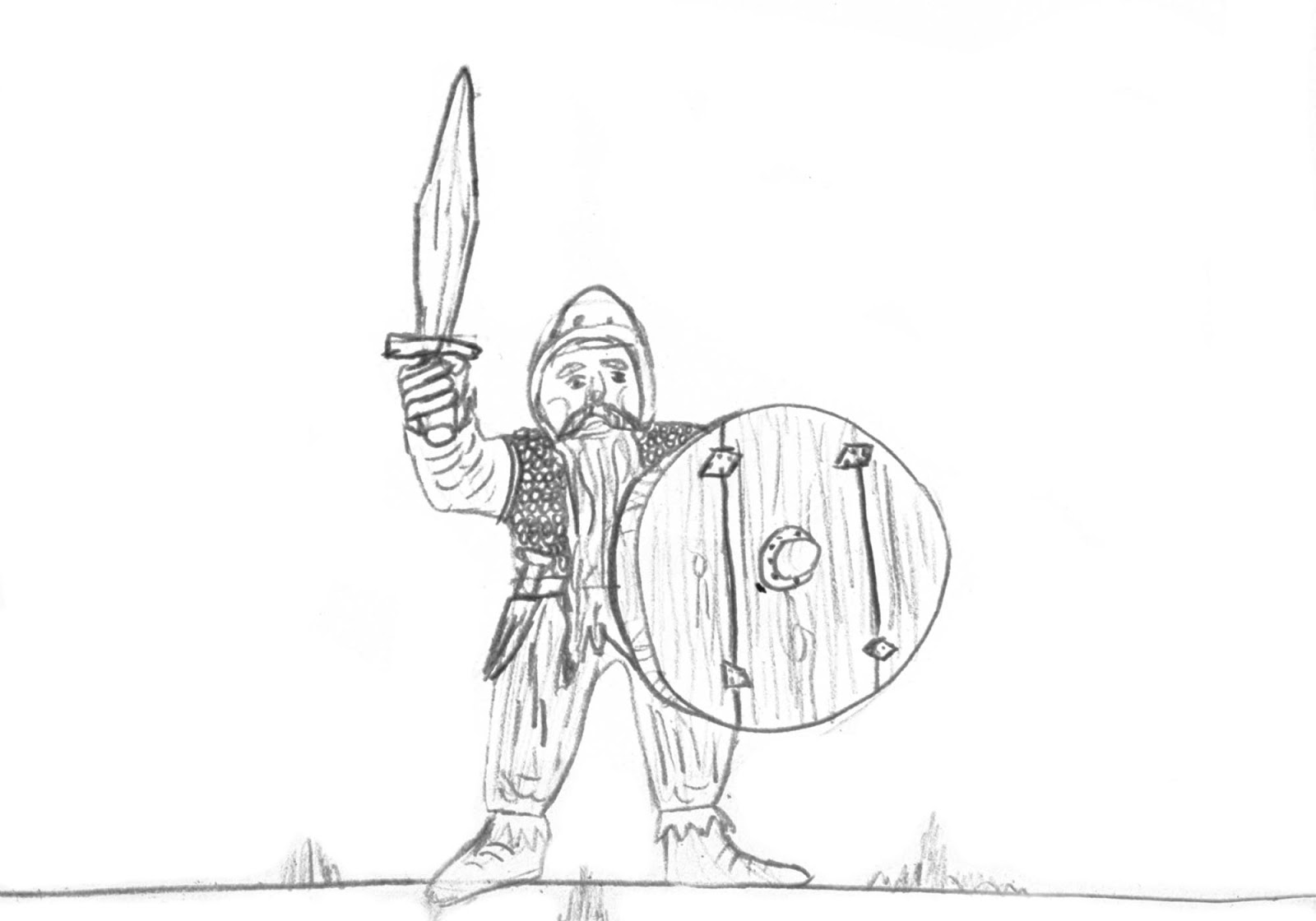
Now… Onto the meat. Below are thumbnails, process, details and final 🙂
Pretty straight forward… Inspiration, thumbnails, photoref, layer of under-inking in greyscale, second layer for 100% black line work and highlights, third layer grid (optional).
Thank you Muddy Colors collective!
This is a tutorial/study piece done specifically for the Muddy Colors Collective and is not a commercial work of art for sale. Anyone who wants a larger file for personal reference feel free to contact me (my blog listed above). This image was created with the intent to freely share with everyone in the sci fi/fantasy community that we all love so much.


Wonderful post, Nate!
Thanks for taking the time and being so thorough.
Great stuff Nate!
I just wanted to chime in with a recommendation, if one were needed beyond his appearance here, for Nate as a commercial artist as well as a brilliant draftsman/illustrator. I've had the pleasure of working with him several times in my capacity as art director for Cubicle 7 Entertainment, and Nate is an absolute powerhouse of reliability and speed. I always look forward to seeing what he's going to turn in next.
Keep it up feller!
Love this, added a bookmark. Thanks for sharing this!
Very cool! Thank you for sharing some insights into your working method as well as some sage advice.
Very Nice Post. Love your attention to detail. Keep it up.
Thank you Mr. Dos Santos for letting me post, maybe the most exciting morning of my life to be among the great illustrators of fantasy if only for a moment…
Thank you for the support Jon (as always)…
Peter, Jared and John… Glad you all enjoyed this, I pretended I was doing an underpainting for Mr. Giancola and that helped me work through this complex piece (good to play tricks on ones self to push through tricky works).
Nate, this is pretty cool. You definitely have a good mix of black, grey, and white. I was taught to keep a good mix in my own work (working in black and white is more important to me since I draw my own comics series). Nothing stand out in a picture full of greys, etc.
Thanks MAx, glad you liked it.
Such a stunning piece of work and a fabulous tutorial, Nate. Thanks for this awesome post! Your work is pretty amazing for being a self-taught artist. I appreciate your process in trying to get everything balanced – so much going on in the background of the work. 😀 <3
Thank you very much Jaime 🙂