-By Justin Gerard
For this post and the next I will take a break from shameless self-promotions to share some process work.
Over the years, my process has mutated from the clear and straightforward approach of my early childhood:
Step 1: Tear page from coloring book.
Step 2: Turn page over and apply crayon directly to back of paper.
..And turned into an overly-complex and technically absurd mess that it involves hundreds of extra steps and expensive, new-fangled products.
So, I will break this into 2 parts to keep things more manageable.
Today’s post is the traditional side, the place where I begin most of my work, and my next post will focus on the digital side, the place where I end most of my work.
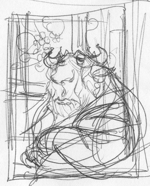
Thumbnail
Ink on napkin
The conceptual stages are generally just exploring ideas to help find a compositional arrangement that seems pleasing. The tools used for this change from image to image. For concept-work I go with whatever works.

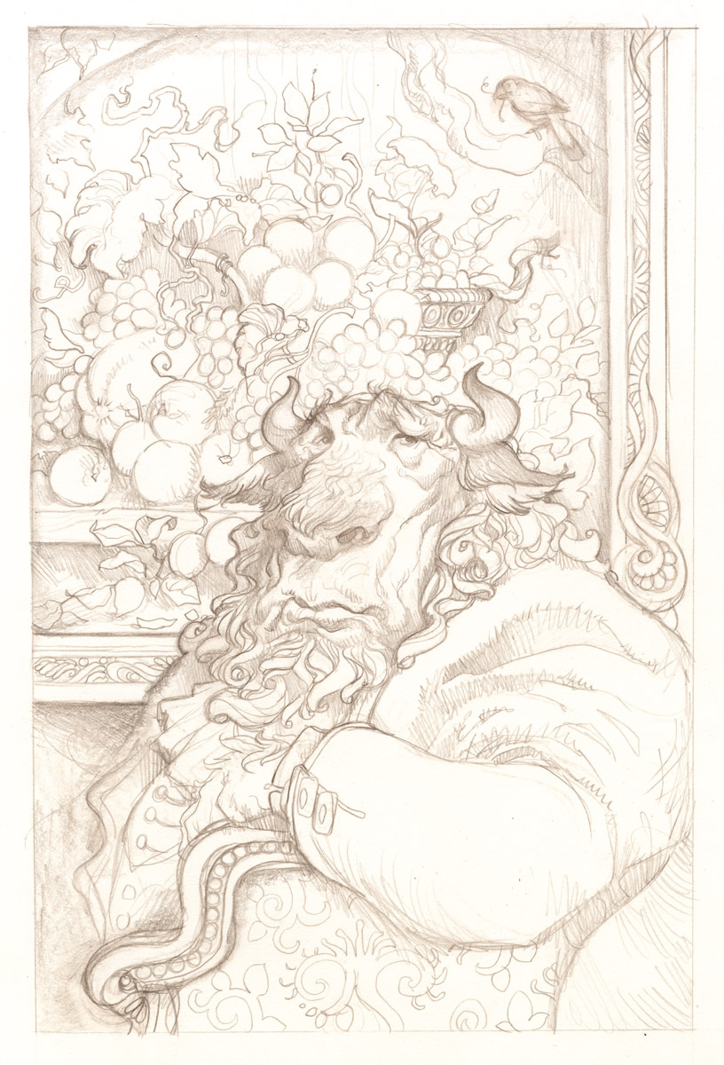
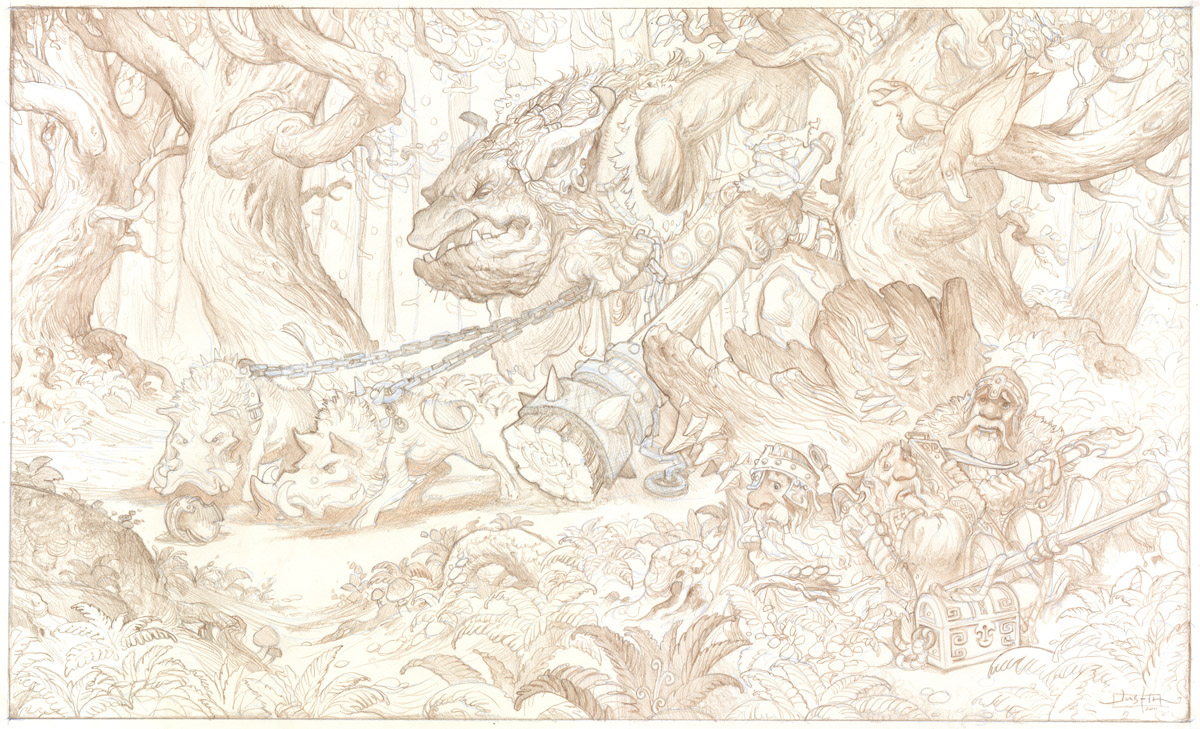
Rough Drawing
#7 pencil on copy paper
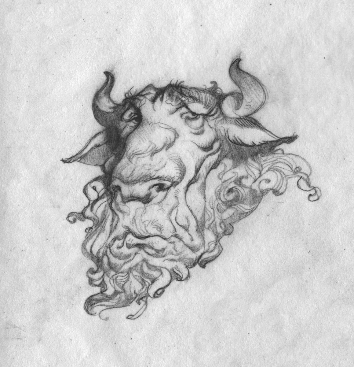
Once I establish a rough drawing that I like I do studies of most of the faces and figures. I will try to really nail the expressions that I am after. I always consider this one of the most important elements of the image. As Rockwell pointed out, “if you get the face and hands right, they’ll forgive you for the rest.” So if I have a face in the image, I try to make sure I have it established in a study somewhere.
And if it hasn’t already been determined, these studies will help me to decide which lighting arrangement will be the most advantageous for the characters.
Study
Pencil on Strathmore Bristol
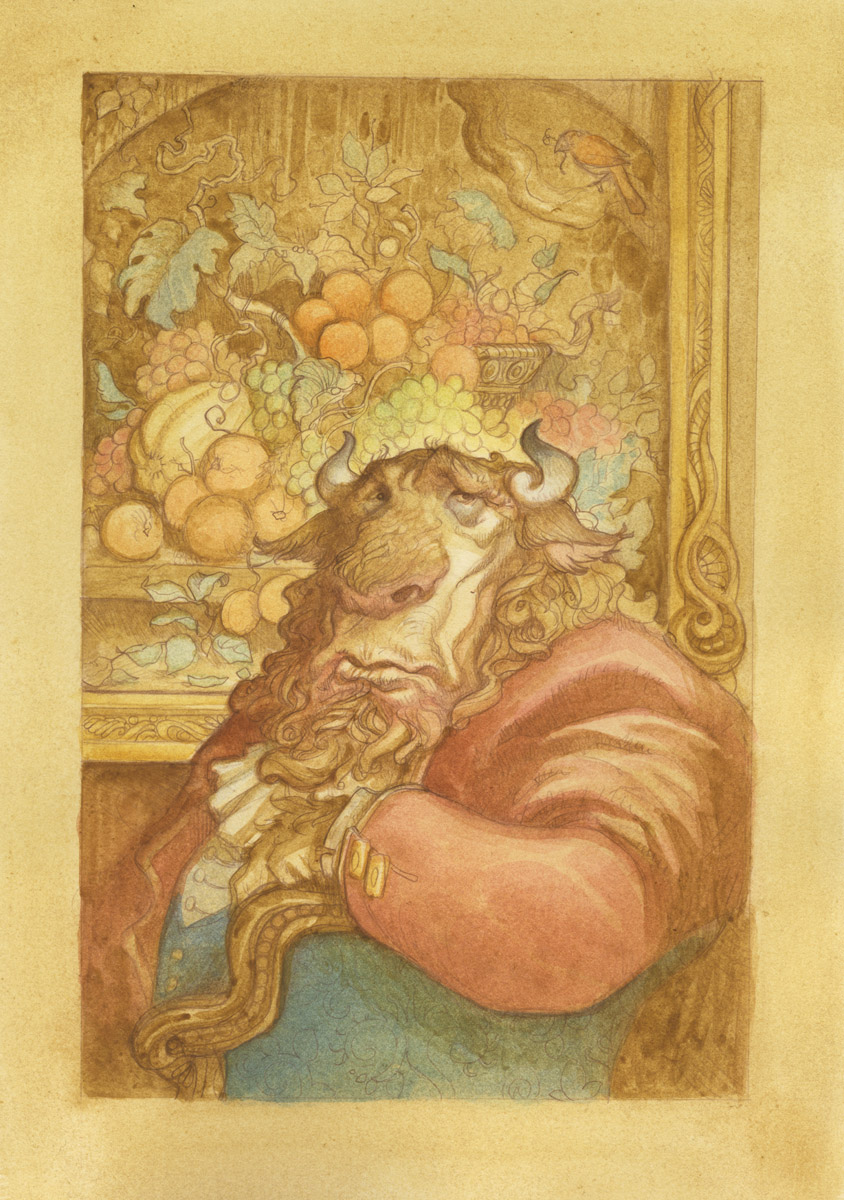
For the watercolor stage I stick very close a process laid out by Peter De Seve in his excellent Step-by-Step Graphics article (Vol.10, no. 6) about his technique. (I highly recommend it if you can find it.)
De Seve’s overall method in the article carries a great emphasis on preserving the drawing, which is one of the most alluring aspects of it for me. You can see from his work how well it allows him to play up his characters expressions and designs.
I will sometimes (and this is one of those times) apply workable fixative to the drawing before starting the watercolor. Fixative will leave the surface a little less workable for the watercolor, (the surface tends to be less absorbent) but will keep the drawing much more intact. Since I weep bitter tears to see the drawing slowly disintegrate, I am generally willing to risk it.
The watercolor process begins with washes of earth colors to tone the paper, applied wet into wet. Then after this has dried color and value are slowly worked up with about ten thousand tiny washes applied wet into wet or wet into damp.
One of the nice things about this approach is that it allows folks like me, who have a foggy command of color at best, to experiment a lot as they work. If a color doesn’t look right it is really easy to adjust.
After this I panic and then throw all the old illustrator tricks at the piece in a last desperate effort to save it.
These tricks include, but are not necessarily limited to: Ink, pencil, acrylic, markers, badgers, lawsuits, incantations, harsh language, oaths, gouache, threats and even blows.
Next Post: Digital Trickery


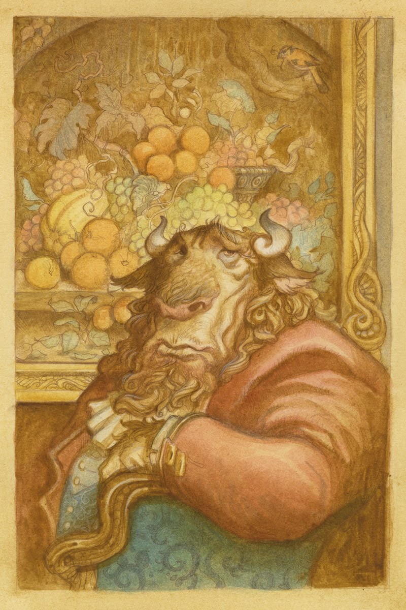



Great post, Mr.Gerrard! Beautiful drawings, as usual, and I love your Minotaur. He's a looker.
You got me looking for that Peter de Seve tutorial, and I found this link in a conceptart thread…
http://www.mediafire.com/file/521mto…DeSeve_tut.pdf
I'm looking forward to part two, unless it's the same as step 2 from your early childhood…
Sorry, the link should read:
http://www.mediafire.com/file/521mtojnmz0/PeterDeSeve_tut.pdf
So what if you want strong contrasts in your illustration? You will lose the drawing then, I guess…
Justin, fanastic! Allow me to nerd out a bit with materials and process here. How much of the De Seve's transferring process are you following. Which Strathmore Bristol are you using, and why bristol? What are your thoughts on a workable fix rather than a permanent fix? For me the workable fix doesn't hold my pencils as well as the permanent. Thanks for blogging good sir!
Jonny, you rock man. Thanks for the link! I love this article. This was such a helpful article for me when I found it. It totally changed everything for me.
Hopefully my part 2 will be slightly more informative than part 2 of my childhood method, but I'm not promising anything…
Wouter, It's true, you do lose the line if you want stronger contrast in the original and that is what holds me back (since I prefer to get the contrast in the digital version). However, De Seve gets by this by taking his original a few steps further (as you can see in the article Jonny posted) He uses pen and ink to reinforce the drawing so that it can keep up with the increasingly darker and darker watercolor washes.
Nicholas,
I am not quite as rigorous as De Seve in the transfer. His method is great and it shows a truly exceptional care of the drawing, which is awesome, but it does require more patience than my raised-on-video-games-and-captain-crunch mind can withstand.
So I transfer a little differently. I use a sheet of Canson tracing paper covered heavily with conte pastel (umber) and then place it over the watercolor paper. I then place a printout of the drawing over this and trace the lines with a 6h pencil.
The reason is mainly that I work on heavyweight strathmore bristol (any of the heavier sheets will work, I believe this one was 4-ply) It is a really smooth paper and it is a pleasure to draw on (so I can really refine the drawing after transferring it). In the article, De Seve is working on cold press and he says that he doesn't care for drawing on the surface of as it steals some of the life from the drawing. I agree with him and this is partly why I avoid cold press altogether for really detailed watercolor illustration. The drawback to the bristol (vs.cold press) is that there is a little less life in the actual watercolor.
As for fixative, I find that the permanent fixative locks out too much water and that the pigment puddles up on the surface in a disagreeable way. It becomes unworkable. And while workable fixative isn't quite as solid, it does hold the line really well. And since I always go back over it in pencil at the end the slight fading doesn't bother me.
Thanks for sharing Justin; I remember reading that Step-by-Step Graphics de Seve article when I was in college and it blew my mind! Thanks Jonny for unearthing it.
As far as paper surfaces, I think hot press watercolor paper is the nicest surface to work on, I'd reccomend Arches. It's so smooth to draw on, has a bit of forgiveness to it to rework the drawing and with watercolor, you actually have to work pretty hard to lose the drawing. I'll have to revisit the de Seve article, but I think he has a step where he soaks the paper, which embeds the drawing in the fibers of the paper; if you're working on multiple projects at once and have the set-up time, it seems like a nice alternative to the workable fix.
Justin – Thanks so much mate. I really appreciate the insight. I also don't like drawing on watercolor paper, so to hear that you are water coloring on Bristol is pretty neat. I will have to try this.
Illworx – I noticed the soaking in the article as well to preserve the line drawing. Now he did mention he was using a secret pencil. May that also be what is helping with that. Has anyone tried the soaking technique to preserve pencils?
Ah… the secret Brown Pencil…. ooooooWWWWEEEEoooooo!
Peter was supposed to have a tutorial video released by Massive Black.
I know they filmed it, but I don't know if it was ever produced and sold?
Maybe Dan might know something about that?? since he's made one with them as well???
re: tricks: badgers . . . hmmm, I may just have to try that on sculpts that don't go the way they should.
Wow, your transfer method sounds like it works a lot better than just applying a 6B graphite stick directly to the back of the printout and then retracing the drawing on the watercolor paper after the initial transfer.
Do you ever have any problems with the conte pastel smudging the watercolor paper due to your hand resting on the surface during the transfer?
Arteast,
After I apply the conte to the paper, I will brush the surface really lightly with a paper towel and then blow off any remaining dust. This will prevent most of the smudging you refer to, but it will also result in a much lighter transfer. I end up redrawing most of the piece anyway, so this lightness doesn't bother me.
Cool! It's nice to see that traditional tools are still being used in these times, where computers are considered all the rage for making artwork.
After looking photos on the article posted by jonny closely, I'm quite sure that the “secret brown pencil” is a Derwent Drawing and I bet it's Chocolate 6600 colour 😉
I love your work so much. I've been wondering about your process for a long time now. Thanks for sharing!