By Justin Gerard
The color comp is done as fast as possible. I don’t want to get bogged down in the details here. This is all about the mood and atmosphere.
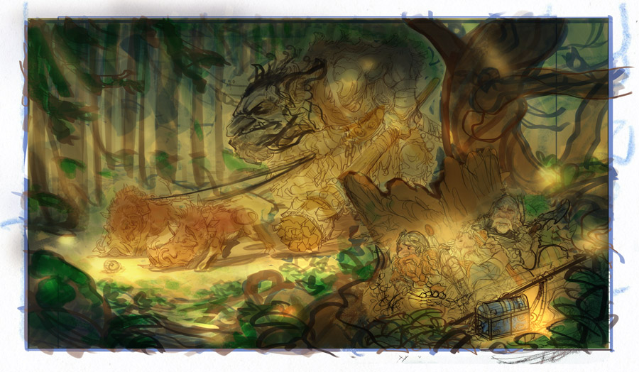
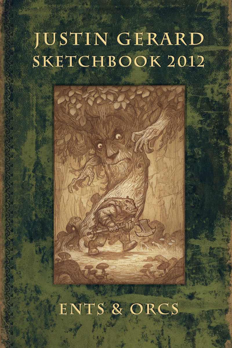
Color Comp
The main goals of the color comp are:
#1 Nail down the lighting.
(Sources, direction, strength. etc.)
#2 Nail down the value relations.
For instance, the tree behind the dwarves: is it more attractive as darker than the background or lighter? By exploring and solving this in the color comp I will be more confident when I tackle it in the final image.
#3 Nail down the color theory.
This image will be confined to a warmer spectrum, one that you might find at midday in an old growth forest with patches of sunlight breaking through the canopy. I wanted to make most of the tones fall in a rather narrow color gamut, and then choose a bright color outside this gamut as an accent. In this case, it was mostly golds and browns accented with a bright green.
In the color comp I just want to make sure this theme will work for my image. I go through this on almost all of my pieces because my brain is incapable of solving value/color mixtures on the fly, so I need a cheat sheet. The color comp helps me idiot-proof my image so I don’t bungle it in the final.
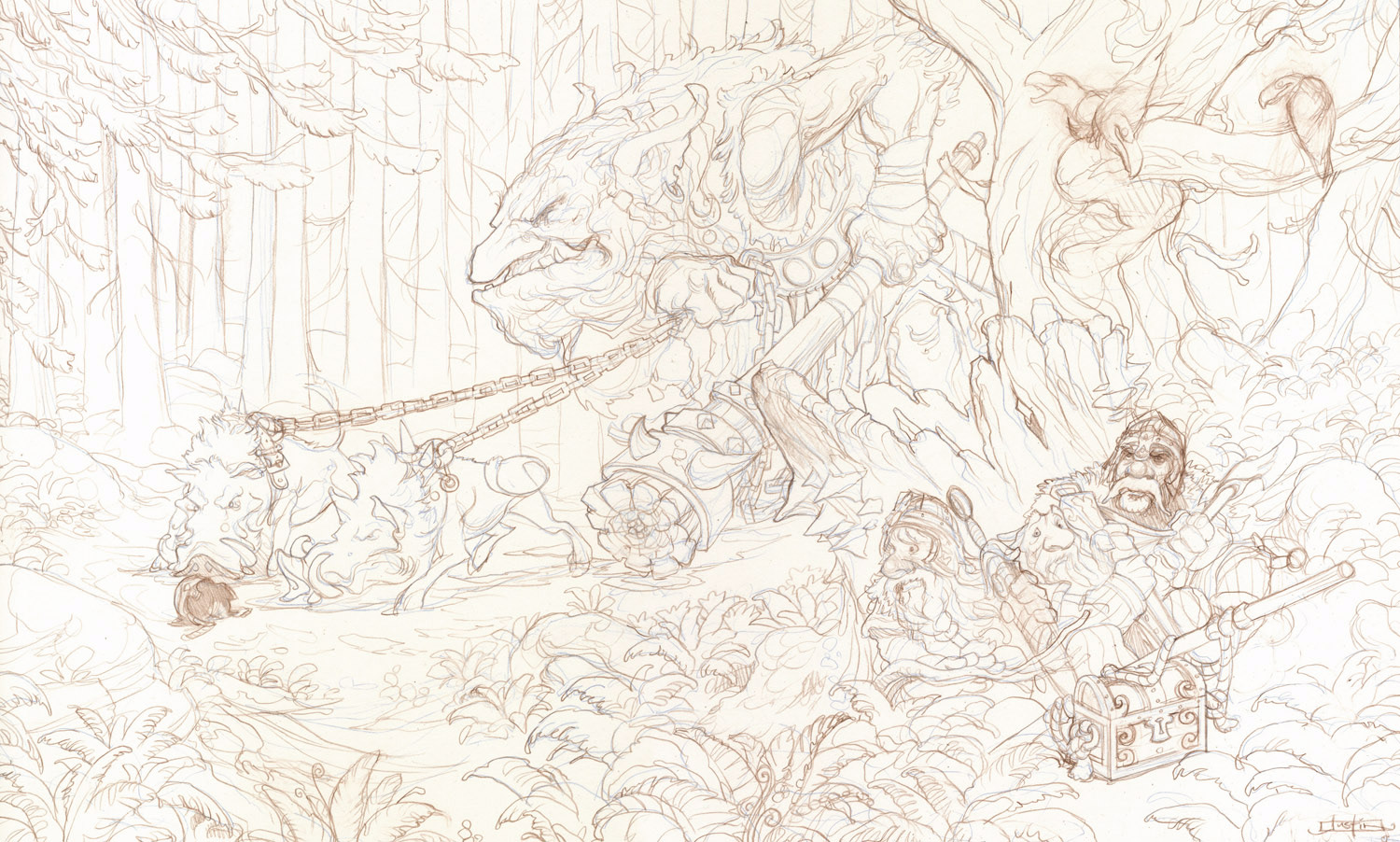
Tight Drawing


Am so looking forward to this one!!! 🙂
The trees behind the troll, will they be light fading into a dark background? John Bauer used to do this in a great many of his paintings and imho it creates a very nice sense of mystery. More so than a sunlit landscape showing through dark trees.
Those crows are going to spoil the day!!! 😉
Nico said… “Those crows are going to spoil the day!!! ;-)”
Not for the Troll! ; )
This is looking great Justin, I cant wait for the final!
Great work Justin, it's always great to see your process to reach a final, will you do this one in watercolors?
Ruivo,
I will be doing this one in watercolor and pencil, with maybe a little acrylic.
Nico,
I totally agree that having the background behind the trees fade to dark adds such a great mystery to a piece. Bauer's use of the effect is wonderful. Dore also used it to achieve a similar feeling in his etchings.
My initial inclination is always to use it any time I can, but I am not sure if I will play the deep background woods up as much here. I am worried that if I do it will fight with the other narrative elements in the scene (which may have a slightly different mood to them).
We will have to see though. I really love the effect it can have…
Hi Justin. Love the story in this…the “hounds” sniffing the helm. Really creates the “what happens next” moment. Can,t help thinking you should have some branches or a tree trunk in the foreground, maybe even breaking into one of the characters. Bit more foresty you know and not a path in a park. Very random things forests…….
Hope you don,t mind me saying! Looking forward to the next bit.
Hi Paul,
Good point. I do think something to break up the space between the foreground and mid would be helpful, especially on that left side which still seems a bit weak.
very promising work so far, looking forward to the final!
in your value study the bright light spot on the dwarfs feels way too overpowered though. I think it would add a lot of atmosphere hiding them in the shadow of the tree with very subtle value changes. that way you could let the viewer “discover” them, maybe even distract the eye by small patterns of light falling through the leafs.
cheers,
Mathias
@paul bonner @justin I think that the branches in the upper left corner are starting to achieve that effect. If there were some way to bring them forward maybe by making them slightly lighter and then maybe add some on the right closer to the dwarves I think it would break it up some. Another idea is to place a few branches between the troll and dwarves where the trunk of the tree is to further conceal them from view. Just some suggestions – I'm excited to see how this turns out!
-Will