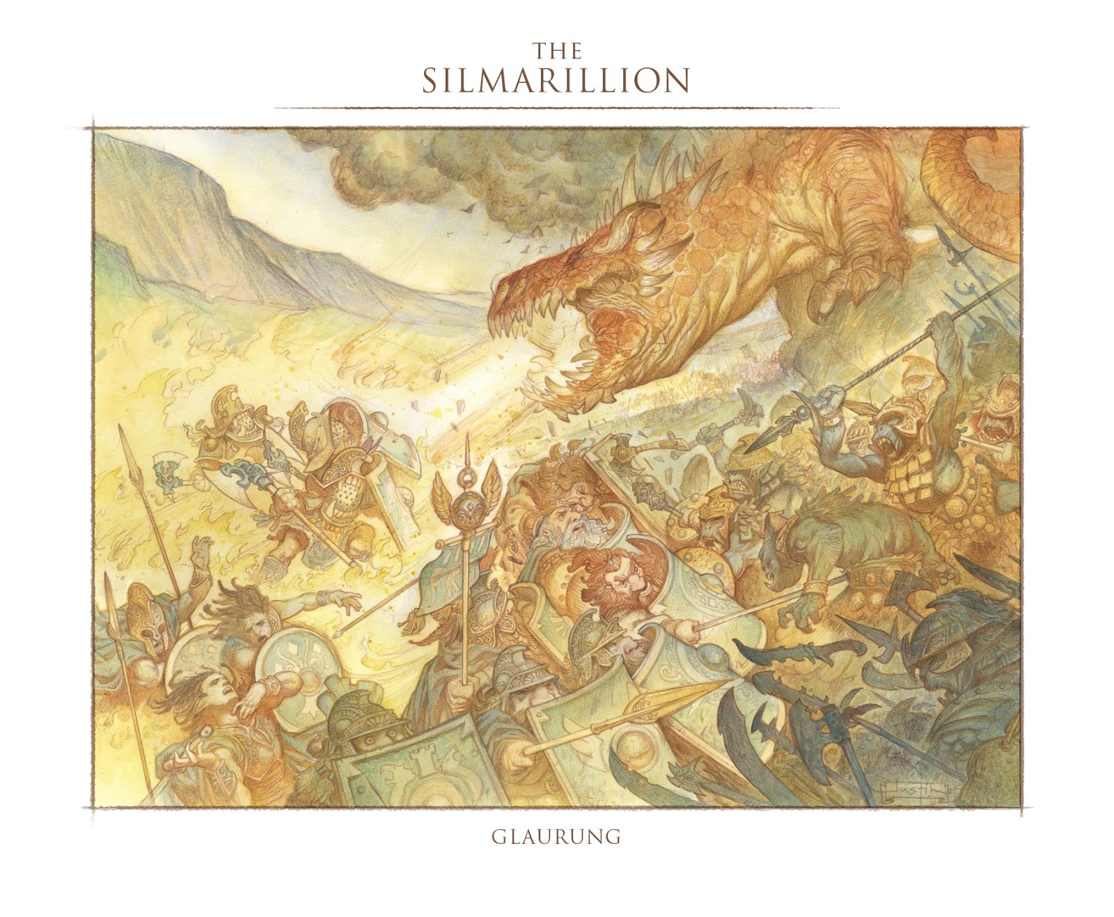
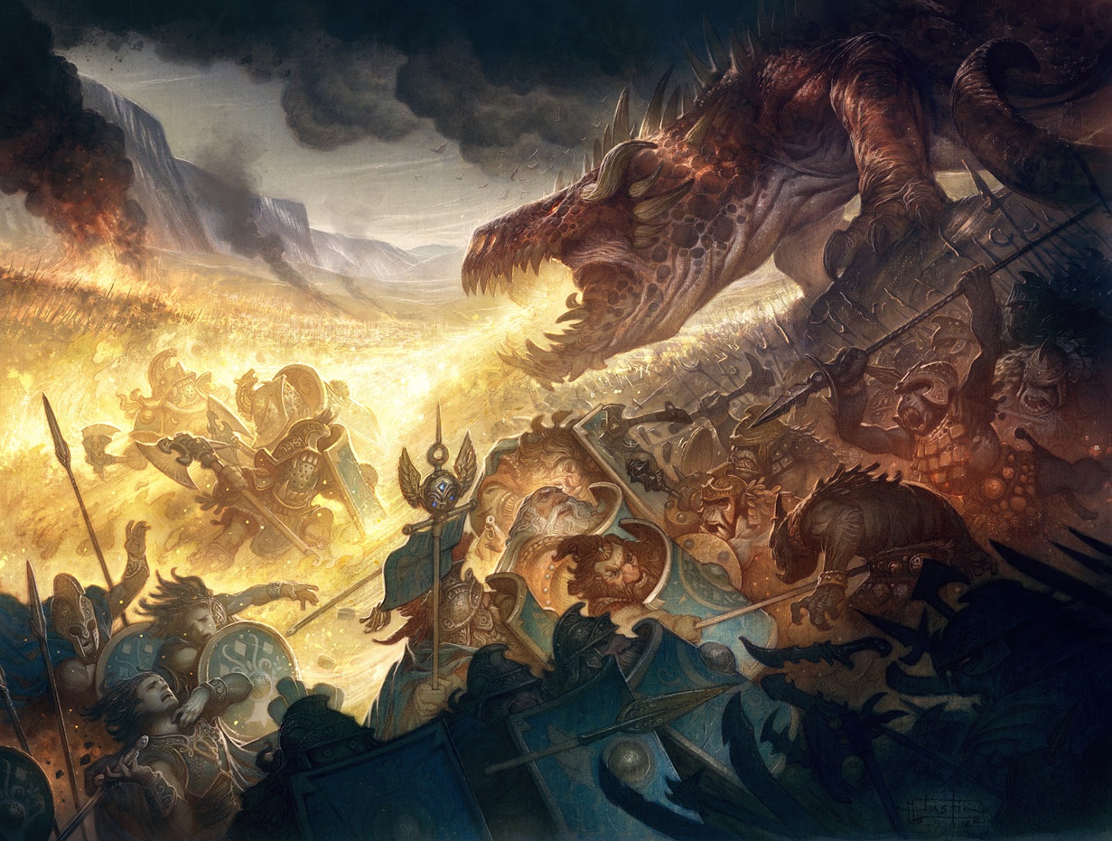
For a long while I have been wanting to go back to several pieces from the Silmarillion and monkey with them digitally. This image of the battle against the dragon Glaurung in particular was one that really kept coming back to mind.
Most of the time I am really against this sort of thing. When it’s done it’s done, and should probably just be left alone. But other times, I just don’t feel like I ever truly caught what I was originally shooting for and it bothers me.
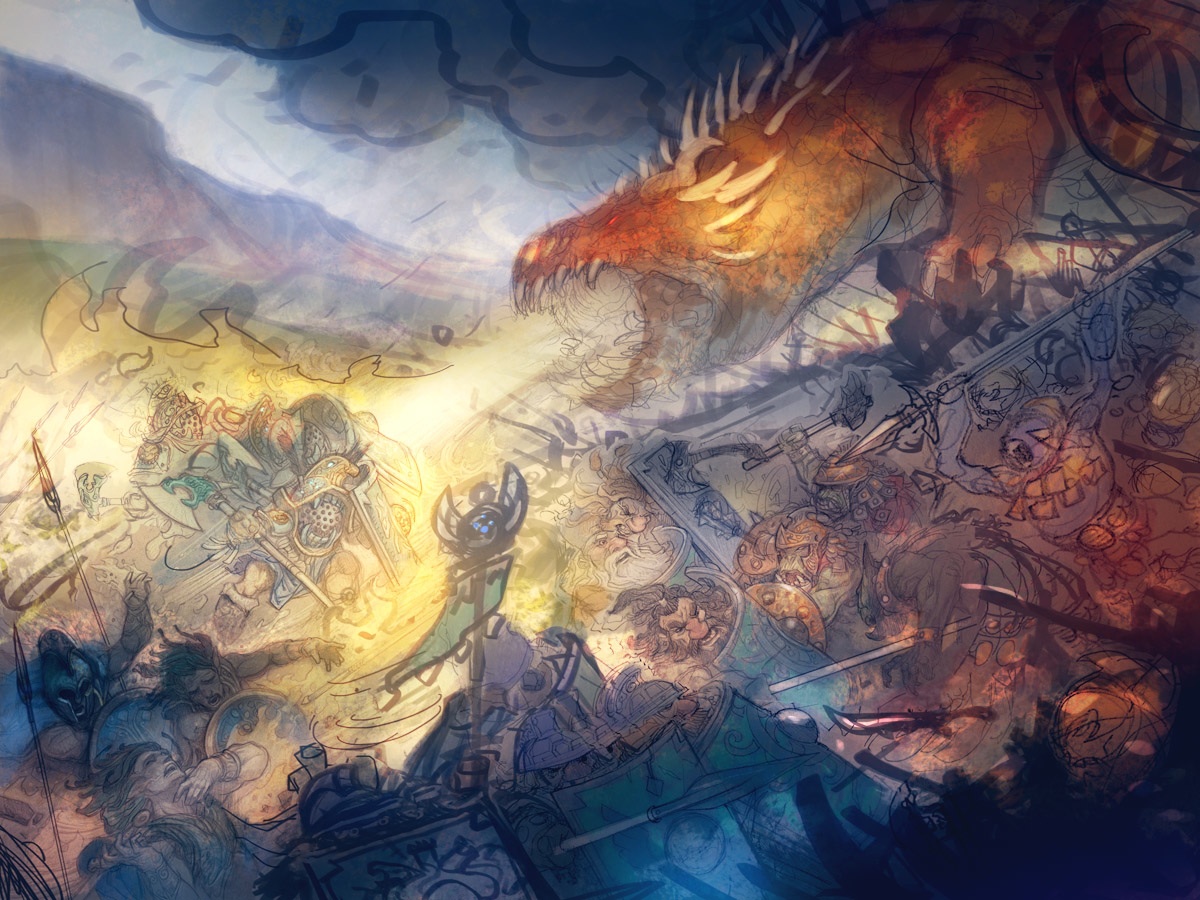
For this one, I had always wanted to hit something a little closer to the digital color comp.
I still really like the original watercolor for it’s old manuscript feel. But here again I can’t help but tinker with the colors and values digitally to push them into a higher range. I’m not sure which version I like more, but the digital one is always the one that is closest to what was in my head when I originally set out to create the image.


Think its nice that we aren't forced to actually choose a preferred version. Both are really nice and if there were 2 illustrated versions of the Silmarillion … I would have to get both.
The shafts of light on Glaurung are incredible! It makes him appear much larger and menacing. Wonderful work, Justin!
Love the depth and the color gradient through out the picture. This is a beautiful example of how to direct the eye's attention.
Great work.
Stunning Justin. What a dramatic difference! From what was quite a pastoral little summer jaunt that the dwarves were on – to a world of darkness and pain, thanks to a dragon that, now, really knows how to make an entrance and look good doing it.
Save a print for me…….
Brilliant- to succeed in one arena is a triumph but these images show victory in three.
It's also a great demo of how digital and natural media can be best buds. I guess the process could equally be reversed- a digital drawing, printed on to suitable paper and then watercoloured?
I guess most art directors now would plump for the amended version on grounds of increased impact, though I love all of them.
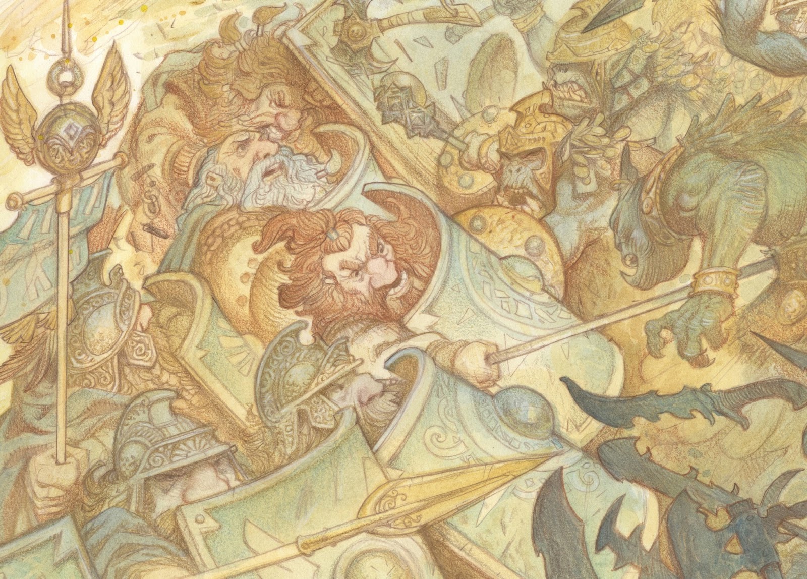
The sunlight area on G's neck in 2 is so beautiful. It's nice to see you kept that in while ensuring the focus is on the flame in 3.
OMG dat Dragon!!! Dude, we all expect a lot from you but I honestly am stunned! This is more epic than Thorin's battle with the Pale orc. It gives me chills! That glow and atmosphere… m/
I agree with Paul – it's stunning, and I'd love to get a print of this. The watercolour is lovely, but you've really throttled up the power in the new one. The value handling is… well, insane… and you've somehow been able to add hundreds of characters to the scene and yet still keep that area structurally simple.
Glaurung really gained some gravity (and yeah, those light shafts – wow!) and the various story moments around the foreground are nicely highlighted without feeling like they compete with each other or the dragon. The smoking blaze at the far left manages to balance the entire dark mass at the front right.
You definitely made the right decision in going back to this one, Justin!
I think what we are saying is that the light tells the story. It certainly does in the second one. The drama, pathos, focus, tension and overall story-telling power are amped up considerably by your increased use of color and contrast.
If I wanted to tell the reader a rosy tale of glorious deeds long past I would choose the first. But if I wanted to grab them by the collar and throw them into the middle of the battle, having them feel the pain and terror and the madness and helping them see the lessons I wanted them to learn, I would choose the second.
I think what we are also saying is that this is one great piece, either way (two great pieces? 😉 . That dragon — sheesh! Well done.
This is fantastic, Justin.. I've already went back to look at it several times today! The story is clearer in the digital, although the watercolor is wonderful in its own way. Paul described it perfectly 🙂
What really strikes me is the use of color “spots”. There's a blue patch, a big warm orange one and a small orange and then of course the yellow focus etc. haven't really seen that done so obviously before, but it works. I learned something!
Can't wait for your lamppostguild demo 🙂
While I do like the light/dark and color contrast better in the “remixed” piece, I can't help but feel that most digital images are homogeneous since the marks all go through the same algorithms, which is my critique here — Your lines and marks in the original piece seem to get lost. Now, thankfully they are not completely lost, as is often the case with 100% digital paintings, so that is a plus.
Over-all I think that they are both gorgeous… a tad more than I could muster, to say the least.
Thank you for all the great feedback guys! I was kind of nervous about some parts of the piece and I am relieved to hear that what I was shooting for seems to be coming through. I really appreciate the feedback!
Hey Paul – I got one with your name on it!
I do like the first version for the same reasons that you do, but that digitally revised one is freakin' GLORIOUS. Really gives a much greater sense of space and feels like a large battle scene. Excellent job and thanks for sharing!
Im curious about how you made the shift. Did you take the pencils, scan them and color the pencils, or did you scan the water color version and paint over that? I've tried to digitally paint over acrylic paintings before and I wasn't really sure how to keep the feel of the acrylic while making it more rich and powerful like you have.
I use acrylic in washes, similarly i guess in some ways to watercolor.
Great work, both in watercolors and digitally retouched piece, I'm surprised the qualities of textures and contrasts added in digital and I love the same things in watercolor good job
Cool post. It's nice to see that there is merit in having both a limited tonal range and an extreme one. Also just wanted to comment and say this is an awesome blog. I end up wanting to bookmark half the posts because I think they're something I need in my knowledge bank. Thanks, keep up the good work!
http://emersongreenesmith.tumblr.com/
Beautiful as always Justin. I think it's wonderful that you can have a manuscript watercolour feel and then a large value range digital painting out of the one piece. Evidence of your versatility. Just jaw dropping work!
Great looking artwork…
when you're done with it, can I have your brain??
ZOMBIES IN THE COMMENTS! WHERE ARE THE MODS?
great change in value and in creating a dynamic composition at the same time.
1. do you scan or take a photo of your painting?
2. what is the resolution of the final image?
3. how many layers do you work with typically?
i teach high school art,love the site and show my students and use your (everyone on the site) tips and “tricks” in my lessons. this site is very useful in teaching my students (and myself). thank you
1. Scan. On an ancient Epson GT-15000 that has been with me since the dawn of time. I never get as good a result with photo for watercolor.
2. 300
3. Literally 300 to 400
I hate to use a catch word that gets tossed around far too frequently these days but the digitally enhanced version just looks more epic. I love the watercolor art and it's a great picture of a war party of dwarves that got caught by orcs and their dragon. The redone version however has the feel of Tolkien's great Lord of the Rings battles with darkness spreading over all both figuratively and literally. Puts me in mind of the way he describes the siege of Minas Tirith. Peter Jackson could have used your color palette for those scenes, although I suppose he figured he'd already shot the Helm's Deep battle in the dark.
Great work, Justin. Thank you for the look at the remastered version.
Best Wishes,
Aaron