Ejsing
painting and drawing them. Mostly because they let you get away with very
twisted and abnormal body proportion and features. Actually the more elongated
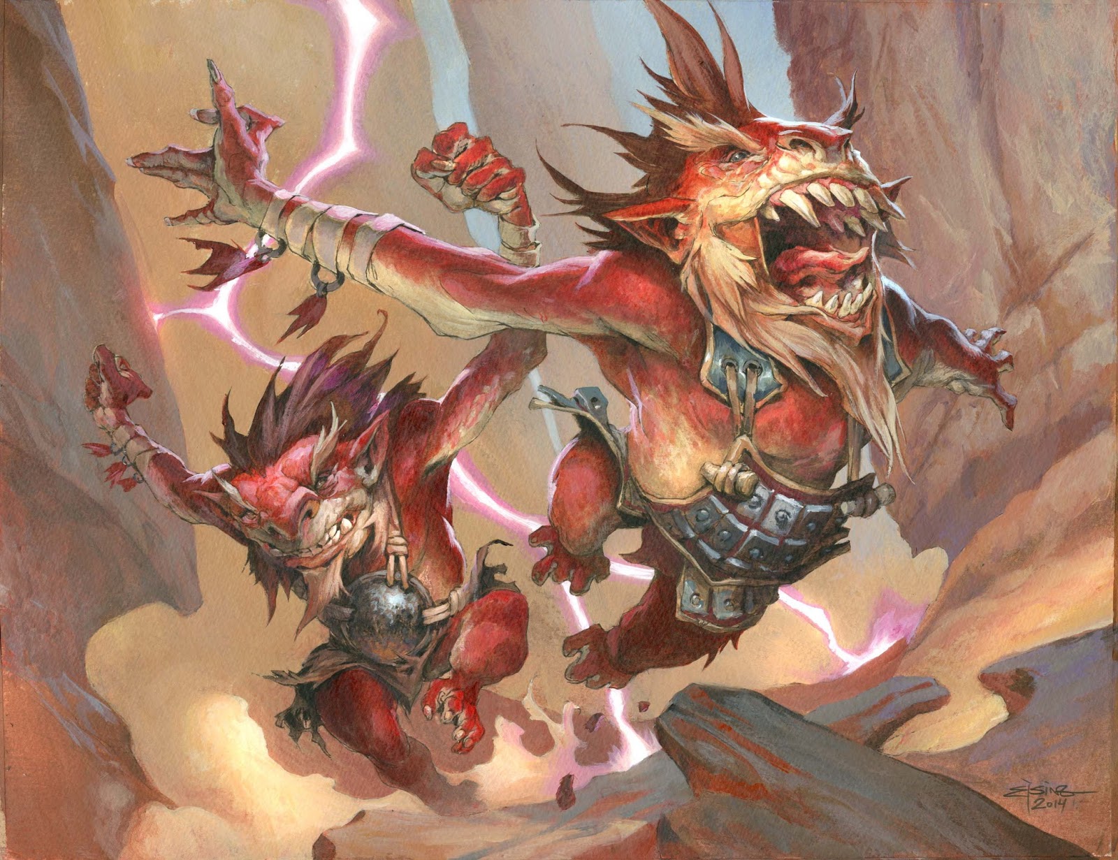
and too much the better, if you ask me. I was going to paint 2 Goblins for
magic, both running like crazy dodging bolts of lightning (The lightning comes
from dragons, thus, the title of the image)
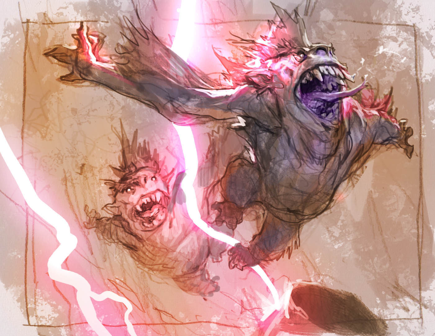
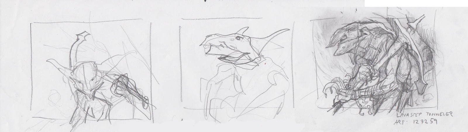
I am
currently in the middle of a period of trying to push my drawings to be more dynamic
and the figures to be more in mid motion. So these 2 guys in the sketch came
out as almost flying from the ground. I was definitely thinking them as running
from their life jumping high and skipping from rocks and cliffs. But my dear
art director Dawn Murrin pointed out that the way they were flying and, with
almost no ground surface, it looked very much like they were being struck by
the lightning bolt, screaming in agony. The very crude astounding expression of
the front goblin enhanced the reading that he was being killed by the bolt. She
suggested that I added ground, changed the expression and made them more
running less flying.
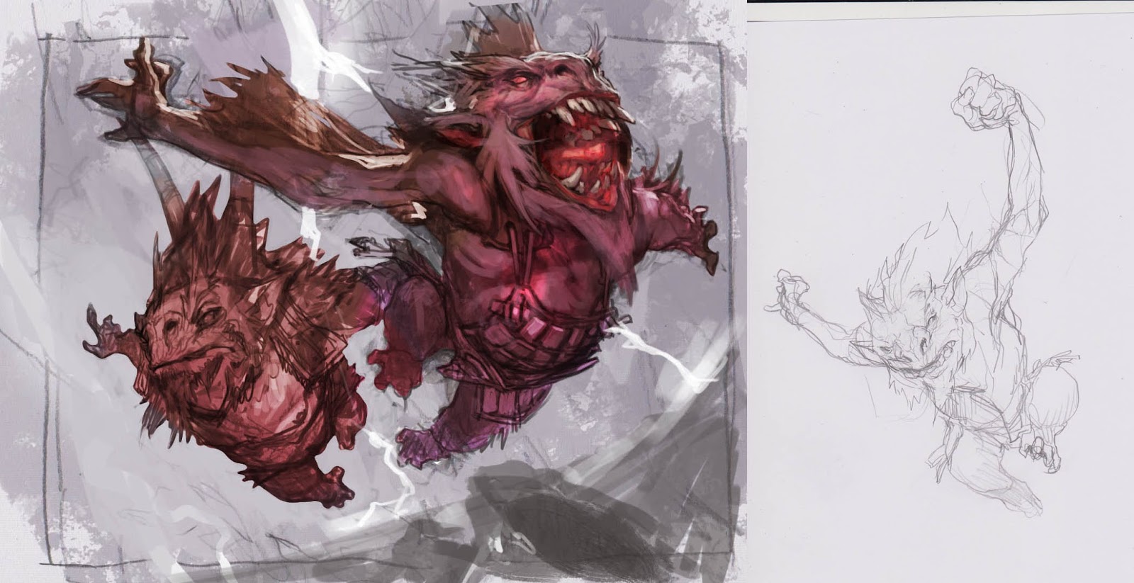
search for absolute dynamic, I had missed the clearness of the storytelling. I changed
a lot of the smaller things she suggested and then went to redraw the goblin furthers
away ( I really liked the front one a lot and only changed his face )
the back got grounded, the bolts shown actually striking the ground and the
stone they were running on closer to the feet…but still the back goblin did
not look right. I think there was something “Fishy” to him and too
little motion. So I drew a thirdv version. One with raised arms. When doing new
sketches of figures I have to shuffle them around in the composition to make
sure there are no tangents. I want every outline to read clearly, every
compositional element to read either in front or behind eachother. Either clear
of the outline or cut at the clearest angle.
I was going
to paint this one digitally, and as you can see in the sketches I already
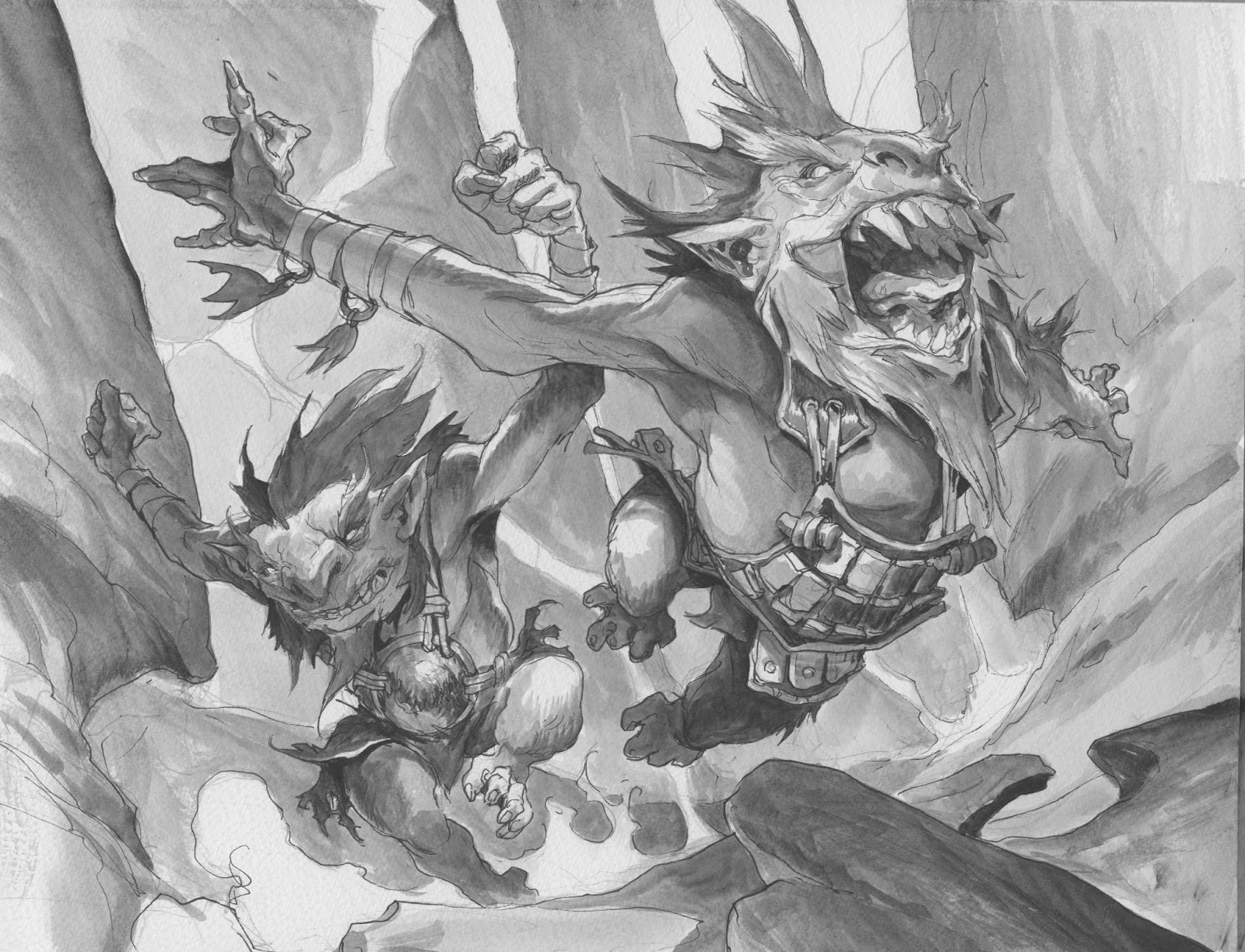
started at the colors. But this was begun when I was in-house at Wotc and had
to be finished when I got back home. when I returned to Denmark I had
been staring at a screen for 12 hours a day for 3 weeks concepting magic and I
really really missed having paint on my fingers and brushes in my hands. So I
abborded the digital version and transferred it all to paper and did my usual routines
of greytoneing it all in line and values and then washes and then thicker paint
and so on and so on. What I had in my
mind from digital painting was that I should try to avoid too dark, especially
black areas. So I imagined all to have a bouncing light reflecting up from the
ground. You can see that in the metal plate on the back goblin and especially
in the rock surfaces pointing down. The grey streak of sky colour acts as a
neutral contrast to all the warm colours. The grey is good for being like an anchor
for the other colours to match up against. I knew the lightning bolt would have
to be pink ( cold ) so I went with warm colours for everything else and used the
grey as a neutral. Had I instead used a bright blue as sky I am sure it would
have seemed too colourful and would definitely had taken away focus from the
lightning bolt. I always try to cut away
colours to make choices left seem more powerful. “Limit your palette”,
is my best advice for anyone who think colors are difficult.

Ha! this is Awesome Jesper. Made me laugh right away. As far as the dynamics go, this is dead on. The front Gob's face is priceless!I know you had mentioned it in an earlier Muddy post, but when is your artbook due to come out?
Really awesome poses i think it's one of your most action filled illustrations, straight to the point yet effective
I love the dynamics of this piece Jasper! And the colors were a great choice. Thanks for sharing the process!