-By Ron Lemen
Notice anything strange about this picture? Well, if you said, “your overhand knot tied around his waist is not correct in the way the extra material hangs from the knot”, you would be absolutely correct. I screwed up that knot and it is so glaringly obvious to everyone who sees it. Clearly, I was not focused when I tied that one off.
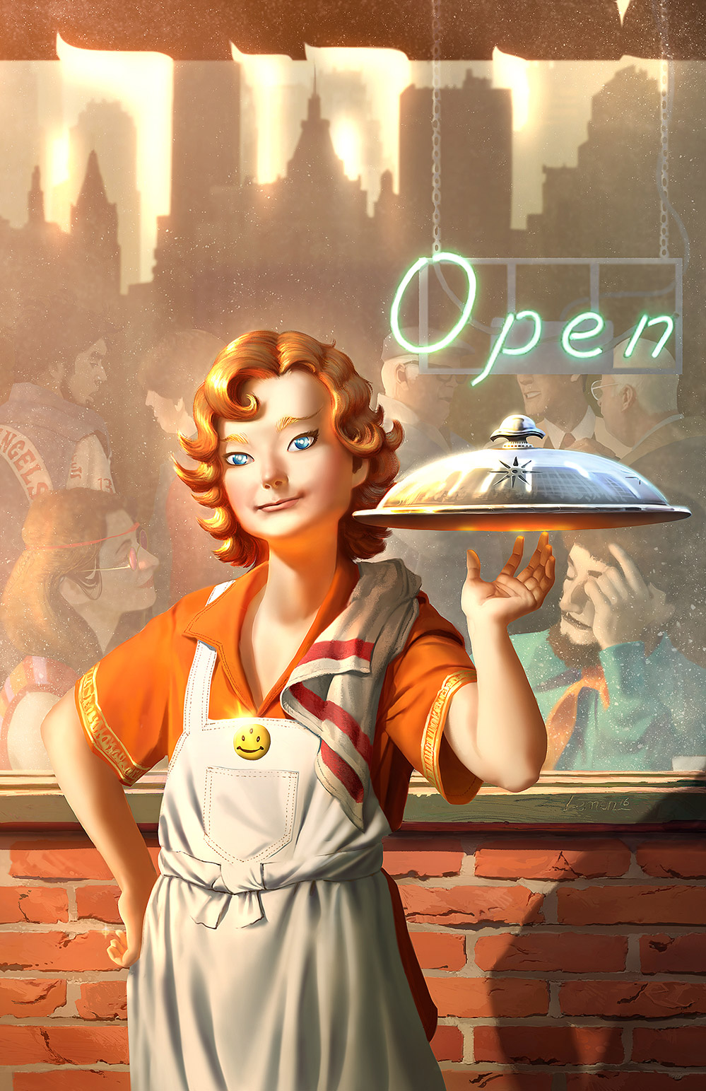
Seriously though, it’s just a painting of a kid holding a serving tray in his hand. Oh wait, it’s above his hand…hmm. The rest of the painting is just a bunch of people in a building. Is he just a kid? Are they just a bunch of people? At a glance, this is just a simple moment in time. But take the picture apart and there are dozens of symbols or clues revealing the true identity of our innocent character. Here’s some background to this painting.
A few weeks ago a friend had asked me if I would do the cover of his new graphic novel he will be selling by Comicon in San Diego this July. I was in the middle of two other jobs and was also asked if I could have it done within a 7 day window of time, and can I do it traditionally. We were also still in session teaching classes, another job that would be reducing that window from 7 days to 4. So of course I said yes! What idiot would miss this opportunity to lose sleep and suffer from overworking?…I mean, help a friend?
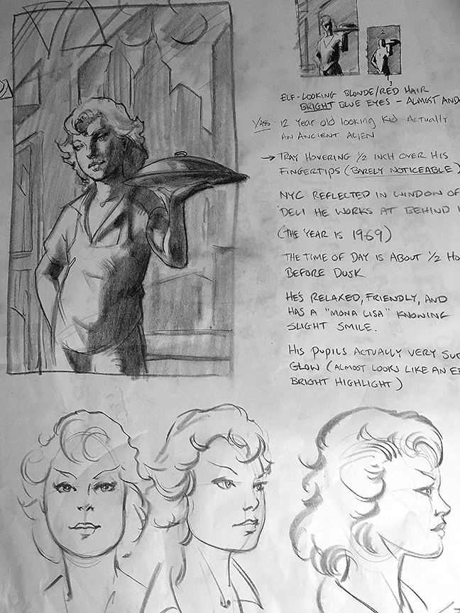
I told him with that little time he would need to supply me with an idea and some character reference. The idea he gave me was simple enough, and along with a design brief he gave me a solid thumbnail of the cover roughly comic book size on an 18 x 24″ sheet of newsprint with several other little value comps for his design plan. As thorough as he was with his design brief, he also said “go ahead and make design decisions that you feel would make the piece a stronger one, I trust you.” Oi, famous last words, right?
His brief included:
Vass, the character’s name, is elfin looking, almost androgynous. It is the late 1960’s and he is a 12 year old boy who works at a cafe and is bringing you your food to eat in the outdoor patio. He is wearing an orange shirt, his hair is reddish blonde and he carries a serving tray with a cover over the contents, New York should be seen reflected in the serving tray and in the window behind him. His eyes are an intense blue with white for pupils and the serving tray he is bringing you is hovering within an inch of his fingertips. No one else seems to notice the peculiar hovering serving tray but you the viewer. The cafe is a gathering spot of all types of people, a very community comfort feel to it.
Here is the thumbnail he provided me with.
This should be enough information for most illustrators to get started with the image but I needed more. I wanted to know about the backstory, what is this mystery character all about and whatever other dirt I could uncover on the story.
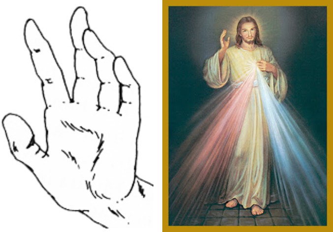
He then added that the character on the cover is an ancient being albeit he looks like a child to us. He comes from the same race of beings that Jesus came from and would be considered something like the second coming if people knew of his powers he possesses, etc. He should be looking on at you with a slight Mona Lisa like, “I know something you don’t” smile and his hand is at rest on his hip showing a childlike cunning.
That’s the stuff I wanted to hear. A boy holding a serving tray is not enough for me to jump at the opportunity to make a cover for a publication. But with this additional layer of information he image just became interesting to me.
The type of illustrations I most enjoy crafting are the ones where I can practice complex staging, excite our other senses besides just the eyes, and exercising allegories, symbolism, idioms, tributes, and weaving it into every square inch of the painting. My favorite master painters pushed meaning into every nook and cranny of their canvases. The illustrators I favor from the golden age of illustration did the same.
Many of the illustration jobs I have been given over my career do not require these BIG ideas or high minded concepts. A big part of our commercial world today involves art that is akin to Pin Ups and Point of Purchase (PoP) Illustrations that involve very little to no symbolism, allegory, or any deep meaning or poetic undertones of any kind is necessary for these pieces. Quoting Frank Lopez from Scarface, “…Flash, they don’t last.” So of course, regardless of my workload, whenever I can find a piece like this to work on I will break my time bank to test my skills with what I love doing.
I began processing the piece. I worked out a list of ideas that I think would add something to the story. But I didn’t have much time to work it all out. This would be a build it on the fly type of composition.
When I finally sat down to make the image, my brain was packed full of ideas that I wanted to try, symbols, and thoughts about ways to execute them in the piece. If I were to have done this illustration with traditional media, 7 days would be pushing it, let alone 2. There is no way I would have been able to add, take away, add again, take away some more, to a traditional surface. It would have looked like a battle field rather than a finished quality piece of art. So I burned my eyes for several days in a row staring at my monitor painting in Photoshop.
I wanted to play up both the alien qualities as well as the divine. I also had a few ideas about catching the viewers eye. I still have yet to find out if the one I used works or if I am just blowing smoke up my own Asgard. When all was said and done, here is what I managed to sneak into the image.
The Alien Symbols:
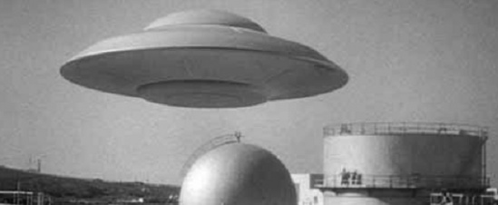
The Serving tray has more of a disc like feel to it, indicative of the commercially favored flying saucers in the news these last many decades. I illuminated the bottom of the tray with his glowing hand from the low sun on the horizon to give it that impression of the equilateral triangular pattern on the bottom side of the saucer from the magnetic engines they supposedly use to fly with. (I did fill my ears many a late night illustrating to the sounds of Art Bell.)
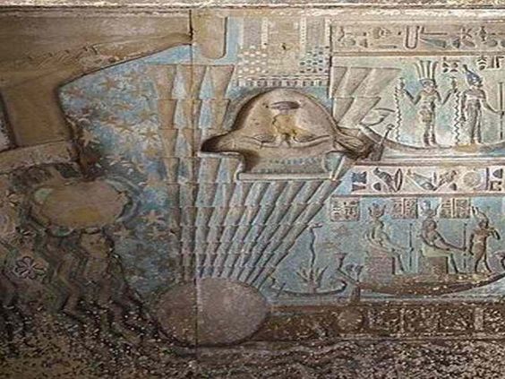
The handle of the serving tray resembles the glyph on an Ancient Egyptian freeze of what some believe to be a UFO.
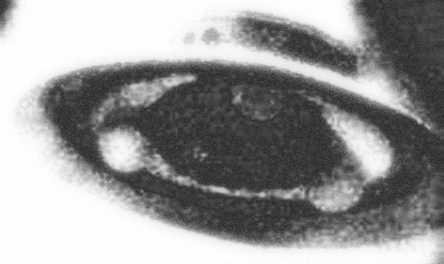
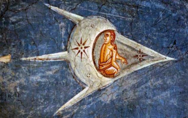
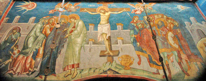
The symbol on the serving tray is from the side of a supposed UFO painted in this rendition of The Crucifixion done around 1350 AD.
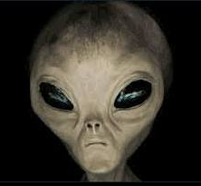
His eyes are farther apart from each other similar to the Grays, an extraterrestrial race that now represents anything we call Alien in mainstream media.
His right hand shows only three fingers with the middle finger facing upward in my personal homage to E.T.. I know it wasn’t his middle finger that was the glowing pointing finger but just go along with it…geez! If you look really closely at the illustration you will also find I put the cheesy Lens Flare in the painting as well. I made it on an overlay layer and dropped it to 30% opacity for those who get really close to the art to look at it. All 3 of us.
The dust on the window represents a star map, the star map to the celestial heavens that our hero has come from, another galaxy far, far, away.
The Spiritual Symbol
I threw in that ubiquitous symbol from the 60’s, the hippy smiley face as a stick pin on his shirt. I added the third eye to it, representing Vass’ inner being, the spiritual and connected side of his personality.
The Religious Symbols
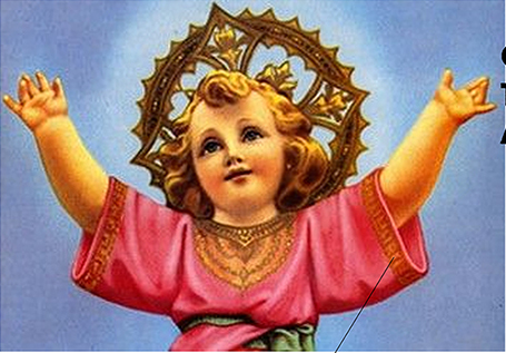
The trim on the sleeves of his shirt I borrowed from the religious baby jesus painting I found while looking for flowing hair styles of the 60’s. Two in one bonus from one reference…WOOT!
I wanted the apron and the towel over his shoulder together to feel religious rather than utilitarian. While the throw over the shoulder is usually longer, I tried to get what I could from the contrast of colors against each other.
The left hand is in the Abhaya Mudra gesture. This gesture symbolizes reassurance and safety, which dispels fear and accords divine protection and bliss to the devotee. This mudra is usually used by a spiritually strong person( like a deity, master or guru) to dispel fear in his//her disciples and to bring calmness into their hearts and situation. (Quoted from Yamuna.biz)
I used a song out of my skateboarder days that might not make much sense to many but I included it to help me make design decisions. A Wonderful Broken Thing, a great band from the 1990’s and two of the coolest people I’ve ever known (RIP Jeff Klindt), made a song called The Bricks of Reason. While these bricks are still intact, they are old, they are crumbling, they are the walls that older generations put up to protect themselves from everything that scares(d) them. I designed the wall to appear smaller than Vass, no wall is too large to keep him out, and no problem is too difficult for him to find an answer. The truth is crystal clear like the window that makes up more of the composition than the wall.
The wall is designed with 23 bricks. I was told long ago that the number 23 was the number of the almighty. I found that it represents God With Us. It is not a number used often in the bible, but when it is it is significant, such as Psalm 23 which speaks of prosperity based on God’s provisions. Those who come in contact with Vass are rewarded with this.
The green strip below the window is a symbolic color of healing, also a reference to the state you feel when you are in his presence, in his temple, in this case, Vass’ temple of healing, the cafe he works for.
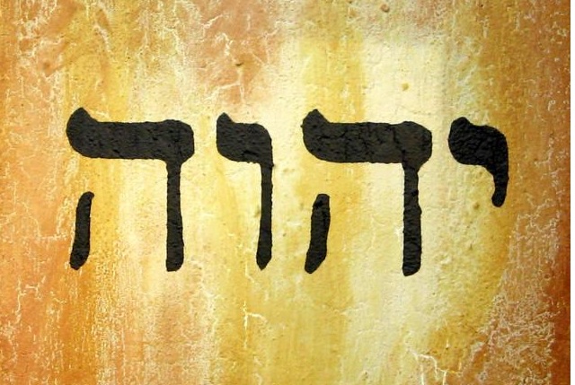
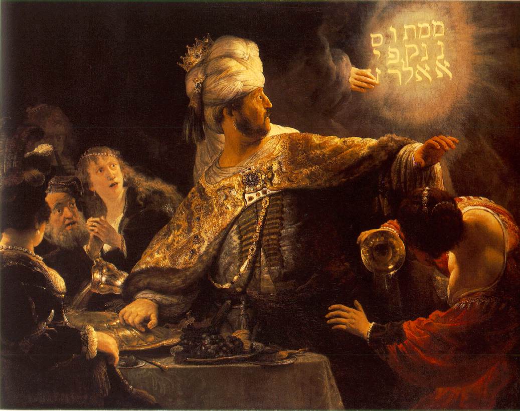
In the window reflection, the lighting behind the buildings and the rips and tears in the awning reflection in front of and reflected at us in the window spells out YAHWEH in Hebrew, it shines brightly in his light, here I was thinking about the glowing letters in Rembrandt’s Beshazzar’s Feast.
The cafe is a melting pot of social classes coming together to “heal”, or to solve problems in their lives. Here in this picture I have a retired conservative talking with a war vet and a young business man. I have two hippies and a biker gang. I also had a doctor, a house wife, a police officer and two Black Panther members in the shot as well, but the crowd overwhelmed the focus, the composition was becoming a cluster-funk and so I did away with the other 5 figures.
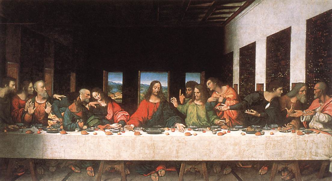
But removing the 5 other figures ruined my chance to successfully riff off of this image of The Last Supper by Leonardo DaVinci. The moment of the Last Supper specifically portrays the reaction given by each apostle when Jesus said one of them would betray him. I changed this around and gave all of my characters question and doubt about the “rebirth” of Jesus in the form of Vass in the center of the composition.
Behind Vass’ head is the doorway from this painting by DaVinci. There were also serving windows to form the trinity of portals, similar to this trinity. However, by the time I built out all of the layers the doorway suffers from too much obscurity and I ended up removing the other windows because they conflicted too much with the other details in the foreground.
The biker represents James the Greater and the guy to the right of him Philip from the Last supper painting, both talking in doubt and searching for an explanation…The biker’s jacket says Hells Angels on it, you can only see the word Angels curving upward from the top of the lady’s head seated inside.
In my tribute to The DaVinci Code and The Last Supper, the character on Vass’ left represents Mary. She is wearing the red sleeve that touches Jesus’ sleeve, in this case, Vass’ Sleeve has a reddish quality to it and they are both touching. The word Angels that curves upward from Mary’s head represents her Assumption. This symbol found its way in to the picture later on when I was defining each individual. While it does not directly relate to Vass, it is another religious tribute I am paying in the piece and riffing off of the already controversial debate over whether it is Mary in the painting or not.
The three men on the right in the BG(back ground) represent Matthew, Jude Thaddeus, and Simon the Zealot. Both Thaddeus and Mathew are turned toward Simon, possibly to find out if he has any answer to their initial questions and doubts.
To the right of our character is Thomas. Index finger is pointing to the sky foreshadowing his incredulity of the resurrection. His eyes, and all the other characters are paying no attention to our main character, in doubt and denial of who he is.
I also literally placed an idiom in the image. The stripe on the towel, the fold in his sleeve, the contour of the towel and his shirt make the visual symbol that he “wears his heart on his sleeve”.
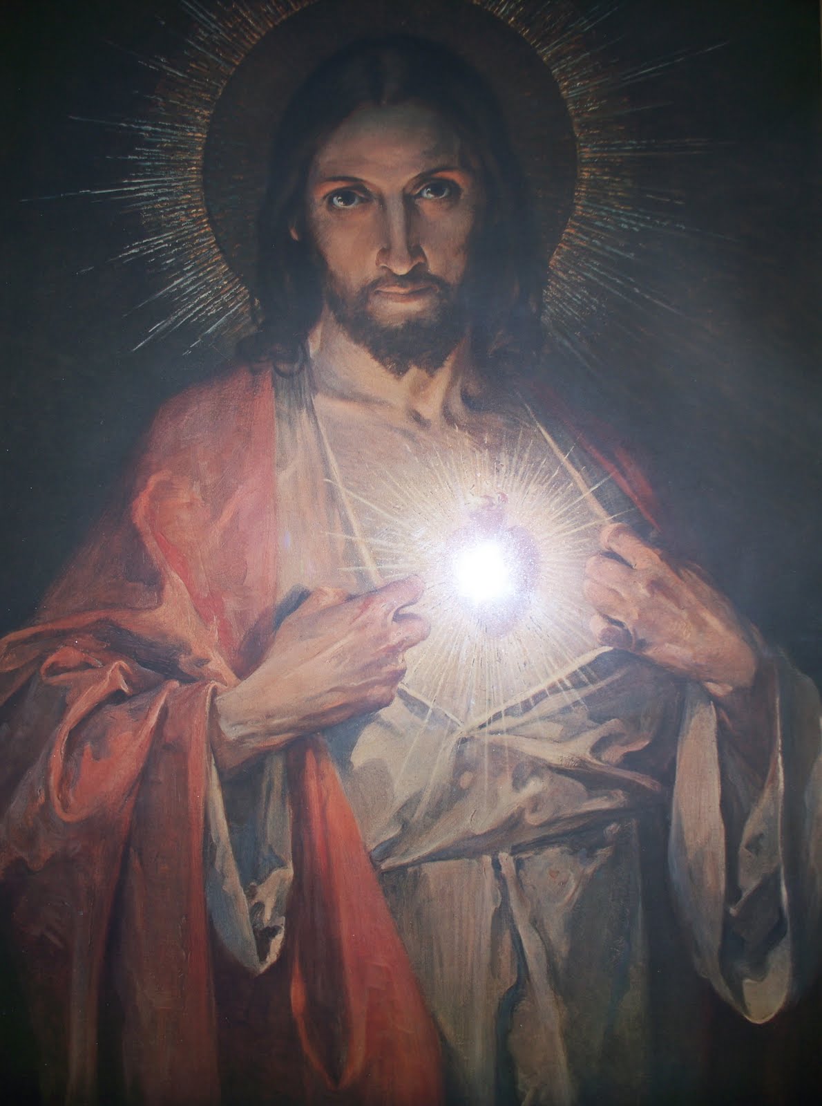
The rays of light beaming off of the 3rd eye on the smiley face button represents the light beaming from the heart of Jesus.
The Consumer Symbol/Experiment
The open sign was something I thought of last second, and killed my trinity of windows in the extreme BG but I wanted this for several reasons. First, it represents the characters openness to anyone, his temple, his cafe is open, and open to anyone and everyone.
Next, I added the open sign to the image as a way to get the potential reader to open the book and investigate the contents.
And finally, the placement of the word Open is no fluke. It is placed where we hold the book when reading it. It is also directly above the serving tray, my Macguffen for our cover story, the mystical suitcase in Pulp Fiction, the trunk of the car in Repoman. The word is tempting you the viewer to want to see what is inside the magical floating serving tray.
And finally, I hid my name in the wood trim on the window sill. I felt at odds about my name and Yahweh on the same page so I reduced mine from the pictorial view so as not to compete with His.
Once all of these ideas were designed in to the piece, I saw the potential for better iterations, and deeper symbols in the facial expressions, and what each individual is wearing, etc But the time I gave myself was not enough to add more.
In the end he gave me a couple extra days to finish once he saw how much meaning I was trying to add to the piece. He was also several days behind in page production so in the end I was not stressing out down to the wire on the piece and I was able to get a symbol or two into the image to satisfy my pictorial needs. And probably, to most who see it, it’ll just be a picture of a kid holding a serving tray. Maybe that’s all it really is, and all this that I finished writing was just a bunch of BS I had to make up because I couldn’t think of anything to write about this week. Yeah, that’s it.
Enjoy your weekend.


So much thought in one picture. So much symbolism. And with so little time. Thanks for giving us the details, Mr. Lemen.
So much thought in one picture. So much symbolism. And with so little time. Thanks for giving us the details, Mr. Lemen.
I'm really confused only because the “he” looks like a “she” to me.
I'm speechless – sir, you have a new fan.
At university, I was told “we don't do symbolism any more”, and that was always a great disappointment; I love layers of meaning and the way the story that becomes richer the more arcane or classical knowledge you have (I won't say 'occult', but the original definition of the word applies), whilst still being completely approachable without it.
I am so happy to read all the symbolism sources you used! My favorite part of study was the obsessive, deliberate use of iconography in art history. Like a puzzle to solve.
I also really appreciate your honesty about the insanity of extreme deadlines etc. I often feel other artists are working completely stress-free in a golden utopia of proper scheduling and tidy workspaces! A dispatch from the trenches makes me know it's not just me !
Nice