As we grow and develop in life one of the many ways we learn is through the emulation of others. Whether we copy someone else’s way of walking, talking, their mannerisms, or habits and more, this is in part how we learn to become who we are.
When an art student reaches a certain point in their development, there is either an internal curiosity, or depending upon the art school, a requirement to study from others before us. Copying from successful works of art is a way to connect with the thought process, the techniques, the choices that the previous generations of historically famous artists made.
So often though, the student does not have a personal goal in mind and as a result the copy looks like “an amateur did it”, an inferior copy that only showcases the bad habits and lack of understanding.
While I was in art school doing my training, I was told to do master copies, but we were told by our wonderfully confused “instructor” that we should paint them to make them look better than the originals. Without understanding what that meant, I set out to copy Elvgren, Rockwell, Frazetta, Sargent, Repin, Cornwell, and on and on. Looking back at all those studies, at least 50 +, what I feel I did to myself was waste needless hours copying with no goal, and though my copies were quite successful in emulation the only real take away I gained was that the faces in my own works started looking like Elvgren Girls faces regardless of gender, the bodies looked like ripped warriors in Frazetta’s canvases with an over tiled technique that I learned from copying Rockwell’s canvases while trying to make them as spontaneous as Sargent’s brushwork. Or, simply put, I was extremely confused and doing as many copies as I had led me to strange bad habits in my work.
Copying from successful works of art is a way to connect with the thought process, the techniques, the choices that the previous generations of historically famous artists made.
Sebastian Capella was a great mentor who helped me develop objectivity in my work and rearrange so many other misconceptions about the arts that otherwise I was not aware of, not paying much attention to, or misguided from other artists who were more obsessed with vanity and capitalizing on students paying for classes than with actual instruction and guidance.
As a teacher, he gave me objective goals that broke habits, heightened my awareness, and focused my efforts. He is one of my role models for teaching, giving everything he had and holding no secrets about how to create works of art. He also gave me his canvases to take home with goals on how to copy from them. The first time I took one of his canvases home, I was so incredibly nervous about anything happening to it I didn’t study from it, in fact, it never left my car. I have a priceless canvas at my house, a rental, worth less than this canvas, and I am supposed to study from it?
I eventually warmed up to the idea and learned a great deal from his canvases. Having the original side by side with my copy made it so much easier to understand what I am attempting to construct. Pictures in books, the internet, etc. cannot inform in the same way that the original can with all the subtleties and nuances that only the eye can see when carefully studying the original. But, whether it is from an original or a terrible facsimile, here are three objective goals he taught me to learn from a master study that keeps the study objective:
Study the Design Matrix of the Composition
Every composition is designed. Graphic design is a real thing we cannot escape. It is in anything artistically crafted. Graphic design might be a modern term, but all artists have been using it since cave painting. The old masters used so many variations of “lead lines”, “implied lines of action”, “relational or harmonious linear pathways”, counterpoints, triadic relationships, etc. long before the title graphic designer was ever invented. They were also masters of the grid, matrix, or armature of the canvas. They invented the steel yard, the triangle, the ovoid, the cross, etc. or designs constructs that immediately lead the viewer to the focal center.
Learning this visual harmonization is like learning to confidently conduct an orchestra of several hundred instruments. Keep in mind that most canvases in churches and cathedrals were commissioned during the construction so the architect and the artist met to collaborate on the placement of the canvases and their design to fit with the rest of the space. The “disegno” was a strong motivation for the end composition for most of the canvases crafted during the Italian renaissance.
A side note to renaissance architecture: the architect designed the spaces to specific dominant tones influenced by the popular and important chants of the times. The art, the architecture, the sound, the lighting arrangement, and the sculptural design were all designed by the similar influences, or were considered “one and the same” in the design process. They were under the strict belief that the house of God should be designed as “perfect” as (s)he is. Harmonizing all the art forms helped to create this grand illusion, not too dissimilar from the same design esthetics that go into theme park rides: immersive experiential design.
 |
|
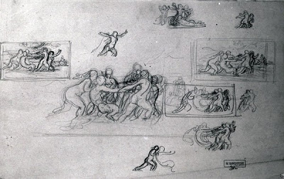
This is an example of the abstraction worked out by Bouguereau for one of his canvases. This is a good enough breakdown of the canvas design without getting involved in using paint.
|
 |
|
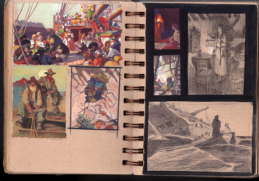
Here are several studies of canvas abstractions I did in both gouache and in ball point pen.
|
 |
|
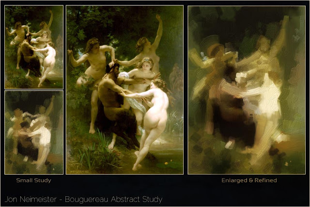
Here is a design matrix breakdown one of my former students Jon Neimeister did of a Bouguereau canvas.
|
Study the Color Relationships of the Canvas
When we see the rare studies(composites) a master did of a famous painting we are often surprised at how clear the colors are and how fun they are to look at in their simple color design. The color studies were usually chromatically enhanced versions of the finished painting, footnotes to the color range the painter should be striving for in their “tonal” finishes.
Most canvases prior to the 1850’s were developed in a Grisaille, Verdaccio, or layered method. Color was not abundant, and most pigments of their time were only pure if they were not mixed with anything else. Glazing was the means to the finish and the only way to achieve a colorful look was with multiple layers of glazes and scumbles. Most great paintings use optical coloring as a means to achieve realism, so each area is filled with small flecks of a broad range of colors, often adding to the “overworked” look of a finish.
The small studies are pure in hue without all the optical color blending, so they graphically have more power in their appearance(design). When we do color studies of these canvases we want to do the same thing, finding the hue relationships the artist used to design the canvas. These color relationships are in part why the canvas is so successful, knowing the color choices on a pure design level are a valuable tool in the simplification of the design structure of the canvas.
 |
|
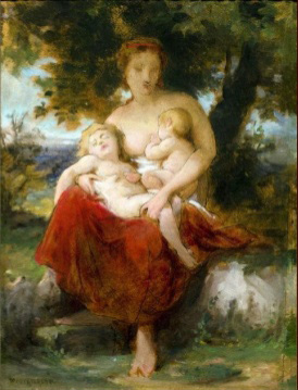
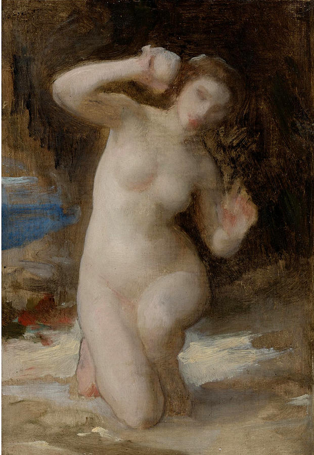
Bouguereau color comps working out the simple chroma design for these paintings.
|
 |
|
Bouguereau color comps working out the simple chroma design for these paintings.
|
 |
|
Rockwell color study
|
 |
|
Dean Cornwell color study
|
 |
|
John Berkey color study
|
 |
|
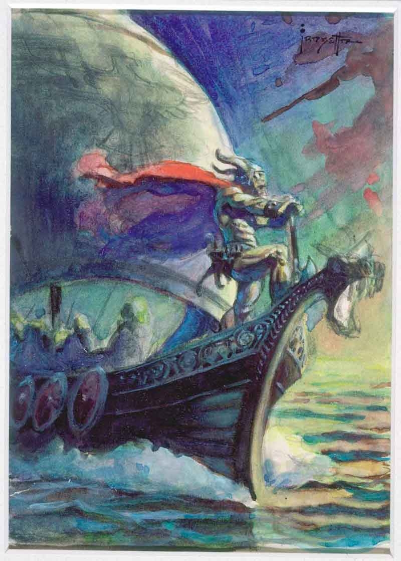
Frank Frazetta color study
|
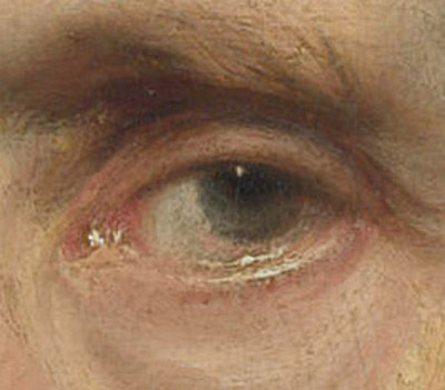
Study a Small Section or Portion of the Canvas to Learn Application of Paint
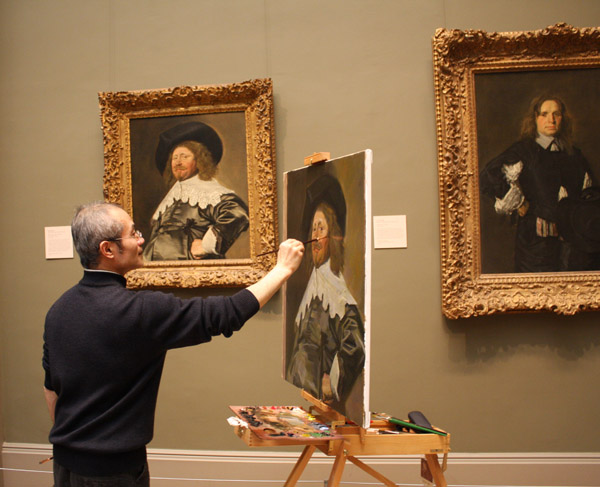
If you are going to copy a master painting directly for the sake of application and construction, first learn the technique that the artist you are intending to study used so that you can then do a faithful job of that construction. Or, if you intend to do a direct painting study or what you see in their work, have a great close up of the area you plan to copy.
Focus on a small area of the canvas, usually an area you are having difficulties with or an area that you will be frequently painting but do not know how to control. Painting beyond what you need will dilute your intent, and can take up a lot of valuable time you could be using for other purposes.
Be patient with the process. If it requires layers, be willing to build them out and take the time to allow each to properly dry before impatiently slapping on the next layer.
Be willing to scrape something back that is not similar to what you see. Just because you painted it does not mean that it is correct and objective comparison will help you distinguish when they look similar in construction and when they do not.
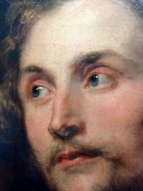 |
| Anthony Van Dyck |
 |
| Anthony Van Dyck |
These are both Anthony Van Dyck examples. Look at the simplicity of design, the economy of information, and the softness of all the shapes with exception to the highlights. This is not something we would even consider if we did not see these older paintings up close.
Here is something else that I would like to add to this list that I learned while cross referencing illustrators and painters for a lecture I did many years back at the San Diego Museum of Fine Art.
Keep in mind that I was doing this with books and poor reproductions on the internet, Google Art Projects which is now called Google Arts and Culture was not yet invented, good digital photography was still a few years out, and many of my students were doing copies from masters with these poor reproductions so this was a way to help them see the blurry brushstrokes of a badly printed canvases.
I had close ups of John Singer Sargent paintings, his portraits, and I had close up shots of Charles Dana Gibson’s Portraits in ink, and the strokes were identical. Although 10 years apart in age, both learned during an era of French influence which technically is a line driven process of hatching, cross hatching and, veiling. What I realized was that regardless of the media, the process that the student learned through was apparent in whatever tools they worked with so cross-referencing etchings and ink drawings with paintings gave way to the understanding of the construction, or the stroke direction in canvases.
I took my Xerox copies of a rare portfolio of Charles Dana Gibson with me to several museums and cross referenced the ink drawings with many different canvases made during his lifetime and they were all similar in their construction confirming my find.
Cross Reference Drawings with the Paintings of the Same Art Period
Cross reference artists using different media within the similar art movement or period in time and chances are likely that the dry media finishes, drawings and inks or etchings of that period will have a similar technical approach that can inform how the canvases were painted. This will save the student many hours of grief trying to decipher paintings if they do not know how to look at them and break them down into strokes, shapes, color changes, etc.
The dry media might not allude to the entire canvases construction, but it will at least give way to the finishing strokes that were so important in adding to the physical illusion of form in the finished canvases.
If technique is not something that is easy to perceive, look at the ink drawings for the line direction, then look at the canvases to see if you can spot the same direction in the lines drawn by the brush.
Until next time, good luck with leveling up and enjoy the journey and multitude of artistic discoveries in your development and growth as an artist.


Great article! Love seeing the Old Master color comps, Thanks!!
Thank you!!! I was trying to find someone that explained the point of master studies well. This really solidified it for me 😀
Brilliant article! Thanks for this.