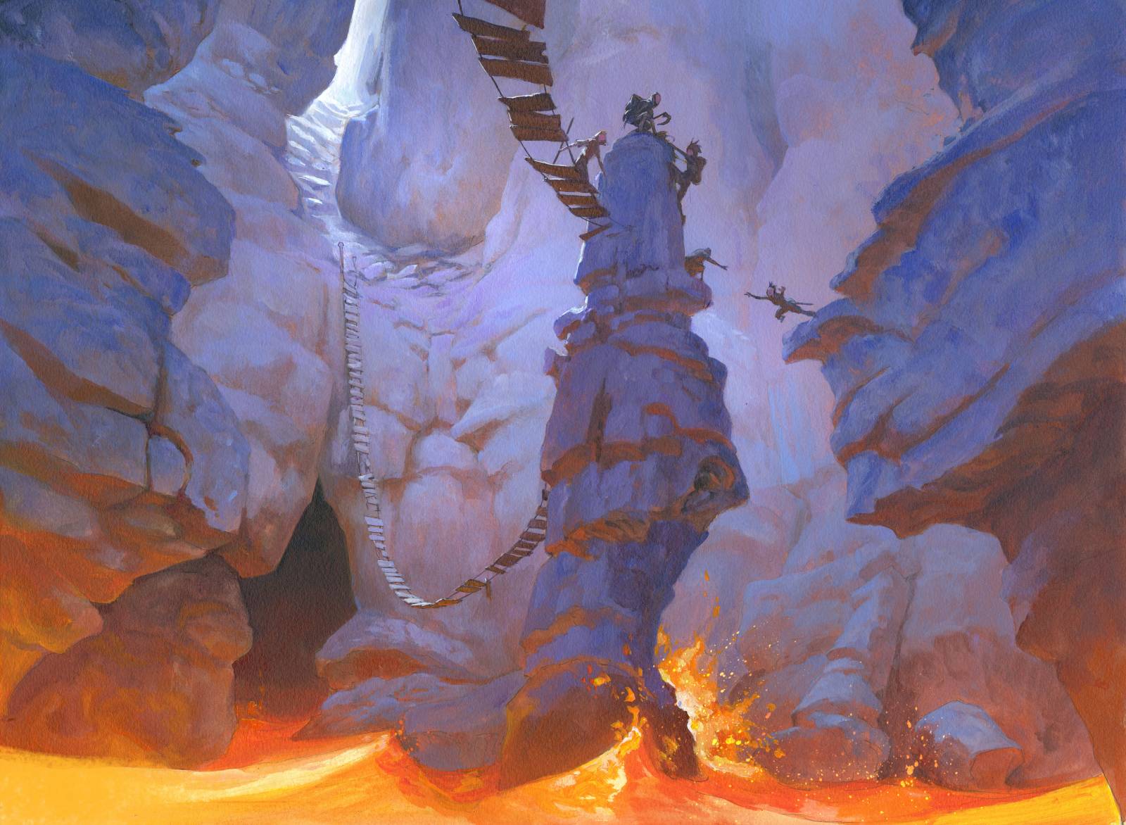
When I got the assignment for the magic card valakut Exploration, I knew I wanted to try something different. The art assignments asked for a lava cave with hanging bridges and a party of adventures trying to get out alive. The focus for the illustration was going to be the danger of the cave and the exploration rather than a character piece. Mostly i am asked to do characters, so this was a real nice break into something else. Also it was why i choose to go for a temperature painting and a real colorful one at that. My idea came from the fact that I needed to paint lava in the bottom. In order for me to make the lava seem like it was glowing I would need to surround it with a dark color and: “If i use the strongest contrast color I can really make it pop”. So my painting would be light and yellow orange in the bottom and purple bluish and dark on the top. And I thought I might hint at the outside with a cold white just to jazz it up. One thing I learned with this extreme contrast is that it’s dangerous. I tried so many times to make it work with portraits or figures and I usually end up with a rather messy and unclear and not very easy readable painting. The contrast is just too strong and overrides a lot of finer shapes in lets say faces or expressions so I hesitate to use these colors together: But since this was a cave and had no character I figured that if I stayed within big shapes I could make it work and still be clear. I always try to think simple and clear in my compositions and ideas so I can make sure that the image works in card size.
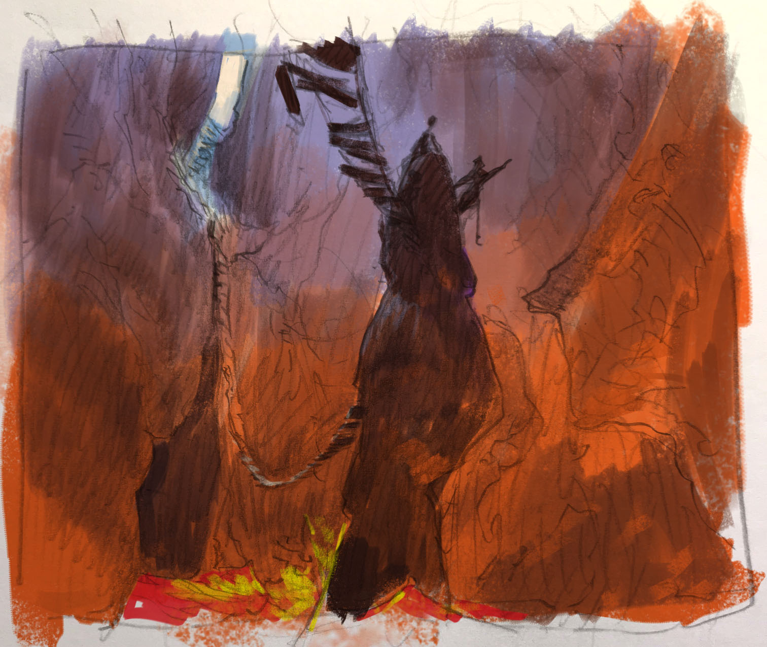
I penciled out a thumb sketch and added the colors I had in my mind to the sketch digitally.
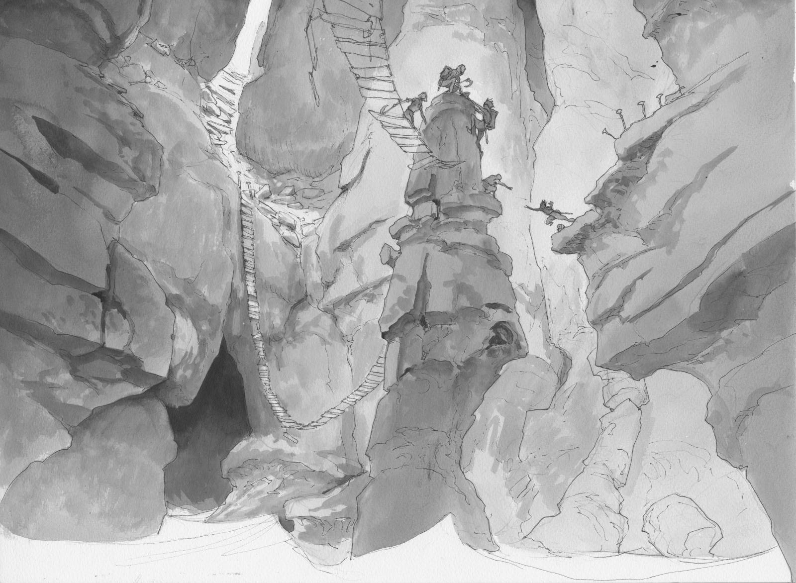
After I got approval I redrew the whole thing to a watercolor board and added greytone and values. I kept the bottom part white where the lava lake was gonna be and planned to use a light yellow wash to that area as an underpaint and possibly keep some of that as the lightest part of the lava. Thing is, a soft light color of acrylic used thinly almost as watercolor will seem brighter because of the paper white shining through, so it’s real neat if you can use the underpaint as part of the final color.
 <
<
When I looked at the color comp I had cooked up it bummed me out a bit. It seemed flat. And I came to the conclusion that it was because it was too warm all over and lacked all the contrast I had decided. So I started painting but constantly switched back and forth between the orange light from the bottom to the bluish purple on everything not pointing downward towards the lava. Suddenly it all made sense. The painting became like building an elaborate lego castle. I started thinking of everything like if it was Lego bricks. “Does this little rock formation have a sid e pointing down?: Add a dot of orange, uhhh, if this was a lego, these sides would be purple…” and so on. As soon as I had the system I relaxed and started painting more freely. Towards the end I enhanced the focus of the bridge that hangs to the left – the only way out – with a white highlight: I really need you to see this.
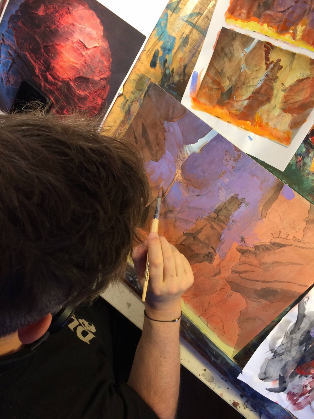
I really like the little scenario taking place between the 2 explorers to the right. She is jumping, hoping her friend will catch her. He is reaching out as if he is shouting : “come on, it’s gonna blow any second. I will catch you”!

I love the color scheme and the subtle change of value on the rocks, insane!
Great post!
Thanks for the post. Always great.
thanks jesper! great post
Really dig the colors in this. Also the idea of LEGO bricks as the planes for the light to hit is a great way to think about it. Will definitely try to use that. Thanks for sharing!
Congrats! You’ve won a FREE VIDEO. Check your email for details.
Great insights! You did get the lava to glow and the coolness of the rest of the scene pushes that so well. The little white slit to the outside is a great touch as it gives the scene its journey. Nice work in contrasts.
It’s so fun watching you perform your magic. Thank you. What is the media you are painting with, sir? It does not look like watercolor.
You are brilliant!!!
Great scene and colours, but I think the lava is not yet lava. It looks like orange-water waves. And perhaps the middle piece, with the people, can have a bit more contrast.
The video process helps so much! I feel like I could watch it for hours and hours without getting tired
Great video. s always, the insight is as valuable as the technique used
Love Jesper’s work! The fact that he most of the times shares the drawing makes really interesting to see how he manges to go to the final works. Makes it seem so easy :V
I am gonna steal that sooner or later >.>
I always love seeing the posts about your painting process!
It’s really good to see more brush technique
Awesomely great. Red and Blue, killer combo