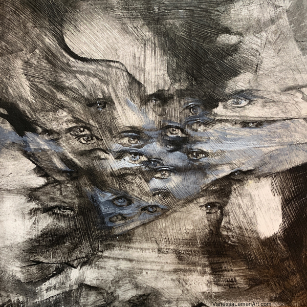
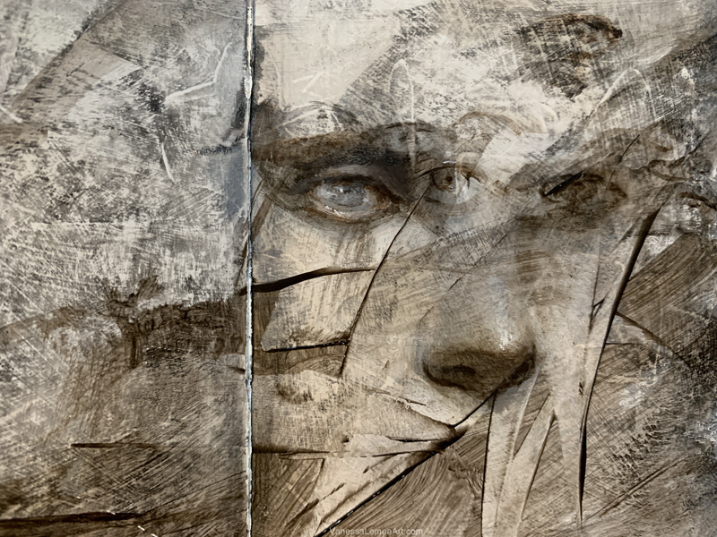
I’ve really been enjoying experimenting with water-soluble chalks and I thought I’d share a little bit about some of the sketch paintings I’ve done with them. I also use this same sort of process with graphite powder and water, and both yield some similarly interesting results. This recent piece is one example of exploring the medium while also journeying into some new territory with new sorts of images and storytelling. It’s a sneak peek at some new work I am very excited about and will be sharing more about all that in the very near future.
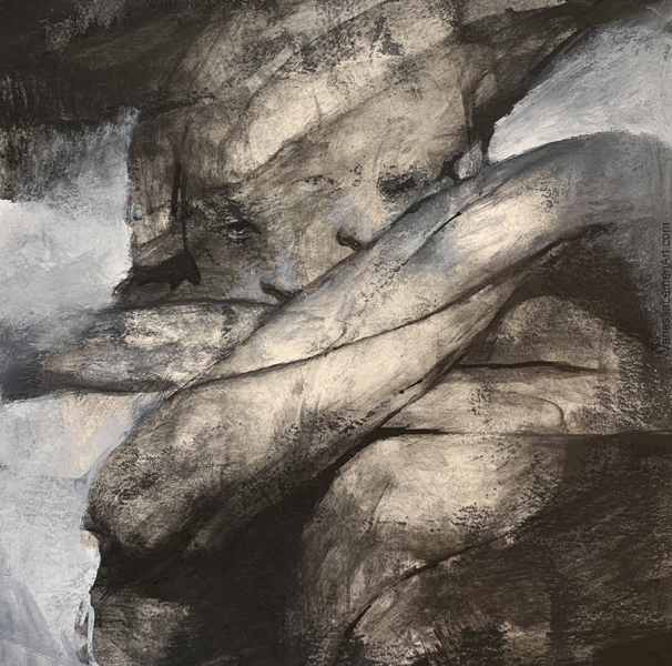
This is a small piece at 5×5″
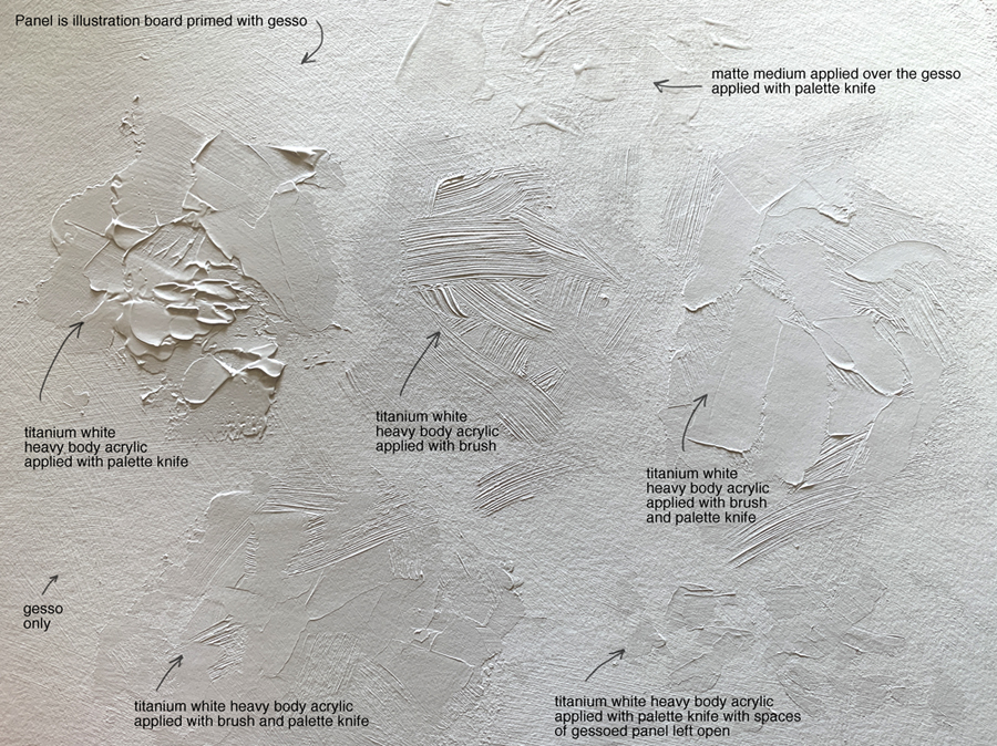
This piece is done on illustration board that has been gessoed. When I paint on a surface such as illustration board or panel, I often might prime the surface with gesso and also add areas of the white acrylic for added build-up of texture or to vary the surface quality. I usually use heavy body acrylic for the added build-up of texture, which can lead to some very interesting results. Sometimes, I will also let the surface show through a bit too, so overall, the surface will be varied in texture and absorbency. For example, in the case of illustration board, the board itself is the most absorbent, then the gesso is the next most absorbent and then the acrylic is the least absorbent, and if I also use a matte medium as well that would be less absorbent too. There are many other options to add to the surface, such as gloss medium, modeling paste, or soft gel matte, just to name a few. I do use those as well, but haven’t used them in these examples in this article. I may show a bit about what those mediums can do in a future article here. I do also work directly onto some surfaces such as claybord without the addition of gesso or acrylic, such as this piece in which the texture is not raised at all and is extremely smooth.
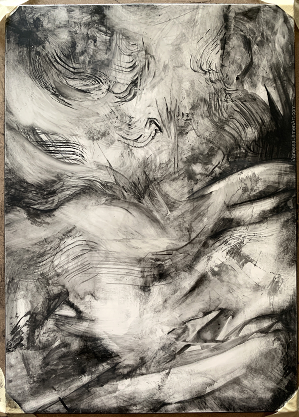
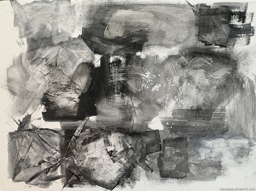
The combination of mark-making and raised texture can produce such a wide range of effects and results. When creating texture, the way I prime the surface can play a big part in how the painting looks and feels in the finished end result. When I apply the chalks over the top of the primed surface, the chalk will catch on the striations of the brushstrokes in the gesso or acrylic, or if I’ve sanded it to lose the striations, it can be smooth and less textured. If I apply heavy body acrylic with a palette knife, I can get some interesting effects as well once the chalk is applied.
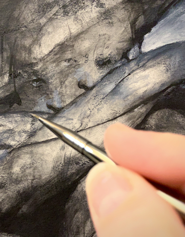
In the case of these sketches, I’ve used Art Graf brand, and water to apply the chalk onto the primed surface, using water and tapping into the blocks similarly to watercolor blocks. These chalk/graphite blocks are really rich and can be used very opaquely. In this article, I’m sticking to black and white and grayscale graphite, but their colors are very rich and velvety too. I recommend trying them. They’re really enjoyable to use, whether you stick to black and white or use the colors they have. You can get a wide range of opacity. Thinned with water can yield some nice washes, and with less water added, you can get some very opaque coverage.
I tend to vary the transparency and opacity a lot when I draw and paint, and so much of my work is a combination of many layers to create depth and different effects utilizing the transparency, opacity with the marks I make. In some areas of my work, you might see marks that still show the texture and effects of the underlying prime of the surface, while other areas on the same piece might be more opaque with that surface covered completely. For me, these types of variances are often times my way of experimenting with the balance of the layers and textures, and pushing ways to see how to make it work.
I’ve also found that experimenting with the use of white and the lack of it is fun and provides for a lot of variance in the results too. Since white creates a cooler appearance to the black when added to it, it creates another color essentially in this monochromatic palette.
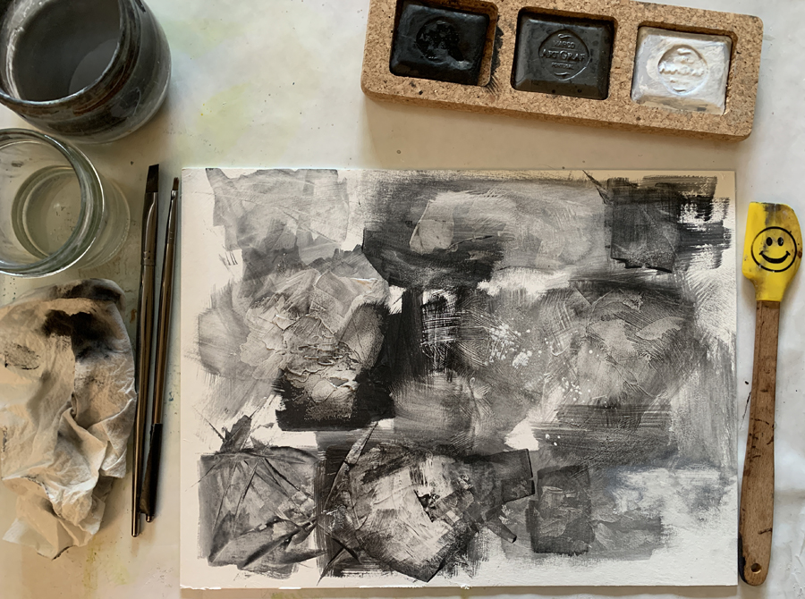
If first trying this way of priming a surface with texture beforehand and then applying the water-soluble chalk or graphite, I suggest trying several swatches of different sorts of ways of working with the gesso, acrylic and mediums. Here are some examples of these sorts of swatches (below). The first image shows the different prepped areas on one panel before I added the chalk, and the second image shows how I’ve added the chalk to that same panel.
Here are the tools I tend to use when working with this medium:
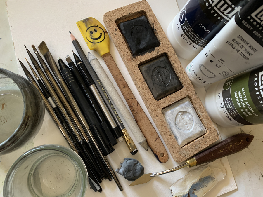
I don’t always use pencils or rubbing stumps and erasers when painting with this water-soluble chalk, but will sometimes. Most times, I tend to draw with very small round brushes. The spatula shown here is a small silicone kitchen spatula and I use it to carve into the marks I make and to wipe out or subtract. Regarding the the two jars on the left, one is filled with water and one is filled with alcohol. I use alcohol to pick out/subtract as well. In the panels showing the swatches of experiments, you can see where I’ve splattered some alcohol and then wiped it away with a spatula. Also, in the lower right corner, I used alcohol with a brush to pick the paint off the surface.
Here is a sketch I did on sketchbook pages. I prepped the pages with acrylic (no gesso), and then painted some marks, then added the facial features, then wiped some away, then sanded some of the marks back, then added more to the face, then wiped some areas away.. this painting was built up in layers, with a lot of back and forth of wiping away and building up.
Overall, I tend to experiment a lot with a balance of values and color, textures, details and broad strokes, abstract and realism. A mix of these are always at play in the pieces I create, whether it be in exploring with graphite or chalk, ink sketches, or the oil paintings I do too.
I hope you’ve found some of these images and information to be helpful, and I hope you can find the time to do some exploring as well.


Awesome! You always surprise me, Vanessa! Just bought the Art Graf swatches (and 6 earth colors too) after reading your article!
Oh that’s great! You will love working with them. I have the earthtones too and really love them as well. 😊 These chalks are like butter- so wonderful to work with.
I’m so excited to see that you enjoy these as much as I do!!! They are so fun to use. I should try them with the textures you’ve created with the mediums and heavy bodies.