When my students get into trouble with a painting and it looks flat and dull, even if the composition is solid, most of the problem is a lack of contrast.
A painting can suffer in so many ways…too similar values, similar shapes, similar light, similar color…all work to destroy depth. You get one chance to pull off depth in an image and it isn’t dependent on just foreground, middle ground, and background. Depth is created by contrasting multiple factors at once.
The idea of using contrast can’t be separated into one tidy thought. These aspects all relate to one another, commingle and affect each other. In these points below, I’ve gently eased them apart to help understand the concept. Read through the list and use it to evaluate your recent work and plan for future success.
Edges

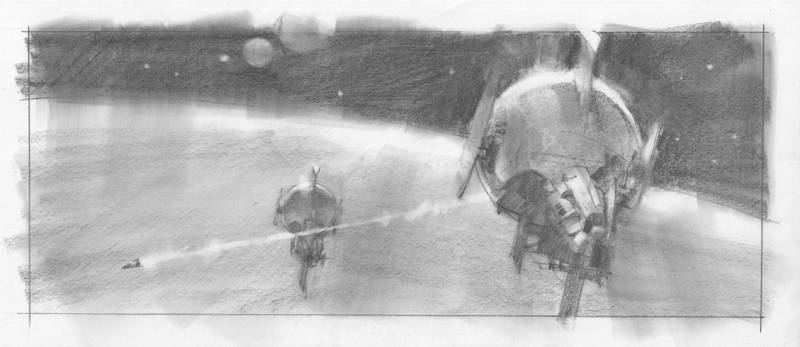
A sharp edge can pull an element forward to the front of the picture plane and a soft edge can push it back farther into the design. The reason is the difference between the abrupt stop or the transition of the edge. The difference can allow the artist to control not only the depth, but where a viewer will spend time looking.
Value

To simplify this aspect, think: dark values fall back, light values come forward. But it can work just as easily the opposite way. Lighter elements can fall back in an overall light image while a darker object can then jump forward for attention.
That’s just the extremes. Subtle values can push and pull the viewer, too. It’s the contrast between the two that grabs attention.
Problems arise if similar values are in the background and the foreground. It causes the image to flatten. Think of the highlight on a helmet, or glint in an eye, matching the white of mountain snow in the background. Similarly, imagine rocks in the foreground having the same value of the color on a horse in the background, or every fold of a shirt having the same value overall. If they all match, volume is lost and the depth fails.
Color
Small accent colors set against broad, dull color passages create contrast and movement. Temperature differences, warm vs cool colors, can help offset or bolster a composition. Skin has warm and cool aspects no matter what race. The contrast brings depth to a face.
Focus
As with edges that shift in sharpness, the focal point of a picture can hang on the variance of which edges are sharp and which fall away. This can be done in broad sections…or along the very same edge. Our eyes detect multiple edge comparisons constantly, differentiating what’s important from what’s not. Alleviate your viewer from working too hard, which leads to eye fatigue.
Light

I’m not talking about just value shifts, but the actual light falling on the overall scene. Fill Light is usually subtle while Key Light is sharp and bright. The contrast between the two is what you’re after.
The difference between shiny surfaces and dull will vary how light is reflected off of those surfaces. Just like velvet dresses in all those turn-of-the-century paintings, we know it’s velvet material because of the way the light strikes it and the way the artist mimics that reflection through value and shape. Satin has a different way of reflecting light, with different values and shapes. For example, wet hair picks up light differently than the the way dry hair scatters it. Contrast between the different surfaces fascinates a viewer.
Texture
Texture is one of the simplest to build contrast because it’s easy to detect. The brain is very aware of surface texture. Smooth vs rough, chunky vs slick, scumbled vs refined. Like the edges above, detail moves forward in a composition while a lack of detail moves backward. Think of leather against fabric or leather against fur, metal against skin, glass next to brick, puddles against the rough sidewalk, soft fabric against the shiny surface of an automobile. It is the contrast between the two that you are after, not only the surfaces themselves.
Scale
Large vs small elements in a composition create depth and interest. Big objects command attention, but not if they’re so large they become background. But then a small object in front of that large object can give contrast to grab a viewer’s interest. The difference between the two allows the brain to understand scale.
Pay attention to how large you make a small object, and how small you make a large object. Our brains want to keep things in the right scale. You can throw scale off for effect, but you’ll be asking the viewer to make the jump. The shift has to be convincing, whether you are fooling the audience or keeping it real.
Rhythm
Take birds for example, flying through a scene. If they are evenly numbered and perfectly separated from one another by the same space, they become uninteresting. If they are separated by scale but lined up with the same space around them, they still lose the effect of depth.
Once they overlap and vary in number, or are grouped sporadically, they build a varying rhythm that an audience loves to lok at. It is the contrast of varying the sizes of repeating forms that builds depth and interest.
Shape
Speaking of varying things, varying shapes is a must. You know this already. If all shapes are the same size in a composition they go flat. That’s ok if one is working to create a graphic approach for an image. Think wallpaper.
Vary the shapes of a forest or even the branches of a single tree. The human figure varies in all of its shapes. Arms are not tubes, legs are not stilts. Clothing varies its folds, as do mountainsides, landscape, brushwork, texture.
There are very, very subtle differences between what we think of as similar things. Smoke vs clouds, or steam. A sunset glow vs campfire light, or flashlight. Hair is shape; grass is shape; leaves are shape. Study the differences and paint those varying shapes.
Depth
To understand it, keep it simple: you can build depth by the contrast of:
scale: large vs small
shape: detail vs broad
texture: rough vs smooth
light: bright sun vs overcast
color: saturated vs greyed
value: dark grey vs light grey
Everything about depth in a painting is about relationship between each element: from side to side, top to bottom, foreground, middle ground, and background. A combination of these contrasting aspects taken together give a painting depth.
Concept
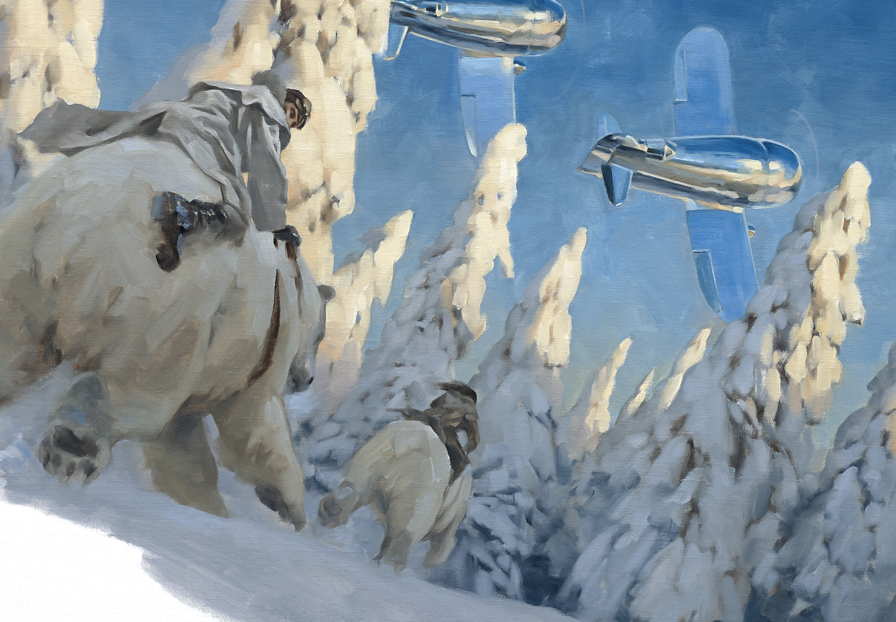
The difference between ideas in a painting can add contrast as well. A simple portrait that is changed by something unexpected to the viewer provides renewed interest. A scene that’s expected to be shown a certain way, but given a slight twist can cause an audience to linger on the work. Unexpected color for an ordinary object contrasted with an ordinary subject. Lighting conditions that seem normal punctuated by a severely lit subject or element. A mechanical object combined with an animal shape, or an animal with mechanical shapes. An abnormal weather pattern in an otherwise peaceful landscape.
All of the above are not only principles, but suggestions. It’s a way of waking up to, and finding, ways to grab attention from a viewer and hold them there by interest. The human brain loves the contrast of alternating aspects and concepts. It loves to fill things in when given just the right amount of information.
That ‘curiosity of mind’ is what you’re after.


Thanks for that, which was of great interest whilst imparting much knowledge
Thank you Greg! Your 10 Things entries are always a welcomed exploration of the subject matter.
This was so informative! Thank you Greg!
Amazing article. This is excellent advice for artists of all levels.
Thanks, you all! Don’t forget to apply this to your work. I hadn’t realized it early on, but as I got more familiar with the concept my paintings improved immediately. It becomes almost automatic after a while, (sometimes a great while!) but the point is to get it into your nerves. It comes out as needed…which is–ALWAYS.
Thank you Greg for one more wonderful article!
One question… So, taking all these aspects, if we were speaking of a black and white illustration (lets say an Ink piece, which the only working tool is a pure black line), you dont have the color aspect of it, you dont have the value aspect (of course, you can hatch etc, but its still an “ilusion”), you dont have the edge aspect (ok, you can make thin vs bold lines, or intentionally not working some lines etc). So, would you say in this case it becomes easier or more difficult to create contrast? Having fewer options in this case is a blessing or a curse? And for the viewer, would you say it gets more or less interesting (sometimes i feel b&w illustration makes really bold statements, but at the same time it seems people are so addicted to colors.)
Always a good day when you go to Muddy Colors and there’s some great wisdom from the Jedi master Manchess!
Thank you for the tips Greg! 🙂
Proctored Exam Online boost grades and provides reliable online exam help for students looking up professionals to take my online exam for me or do my online exam.