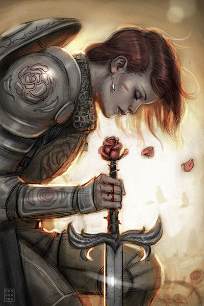
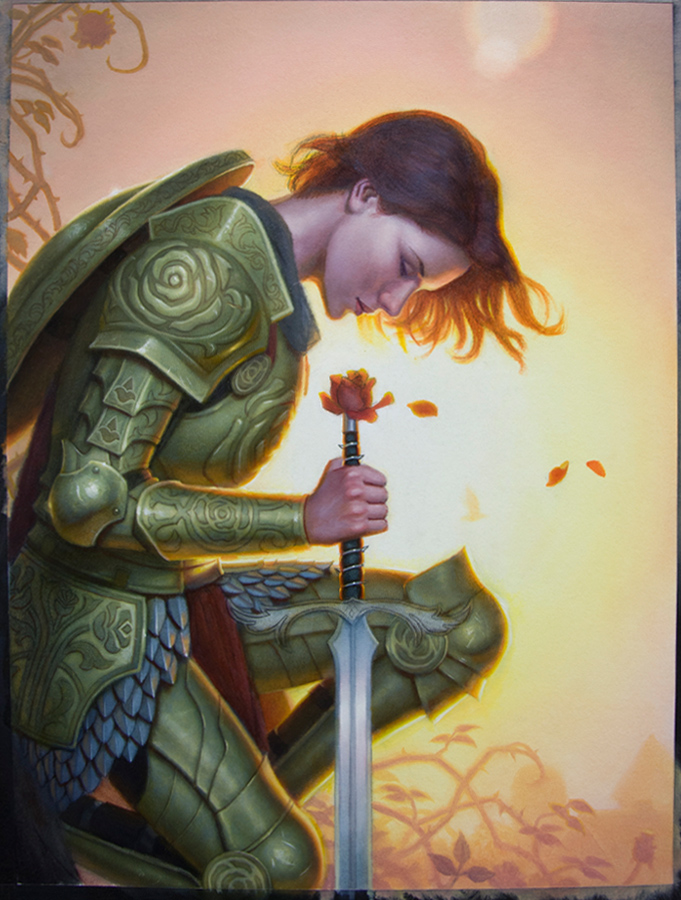
My ‘Rose Red’ painting is currently hanging at the Norman Rockwell Museum as part of their ‘Enchanted: The History of Fantasy Illustration‘ exhibit. As such, I thought it’d be fun to dust off this old post from when I first painted this image. It’s odd to look back on this article now, as you never know what pieces of yours will stand the test of time. At the moment, it felt like any other job. Now, it has become one of my most iconic images in my portfolio.
The following article was originally posted September, 2013:
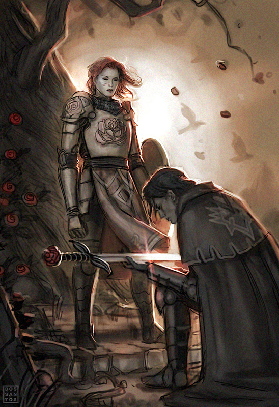
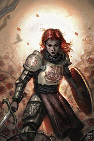
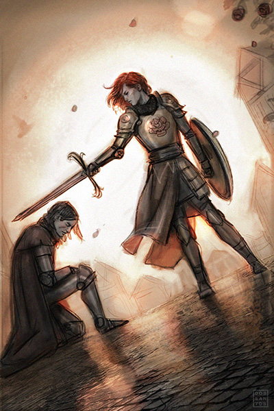
Here is a painting I just finished up for DC Vertigo’s best selling comic, ‘Fables‘. Shelly Bond, Executive Editor for Vertigo, asked me to depict the heroine Rose Red for issue #136’s cover. She asked that I either show her knighting Lancelot, or show her by herself with a focus on her armor. I worked up two different versions of each concept, and submitted them for approval.
Shelly decided to go with the more contemplative solo shot of Rose Red, feeling that the composition was a nice compliment to the previous issue’s cover painted by Greg Ruth.
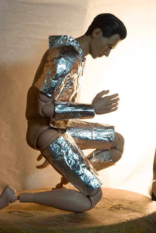
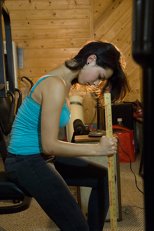
Once I had sketch approval, I went about acquiring reference. Since the look for the character was already established, I was mostly concerned with lighting and anatomy reference. I used an amalgam of reference to aid me in the painting process, including:
– A photograph of a student from the IMC, whose hair was similar in color and cut to Rose’s,
– A 12″ figurine, which I donned with aluminum foil armor, for general lighting information,
– A shot of my Niece, to help me portray the realism of the face and hands.
Once I had all my reference, I redrew the sketch directly onto my gessoed illustration board. There were still a lot of graphic decisions to be made about the armor, so the drawing process actually took considerably longer than usual since I kept double guessing myself.
Eventually, I resolved the drawing, sealed it, and went about laying in paint. I began with a very light wash of oils to help establish the overall color scheme.
I allowed the wash to dry overnight, and then went back into it with semi-opaque paint, gradually building up the realism.
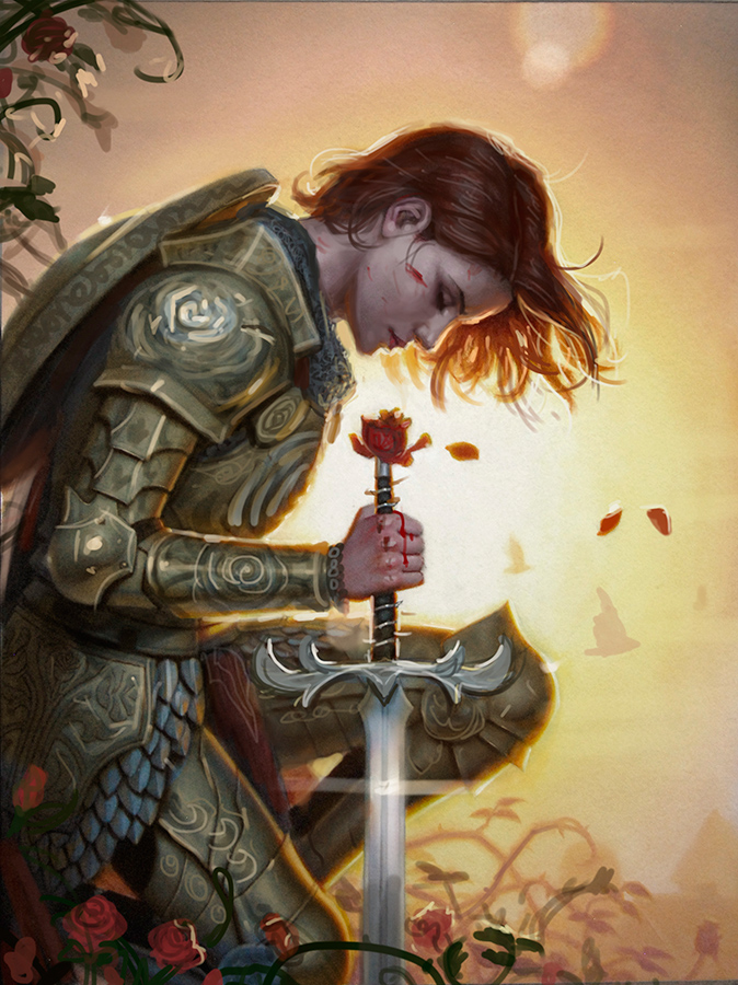
Eventually, I got to a point where I could start to envision the final, and was not happy with what I saw. The general temperature scheme of the monochromatic sketch looked fine to me, but something about the actual painting looked ‘off’. The flesh tones of the face were a particular struggle, as they just looked a little lifeless and icky.
Often times, when I’m stuck like this, I will photograph my painting, import it into Photoshop, and just start messing around with it. This allows me to make brazen revisions without fear of destroying the original painting.
I soon discovered that the flesh tones were fine… it was the color of the armor that was making them look messed up. In fact, the whole painting would look a lot better if the armor were gold instead of silver.
Changing silver armor to gold armor is pretty darn easy in Photoshop. In real paint… not so much. There is no easy way to do it. You just need to suck it up, and repaint the darn thing. I was able to color shift a good amount of it simply by applying an intense yellow glaze, but ultimately it took a lot more time than I would have liked. Though, in the end, I think it was worth it.
The revised comp also prompted me to add some more rose bushes around her, both on top and in front.
Secure in my color choices, I just needed to refine things. A little more polish, a lot of filigree, and the image was finally complete.
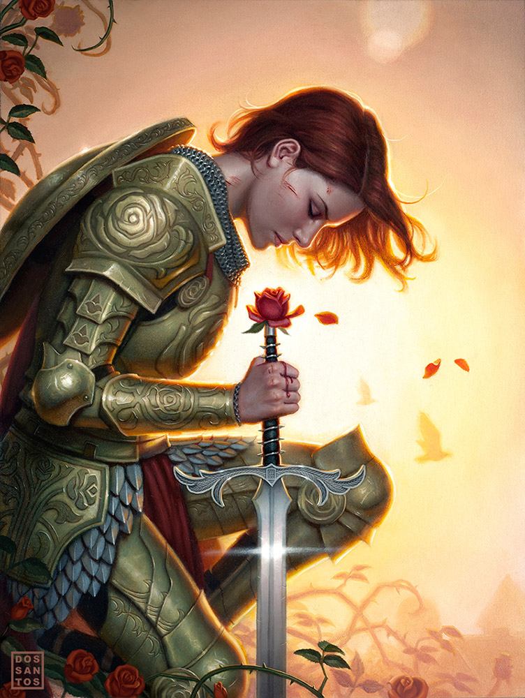 |
| Rose Red, by Dan dos Santos. Oils on Board, 12×16 in. |
For those of you in the area, I will be exhibiting the original painting this weekend at IlluXcon in Allentown, PA, along with a several other works.
Fables #136 will be on the stands in Mid-December.



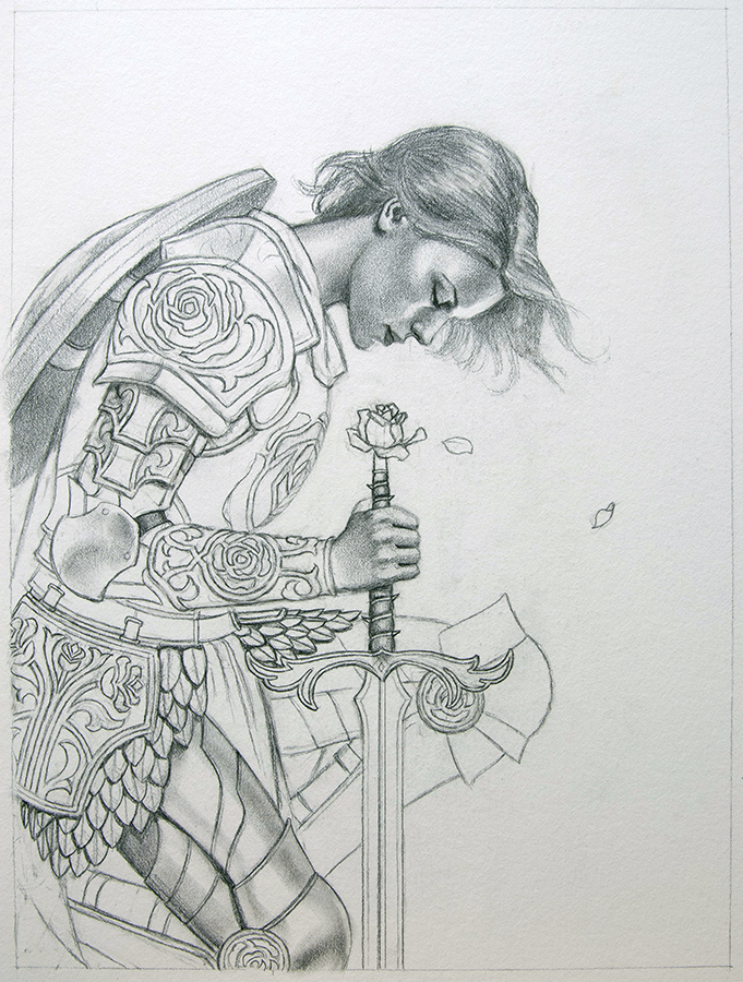
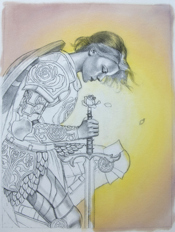
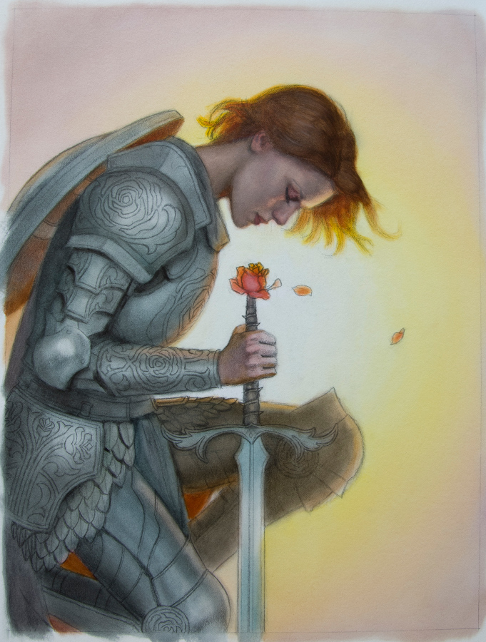
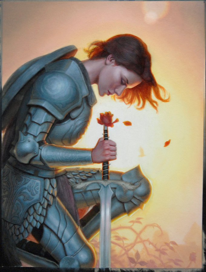

Awesome work Dan! It's very cool to see the process. You always surprise me with ways to improvise for reference.
Beautifully done!
That's the main reason I just broke up with traditional painting- “too much pain, not enough profit” as a D3 NPC says often 😀 Digital lets you do those shifts quickly and light-mindedly and rly becomes a sort of an extension of one's conciousness. Ofc you dont have a beautiful original for generation ahead to marvel at but, hey, there is no perfect happiness
Amazing work Dan! Thank you for sharing the process with us 🙂
I can't wait to see this, in-person. The colors are amazing and the amount of work you put into it … *stunned*
That 12″ figurine looks really useful. Is that something you use quite often to supplement real models, and do you happen to remember where you got it? And thanks for sharing your process with us; it's both incredibly inspiring and wonderfully helpful!
Beautiful work!
I would like to know where you got that posable figure too.
I think what I like the most is hearing about the parts that you struggled with. I know it's that unwillingness to allow a mediocre image stay mediocre that separates the successful artist from the amatures. Great painting Dan! And I'm glad you got to paint someone that isn't a werewolve chick for a change! That armor looks sweet!
I too am curious about the figure. Awesome painting Dan. Really captured the glow of light and it added so much mood to the piece.
Your process and honest analysis of your progress is always fascinating. Thank you for showing this.
I can see why you initially went for the blueish armor, as it would complement the background color. Good idea to use photoshop as a problem solver, it gives you the best of both analog and digital that way. Its interesting that you ultimately made the final look more monochrome, like your sketch.
Beautiful piece Dan! I really like this one. Great work on the armor designs!
Awesome… :O
Love the colors.
Yes, I use it quite often. A expect I will do a whole post about it soon.
Personally, I -need- that original. Otherwise, I just feel like I'm continuously laboring with no real payoff for my efforts other than payment.
You're right, that was my thinking. Usually I want that contrast to help the figure pop off the background, but often times, it is at the sacrifice of 'mood'. I wanted the feel of a humid sunrise, and that cool armor was just ruining it.
Great walk-through! I think being willing to redo a large (and time consuming) section of a problematic piece is a great habit to be in and something a lot of learning artists, including myself, struggle with. Where in Illuxcon will you be showing your work?
Dan thank you so much for the this! It's inspiring and humbling to see the process, especially the trouble shooting. (And foil covered figurines. wow.) The painting is just stunning.
~galen dara
I will be in the weekend salon. See you there!
Is Crit-Submit done forever?
No. We just need to get that ball rolling again.
By having originals it is also establishing an inheritance for your next of kin. That is one of the most beneficial aspects of traditional pieces of work in my opinion.
Extra time repainting totally worth it- lovely piece!
Thank you so much for showing the process. Incredibly beautiful work.
Umm…any chance prints will be available for sale? If not, who do I contact to ask about the original? I am in love with this painting, just lost almost an hour of time staring at it.
Dan, you showed us a screen shot of this a couple of months ago. I was impressed then, but seeing a higher resolution version I'm SUPER impressed. The detail on the armor is simply stunning, and the lighting is magical.
Rose, I am not allowed to make prints, as most comic commissions are a 'work for hire' arrangement. As for the original, it has already been sold.
I'm really not trying to be a jerk, but is her sword crooked in the final painting? or is there a photographic distortion?
Hey Dan, awesome process. Thank you for posting this. Reminds me of the stuff I used to do in school where you had many models to choose from (classmates). I only had one technical question and this may seem obvious to you. When you finish the pencil, what do you use to seal it? A regular fixer? Thanks!
It's an illusion. Because you really only look at the highlight, and not the darker sharpened edge next to it, the width up top appears to be narrower (especially on the left side) than it does on the bottom. I guess it does look a bit like the sword is curved as a result.
Just Krylon Workable fixative.
Gorgeous piece in person…