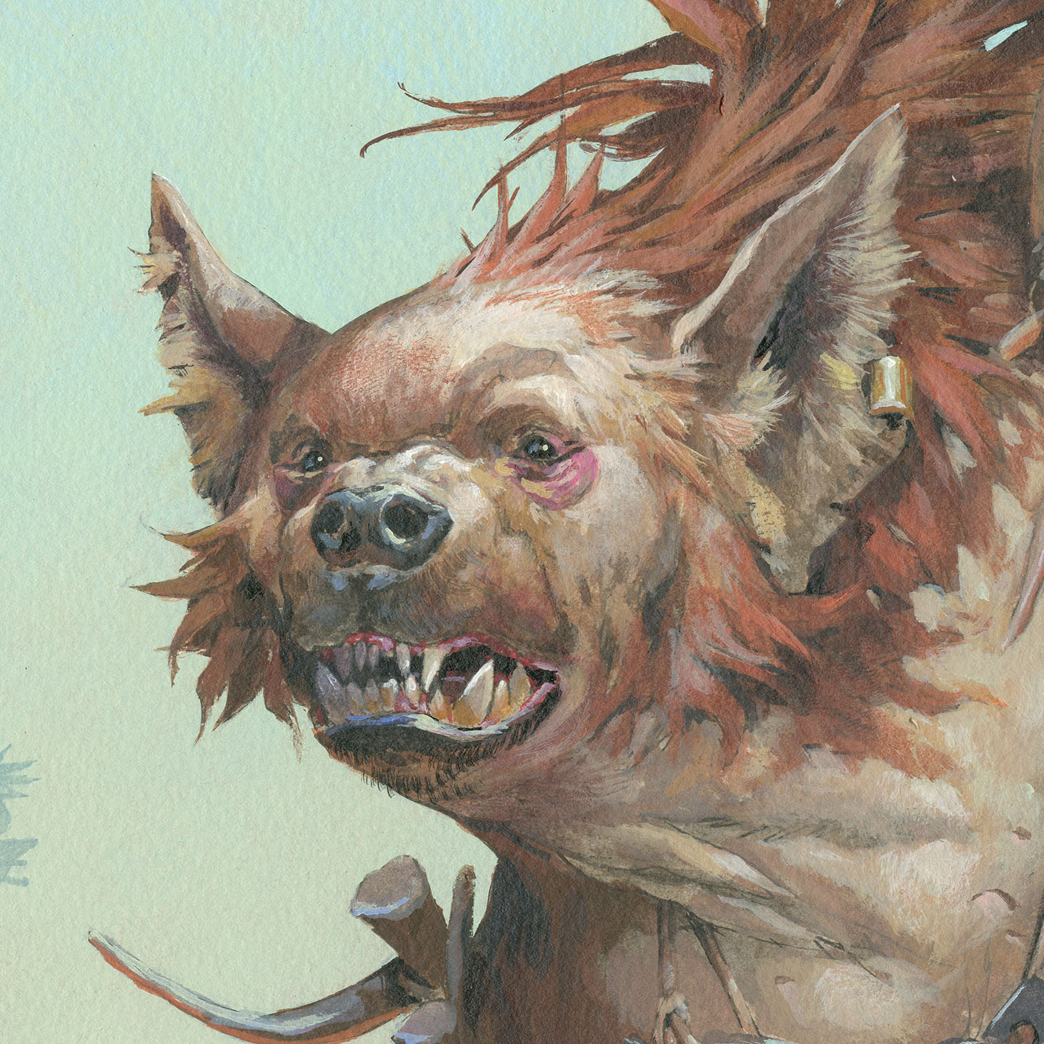
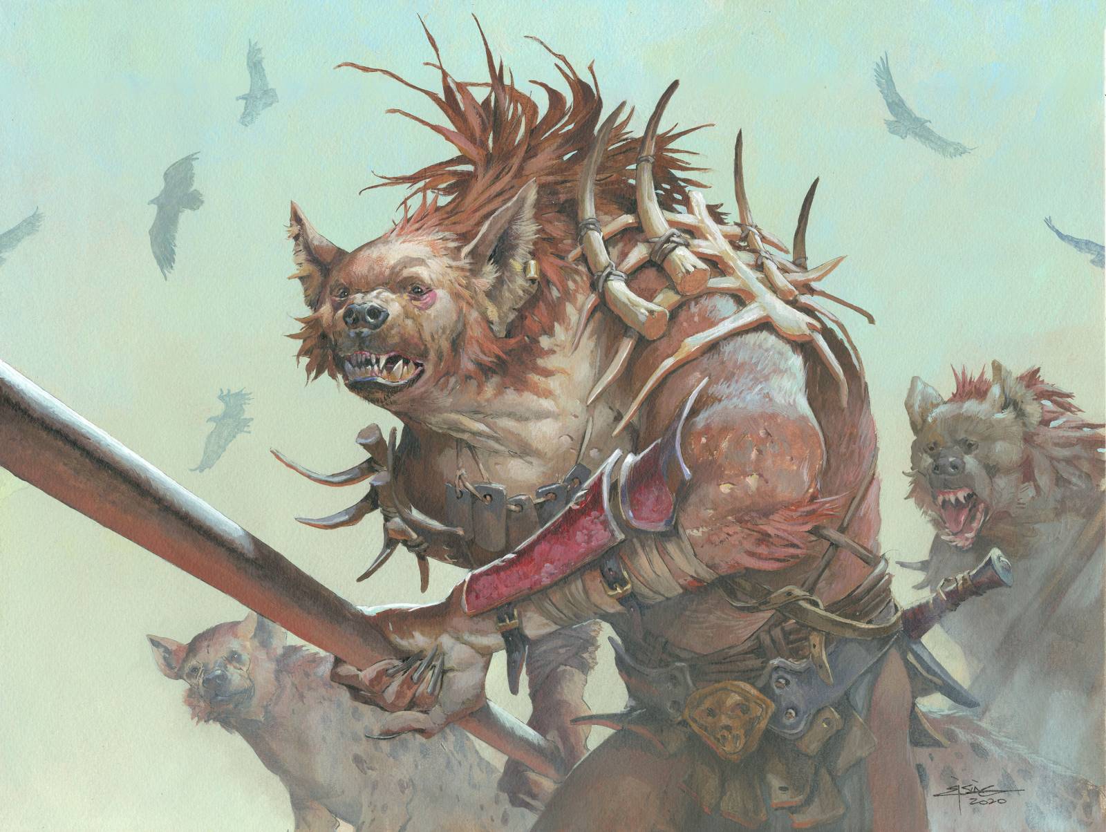
More or less a year ago I got to paint a classic Gnoll portrait for the Magic the Gathering expansion “Adventures into the Forgotten Realms” A Gnoll is a monster that looks like a muscular human with a hyena head. They come in packs and often travel with real hyenas. (or at least I thought that was cool if they did ) For the composition I wanted to try something classic. A crop around the thigh section would allow me to get close enough to the main figure that I could do all the details and things in the face that I wanted and still keep it a figure portrait. I had the idea that they figure would come out of the fog or smokey dust in the air from burning down villages. Or at least I saw them as emerging out of a distant fog. I kept the angle low so I would avoid having to fill the frame with too much background details to further enhance the emerging feeling. There would be nothing but the main figure and the pack behind him. No setting no landscape no background but the fog color. Well; and then some carrion birds like Frazetta would have added to give the sense of sinister deeds and death laying behind them and rotting in their tracks. The problem with classic angles is that they can become boring and un-engaging. So to make it a bit more “action-like” I let the spear push out towards us in a for shorting angle. So that we would feel the tip of teh spear almost next to our heads.
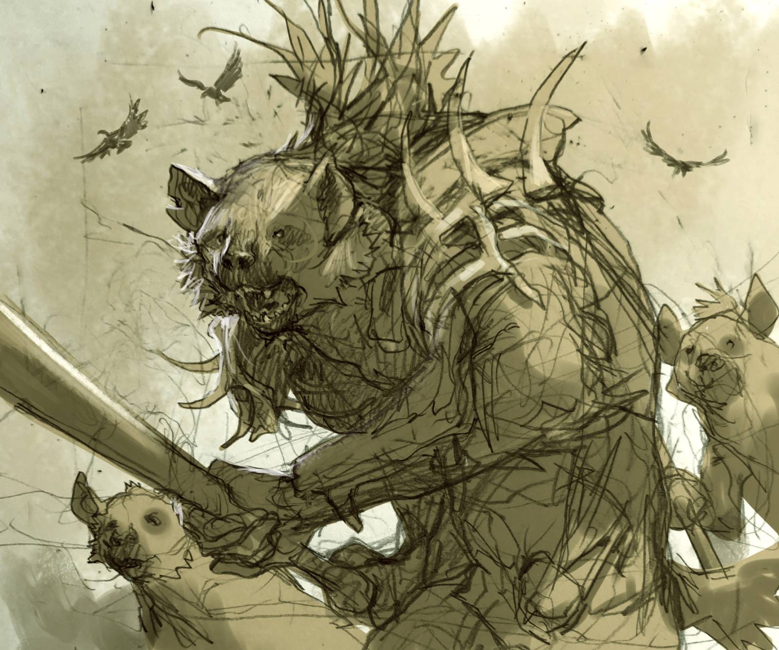
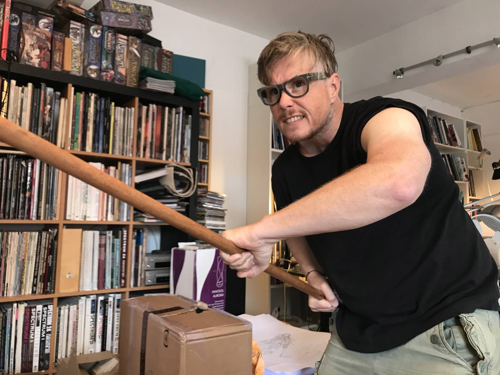
And I tried a less common spear grip; a more backhanded thrusting grib. The idea came from stabbing around at the studio with my real spear to see what would feel right. And then having my friend Claus take a photo for hand reference. It helps me a lot to act out the pose to get the feeling right and sometimes it lets me correct or adjust small things that make the image seem more believable. in this case it was the inwards twist of the hand gripping the bottom part of the spear that I could see was weaker in my sketch but seemed more powerfull in the photo.
I adjusted the sketch while drawing it onto my watercolour board. I consulted a bunch of images of hyenas to get the face right and then as usually inked the whole sketch in waterproof ink and added greytones. The greytones aids me a lot when I start to apply the first many thinner layers of paint and washes as I can still see the lines and values underneath. I try to keep as much of the drawing and value painting in the final as possible only toning the values with a base color. It gives an impression of lightness or a bit of a casual finish compared to having all the image build up by equally thick strokes of paint.

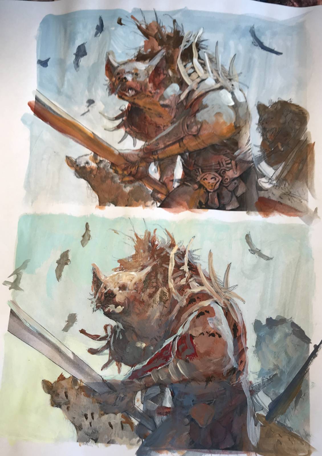
I wasn’t quite sure if my fog-idea would work or if it would be dramatic enough, so I tried out 2 color compositions. One being blue with dramatic orange bounce light as if there was a fire close, and one with a more hazy greenish atmospheric color. I ended up going with the last mainly because I noticed that I hadn’t really tried that color palette before and the blue/orange one was something I had done countless times. Hurray for adventure!
Before I started painting I masked out the main figure So I could work more freely on the background without having to bend the strokes around the figure. The tonal from thin green to yellow was done with a very wide brush. I took of the masking film and started the main figure building it up from dark towards the light. I will add a tone of color, like the brown skin tone in a layer covering the whole face. This layer acts as a transparent tonal layer that colorises the greytone value painting underneath. And it function as the shadow part of the face.
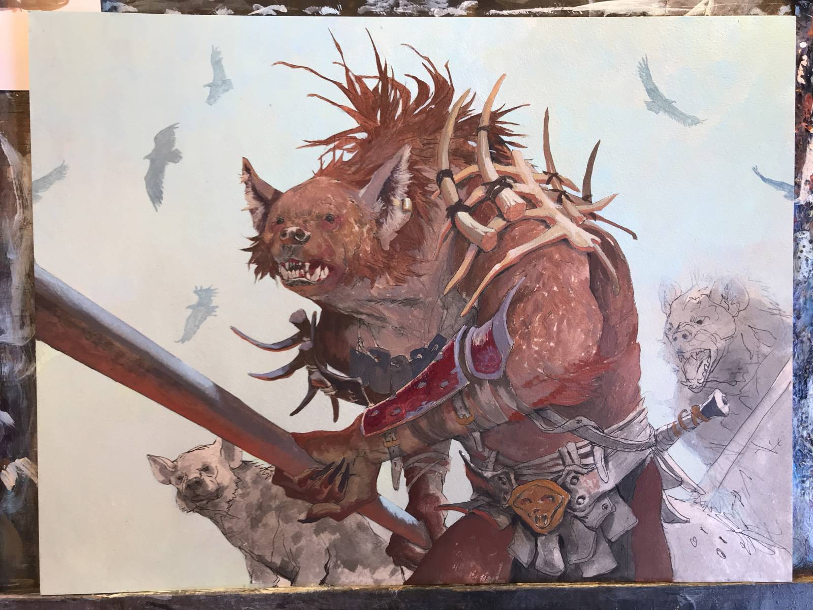
From here on I will add texture and paint thicker and thicker so to speak painting in the light on top of the shadow layer. I do it bit by bit to gain some texture and variations within each color. Its more of an optical mixing of color rather than a blending on the palette.
Before I started the painting I had this grand Idea that I wouldn’t use any rim light this time. I would build him up with only local colors and model the shapes with the cold greenish haze color as light. But I gave in and added stronger rim light effect on the spear and let it creep up the front arm, to pull it away from the body. One can only try so many new things in one painting and this one already had a new color scheme. I treated myself to some rim light…dont feel bad about it.

Then you turned into a WereHyena and took the picture for the Hyena’s head. That’s cool.
Love your process posts.